
Selecting the right exterior paint color can feel confusing, and many people want something warm, classic, and not boring. Accessible Beige by Sherwin-Williams has become a go-to choice for exactly that reason.
In this blog, I’ll show you why Accessible Beige Sherwin-Williams SW 7036 remains a favorite for exteriors.
It strikes the perfect balance between beige and subtle gray undertones.
You’ll learn about Accessible Beige LRV, undertones, how it pairs with trims and materials, and why designers recommend it for a wide range of home styles.
What Color is Sherwin-Williams Accessible Beige (SW 7036)?
Accessible Beige (SW 7036) by Sherwin-Williams is one of the brand’s most popular neutral paint colors, loved for its balance and grace.
It’s the kind of color that provides an advanced backdrop without ever feeling stuffy, making it a go-to for designers and homeowners who want a classic look that will stand the test of time.
Accessible Beige has also become a trusted choice for exteriors, where it adapts beautifully to changing daylight.
Its subtle undertones complement a variety of trims, materials, and landscaping, making it an option for people seeking a warm and inviting look.
Why it is a Top Choice for Exterior Painting
Sherwin-Williams Accessible Beige’s versatility and durability make it a top choice for exterior applications.
- Neutral greige tone offers a classic, advanced look that resists outdated trends.
- Appears soft white in sunlight, adding warmth and brightness to exteriors.
- Hides dirt and resists fading, ensuring long-lasting beauty with minimal upkeep.
- Pairs well with bold or subtle accents, creating beautiful palettes.
- High-quality pigmentation withstands various weather conditions, maintaining vibrancy over time.
Accessible Beige Color Characteristics
Accessible Beige has balanced greige qualities, making it a favorite among people seeking a dependable and stylish exterior color.
Warm Greige Tone
Accessible Beige combines beige and gray to create a balanced greige shade. It keeps a soft neutrality that avoids the flatness of cooler grays, making it a good choice indoors and outdoors.
Subtle Undertones
This color features subtle green and taupe undertones that shift in response to changing light conditions.
In bright natural sunlight, the tones feel fresher, while under artificial light, they reveal a deeper warmth, adding style to exteriors.
Light Reflectance Value (LRV)
With an LRV of 57.70, Accessible Beige reflects a moderate amount of light. It’s light enough to brighten exteriors without harsh glare, yet has enough depth to add dimension and richness to home facades.
Versatile Appearance
Accessible Beige adapts beautifully to its surroundings, shifting in mood with changing daylight. While shaded areas highlight its depth, giving exteriors both warmth and a touch of coziness.
Neutral Color
Its balanced greige tone ensures it never feels outdated. Accessible Beige’s versatility keeps it relevant across shifting design trends.
Making it a neutral that suits modern, classic, and transitional home exteriors equally well.
Accessible Beige Exterior Color Palette
Sherwin-Williams Accessible Beige (SW 7036) is a versatile, warm neutral exterior paint color. It blends beige and gray, creating a timeless and inviting look that suits a variety of architectural styles.
| Element | Color | Description |
|---|---|---|
| Siding/Body | Accessible Beige (SW 7036) | Warm greige, looks soft white in sunlight |
| Trim | Tony Taupe (SW 7038) | Slightly darker taupe creates an elegant monochromatic palette. |
| Accent | Urbane Bronze (SW 7048) | Dark gray-brown adds depth for front doors, gutters, or corbels. |
| Alternate Trim | Alabaster (SW 7008) | Crisp white offers classic contrast, ideal for a brighter look. |
| Secondary Accent | Grays Harbor (SW 6236) | Dark gray-green enhances historic or natural settings. |
Exterior Use & Performance
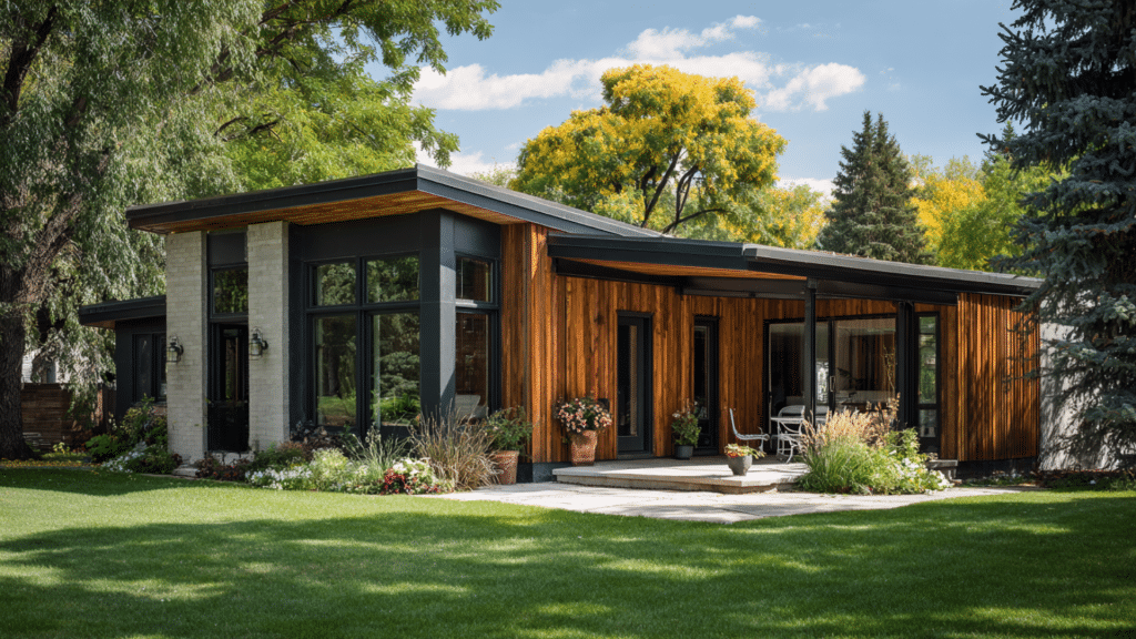
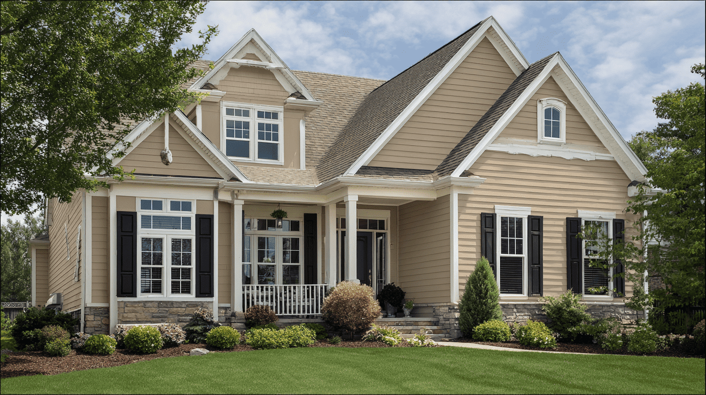
Accessible Beige is a warm neutral ideal for the exterior. Its greige tone increases appeal, blending seamlessly with various architectural styles and natural surroundings.
Main Siding
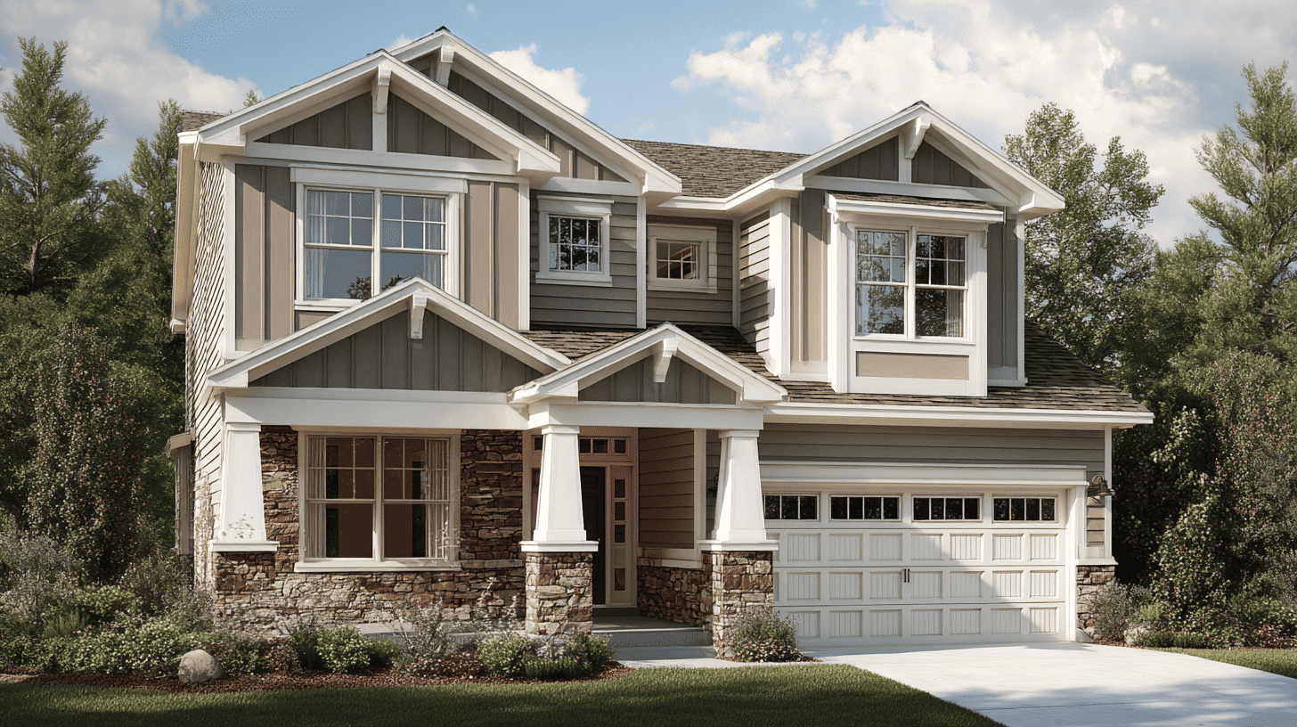
Use Accessible Beige for primary siding to create a warm, inviting exterior. It suits modern, traditional, or craftsman homes, reflecting light to appear soft white, adding beauty and warmth to the overall design.
Front Door
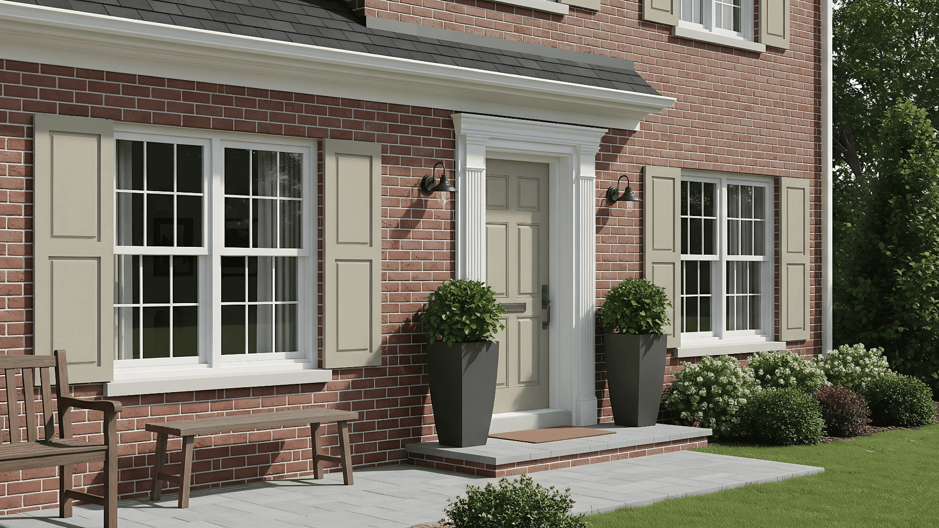
Paint the front door Accessible Beige for a subtle entry. Pair with darker trim, such as Urbane Bronze (SW 7048), to add depth and create a welcoming focal point without bold contrast.
Shutters
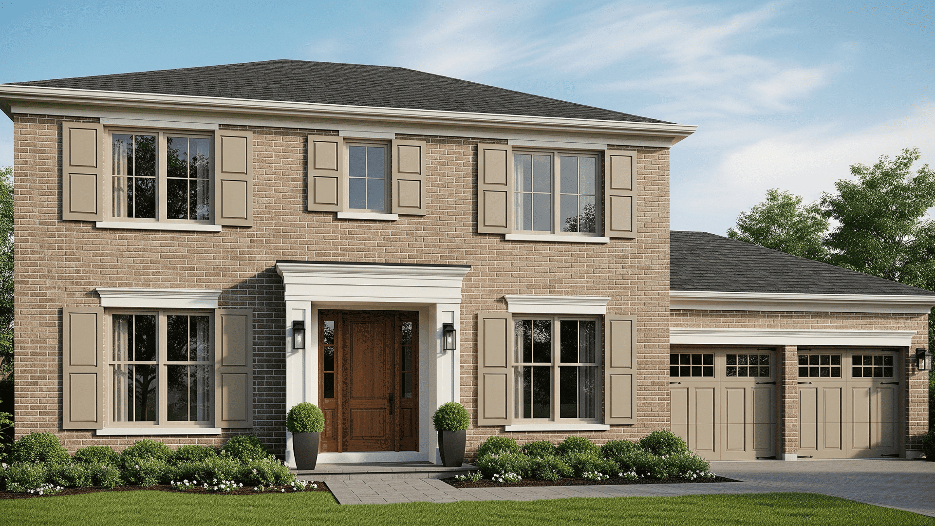
Apply Accessible Beige to shutters for a unified, monochromatic look. It complements bold accent colors or natural wood tones, adds to traditional or contemporary homes with understated beauty and balance.
Porch Ceiling
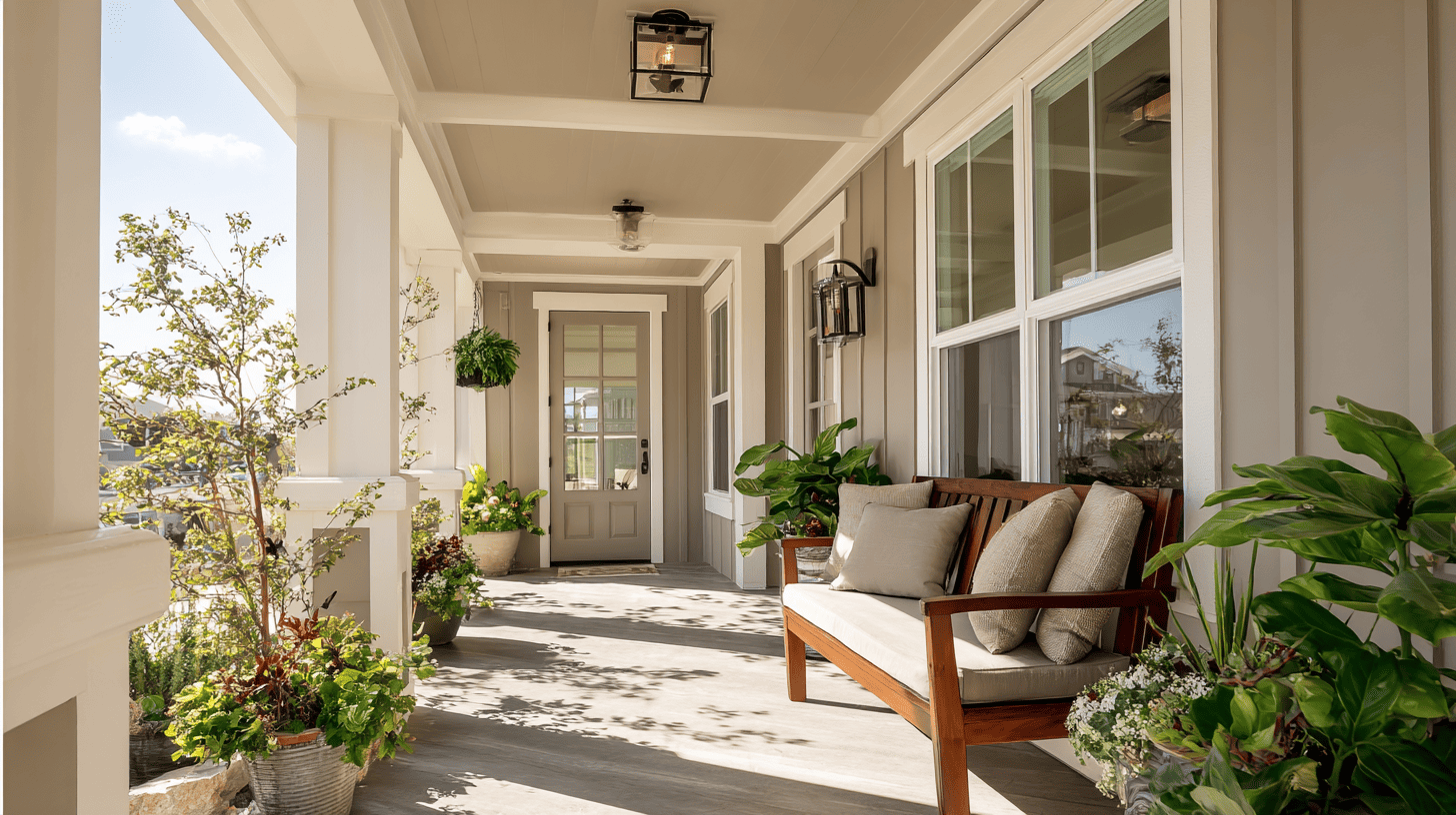
Use Accessible Beige on porch ceilings to create a warm, inviting ambiance. Its soft, beige tone reflects light subtly, pairing well with white or taupe trim for an airy feel.
Garage Door
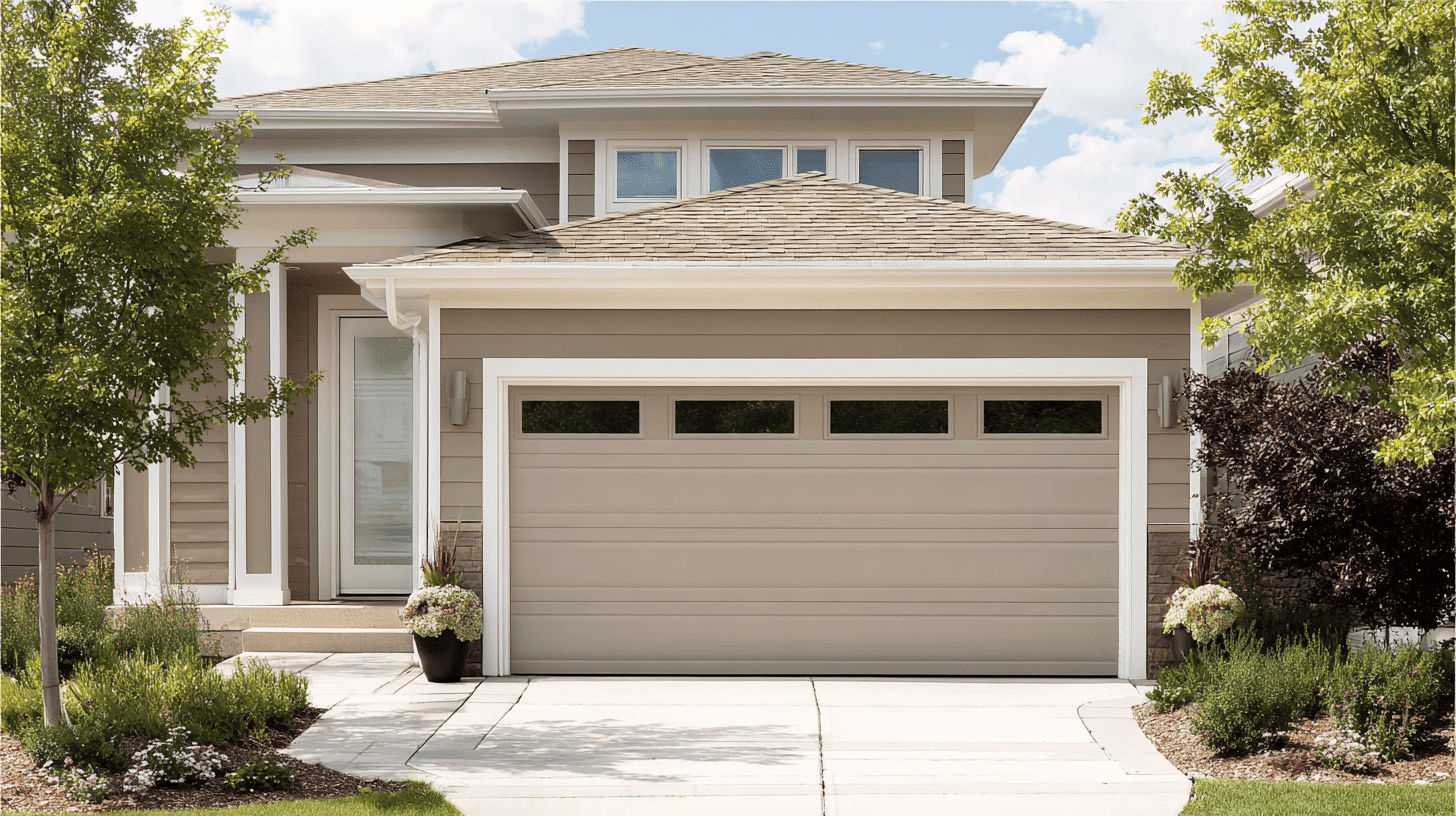
Paint the garage door Accessible Beige to blend seamlessly with the siding. This creates a streamlined look, ideal for modern homes, while its neutral tone hides dirt for low maintenance.
Color Combinations that Work Well with Accessible Beige Exterior
Finding the perfect color combinations for accessible beige Sherwin-Williams exterior can convert your home’s curb appeal.
The following are the most loved – six top pairings that work beautifully with beige siding.
| Color Name | Tone | Pairing Effect |
|---|---|---|
| Cadet (SW 9143) | Soft Blue | Calming |
| Urbane Bronze (SW 7048) | Brown-Gray | Bold contrast, modern accent |
| Pure White (SW 7005) | Crisp White | Fresh trim feel |
| Sea Salt (SW 6204) | Green-Blue | Coastal, spa-like |
| Evergreen Fog (SW 9130) | Muted Green | Modern, subtle accent |
| Upward (SW 6239) | Blue-Purple | Contemporary, balanced |
Conclusion
Accessible Beige exterior stands out as a premier paint choice.
Whether paired with bold accents or subtle trims, Accessible Beige creates exteriors that increase upscale curb appeal.
Perfect for people wanting a blend of modern and traditional design, this color offers durability and visual consistency, making it an excellent option to turn any home into a beautiful, stylish, and durable space.