
Staring at paint samples for hours, yet still can’t decide between two popular neutrals?
Choosing between Accessible Beige vs Agreeable Gray might look simple on tiny chips, but they create completely different vibes in your actual room.
I’m going to break down their undertones, brightness levels, and which rooms they work best in. No more guessing or expensive paint mistakes.
Let’s figure out which one’s right for your space.
Accessible Beige – Identity & Character
Accessible Beige (SW 7036) is a warm, creamy neutral that creates an inviting atmosphere. This color has rich depth with subtle brown undertones that become more pronounced in natural light.
It feels cozy, making spaces feel like home.
Key Characteristics:
- Warm beige base with yellow and brown hints
- Works best in traditional and transitional decor
- Perfect for living rooms and bedrooms
Agreeable Gray – Identity & Character
Agreeable Gray (SW 7029) is a balanced greige that combines the best of gray and beige. This modern neutral maintains a gentle approach while staying approachable.
It adapts well to different lighting conditions and decor styles, making it incredibly adaptable for any room.
Key Characteristics:
- Cool gray base with subtle beige warmth
- Works with both warm and cool lighting
- Suits contemporary and transitional styles.
Accessible Beige vs Agreeable Gray
When I compare these two popular Sherwin-Williams colors, several key differences stand out. Both colors work well in most spaces, but they create completely different moods.
Learn these differences helps you pick the right color for your specific room and lighting situation.
| Color Attribute | Accessible Beige (SW 7036) | Agreeable Gray (SW 7029) |
|---|---|---|
| Color Family | Neutral | Neutral |
| LRV (Light Reflectance Value) | 58 | 60 |
| Undertones | Yellow, brown, cream | Purple, blue, slight beige |
| Hex Code | #D1C7B8 | #D1CBC1 |
| RGB Values | R: 209, G: 199, B: 184 | R: 209, G: 203, B: 193 |
Room-by-Room Recommendations
Different rooms have unique lighting conditions and functional needs that affect color choice. Understanding where each color performs best helps you make confident decisions for every space in your home.
1. Bathroom
In the living room, both Accessible Beige and Agreeable Gray can set the tone, but your choice depends on how you use the space.
Accessible Beige
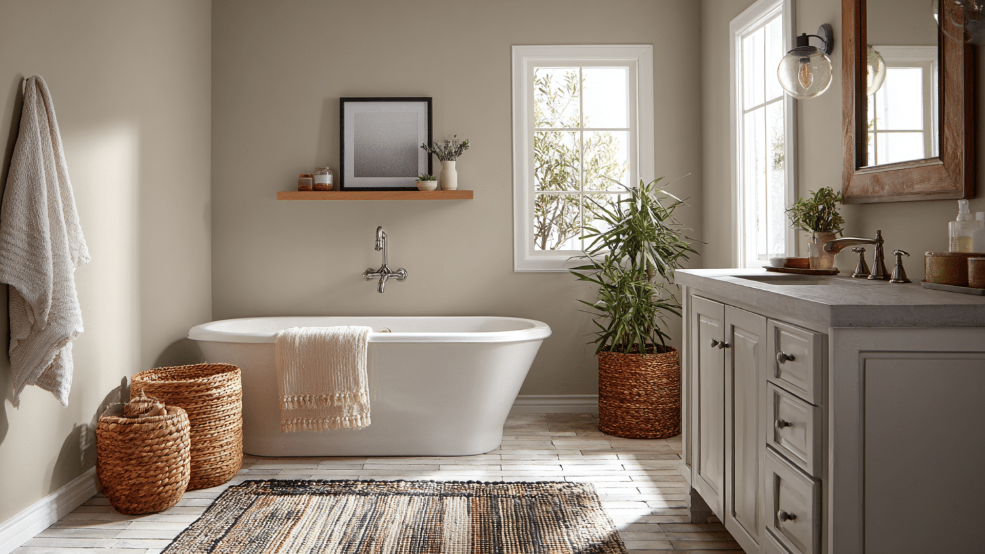
Accessible Beige changes your bathroom into a cozy retreat that never feels cold or unwelcoming. This gentle shade works well in smaller bathrooms where you want to avoid that sterile hospital feeling.
It looks great with warm vanity lighting and pairs beautifully with classic subway tiles or wooden accents.
Agreeable Gray
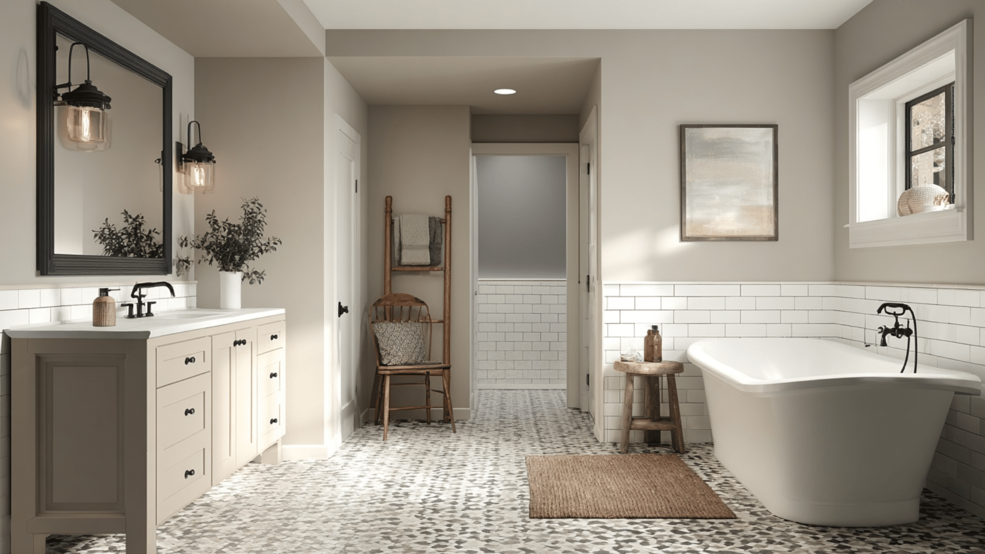
Agreeable Gray brings a spa-like quality to your bathroom that feels polished and refreshing. This color reflects light beautifully in well-lit spaces and creates a modern, clean atmosphere.
It looks stunning with glass shower doors, chrome fixtures, and sleek floating vanities for that contemporary edge.
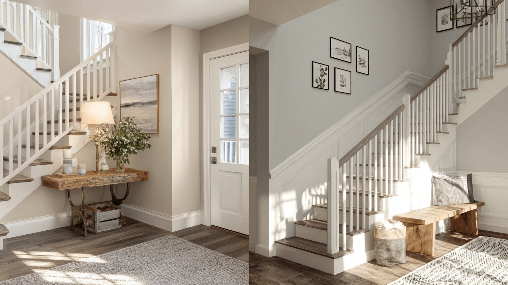
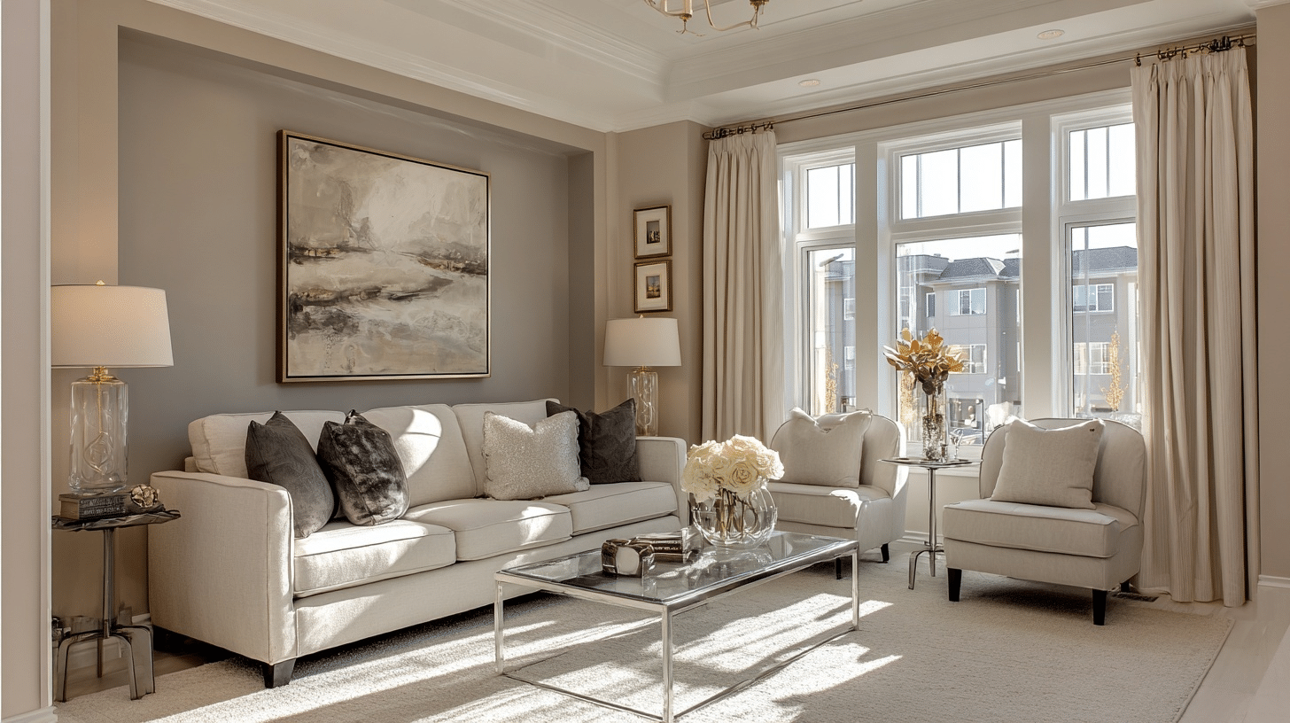
2. Living Room
In the living room, both Accessible Beige and Agreeable Gray can set the tone, but your choice depends on how you use the space.
Accessible Beige
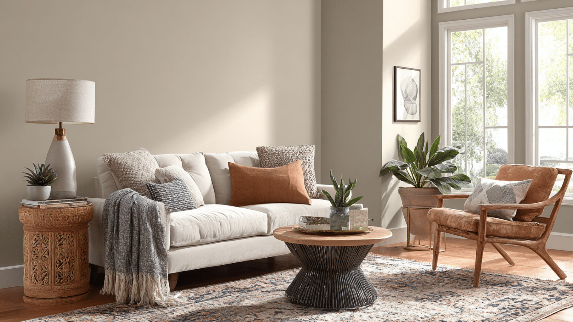
In the living room, Accessible Beige brings warmth that makes everyone feel at home.
This color works perfectly when you want your space to feel cozy and comfortable. It handles dim lighting well and pairs beautifully with wood furniture and soft textures.
Agreeable Gray
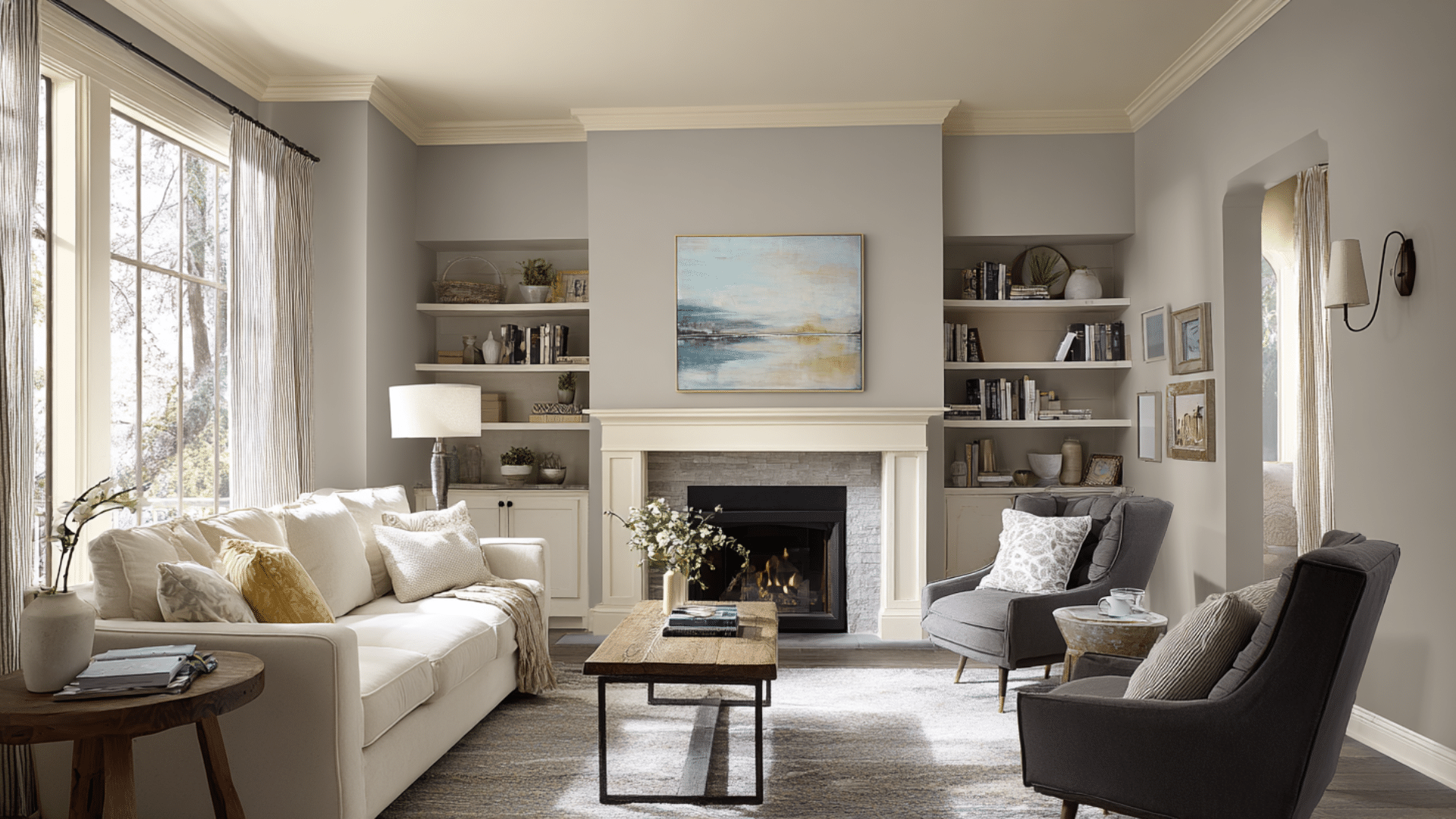
Agreeable Gray gives your living room a fresh, modern look that feels clean and open. This shade works great in bright spaces and creates the perfect backdrop for contemporary furniture.
It connects well with other rooms in open floor plans, making your whole home feel larger.
3. Bedroom
In the Bedroom, both Accessible Beige and Agreeable Gray can set the tone, but your choice depends on how you use the space.
Accessible Beige
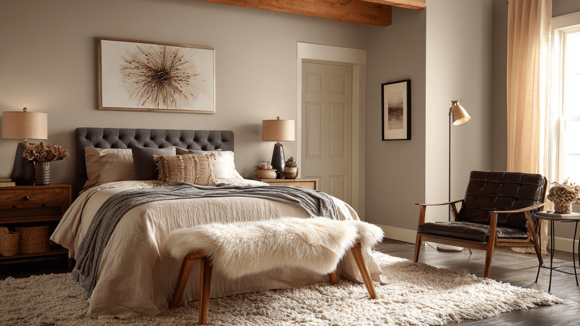
Accessible Beige turns your bedroom into a cozy retreat where you can truly relax. This warm tone creates an intimate feel that makes the space feel like a personal sanctuary.
It keeps its comforting quality even with bedside lamps or softer lighting, and pairs perfectly with wood headboards and soft linens.
Agreeable Gray
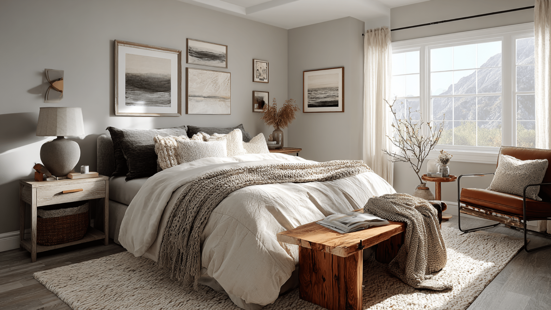
Agreeable Gray offers your bedroom a calm, balanced foundation that never feels overwhelming. This neutral shade gives you freedom to change your bedding colors and wall art whenever you want a fresh look.
It stays crisp and clean in morning sunlight while working beautifully with both bold patterns and simple, minimal decor.
4. Kitchen
In the kitchen, both Accessible Beige and Agreeable Gray can set the tone, but your choice depends on how you use the space.
Accessible Beige
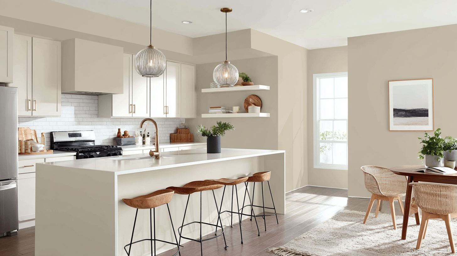
Accessible Beige creates a kitchen that feels like the heart of your home, where family naturally gathers.
It works perfectly under pendant lights and complements warm countertops, such as butcher block or classic tile backsplashes.
Agreeable Gray
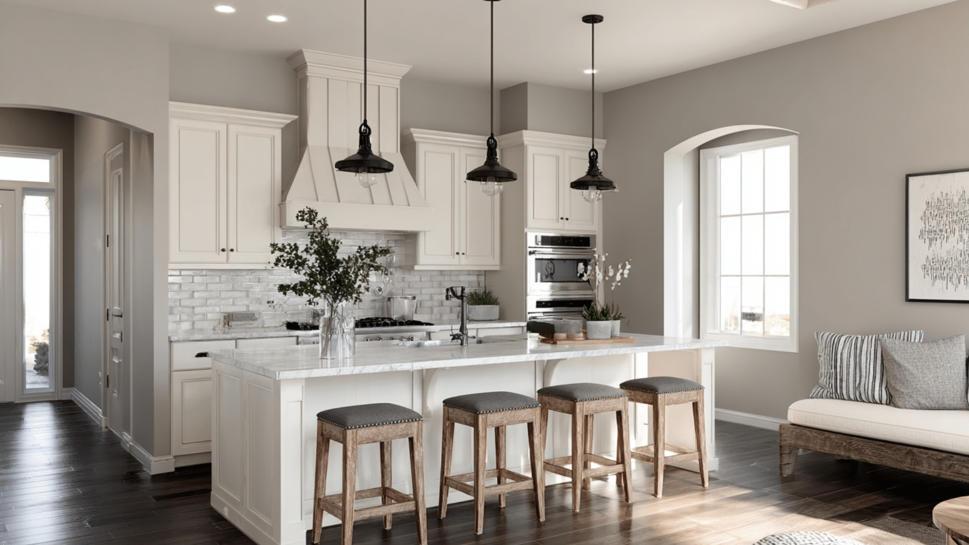
Agreeable Gray gives your kitchen a sleek, contemporary look that feels fresh and organized. This color makes white cabinets pop and creates the perfect backdrop for stainless steel appliances.
It thrives in bright kitchens with plenty of windows and looks stunning with marble countertops or modern quartz surfaces.
When to Avoid Using Them Together
Avoid using these colors together when their undertones clash with your lighting conditions.
In rooms with strong yellow artificial lighting, both colors can look muddy when paired together. The warm undertones in Accessible Beige may fight with the cool undertones in Agreeable Gray, creating visual confusion.
Skip this combination in small spaces where the subtle differences become lost. The similar LRV values mean they won’t provide enough contrast in compact rooms.
Additionally, avoid pairing these colors in spaces with multiple existing neutral tones, as combining both creates an overwhelming neutral palette that lacks focus and direction.
Styling Tips & Accent Ideas
Creating visual interest goes beyond just choosing the right wall color. Smart accent treatments and color pairings can change your space from ordinary to extraordinary.
Accent Walls
- Shiplap treatment with Accessible Beige creates farmhouse charm in dining rooms
- Board and batten using Agreeable Gray adds modern texture to hallways
- Two-tone walls with darker trim color create a gentle contrast
- Feature fireplace walls in either color become stunning focal points
- Bedroom headboard walls using wood paneling enhance the cozy factor
Coordinating Colors and Trims
The right trim and accent colors can make or break your neutral paint choice. Each color works best with specific companions that enhance its natural undertones.
For Accessible Beige:
- Alabaster trim provides clean contrast without the harshness of stark white.
- Warm wood tones, such as honey oak, complement the yellow undertones perfectly.
- Sage green accents create calming, nature-inspired combinations.
- Soft cream ceilings maintain warmth while adding subtle dimension.
- Terracotta accessories bring out the brown undertones beautifully.
For Agreeable Gray:
- Extra White trim creates crisp, modern contrast that stays fresh.
- Navy blue accents complement the cool undertones for depth.
- Charcoal gray as an accent color adds dramatic contrast in contemporary spaces.
- Soft mint green works with gray’s cool base for spa-like serenity.
- Black hardware provides sharp definition against the neutral background.
Can You Use Both Colors Together?
Using both colors together can create beautiful layered looks when applied thoughtfully. The key is choosing which color dominates and which colors support it.
Accessible Beige pairs well with Agreeable Gray trim, creating warm rooms with a cool contrast. This combination adds visual interest without overwhelming the space.
For accent walls, use Agreeable Gray on one feature wall while painting the remaining walls in Accessible Beige.
This creates a modern focal point in an otherwise traditional warm space. The slight difference in their LRV values (60 vs 58) provides a subtle contrast that feels intentional rather than accidental.
Which One Suits Your Space?
Go with Accessible Beige if you want warmth, intimacy, and a cozy home feel.
This color creates spaces that feel like a warm welcome. It pairs beautifully with wood floors, soft textiles, and traditional furniture.
Go with Agreeable Gray if you prefer a balanced, modern, and versatile backdrop. This gentle neutral adapts to changing decor needs effortlessly.
It complements stainless steel appliances, contemporary lighting, and both bold artwork plus minimalist accessories. Ideal for homeowners who value flexibility and timeless appeal.
Conclusion
So, which wins in the Accessible Beige vs Agreeable Gray debate?
It really comes down to your lifestyle and what feeling you want when you walk into your room.
Want cozy and traditional? Go with Accessible Beige. Prefer modern and flexible? Agreeable Gray’s your pick.
Ready to change your space? Pick up those paint samples and start testing!