
If you’re hunting for the perfect warm white that feels both fresh and cozy, it might just be what you didn’t know you needed.
It’s not a stark, cold white, but one with subtle warmth that breathes life into any room.
What I appreciate most about Cheviot is its versatility; it works beautifully in bright sunlit spaces and cozy corners alike.
In this blog, I’ll share why this color has become a go-to favorite among homeowners and designers alike.
What Color is Cheviot by Sherwin-Williams?
Cheviot Sherwin-Williams (SW 9503) is described as a soft, warm white with subtle beige or yellow undertones. It creates an inviting vibe in any space, reflecting plenty of light to make rooms feel open and airy.
| Feature | Description |
|---|---|
| Color Type | Creamy off-white with a warm, neutral cast |
| Hex Code | #F5F0E6 |
| LRV | 89 |
| Appearance in Light | Warm glow in bright sunlight; soft and inviting in cooler, low-light settings |
Color Characteristics
Cheviot by Sherwin-Williams is a warm off-white paint color known for its subtle complexity and inviting softness.
It offers a soft feel with a warm creaminess that works well in various settings, avoiding the starkness of pure white.
Tone and Undertones
Cheviot’s tone is predominantly warm, featuring soft yellow undertones that add gentleness without making walls appear overtly yellow.
This blend allows Cheviot to adapt to its surroundings; it is creamy and warm in bright sunlight, and softer with muted lilac and gray tones in cooler or dimmer light.
This nuanced undertone profile gives Cheviot a fresh feel, making it a warm neutral rather than a flat color.
Versatility in Different Lighting Conditions
Cheviot adapts beautifully to various lighting:
- In natural daylight, its yellow undertones brighten spaces with a sunny warmth.
- Under artificial light, it maintains a steady softness.
- In north-facing or low-light rooms, cooler lilac undertones soften the warmth, preventing a heavy yellow cast.
- South-facing rooms with strong sunlight make Cheviot appear brighter and more luminous.
Where to Use Cheviot
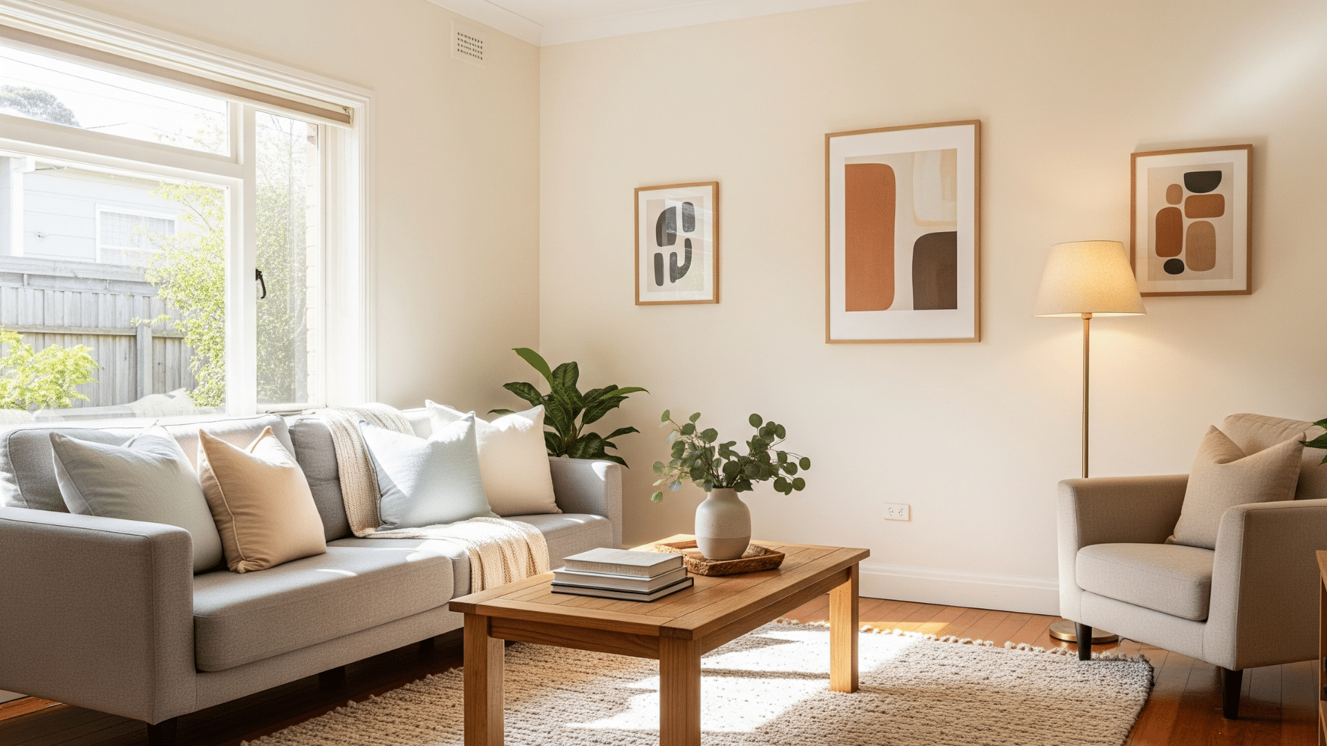
Cheviot’s balanced nature makes it suitable for almost any room in a home. Its ability to add brightness without being overpowering is its key strength.
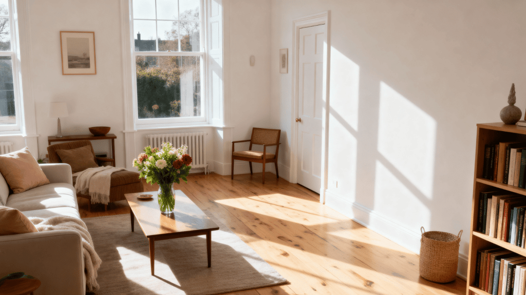
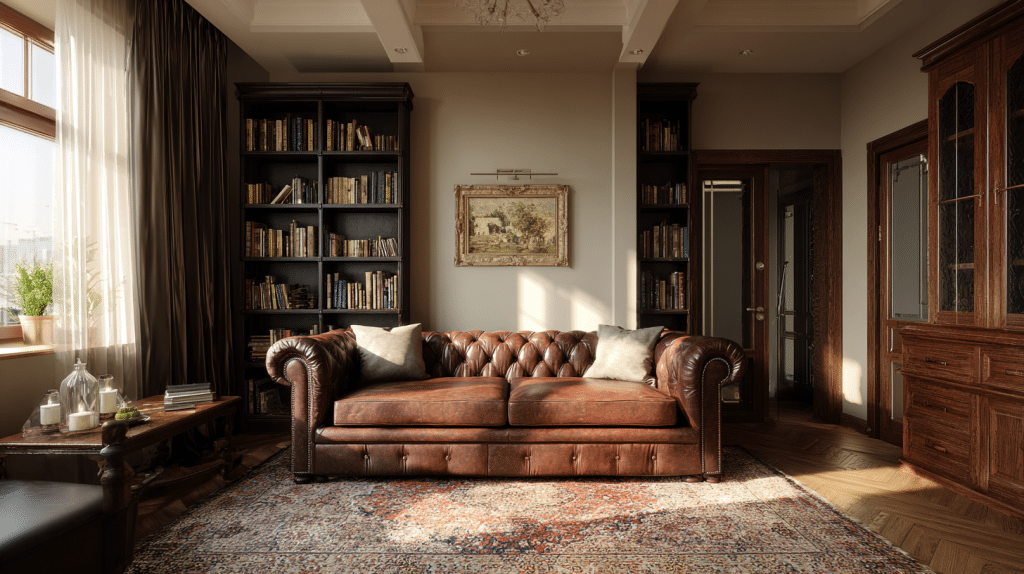
1. Living Rooms
Cheviot is an excellent choice for living rooms, creating a warm, welcoming backdrop.It pairs beautifully with natural materials, such as wood, and can be used to highlight furniture, art, and other decorative elements.
It works well with various design styles, from rustic to modern farmhouse and Scandinavian.
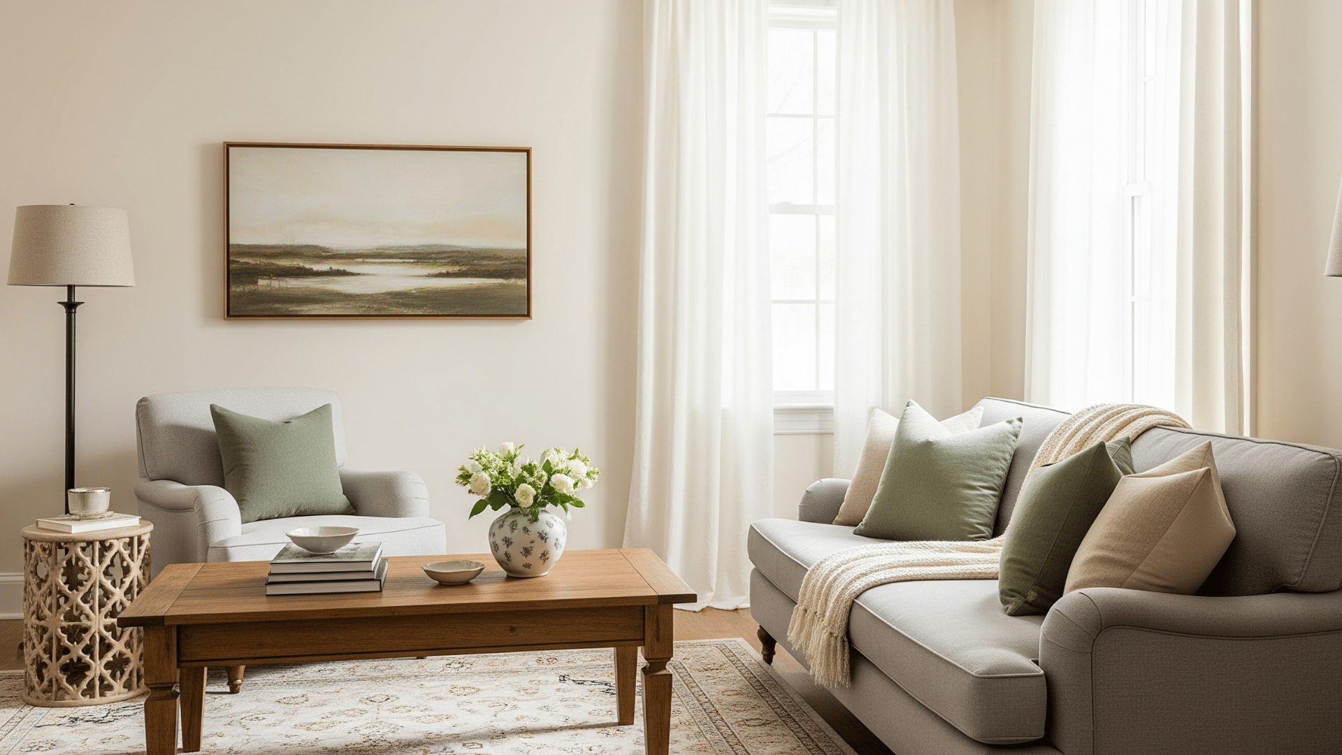
2. Bedrooms
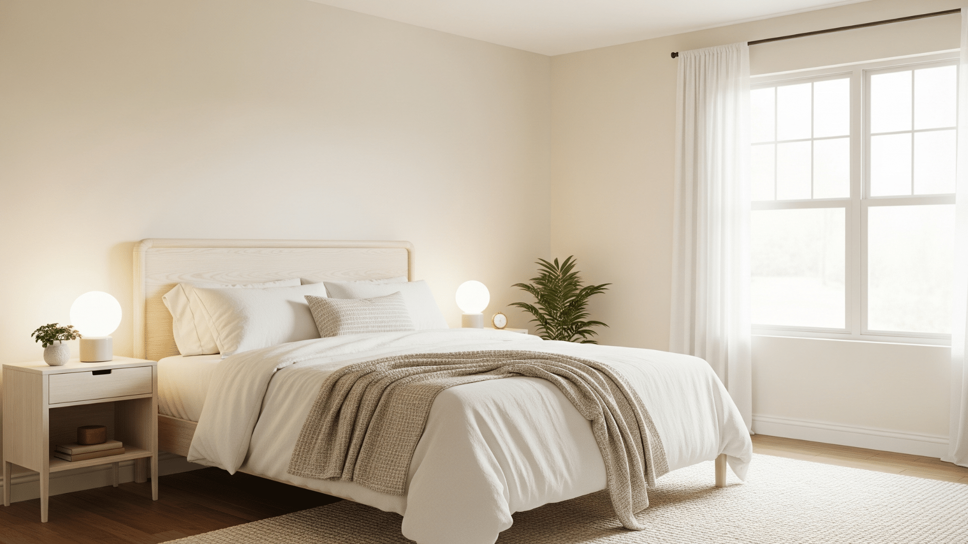
For bedrooms, Cheviot is ideal for creating a calm and peaceful sanctuary. It’s not so bright that it feels cold or stark, making it a great choice for a relaxing space.
Neutral undertones support restful sleep and reduce visual clutter. Combine it with soft bedding fabrics, muted accent colors, and natural textures like linen.
3. Kitchens and Cabinets
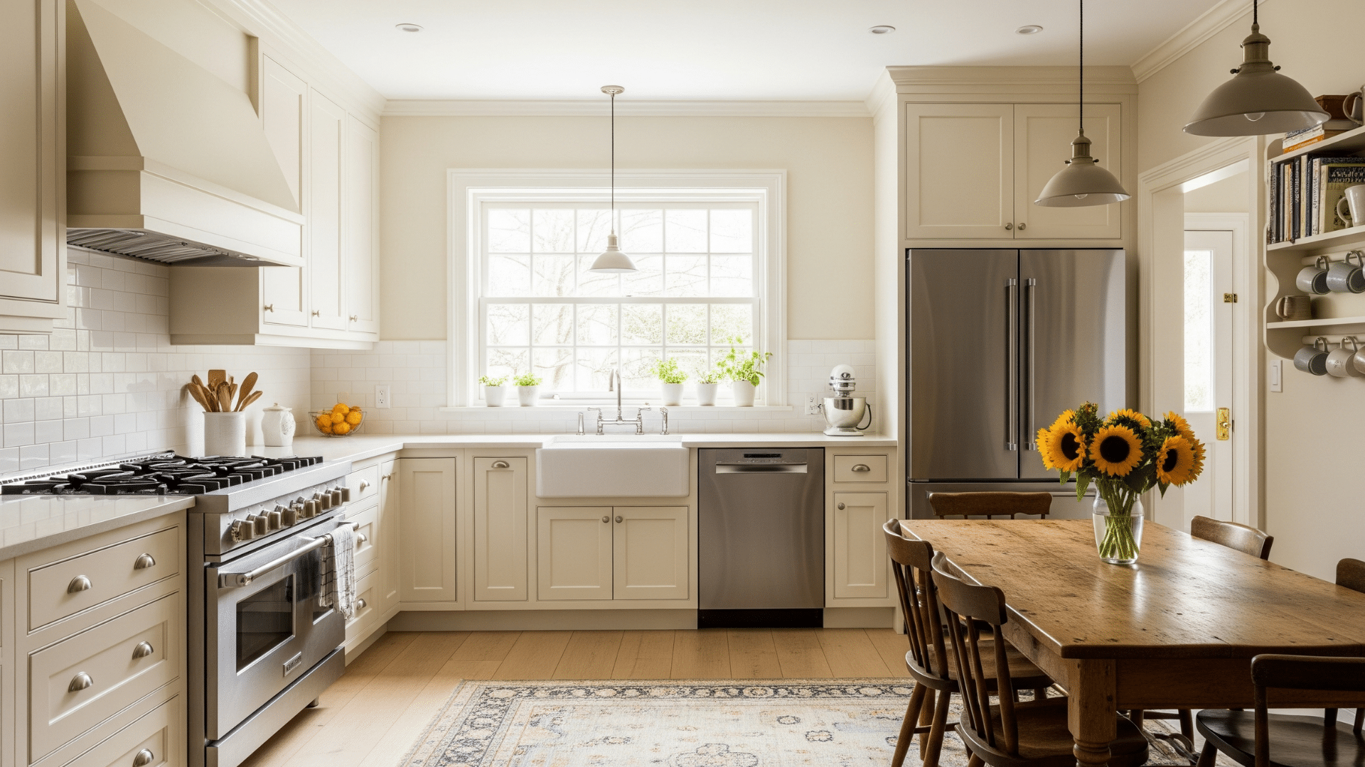
Cheviot is a popular choice for all-white kitchens, as it offers a clean look without the coldness that can accompany stark white.
When used on kitchen cabinets, it can create a space that feels more open and airy.
It works well with a range of countertop materials and can be paired with both light and dark colors for a stylish kitchen.
4. Bathrooms
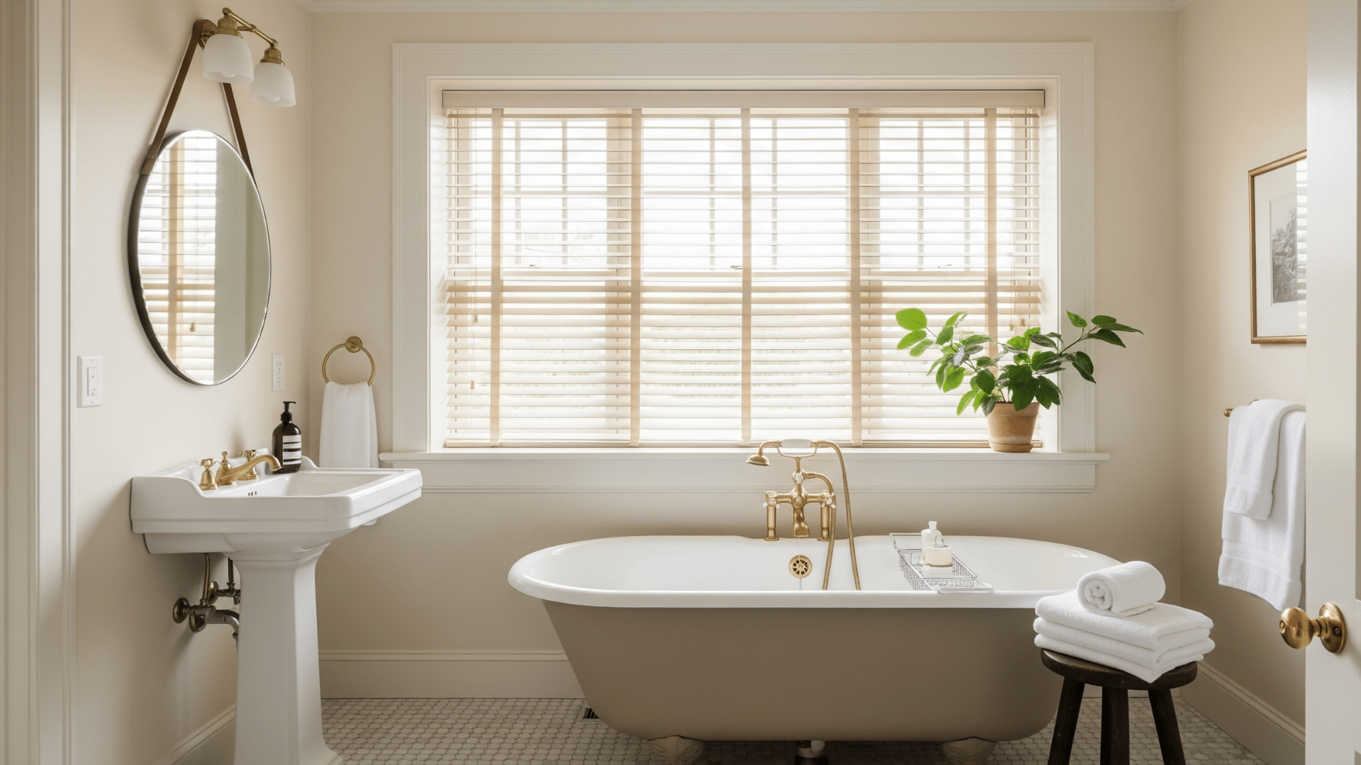
Given its high LRV, Cheviot can make bathrooms, especially smaller ones, feel more spacious and bright.
It can create a spa-like, tranquil atmosphere and pairs well with common bathroom elements, such as marble, tile, and chrome fixtures.
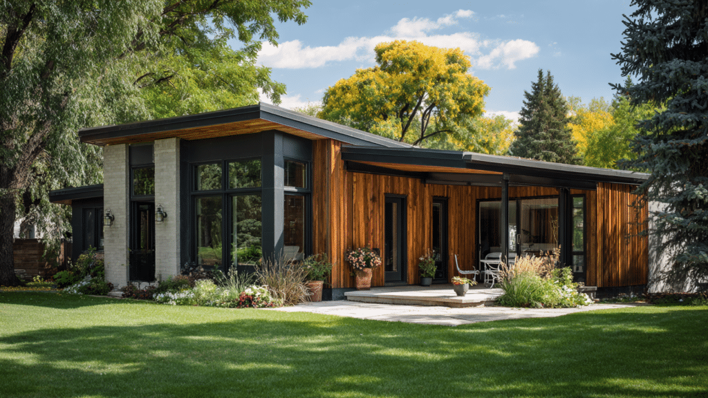
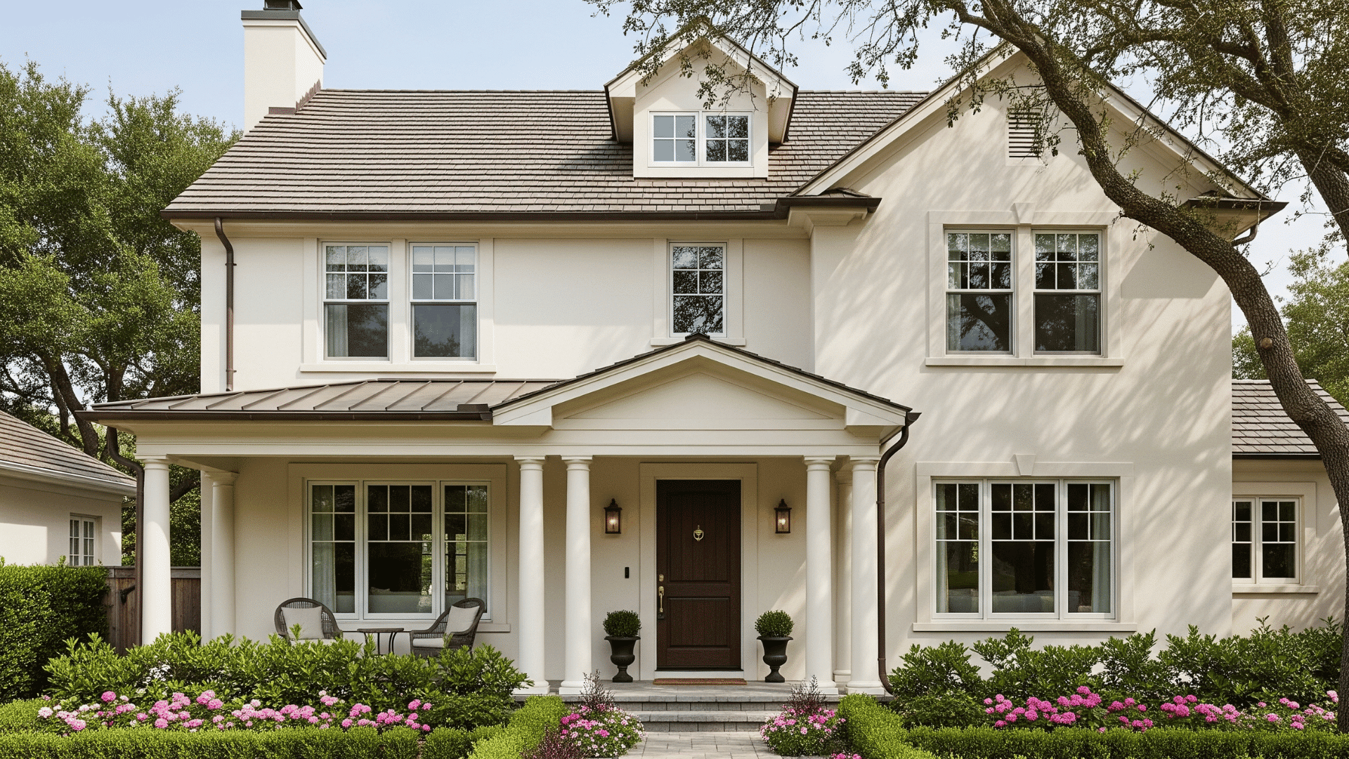
5. Exteriors
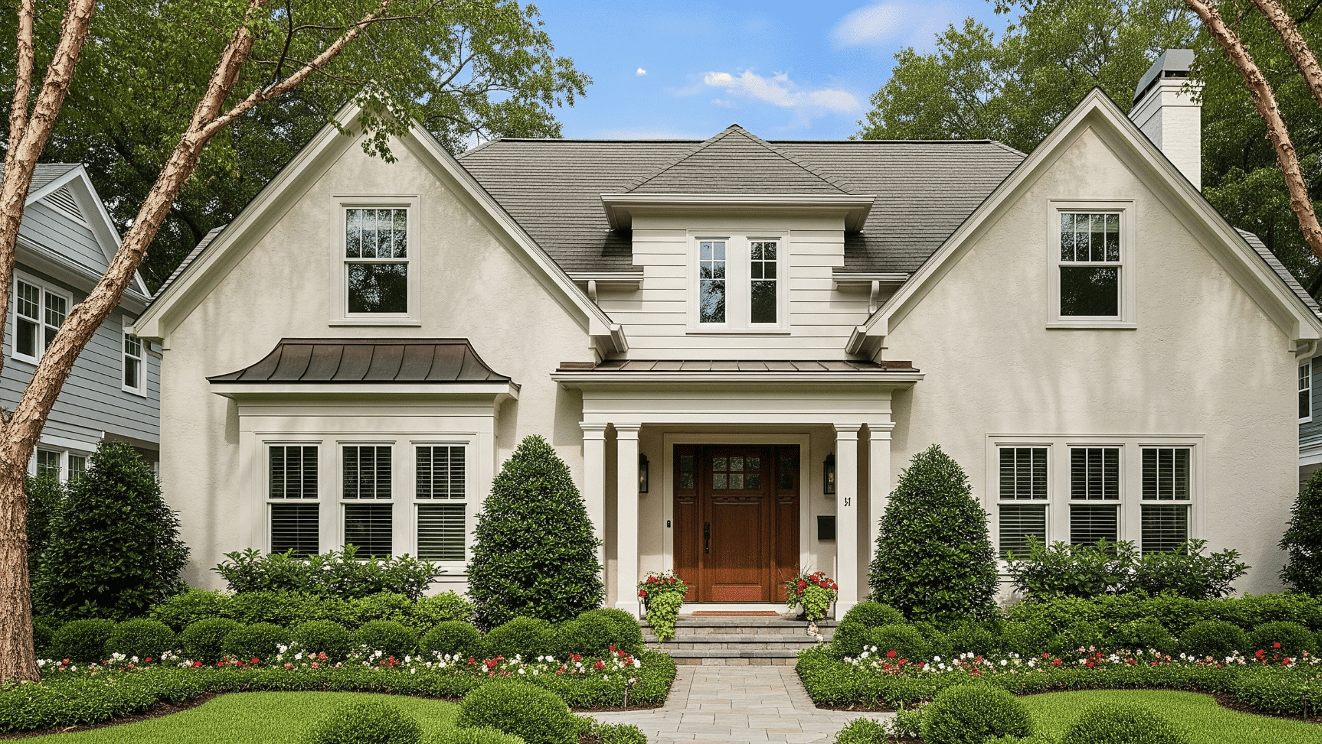
Cheviot can be a beautiful choice for a home’s exterior. It offers a fresh and clean appearance that is not glaring in direct sunlight.
It harmonizes well with natural surroundings and complements exterior materials like brick, stone, and wood trim.
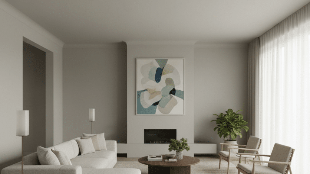
Coordinating Colors and Pairings
Cheviot’s soft warmth allows it to pair well with a range of other colors, from crisp whites to deeper, more saturated hues.
For Trim and Ceilings
Same color, different sheen: For a seamless, cohesive, and modern look, paint the walls, trim, and ceiling all in the Same Color.
Use a matte or eggshell finish on the walls and a satin or semi-gloss on the trim and doors.
Crisp Whites: For added contrast, pair Cheviot walls with a crisp white trim, such as Sherwin-Williams’ Extra White (SW 7006).
This combination creates a clean, defined line and can make the Cheviot walls appear even warmer.
Soft Whites: To achieve a soft, low-contrast look, consider using a slightly warmer white, such as Sherwin-Williams Pure White (SW 7005) or Sherwin-Williams Alabaster (SW 7008).
For Accent Walls and Complementary Colors
Earthy Greens: Cheviot’s gentle undertones are complemented by earthy greens.
Consider shades like Sherwin-Williams Moonmist (SW 9507) or Sherwin-Williams Acacia Haze (SW 9132) for a natural, calming palette.
Muted Blues and Greys: Cheviot’s clean warmth works well with soft blues and greys.
Colors like Sherwin-Williams Raindrop (SW 6485) or Sherwin-Williams Repose Gray (SW 7015) provide a subtle contrast that feels sophisticated and balanced.
Rich, Deep Hues: For a dramatic look, pair Cheviot with a deep, moody accent color
A dark grey, such as Sherwin-Williams Iron Ore (SW 7069), or a warm bronze, like Sherwin-Williams Urbane Bronze (SW 7048), can create a striking contrast that highlights Cheviot’s brightness.
Pairing with Materials
Woods: Cheviot complements both light woods (ash) and dark woods (walnut).
Metals: It works with both warm metals (such as brass) for a luxurious feel and cool metals (like chrome) for a modern look.
Fabrics: Its neutral tone is ideal for layering with natural textures, such as linen and cotton.
How to Test Cheviot in Your Space
Paint colors often look different on a screen than they do on your walls. The best way to know if Cheviot will work in your home is to test it out.
1. Use Sample Pots or Peel-and-Stick Swatches
Order a small sample of Cheviot from Sherwin-Williams. Paint large patches directly on your walls, or try peel-and-stick samples for a less messy option.
2. Test in Multiple Spots
Apply the sample in different parts of the room, such as near windows, in corners, and on walls that receive less light. This will help you see how Cheviot changes throughout the day.
3. Check in Daylight and Artificial Light
Observe the color at different times of the day, including morning, afternoon, and evening. Pay attention to how warm or cool it appears under lamps or ceiling lights.
4. Pair with Materials
Place the sample next to flooring, countertops, fabrics, or trim colors to ensure a cohesive look. This shows whether Cheviot complements the finishes you already have.
Conclusion
Cheviot by Sherwin-Williams stands out because it perfectly balances brightness, making it a truly versatile white.
It’s soft enough to feel cozy but bright enough to keep spaces feeling fresh and open.
If you’re updating your living room, kitchen, or even the exterior, Cheviot adapts effortlessly. Plus, its subtle undertones give it a bit of personality without overwhelming a space.
If you’re aiming for a classic, welcoming vibe that works across styles, this Sherwin-Williams favorite is definitely worth considering.
When are you trying Cheviot then?