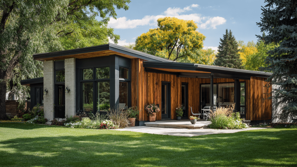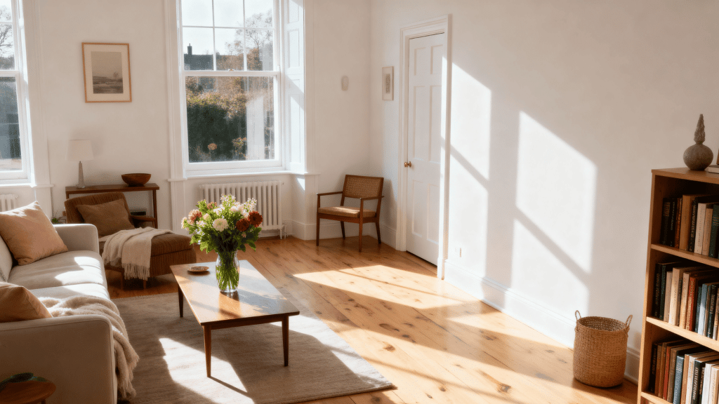


What if I told you there’s a paint color that works in almost any living room?
Sherwin-Williams Drift of Mist (SW 9166) does exactly that. This isn’t just another beige or gray; it’s a carefully balanced greige that shifts beautifully with natural light.
I’ll show you how to create spaces with drift of mist in all areas of your house. It will help you decide if it’s the right color for you or not.
What Color is Sherwin-Williams Drift of Mist?
Drift of Mist is a soft beige that sits beautifully between gray and beige.
It’s not too warm, not too cool. I’d describe it as a gentle, neutral tone with subtle gray undertones.
In certain lights, you’ll catch hints of green. But don’t worry, it’s not obvious. The color reads as a whisper-soft neutral that feels modern and calming.
It works in living rooms because it doesn’t compete with your furniture or decor. Instead, it creates a peaceful backdrop. The hex code of this color is #E1DED4.
Is it Closer to Gray, Greige, or Beige in Tone?
Drift of Mist leans most heavily toward greige. It’s that perfect middle ground where gray meets beige.
The color has more gray presence than beige, but the warm undertones keep it from being a true gray. I’d say it’s about 60% gray and 40% beige if I had to split it up.
In cooler lighting, the gray dominates. But warmer light brings out the beige qualities.
This balance is exactly why it’s so popular; it gives you the best of both worlds without committing fully to either side.
Features of Drift of Mist Gray
Every paint color has characteristics that make it unique. Drift of Mist is no exception, and these features will help you decide if it’s the right fit for your living room.
1. LRV
Drift of Mist has an LRV of 66. This means it reflects a good amount of light back into your room.
The number sits in the mid-range, so it’s neither too dark nor too light. I’ve found this level works well for most spaces.
2. Undertones
This color carries warm gray and greige undertones throughout. You’ll notice subtle beige hints that keep it from feeling cold or clinical.
The warmth becomes more visible in natural daylight. These undertones make it feel inviting and comfortable in living spaces.
3. The Effect of Lighting
Lighting changes everything with Drift of Mist.
- Morning sun brings out its warmer, softer side.
- Afternoon light makes it look more neutral and balanced.
- Evening artificial light can push it slightly cooler.
- North-facing rooms will show more gray.
- South-facing spaces reveal the greige.
Always test samples in your specific lighting.
4. Personality and Ambiance
This color creates a calm atmosphere in any room. It’s not bold or attention-grabbing, which is exactly the point.
I think of it as quietly confident; it doesn’t need to shout. It simply makes everything else in the room look better.
5. Versatility
This color works with almost any design style you can think of. Modern, farmhouse, traditional, coastal, it fits them all.
The color pairs beautifully with both warm and cool accent colors. You can use it with dark furniture or light pieces.
6. Psychology
Soft grays and greiges promote relaxation and mental clarity. This color won’t overstimulate or energize you like bolder choices might.
Instead, it creates a peaceful backdrop for daily life. I’ve noticed people naturally feel calmer in rooms painted this shade.
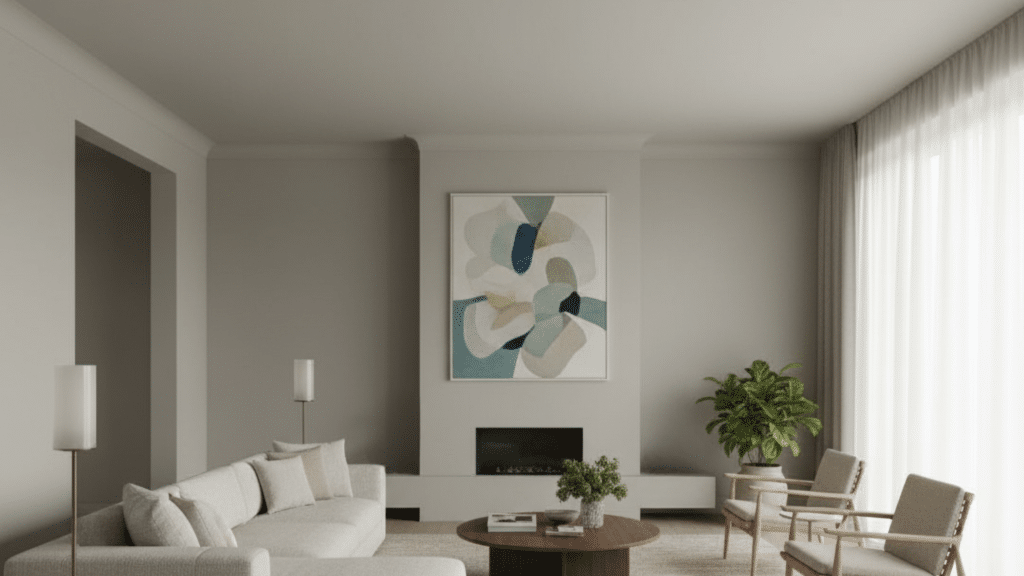
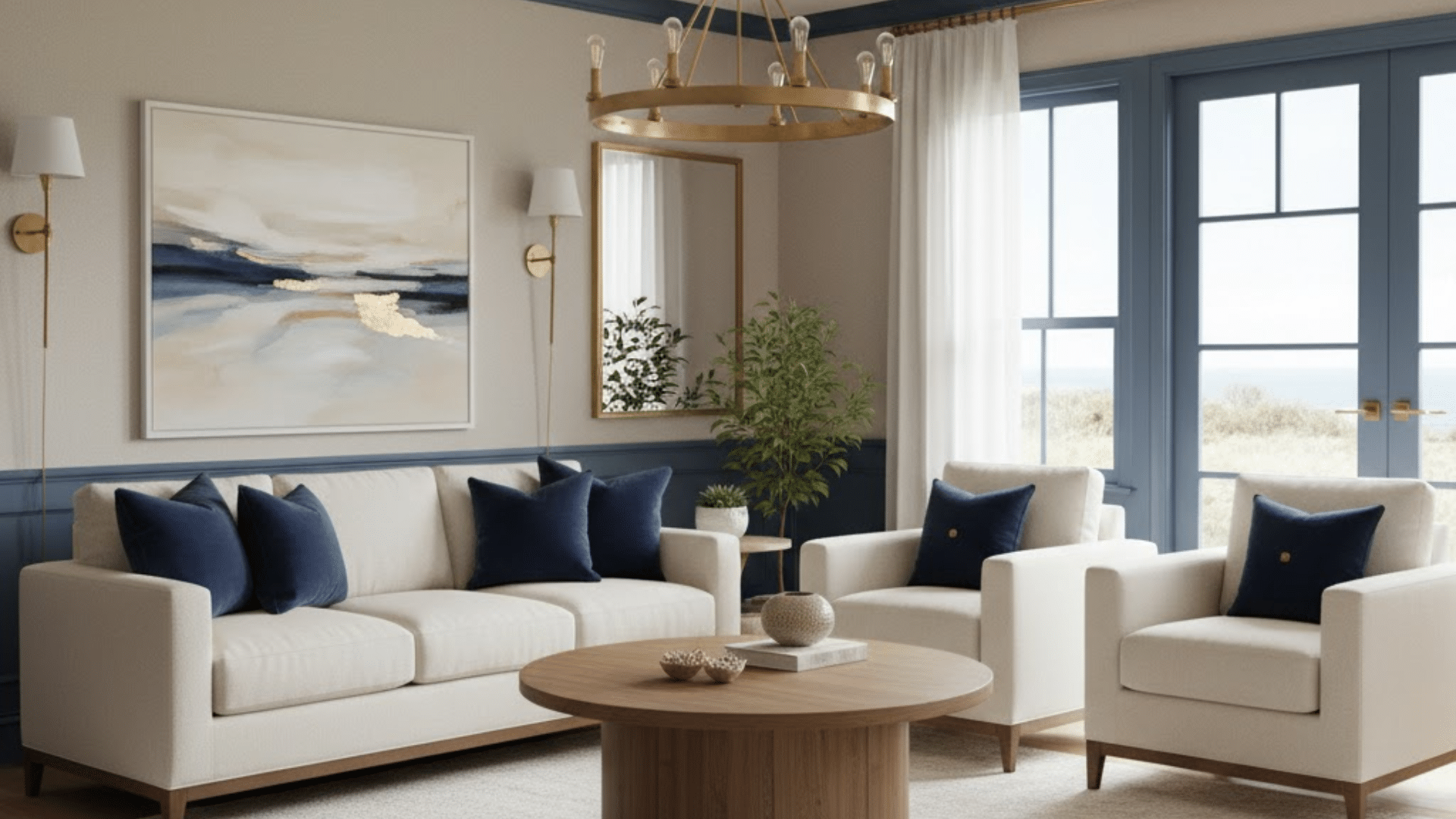
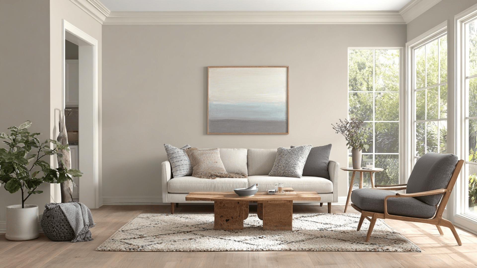
Drift of Mist in Living Room with Different Trim Colors
The right trim color makes all the difference. I’ve tested Drift of Mist with various trims, and these combinations really stand out.
1. Delicate Whisper
White Dove creates a clean, classic look with Drift of Mist. The crisp white brightens your living room while keeping things soft. I love how it makes windows and doorways pop without feeling too stark or cold.
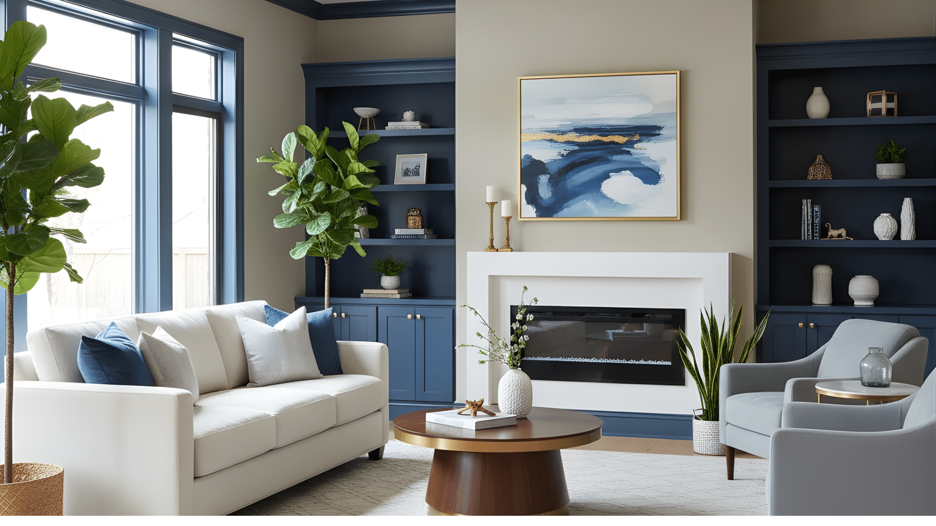
2. Coastal Peace
Van Deusen Blue adds depth and character to Drift of Mist walls. This bold trim adds a nautical vibe that feels relaxed. I find it works beautifully in rooms with lots of natural light and airy decor.
3. Soft Contrast
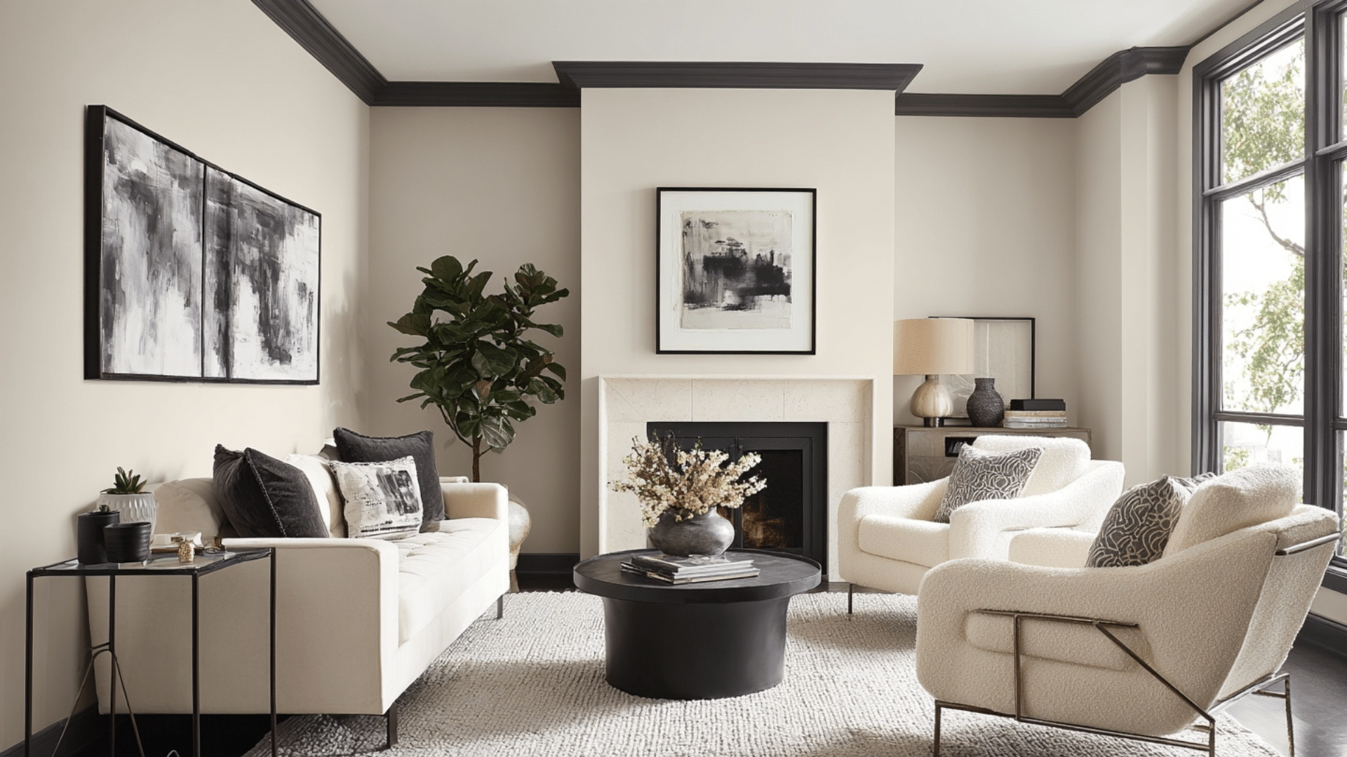
Iron Ore is one of my favourite ways to use drift of mist in the living room because it gives your space a modern edge. The dark gray trim creates definition without overpowering Drift of Mist’s gentle tone.
4. Subtle Experience
Gray Owl offers a monochromatic look that’s incredibly soothing. The trim blends smoothly with Drift of Mist while providing just enough contrast.
5. Bold Serenity
Hale Navy makes a statement against Drift of Mist. The rich navy trim adds drama and interest to your living room.
Pros and Cons of Drift of Mist
No paint color is perfect for every situation. Drift of Mist has plenty of strengths, but it also has some limitations you should know about.
| Pros | Cons |
|---|---|
| Pairs well with both warm and cool accent colors | May appear too gray in north-facing rooms without warm accents |
| Creates a calm, peaceful atmosphere perfect for relaxation | Not bold enough if you want a statement wall or dramatic look |
| Light enough to make small spaces feel larger and open | The greige tone might feel too trendy and could date quickly |
| Complements multiple design styles from modern to farmhouse | Requires careful white trim selection to avoid looking washed out |
| Hides minor wall imperfections better than pure white paint | Can read differently than expected based on your lighting conditions |
| Easy to decorate around with furniture and artwork | It might be too similar to other grays you already have |
| Doesn’t clash with existing wood tones or flooring | May need multiple coats for even coverage on darker walls |
Using Drift of Mist in Other Rooms
Drift of Mist isn’t just for living rooms. I’ve seen this color work beautifully throughout the home. Let me show you how it performs in different spaces.
Porch
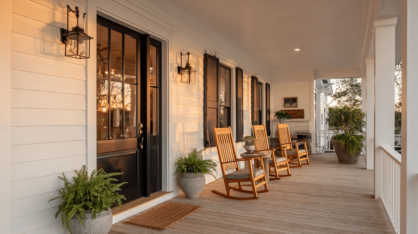
Drift of Mist creates a welcoming transition from outdoors to indoors. The soft gray handles weather exposure well and don’t show dirt easily.
It pairs nicely with natural wood tones and wicker furniture for a classic porch look.
Entryway
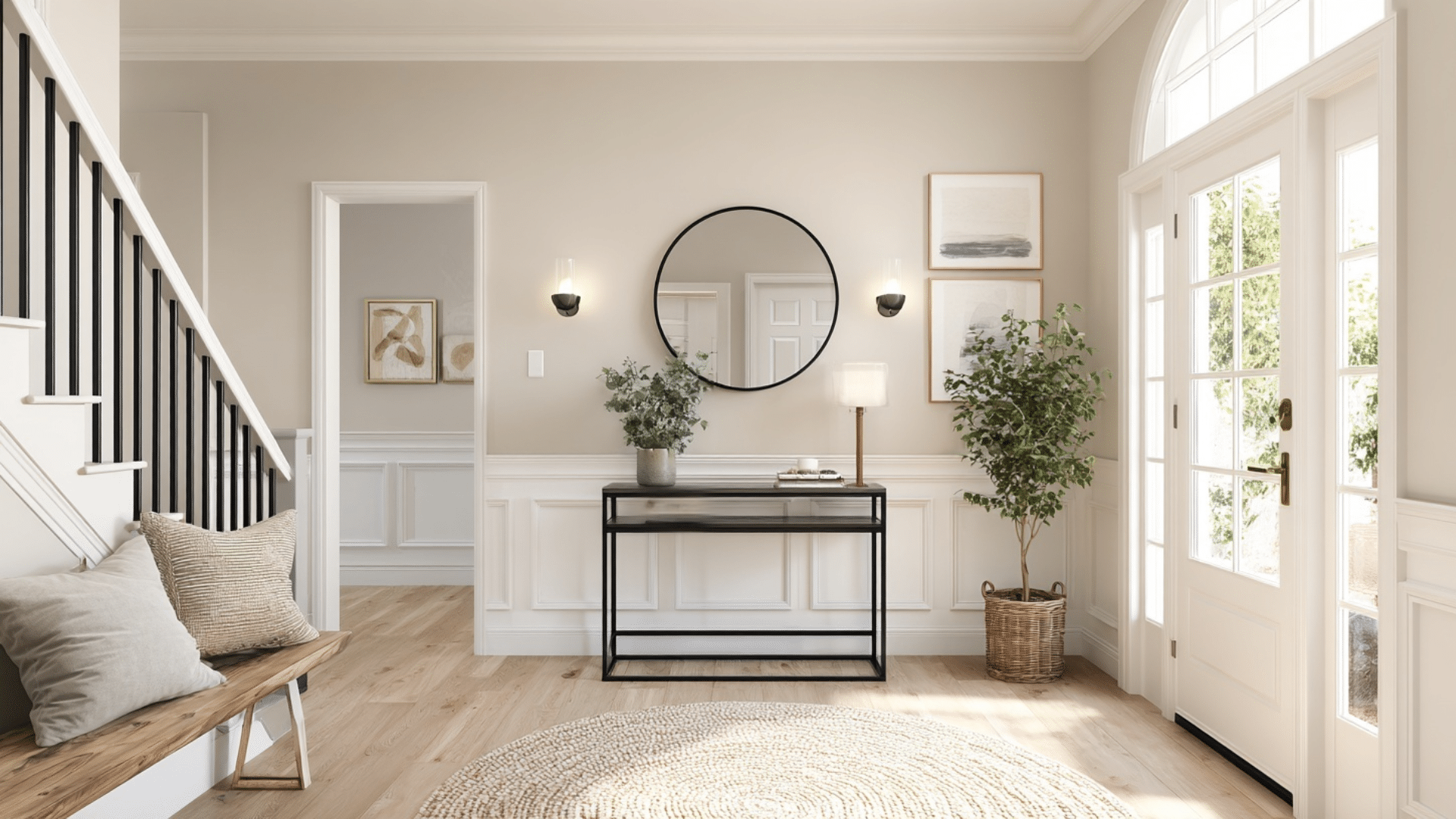
First impressions matter, and this color sets a calm, inviting tone. It makes narrow entryways feel more spacious and open.
The neutral backdrop lets your artwork and decor shine without competing for attention with bold wall colors.
Kitchen
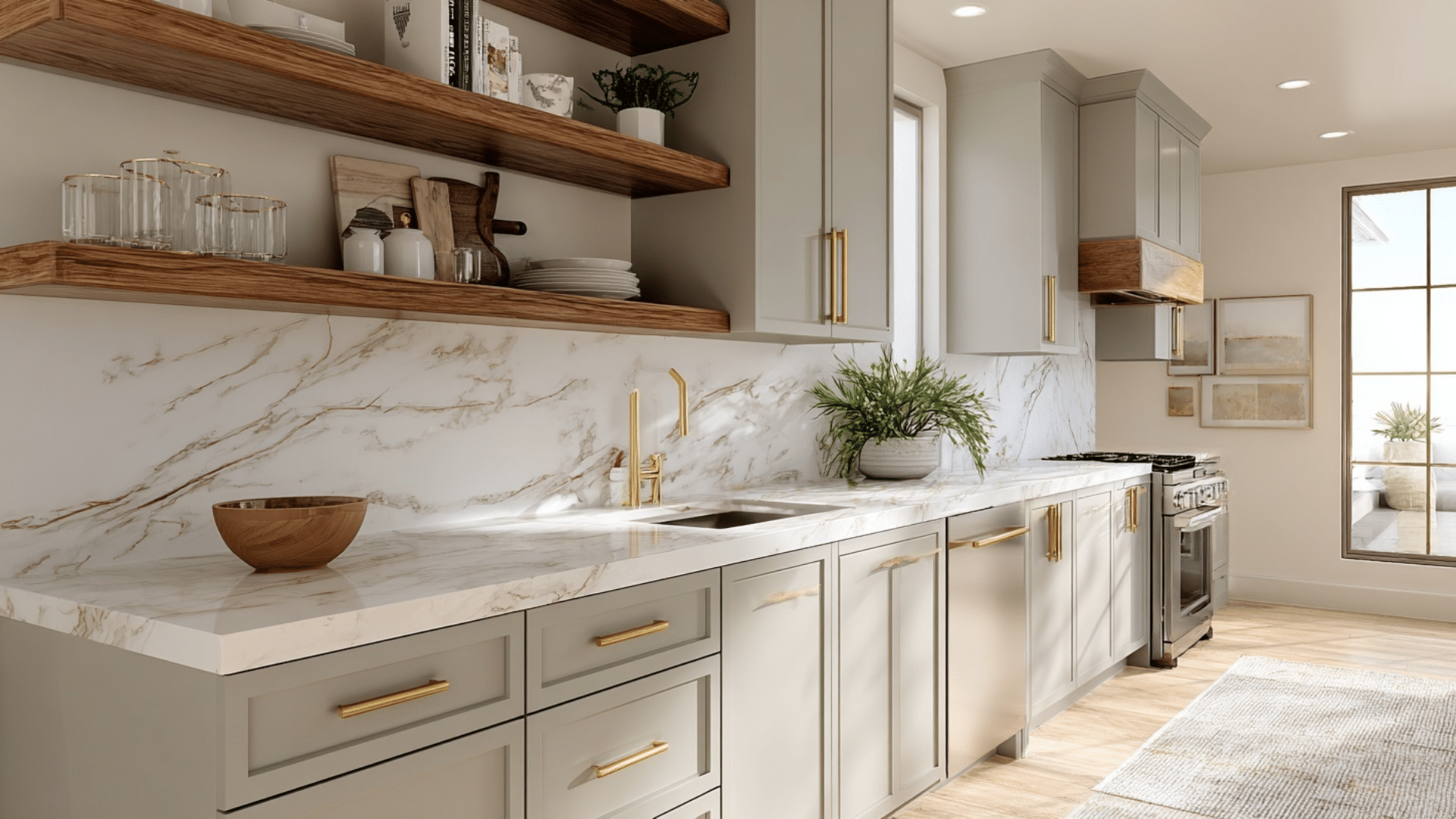
Drift of Mist brings a clean, fresh feeling to kitchen spaces. It complements both white and wood cabinets beautifully.
The color handles splashes and cooking steam well, and it makes small kitchens feel larger and more airy than darker shades.
Bathroom
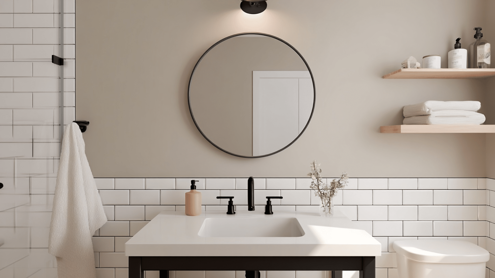
Bathrooms need colors that feel clean and spa-like. Drift of Mist delivers exactly that vibe. It pairs well with white fixtures and chrome or brass hardware.
The soft gray creates a relaxing atmosphere perfect for long soaks in the tub.
Home Office
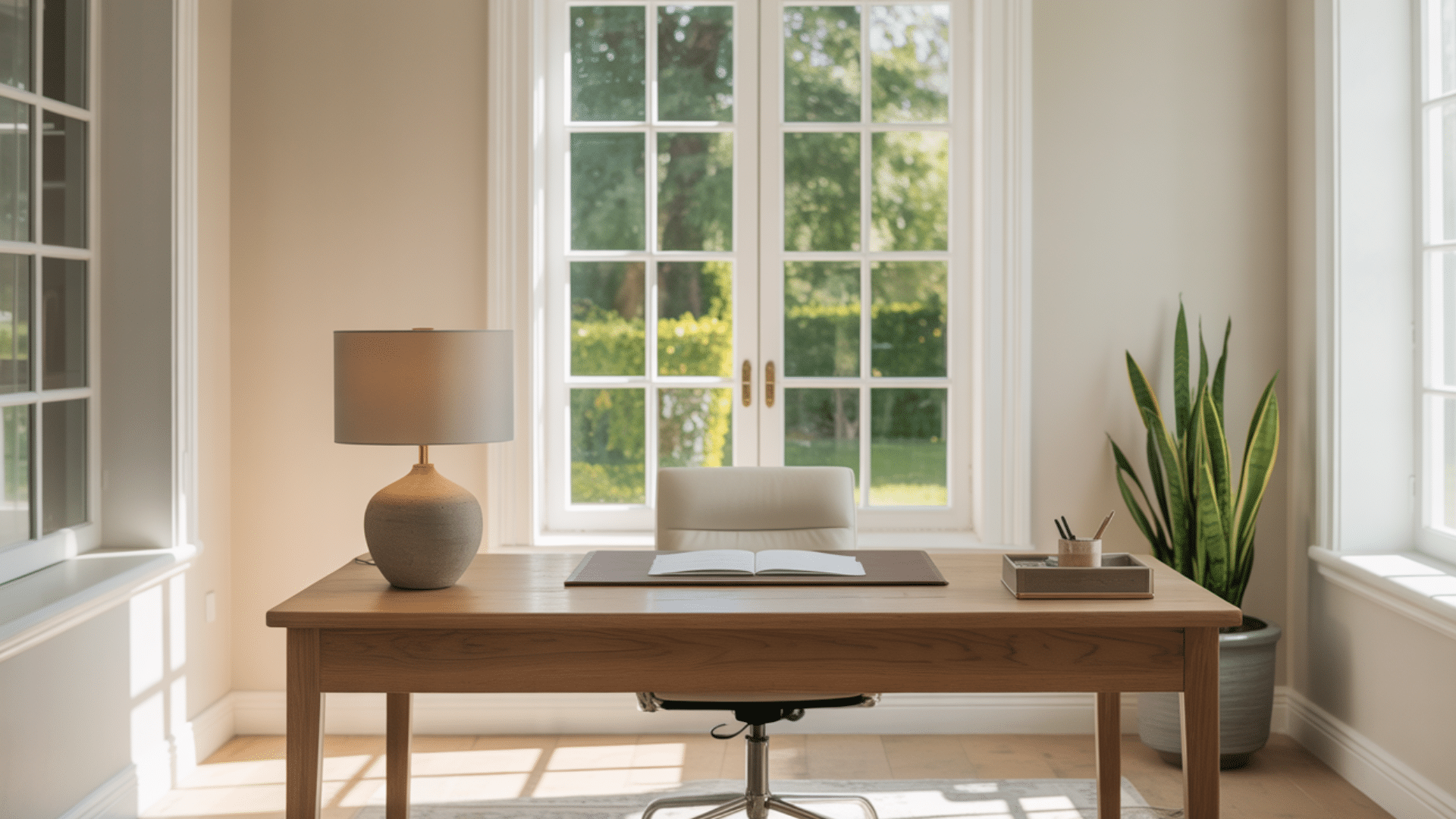
Productivity needs calm, distraction-free environments. Drift of Mist provides that without feeling boring.
The neutral tone helps you focus on work rather than your walls. It also looks professional on video calls and virtual meetings.
Bedroom
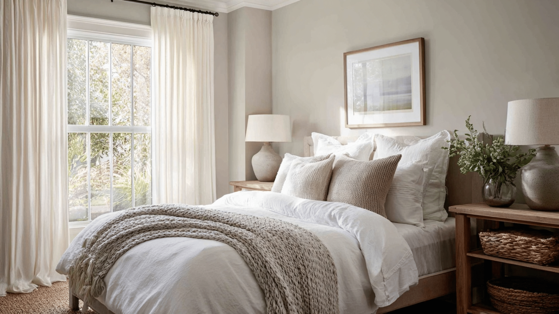
Bedrooms should promote relaxation. Drift of Mist creates a sanctuary for sleep. The gentle color won’t disrupt your wind-down routine at night. It also looks soft when you wake up each morning.
Wrapping It Up
So there you have it, Drift of Mist in the living room and more.
This soft greige has earned its popularity for good reason. It’s forgiving, flexible, and creates exactly the kind of calm atmosphere most of us crave at home.
Will it work in your space? That depends on your lighting, your style, and what you want to feel when you walk into the room.
Grab a sample and test it on your walls for a few days. Let me know what you think of this color!