
White Dove LRV confuses many homeowners.
You’ve probably stared at paint swatches for hours, wondering if White Dove will look too stark or too creamy in your space. Maybe you’ve read conflicting advice online about its LRV (light reflectance value).
The uncertainty is frustrating when you’re trying to create the perfect room.
In this blog, I’ll show you exactly how White Dove affects your space and why it might be the perfect white you’ve been searching for.
Let’s clear up the confusion once and for all.
Key Takeaways
-
White Dove looks completely different based on your room’s direction – North-facing rooms make it appear gray and cool, while south-facing rooms bring out warm, creamy tones. The same paint, totally different results.
-
It’s not actually white – it’s a soft off-white with gray and beige hints – This prevents that stark, hospital-like feeling you get from pure whites while still keeping rooms bright and fresh.
-
Skip White Dove in these situations – Ultra-modern homes, very dark rooms with tiny windows, or next to bright white trim (it’ll look dingy by comparison). Also not great if you love cool blues and grays.
White Dove Paint Color Overview
Benjamin Moore’s White Dove stands out as the most beloved white paint choice.
This classic shade has earned its reputation through years of consistent performance in homes across the country.
With an LRV of 83.16, White Dove looks like fresh cream mixed with the softest gray – not stark white, not beige, but something in between that feels warm yet clean.
| Property | Details |
|---|---|
| Paint Code | OC-17 |
| LRV (Light Reflectance Value) | 83.16 |
| Hex Code | #F7F5F3 |
| Popular Names | “The Perfect Off-White”, “Benjamin Moore’s Flagship White” |
Two Sides of The Dove White Paint
Just like the two sides of a coin, the Dove White Paint also has its own pros and cons
Pros of White Dove:
- Works well in any room – north or south facing
- Not too stark or cold like pure whites
- LRV of 85.38 reflects plenty of light
- Pairs with both warm and cool colors
- Hides imperfections on walls better than bright whites
- Ideal for open floor plans
Cons of White Dove:
- It can look dingy next to pure white trim
- More expensive than basic white paints
- Might feel too warm for some modern styles
- Not the best choice for dark rooms
- Can appear gray in north-facing spaces
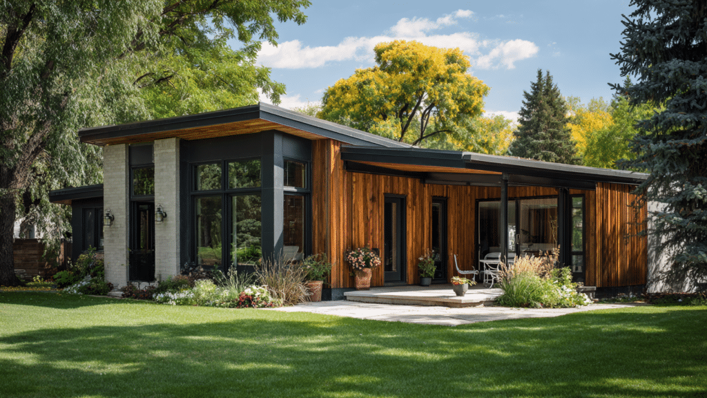
Best Places to Use White Dove Benjamin Moore
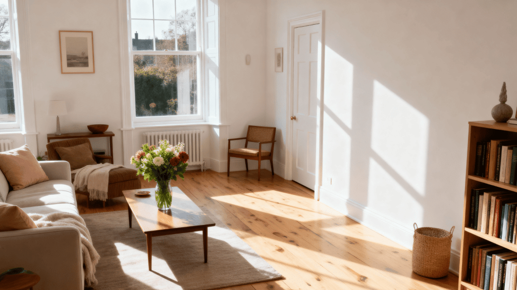
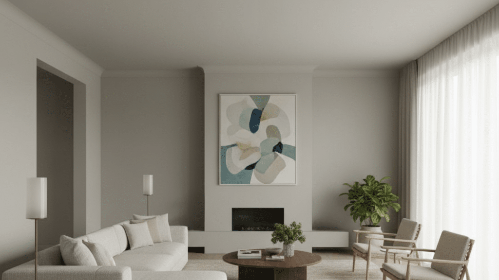
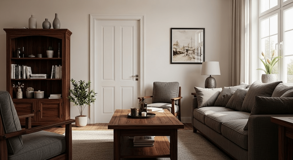
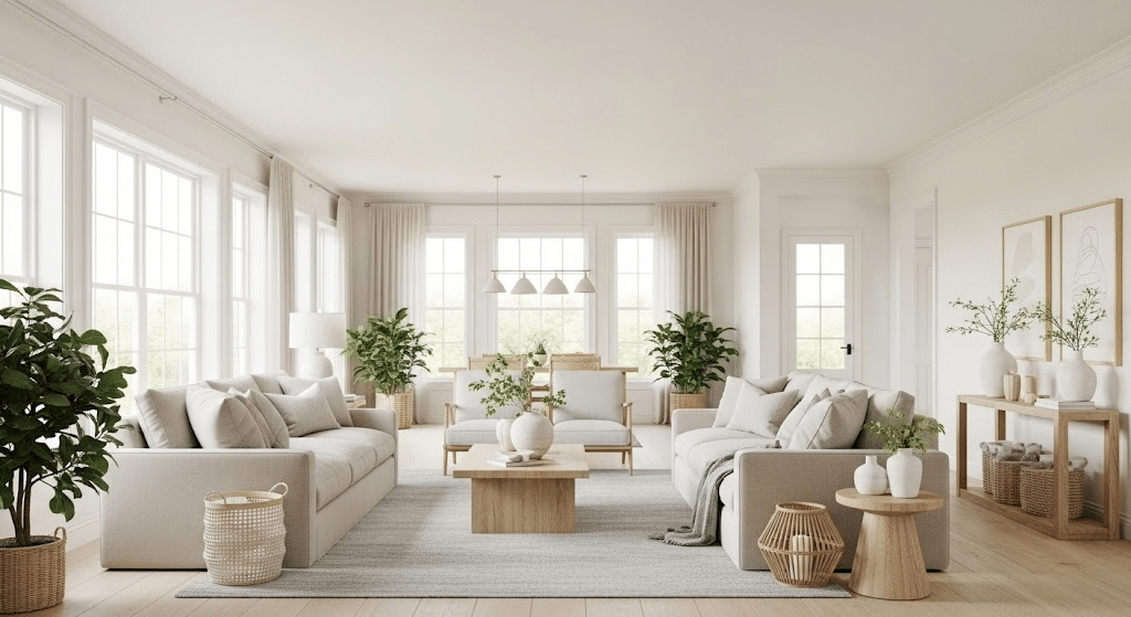
1. Living Room
Comfortable, resilient choices that look good under real-life stress. Rounded edges and stain-resistant textiles keep the vibe relaxed and welcoming.
- Flooring: medium oak, performance flat-weave rug
- Fabrics: performance linen sectional, stain-resistant chenille pillows
- Finishes: soft brass pulls, matte lacquer side tables
- Color combo: mustard + denim blue + light oak
2. Bedroom
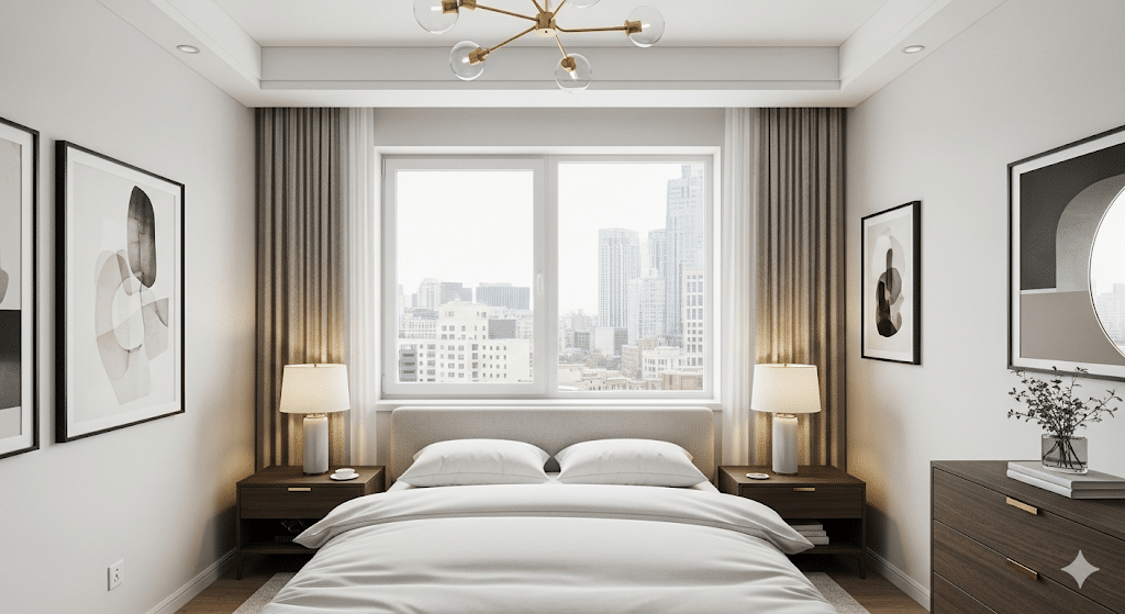
Minimal forms meet organic comfort. Negative space, low furniture, and natural fibers keep the room restful while Dove White softens edges and diffuses light.
- Flooring: natural maple, low-profile rug
- Fabrics: linen duvet, cotton-linen drapes, wool throw
- Finishes: light ash wood, matte black pull handles
- Color combo: sage + oatmeal + soft graphite
3. Kitchen
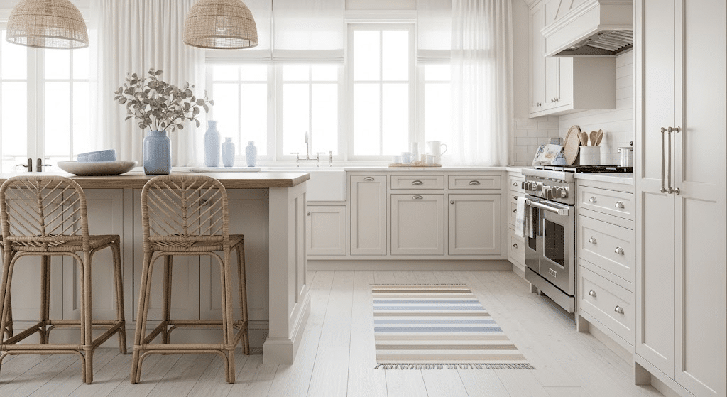
Airy, welcoming cabinetry in Dove White with soft seaside notes.
Keep hardware light and reflective, then ground the space with woven textures and a sandy runner for easy warmth.
- Flooring: white-washed oak or pale tile
- Fabrics: striped cotton runner, linen cafe curtains
- Finishes: satin nickel pulls, rattan stools
- Color combo: soft blue + sand + bleached driftwood
4. Bathroom
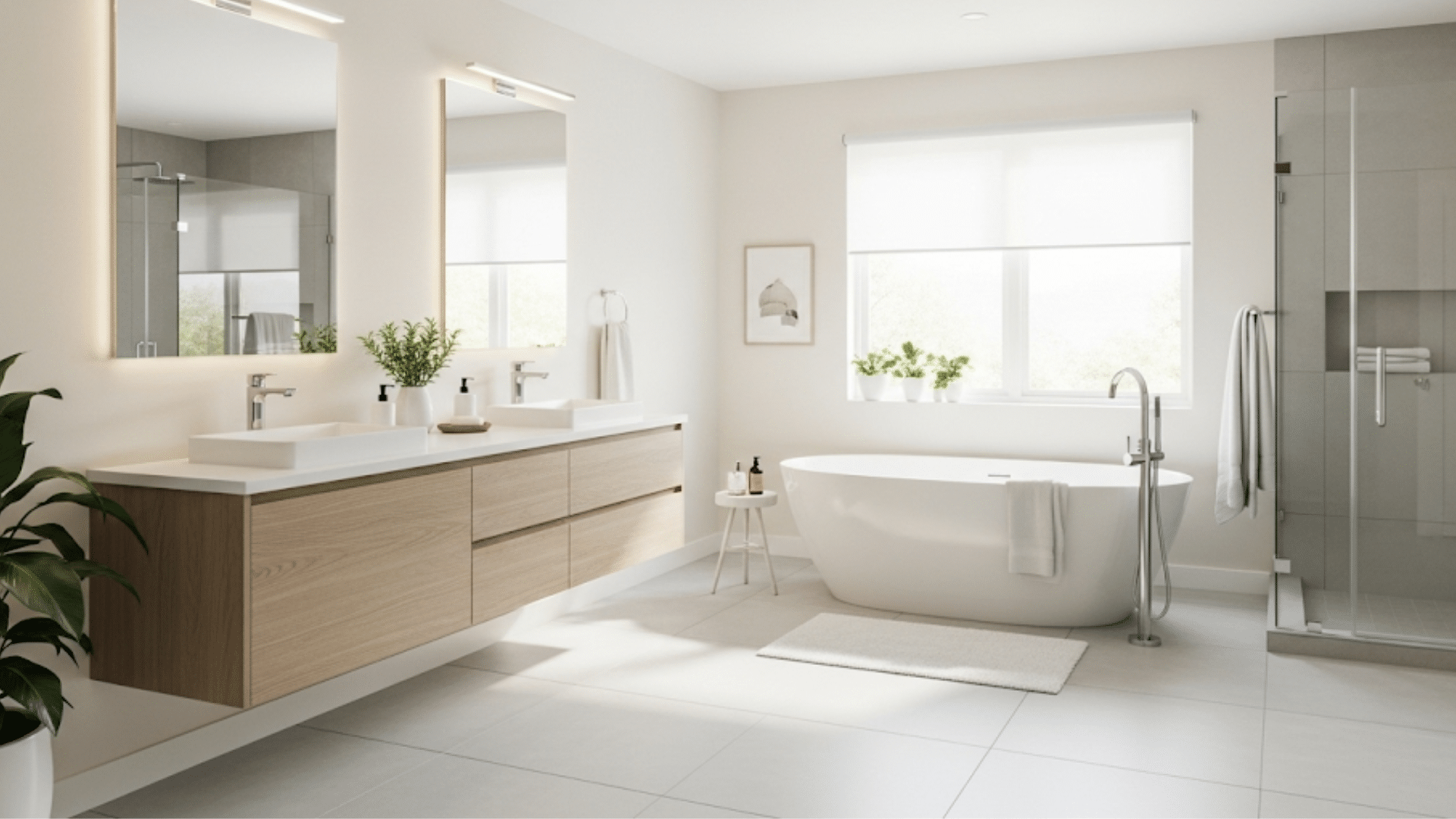
Dove White reflects light beautifully, making small baths feel open. Layer pale stone, soft towels, and warm metals for spa-level ease without fuss.
- Flooring: light stone tile, honed
- Fabrics: plush white towels, waffle shower curtain
- Finishes: champagne brass fixtures, frosted glass
- Color combo: pearl gray + champagne gold + pale stone
5. Entryway
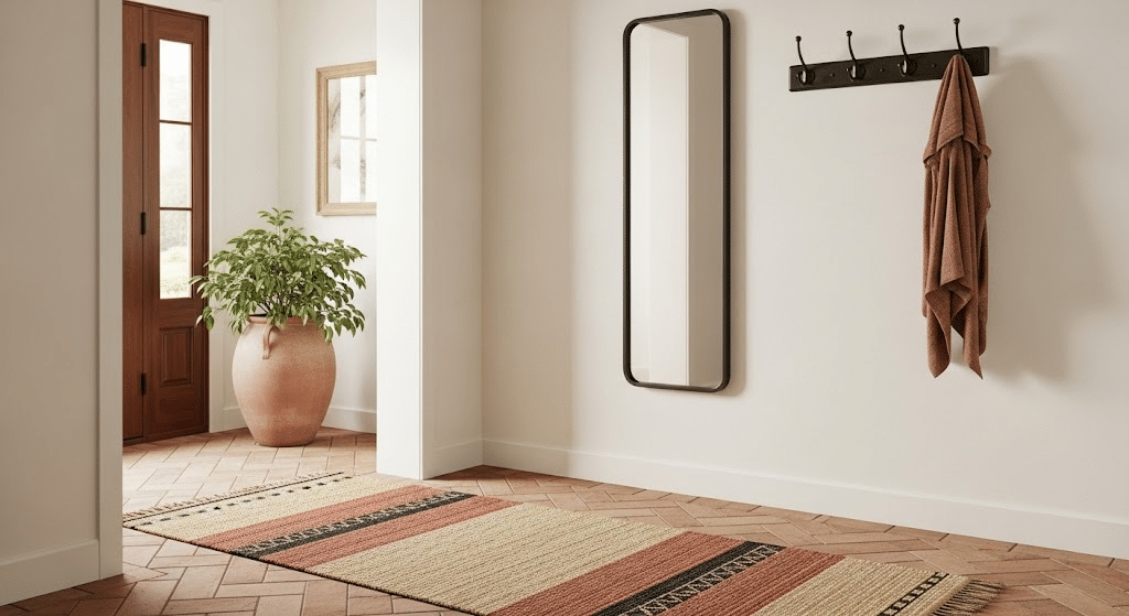
Set an inviting tone with Dove White, then add durable surfaces and a few bold elements for personality that stands up to daily use.
- Flooring: porcelain tile or sealed oak
- Fabrics: indoor-outdoor runner, canvas bench cushion
- Finishes: oil-rubbed bronze hooks, mirror with thin frame
- Color combo: terracotta + sand + dark bronze
Comparing White Dove and Other Shades of White
| Paint Name | Brand & Code | LRV | Main Undertones | Best For | Key Difference |
|---|---|---|---|---|---|
| White Dove | Benjamin Moore OC-17 | 83.16 | Gray, beige | Any room | Warm but not yellow |
| Simply White | Benjamin Moore OC-117 | 91.7 | Cool gray | Modern homes | Brighter and crisper |
| Cloud White | Benjamin Moore OC-130 | 82.13 | Gray, blue | North rooms | Cooler than White Dove |
| Ultra Pure White | Behr PPU18-06 | 89 | Clean, neutral | Budget-friendly option | Similar to Simply White |
| Chantilly Lace | Benjamin Moore OC-65 | 92.2 | Pure white | Trim work | Brightest option |
| Polar Bear | Behr 75 | 83.1 | Soft gray | Family rooms | Warmer than most grays |
| Dover White | Farrow & Ball No. 2 | 85 | Yellow, pink | Luxury homes | Premium option with warmth |
Quick Tip: White Dove sits right in the middle, not too warm like Dover White, not too cool like Simply White.
How White Dove’s Color Shifts Throughout Your Home
White Dove’s LRV of 83.16 means it reflects light well, but its appearance depends on your room’s direction and lighting.
1. North-Facing Rooms
- Looks slightly cooler and grayer in morning light
- Maintains warmth better than pure whites
- May appear more beige in the afternoon
- Works well with warm lighting fixtures
- Stays consistent throughout the day
2. South-Facing Rooms
- Appears brightest and most true to color
- Shows warm undertones clearly in direct sunlight
- It can look almost cream-colored at midday
- Perfect balance of light reflection
- Looks crisp in morning and evening light
3. East-Facing Rooms
- Bright and fresh in morning light
- Subtle gray undertones show up after noon
- Good light reflection in the early hours
- Needs warm lighting for evening use
- Changes character throughout the day
4. West-Facing Rooms
- Cooler appearance in morning hours
- Warm and glowing in the afternoon sun
- Shows beige undertones in evening light
- Great for living spaces used after work
- Most dramatic color changes occur during sunset
5. Under Normal Sunlight
- True color shows best in natural daylight
- Balanced gray and beige undertones are visible
- LRV of 85.38 reflects light beautifully
- Appears neither too warm nor too cool
- Most accurate representation of the color
- Works well in rooms with large windows
6. Under Artificial Light
- LED lights make it appear cooler
- Warm bulbs bring out beige tones
- Fluorescent lighting shows gray undertones
- Dimmed lights enhance the cozy feel
- Mixed lighting creates a balanced appearance
How to Test if White Dove LRV is Good for Your Space
Testing White Dove in your space is simple but important.
Buy a sample size and paint large 2×2 foot squares on different walls – tiny brush strokes won’t show the real color.
Check your samples in morning and evening light, as natural light alters the color appearance. Move furniture near the painted areas to see how everything works together. Test it under your artificial lights as well, since you’ll be using the room after dark.
Compare your sample to existing white trim or hold a white piece of paper next to it for reference. Most importantly, live with your samples for several days before making a decision. Colors appear differently as you become accustomed to them.
This simple testing process will save you from expensive mistakes and help you feel confident about your choice.
White Dove in Dim and Dark Spaces
In Dark Houses, White Dove effectively brightens up dark spaces. The shade bounces light around the room nicely. In dim houses, it looks warmer and more cream-colored.
The beige hints show up more. This makes small, dark rooms feel bigger and brighter. It works great in basements or rooms with tiny windows. You’ll need good lights, though, or it might look gray.
It also makes dark wood look really nice.
White Dove in Bright Spaces
In bright, white homes, White Dove acts differently.
It looks cooler and shows its gray side more. Next to pure whites, it might seem a bit dull.
But that’s actually good! It stops your home from feeling too cold or like a hospital. It pairs well with bright white trim. You can see the real color better in these spaces. It’s Ideal if you want white walls that aren’t too harsh.
Dark houses make White Dove look warm. Bright houses show its cool gray side. Same color, totally different looks.
When Benjamin Moore’s White Dove Won’t Work
White Dove isn’t the right fit for every home – here are situations where you should consider other options:
- Ultra-modern homes: The warm undertones clash with sleek, contemporary styles that need crisp, clean whites.
- Very dark rooms: Without enough light, they appear gray and dull, rather than fresh and bright.
- Next to bright white trim, White Dove appears dingy and off-color when paired with pure white molding.
- Cool-toned decor – The beige undertones fight with blues, grays, and other cool colors in your space.
- Small budget projects – Benjamin Moore costs more than basic contractor whites from other brands available.
- Need pure white – If you want true white without any undertones, this isn’t the right choice.
- Contemporary minimalist – Too soft and warm for spaces that need stark, clinical white walls throughout.
- High-contrast looks – Not crisp enough for bold contrast against dark furniture or accents.
White Dove’s LRV of 83.16 and balanced undertones make it a smart choice for most homes.
So, which room are you painting with white dove first?