
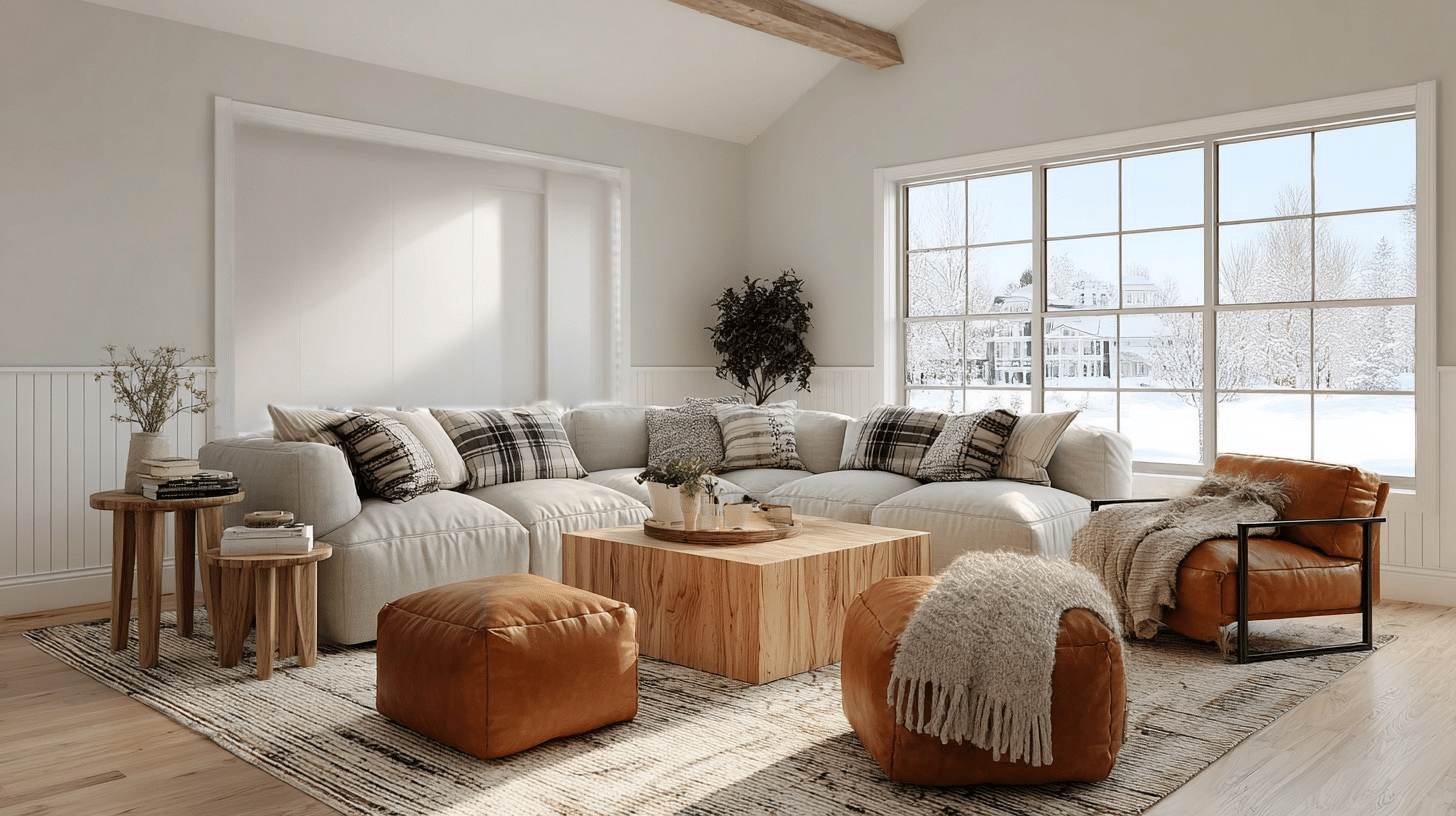
There’s something about that clean, fresh look that clears your mind.
But not all whites work the same way. Pure whites can feel clinical, while warmer whites give you that open feeling without sacrificing coziness.
Snowbound hits a sweet spot here. Its subtle comfort makes spaces feel peaceful without being boring.
The slight gray undertone keeps it from feeling too yellow or dated. It’s the kind of white that feels fresh in the morning and cozy at night.
So let’s get into what makes Snowbound worth considering for your next painting project.
Sherwin-Williams Snowbound 7004 Color Description
It’s one of Sherwin-Williams’ most popular whites, a warm white that leans ever so slightly into gray territory.
This paint color has become a go-to choice for landowners who want something softer than pure white but still bright and airy. It’s part of their classic collection, and for good reason.
| Property | Details |
|---|---|
| Color Code | SW 7004 |
| LRV (Light Reflectance Value) | 83 |
| Hex Value | #EDEAE5 |
| Undertones | Slight gray with a hint of warm beige |
| Color Family | White/Off-White |
| Finish Options | Flat, Eggshell, Satin, Semi-Gloss, Gloss |
Undertones:
- The warm side: Subtle beige notes prevent any icy feeling, especially in north-facing rooms.
- The cool side: Gentle gray undertones balance the warmth, preventing it from looking yellow.
- The chameleon effect: Changes with lighting; warmer in morning sun, grayer on cloudy days.
- Compared to true neutrals: Richer than stark white, cooler than cream, it sits right in the middle.
- Best lighting conditions: Excellent with natural light and LED lighting. Test first in dim rooms where gray shows more.
Snowbound in Different Rooms
Want to know where this color really shines? I’ve used it in every room imaginable, and some spaces love this color more than others.
Here’s my room-by-room breakdown.
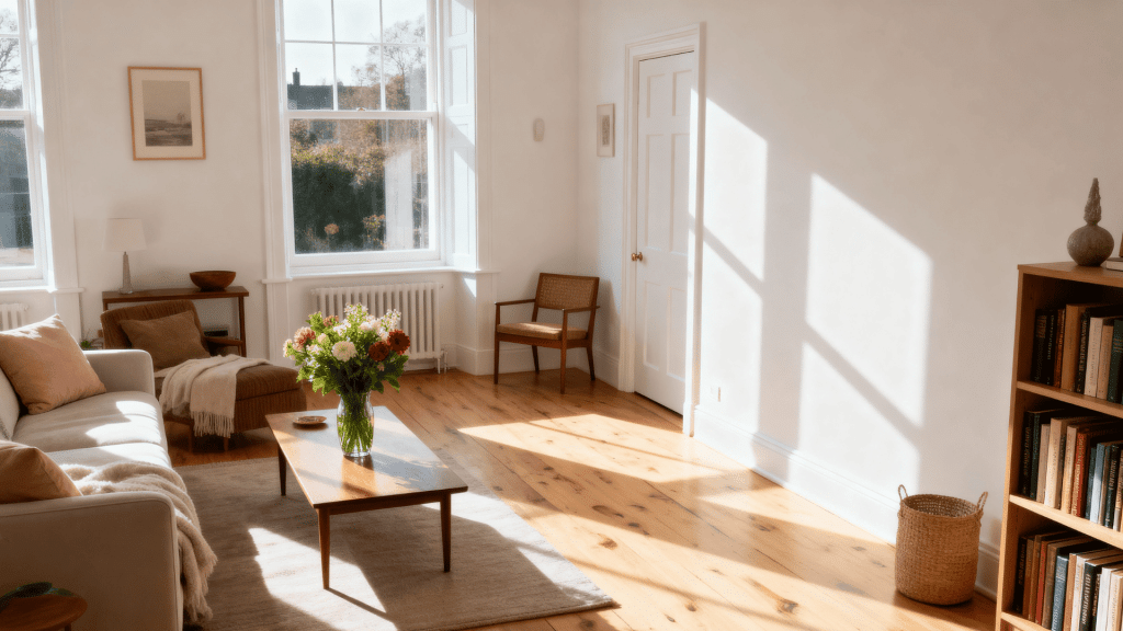
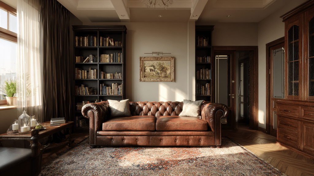
1. Living Room
I’ve found Snowbound creates the perfect neutral backdrop that never competes with my decor choices.
It makes my decor pop without being stark, and I love how I can switch accent colors seasonally. The soft white keeps the family room feeling relaxed and conversational.
- Furniture: Gray sectionals, leather recliners, wooden coffee tables, upholstered ottomans
- Color pairings: Navy blues, sage greens, charcoal grays, warm terracottas
- Decorative styles: Modern farmhouse, transitional, Scandinavian minimalist, casual contemporary
- Variations: Add Black Fox SW 7020 accent wall, use Alabaster SW 7008 for trim contrast
2. Kitchen
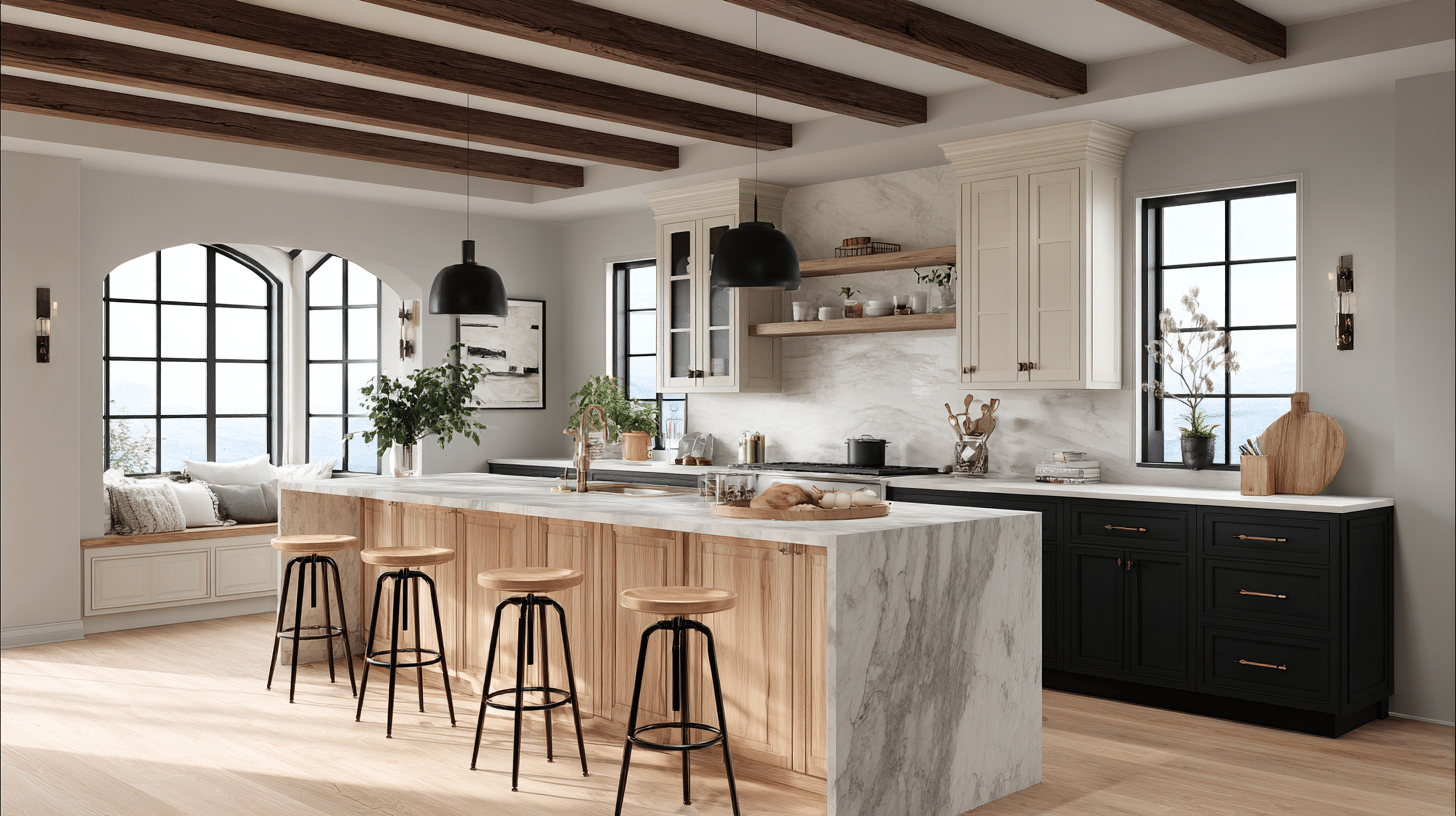
It doesn’t matter if I use it on walls or cabinets, Snowbound brings a rich feeling without yellowing over time.
I’ve noticed it reflects light beautifully off my backsplash and countertops. I like using different sheens to create subtle visual interest between surfaces.
- Cabinets: Natural wood islands, black metal stools, marble countertops, brass hardware
- Color pairings: Deep forest green, soft blacks, wooden designs, crisp whites for trim
- Decorative styles: Modern traditional, updated classic, industrial chic, refined rustic
- Variations: Pure White SW 7005 on upper cabinets, Urbane Bronze SW 7048 on island
3. Bedroom
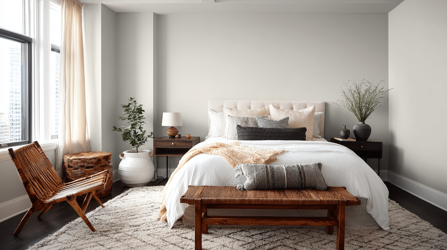
This color creates my serene retreat that feels fresh when I wake up and cozy when I’m winding down.
My south-facing bedroom, in particular, benefits from its balanced undertones. It’s quiet enough for rest but bright enough to help me start my day.
- Furniture: Linen headboards, dark wood nightstands, rattan benches, velvet chairs
- Color pairings: Dusty pinks, soft blues, warm grays, muted lavenders
- Decorative styles: Coastal calm, modern romance, minimalist retreat, collected traditional
- Variations: Agreeable Gray SW 7029 behind headboard, Natural Linen SW 9109 on ceiling
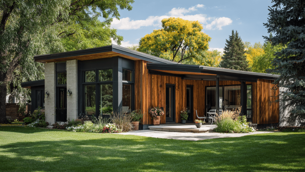
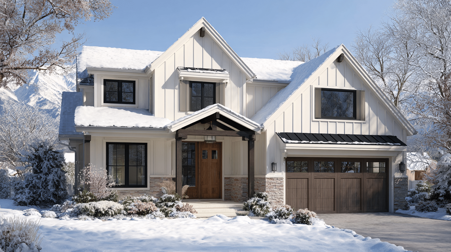
4. Exterior
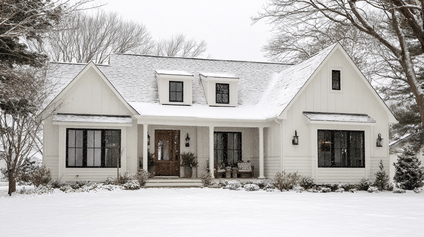
I chose Snowbound for my home’s exterior because it offers a modern, crisp look without harsh coldness. I’ve watched it handle weather changes gracefully, and it doesn’t show dirt as quickly as I expected.
The color maintains its character whether it’s bright and sunny or completely overcast.
- Furniture: Black shutters, wood doors, stone accents, metal roofing
- Color pairings: Iron Ore SW 7069 for trim, natural cedar, slate blues, deep browns
- Decorative styles: Modern farmhouse, modern ranch, updated colonial, prairie style
- Variations: Tricorn Black SW 6258 for doors, Dovetail SW 7018 for garage doors
5. Mudroom
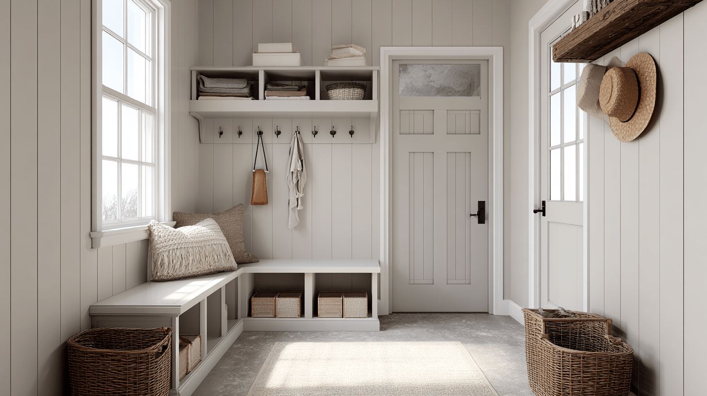
Even my high-traffic mudroom stays bright and welcoming with Snowbound.
I’m surprised how well it hides scuffs from my kids’ backpacks and sports gear. My bold trim colors prevent it from feeling bland while maintaining that clean, organized look I need.
- Furniture: Built-in benches, wire baskets, wooden hooks, metal lockers
- Color pairings: Naval SW 6244 trim, warm wood stains, black accents, olive greens
- Decorative styles: Practical traditional, modern utility, cottage charm, industrial organization
- Variations: Accessible Beige SW 7036 on bench cushions, In the Navy SW 9178 on doors
Why Choose Snowbound?
I’m asked all the time why Snowbound SW stands out from the dozens of other white wines on the market.
After using it in multiple projects, I can tell you it’s not just another white paint. There’s a reason designers and homeowners keep coming back to SW 7004.
Let me break down what makes it special!
| Category | Details |
|---|---|
| Adaptability | Works in almost any room, from tiny powder rooms to massive living areas. Adapts to farmhouse, modern, or traditional styles. Pairs well with warm wood tones, cool metals, bold accent colors, and neutral palettes. |
| Key Features | High LRV of 83 reflects light without being blinding. Covers well in two coats. Smooth application, self-leveling, no brush marks. Part of Sherwin-Williams’ Living Well collection (lower VOCs, better air quality). |
| Durability | Resists scuffs and marks. Easy to clean with soap and water. Maintains color without yellowing. Performs well in high-traffic areas, staying fresh longer than expected. |
| Texture Effects | Eggshell: Soft, subtle glow. Satin: Enough sheen for easy cleaning, not shiny. Semi-gloss: Great contrast on trim with eggshell walls. Looks good on textured surfaces; shadows add depth without looking dingy. |
How Snowbound Performs in Different Lighting
Lighting can make or break any paint color, and I’ve tested Snowbound SW in every condition imaginable.
Here’s exactly what to expect:
- Natural Light Performance: Stays soft white in south-facing rooms, brings out gray in north light, glows warm in eastern morning sun, turns slightly peachy in western sunset, and maintains consistency throughout the day without major shifts.
- Artificial Light Effects: Looks cozy under warm LEDs (3000K), crisp with cool LEDs (4000K+), and creamy with incandescent bulbs. It might pull green under fluorescents and works best with dimmers for adjustable coziness.
- Shadow and Highlight Behavior: Won’t turn muddy in corners like pure whites, creates soft highlights without glare, adds nice depth to architectural details, stays bright in low-light hallways, and maintains consistent color across varied lighting conditions.
Similar Colors Worth Looking Into
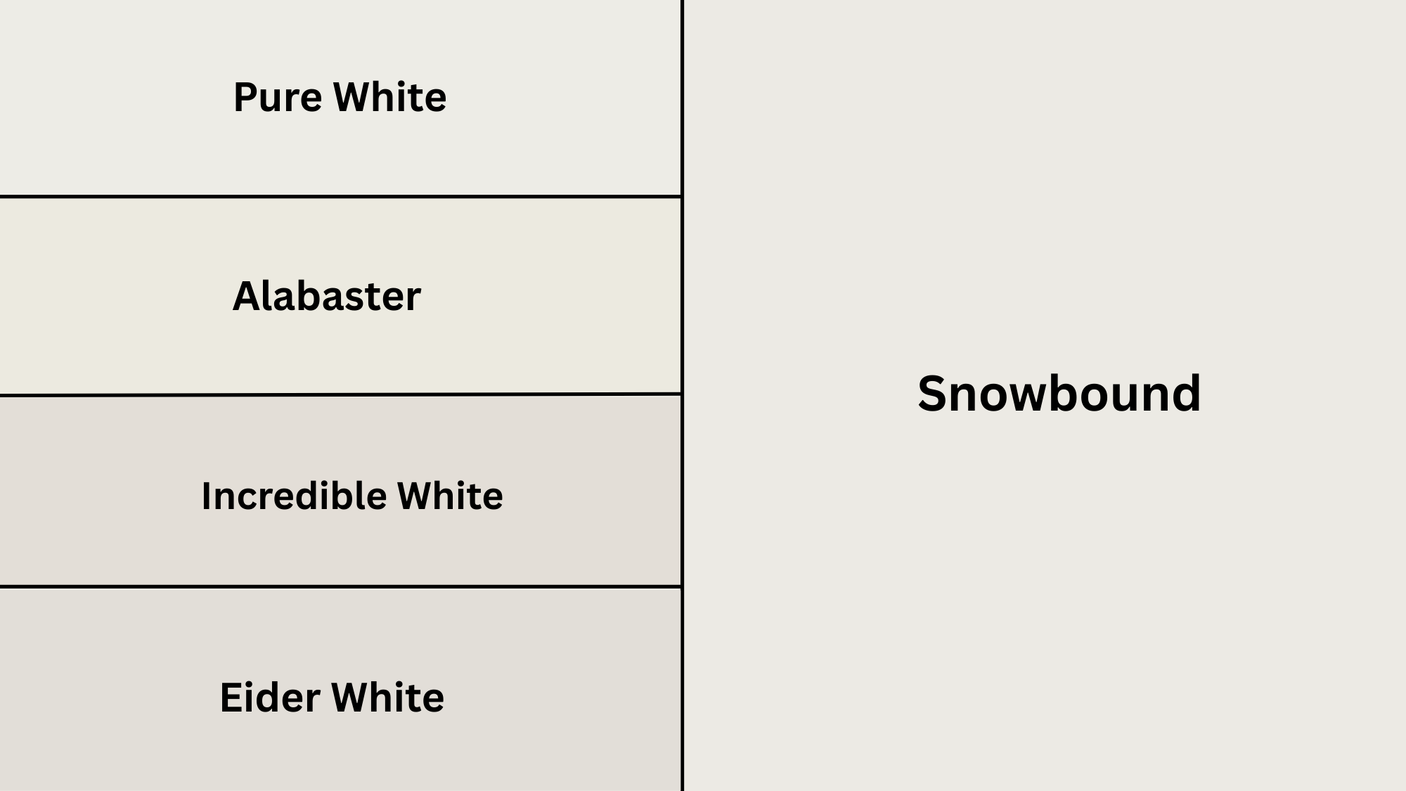
If you’re considering Snowbound but want to see similar options, I’ve tested these comparable whites side by side. Each has its own personality, and the differences might surprise you.
Let me tell you how these popular whites stack up.
Snowbound’s crisper cousin, cleaner and brighter without undertones. My go-to for modern spaces and trim work. Reads as true white in most lighting.
With an LRV of 84 and a hex value #EDECE6, it’s slightly brighter than Snowbound.
More inviting than Snowbound with more beige undertones. Makes spaces feel cozy and inviting. I recommend it for north-facing rooms or homes with lots of wood tones.
Has an LRV of 82 and a hex value #EDEAE0.
Has green-gray undertones for a fresh, contemporary feel. Works beautifully in bathrooms and kitchens. At LRV 85 with hex #E9E6DF.
It’s the brightest option here with more complexity than Snowbound.
This is the moodiest option with stronger gray undertones. Perfect when you want white with depth. Its LRV of 73 and hex #E9E7E3 make it the darkest choice, less brightness but more refinement.
Expert Opinions on SW Snowbound
I’ve gathered insights from industry professionals who work with Sherwin-Williams Snowbound daily. Their honest feedback might help you decide if this color fits your needs.
Interior Designers’ Verdict
Most designers call it their “reliable neutral”, used in 70% of projects because clients never complain later. Perfect for indecisive clients since it’s safe without being boring. Doesn’t fight with furniture or art.
Main criticism: too predictable for high-end custom homes wanting unique character.
Paint Contractors’ Experience
Contractors praise its workability and coverage. Touch-ups blend well without visible patches. Their go-to recommendation is when customers want “white but not too white.”
Only downside: needs good primer over dark walls.
Real Estate Professionals’ Take
Realtors love it for staging and pre-sale updates. Photographs are beautifully taken for listings and appeal to most buyers. Homes with Snowbound reportedly sell faster than those with beige or gray.
Makes rooms look larger and cleaner in photos.
Color Consultants’ Analysis
Consultants see it as a chameleon that bridges warm and cool palettes. Called “mistake-proof” for DIYers. Best used as a backdrop with a character added through decor, not expecting the paint to make the statement.
Warning: might feel too safe for those wanting personality.
Common Mistakes to Avoid
After seeing Snowbound used in numerous homes, I’ve noticed the same mistakes recurring repeatedly.
Here’s what to watch out for:
1. Testing & Sampling Errors: Not testing on multiple walls, using tiny chips instead of large samples, judging at only one time of day, skipping primer, and testing over dark paint without priming first.
2. Application Mistakes: Using flat finish in high-traffic areas, not boxing paint batches together, rushing the second coat, using cheap brushes, and not maintaining a wet edge for a smooth finish.
3. Color Coordination Issues: Pairing with cool white trim, using beige in beige-heavy rooms, ignoring flooring undertones, choosing clashing cool furniture, and not testing against countertops or tile.
4. Lighting Oversights: Ignoring LED bulb temperature, not considering neighboring wall colors, painting without checking each room’s light, using untested methods in windowless spaces, and forgetting corners read grayer.
Wrapping Up
So there you have it, everything I’ve learned about Snowbound SW through years of real-world use.
This soft white has proven itself as more than just another paint color.
It doesn’t matter if you’re painting one room or your entire home, Snowbound offers that perfect balance. The mistakes I’ve shared will save you time and frustration, while those expert insights confirm what I’ve experienced firsthand.
My advice? Grab a sample and test it correctly in your space.
See how this color lives with your lighting and decor.