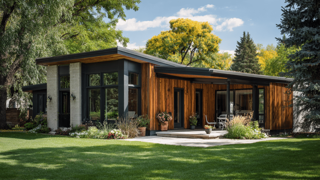

Trends come and go. Collingwood doesn’t. It’s the rare gray that stays balanced under real-world light, plays nicely with bold accents, and still feels calm
I’m not here to parade every trendy neutral that pops up on design feeds. Just the one that consistently earns a second look in real life.
Collingwood by Benjamin Moore is that rare shade that looks effortlessly refined without trying too hard. I’ve seen it shift with the light, hold its own next to bold accents, and still feel perfectly balanced.
Once you’ve tested it, it’s hard to go back to anything else.
Fair warning, this color has a quiet confidence that tends to win people over fast.
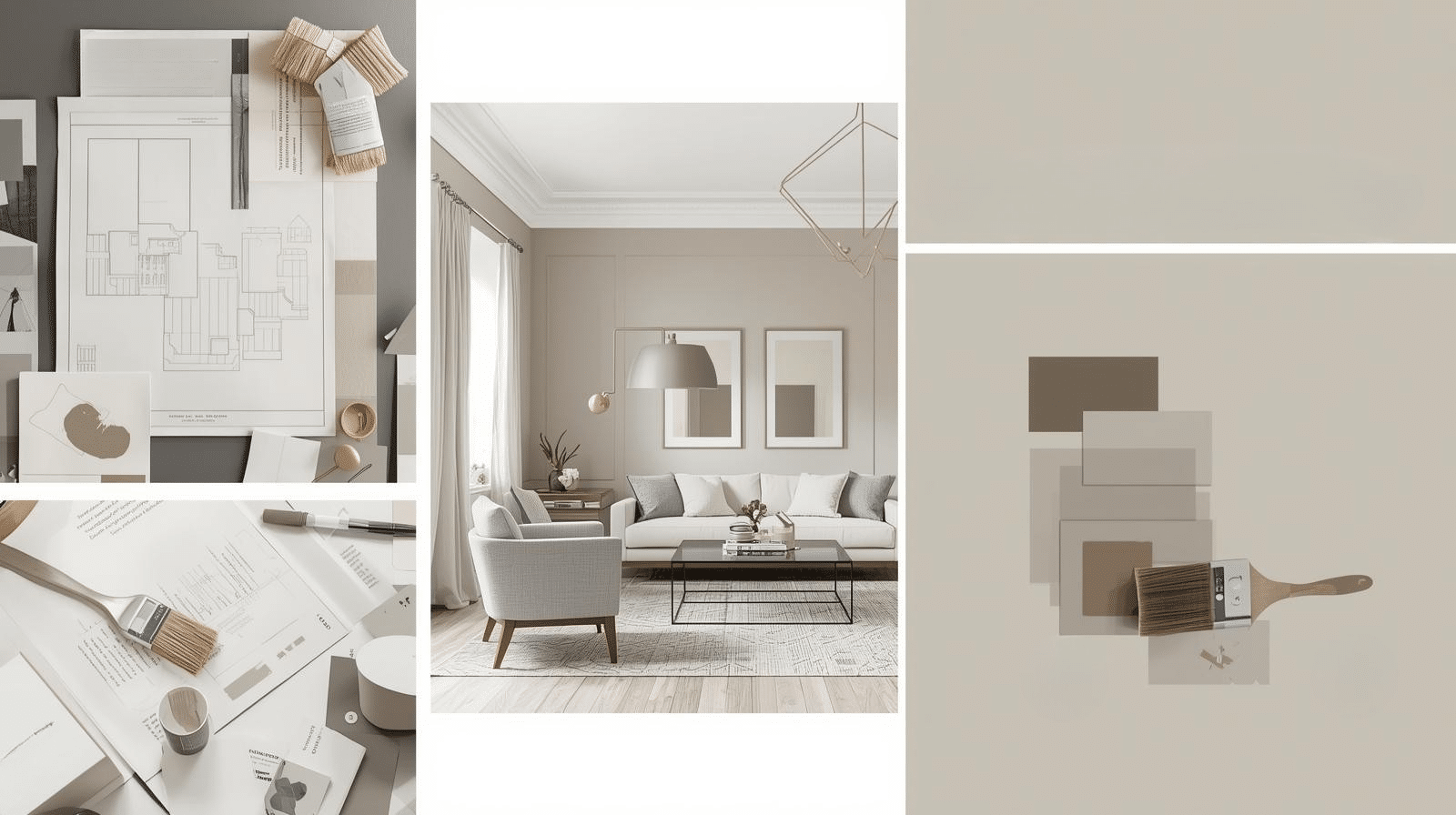
Color Profile & Technical Specs of Collingwood OC-28
Benjamin Moore’s Collingwood is part of the Off-White Collection, and knowing its specs helps you use it right. Let me break down the technical details so you know exactly what you’re working with.
| Specification | Details |
|---|---|
| Paint Name | Collingwood OC-28 |
| LRV (Light Reflectance Value) | 61.52 |
| Undertone | Warm gray with beige |
| Hex Code | #C9C5BC |
| RGB Values | R: 201, G: 197, B: 188 |
| Color Family | Neutral gray |
| Collection | Off-White Collection |
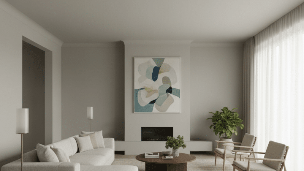
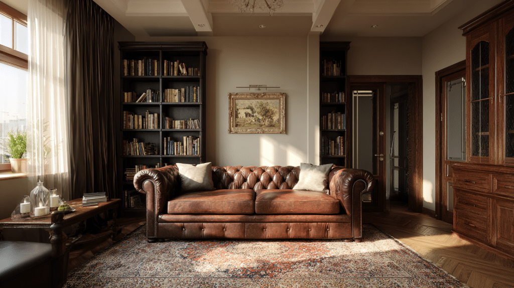
How Collingwood Works in Real Rooms
Collingwood works differently in every room, and that’s what makes it so adaptable. The way it interacts with light and furniture can completely change your space.
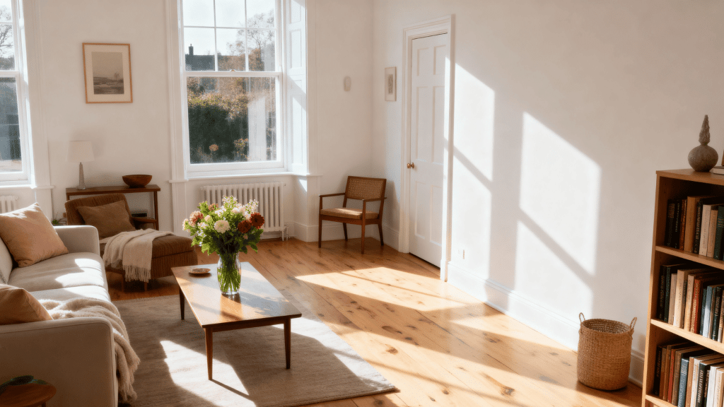
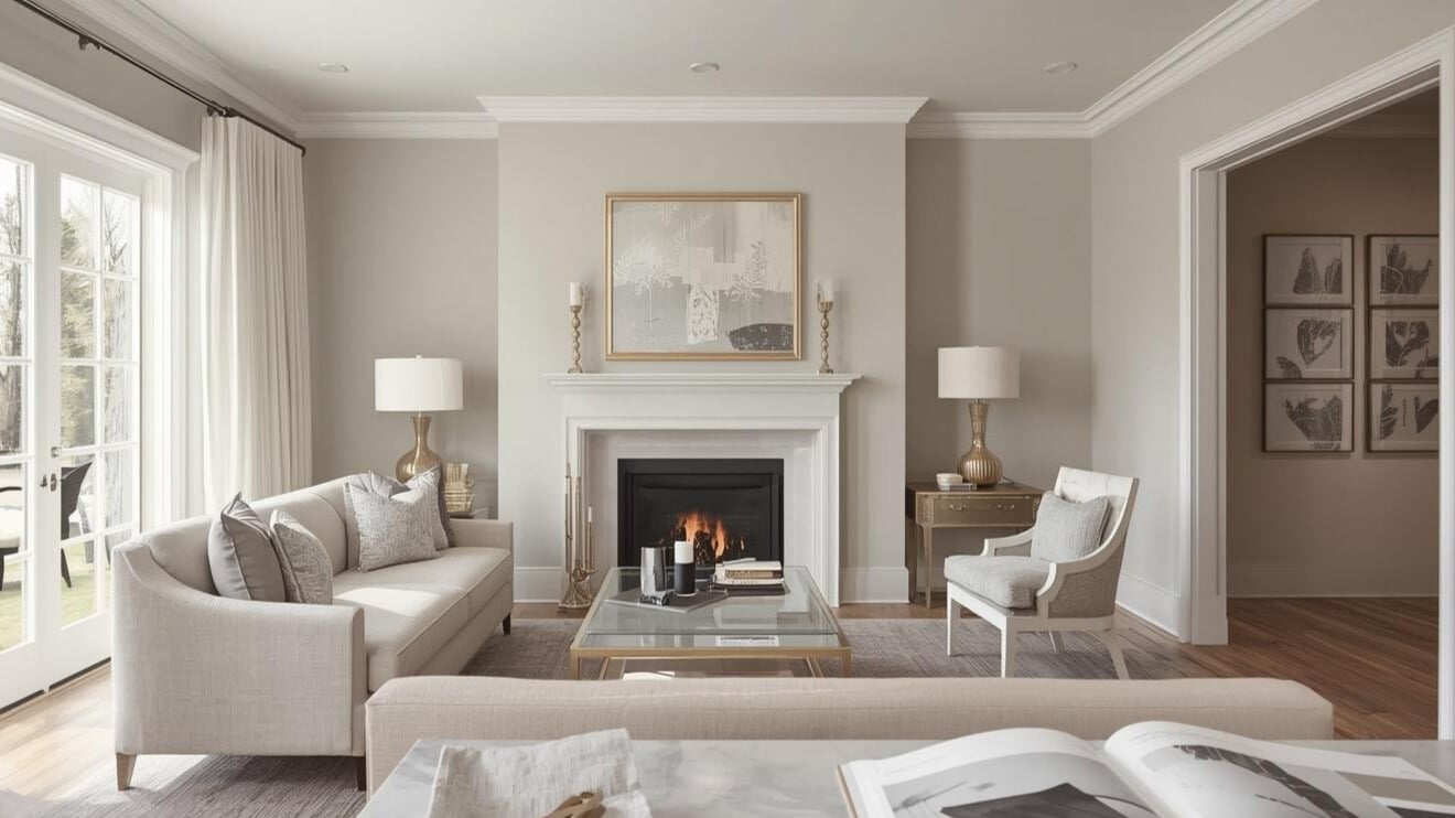
Living Room
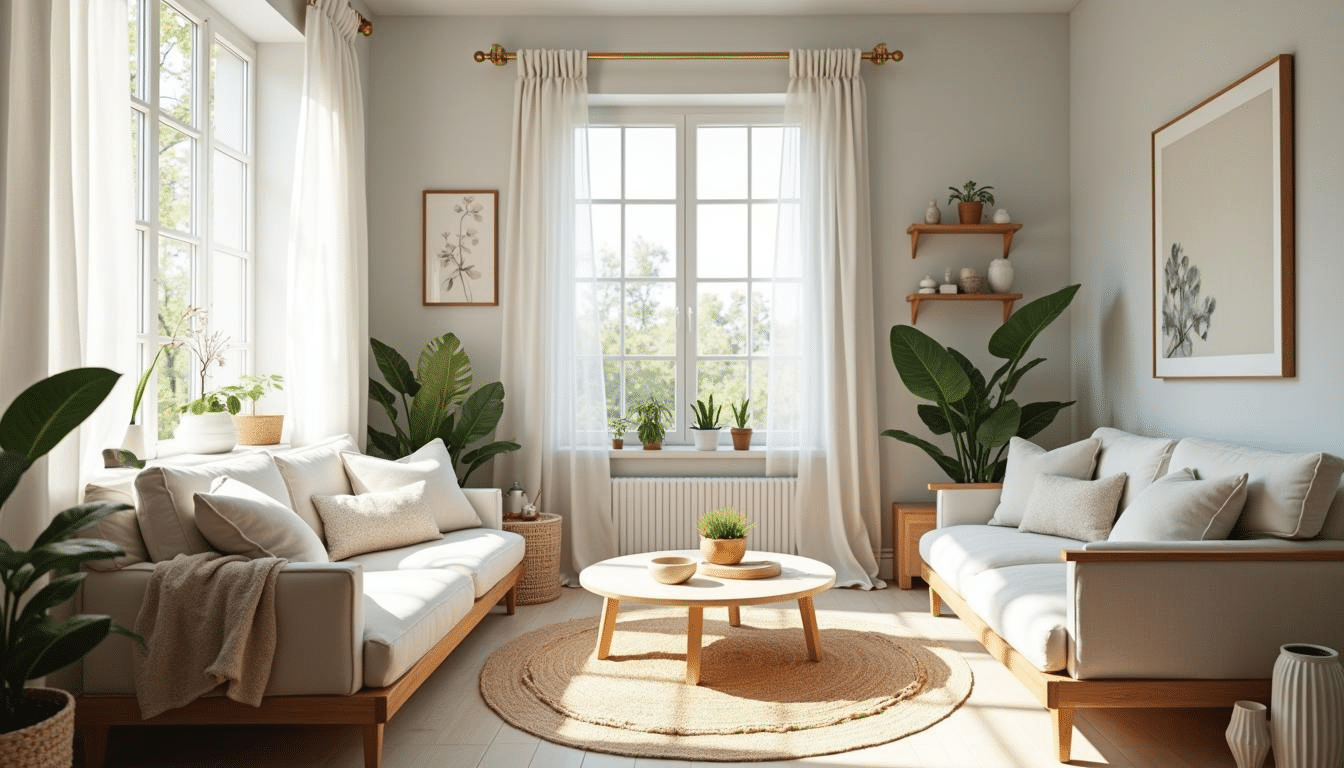
Collingwood creates a cozy feel in living rooms without making them dark. It pairs well with white trim and natural wood furniture. The muted undertones complement both modern and traditional styles.
- Color Palette: Pair with Simply White OC-117 trim and Pale Oak OC-20 accents
- Coordinating Colors: Navy blues, soft creams, and gentle browns work beautifully.
- Accessories: Brass fixtures, linen curtains, and natural fiber rugs improve the soft glow
Kitchen
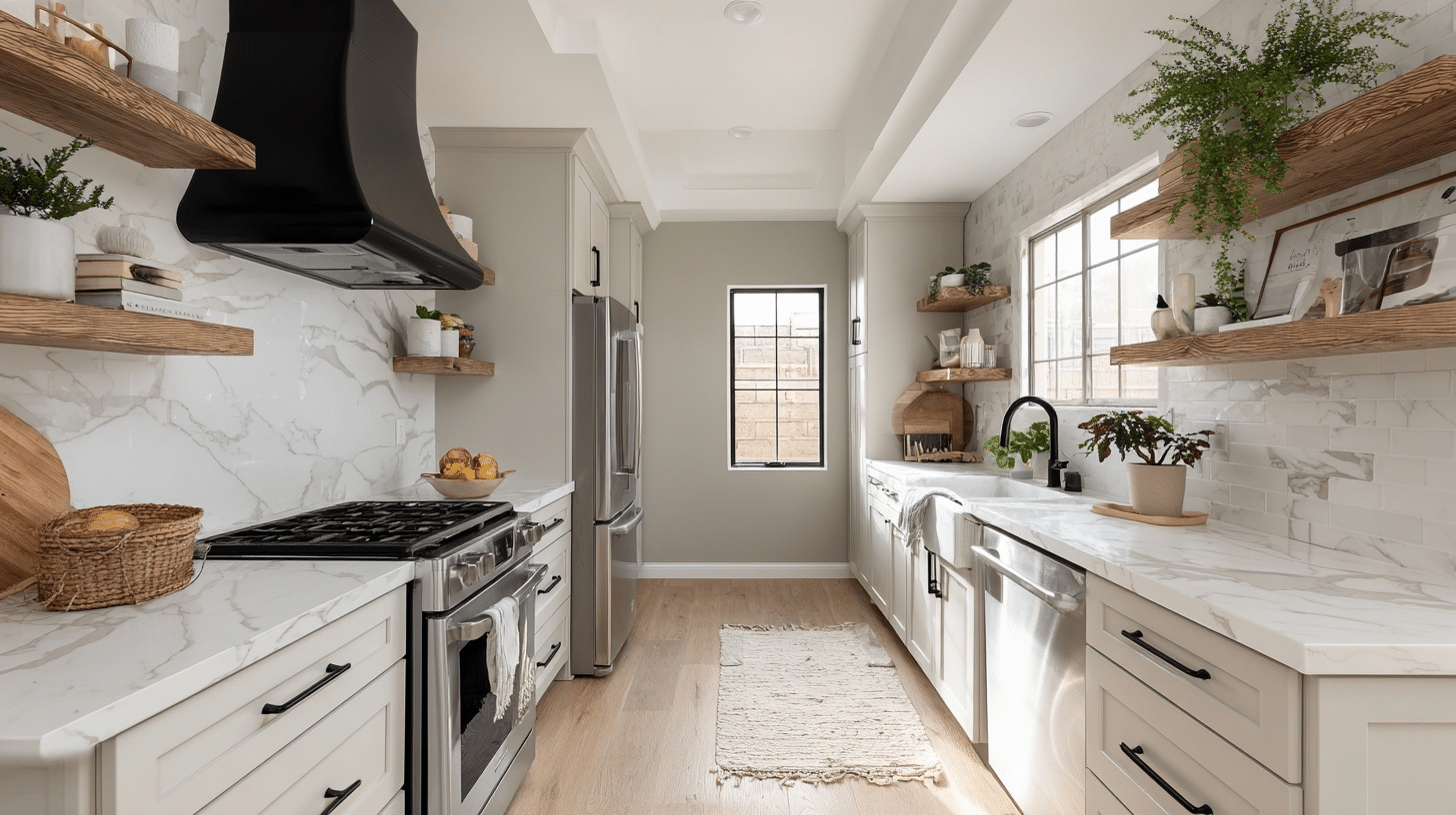
This shade brings a soft, neutral backdrop to busy kitchens. It works especially well with white cabinets and stainless steel appliances. The color stays true under bright kitchen lighting.
- Color Palette: Combine with White Dove OC-17 cabinets and black hardware
- Coordinating Colors: Sage green, soft blue, or gentle terracotta for accents
- Accessories: Marble countertops, open wood shelving, and pendant lights in black or bronze
Bedroom

Collingwood creates a restful atmosphere perfect for bedrooms. The neutral tone doesn’t compete with bedding or decor. It feels calming without being cold.
- Color Palette: Use with Chantilly Lace OC-65 ceiling and Classic Gray OC-23 for depth
- Coordinating Colors: Soft blush, muted lavender, or taupe in textiles
- Accessories: White bedding, wooden nightstands, and soft-toned table lamps
Home Office
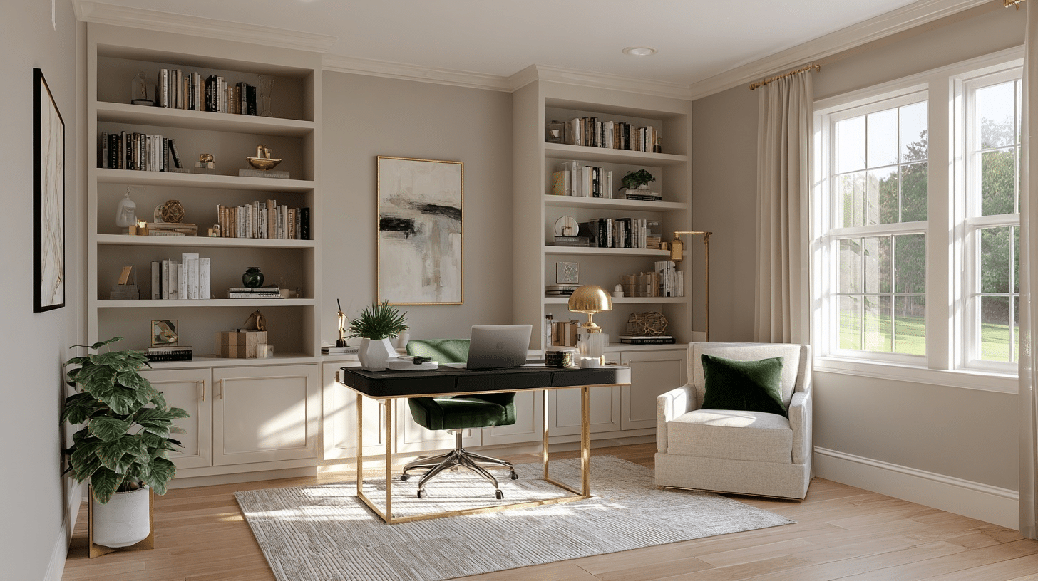
This color provides a professional look without feeling sterile. It helps reduce eye strain during long work hours. The neutral base lets you add pops of color through art and accessories.
- Color Palette: Match with Decorator’s White CC-20 for trim and built-ins
- Coordinating Colors: Deep charcoal, forest green, or burgundy for accent walls
- Accessories: Black office furniture, gold desk accessories, and colorful artwork
Bathroom Spa Look
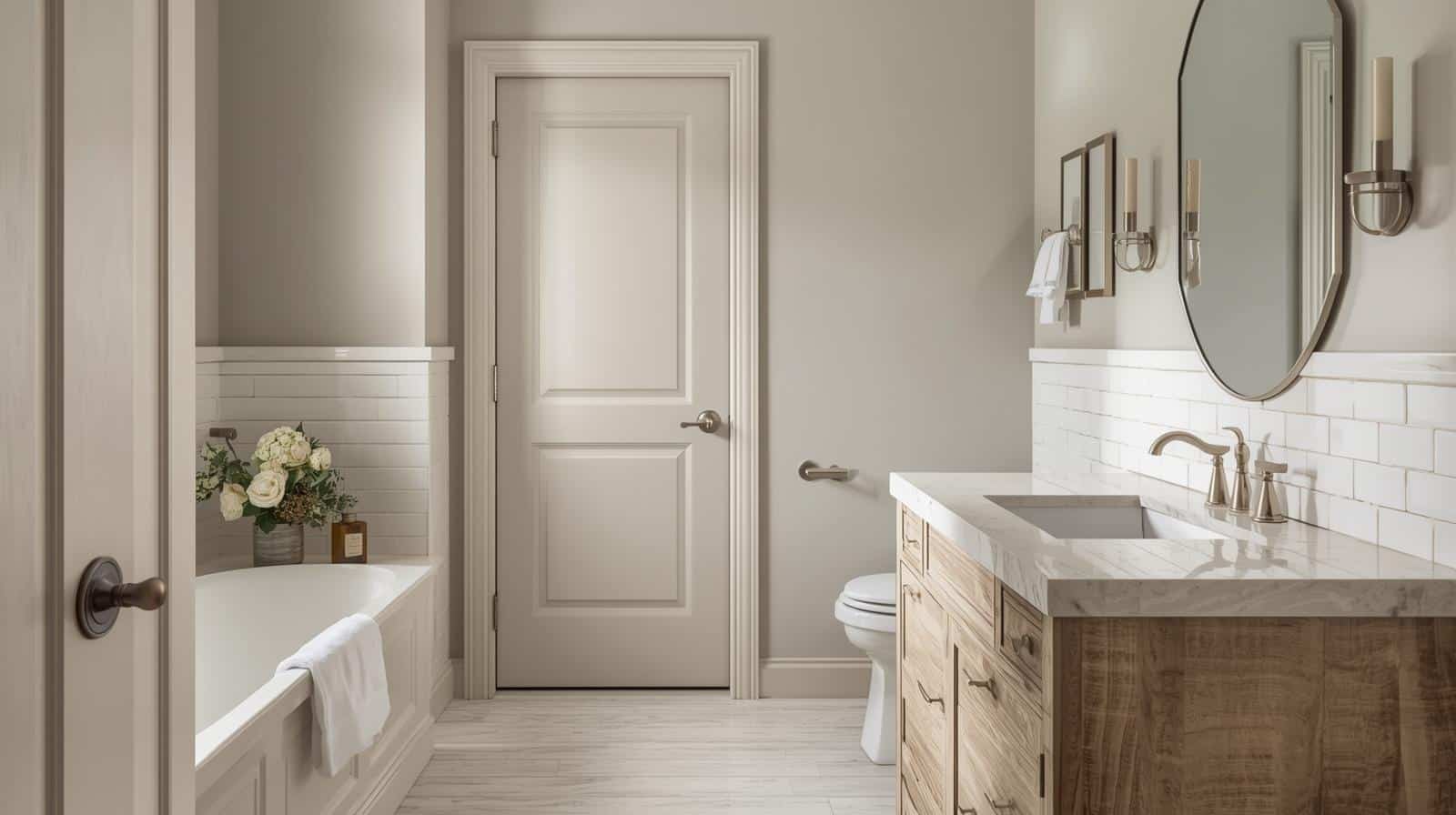
Collingwood Benjamin Moore turns bathrooms into spa-like spaces. It handles humidity well and doesn’t show water spots easily. The color feels clean but softer than stark white.
- Color Palette: Coordinate with White Heron OC-57 for wainscoting or tile
- Coordinating Colors: Soft aqua, pale green, or inviting beige in towels and mats
- Accessories: Chrome or brushed nickel fixtures, white subway tile, and natural stone accents
Hallway
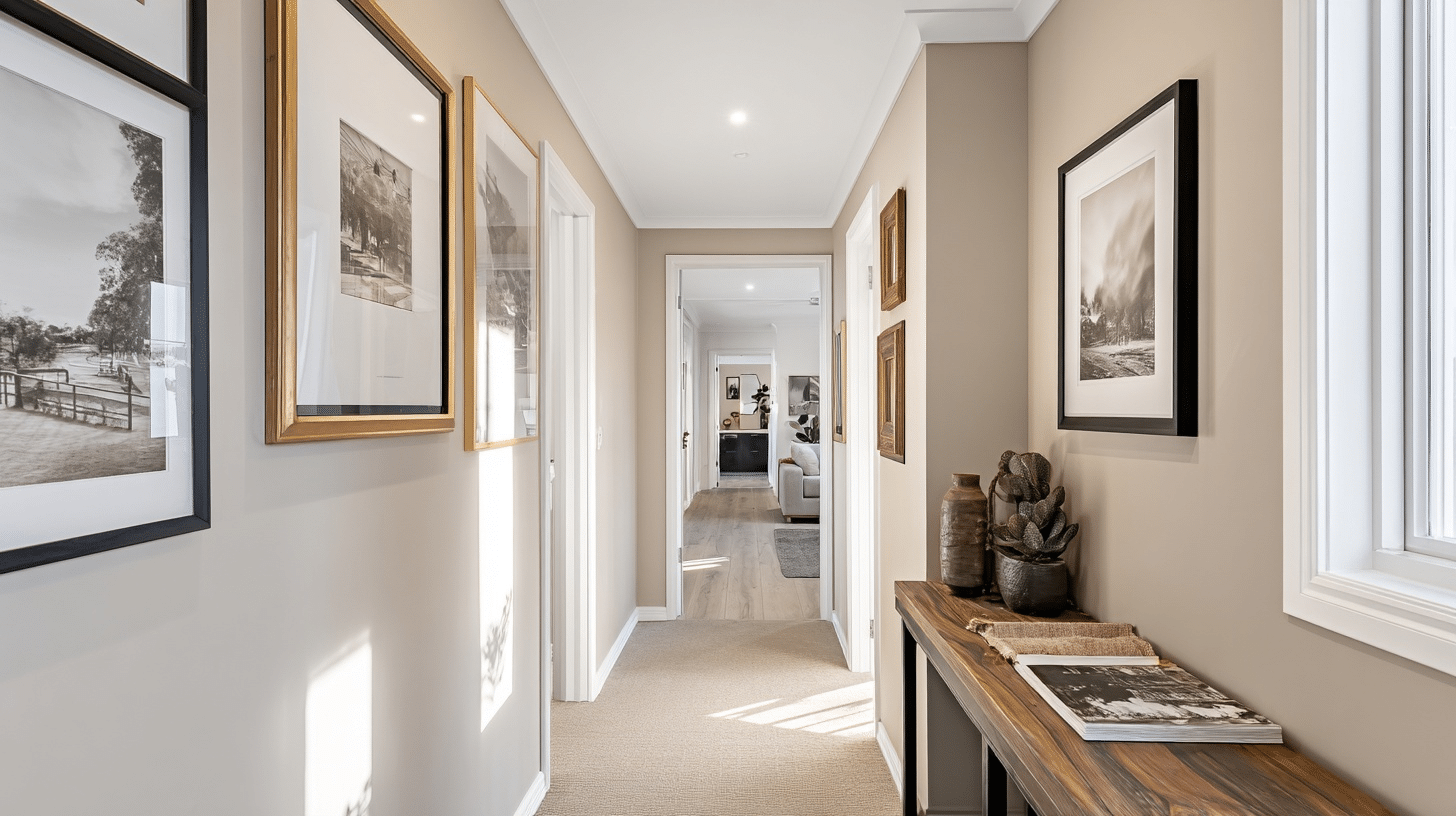
This shade creates smooth transitions between rooms. Hallways painted in Collingwood feel wider and brighter. It’s neutral enough to work with whatever colors are in adjacent spaces.
- Color Palette: Extend with Swiss Coffee OC-45 on ceilings for added height
- Coordinating Colors: Any room color flows well; blues, greens, or soft neutrals
- Accessories: Gallery wall frames in black or gold, console tables in dark wood
Open Concept
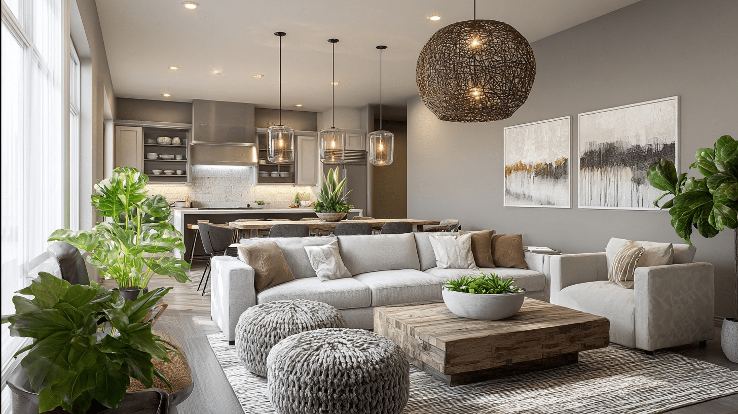
Collingwood unifies open floor plans beautifully. It creates cohesion without being boring. The color adapts to different lighting zones throughout the day.
- Color Palette: Blend with Balboa Mist OC-27 in alcoves for subtle variation
- Coordinating Colors: Mix furniture in grays, browns, and soft accent colors freely
- Accessories: Mix metal finishes, varied textures in throw pillows, and plants for life
The Effects of Lighting on Collingwood in Every Direction
Lighting changes everything with this color, and I mean everything.
In north-facing rooms, Collingwood leans cooler and shows more of its gray side. You might notice it feels a bit flat without direct sunlight.
South-facing spaces bring out the soft glow. The beige undertones come alive, and the room feels cozier. It’s where this color really shines.
East-facing rooms get that muted morning glow, then shift to a cooler tone as the day goes on.
West-facing spaces do the opposite; they start neutral and eventually get beautifully bathed in the afternoon light.
Test samples on all four walls before you commit. What looks perfect at noon might surprise you at sunset.
The color isn’t chameleon-level changeable, but it does shift enough to matter.
The Bright Side and Watch Outs of This Neutral Gem
Every paint color has its strengths and limitations, and Collingwood Benjamin Moore is no exception. I want to give you the full view so you can decide if it’s right for your space.
Here’s what works well and what you should keep in mind.
What Works Well:
- Goes with almost any decor style, from farmhouse to modern designs
- Hides minor wall imperfections better than pure white
- Stays neutral enough not to clash with existing furniture
- Works beautifully with both warm and cool accent colors
- Doesn’t look dingy or yellow over time like some beige
Watch Out For:
- Can feel too cool in rooms with only north-facing windows
- It might read as plain gray if your room lacks natural light
- Shows up differently on textured walls versus smooth drywall
- May need two coats for full coverage over darker colors
- It can look washed out next to bright white trim in some lighting
What to Consider if You Are Not Sure About Collingwood
If Collingwood isn’t quite right, there are other shades worth considering.
Shades like Agreeable Gray or Accessible Beige share similar qualities, but each brings something slightly different to the table.
| Paint Color | Brand | LRV | Key Difference |
|---|---|---|---|
| Revere Pewter | Benjamin Moore | 55.51 | Richer with stronger beige undertones |
| Agreeable Gray | Sherwin Williams | 60 | More true gray, less beige influence |
| Edgecomb Gray | Benjamin Moore | 63.88 | Similar glow but slightly softer feel |
| Balboa Mist | Benjamin Moore | 60.68 | Cooler with hints of green |
| Accessible Beige | Sherwin Williams | 58 | Leans more beige than gray |
| Repose Gray | Sherwin Williams | 60 | Cleaner gray without warm tones |
What the Experts Really Think
Interior designers keep coming back to Collingwood for good reason.
I’ve seen it recommended in countless design forums and professional portfolios. It’s become a go-to neutral for projects of all sizes.
Many experts praise its ability to work with both warm and cool palettes. They mention how it creates a complex backdrop without demanding attention. That’s rare in the neutral category.
Some designers note it’s easier to work with than trendy grays that can feel cold. They appreciate how it ages well and doesn’t go out of style quickly.
The common thread? Professionals value its reliability.
It performs consistently across different homes and lighting situations. That predictability matters when you’re making recommendations to clients who need results they can trust.
Finishing it Up
So that’s the scoop on why Collingwood Benjamin Moore is a must-try.
No confusing undertones, no limitless paint samples, no second-guessing every swatch, just one classic color that manages to look put together in every kind of light and setting.
I’ve seen it change rooms without shouting for attention, which is exactly what makes it so easy to love.
Tried it yet? Share your Benjamin Moore Collingwood experience in the comments below!