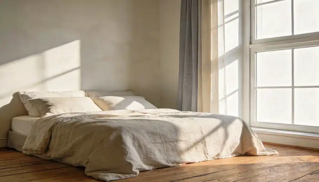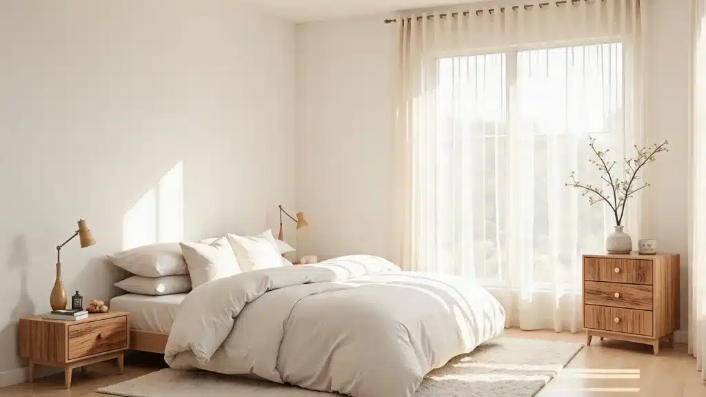

The colors on your bedroom walls do more than decorate. They set the mood, change how a room feels, and affect how well you sleep.
But picking the right pairing? That’s where most people get stuck.
Choosing a two color combination for bedroom walls need not be overwhelming.
Ahead, you will find curated two color combinations for bedroom walls, alongside practical tips to help you pull the whole look together with confidence.
How to Pick the Right Two Color Combination for Your Bedroom
Lighting changes everything. A color that looks warm in the store can turn flat on your actual walls.
North-facing rooms run cool and benefit from warm tones, while south-facing rooms can handle deeper shades without feeling heavy.
Always check how light moves through your space at different times before deciding.
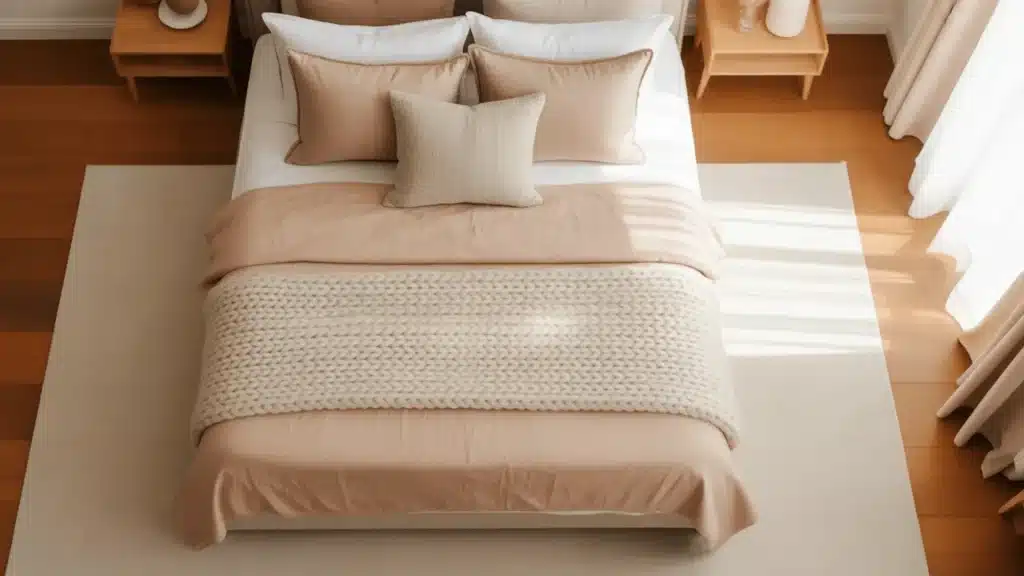
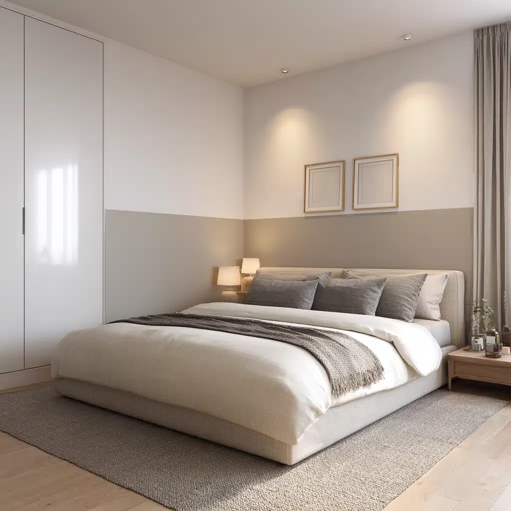
Start with a 60/40 split. Dominant color on three walls, accent on one. Pull both shades from the same color family for a safe, layered look.
For contrast, pick opposites on the color wheel but keep one muted so it feels intentional rather than loud.
Always patch test on the wall and observe under different lighting conditions before you commit.
Different Ways to Apply Two Color Combinations
There is no single way to use two colors on bedroom walls.
The technique you choose changes the entire mood of the space, sometimes more than the colors themselves.
A split wall feels very different from a full accent wall, even if you use the same two shades.
The approach you pick matters just as much as the colors themselves:
- Accent wall: One wall in a contrasting or deeper shade, remaining three in a lighter or neutral tone
- Half-and-half: The wall is split horizontally or at chair rail height into two distinct colors
- Vertical or horizontal split: A clean line divides the wall into two color zones, either top-bottom or side-by-side
- Geometric and patterned: color is applied in shapes, blocks, or patterns rather than full sections
- Color blocking: Large, bold sections of two colors placed deliberately to create visual structure
Each technique suits different room sizes, ceiling heights, and personal styles.
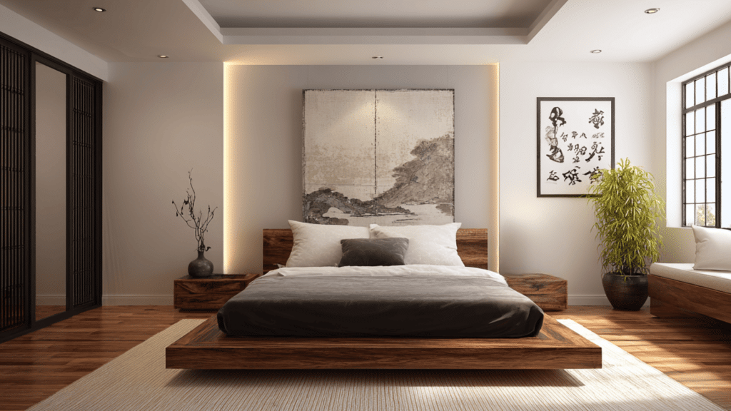
Accent Wall Design Ideas
An accent wall is the most approachable way to work with a two color combination for bedroom walls.
Three walls stay neutral, one goes deeper or bolder, usually the wall behind the bed.
Use painter’s tape along edges and skirting boards, apply two coats, and let each dry fully before peeling the tape back.
1. Navy Blue and White
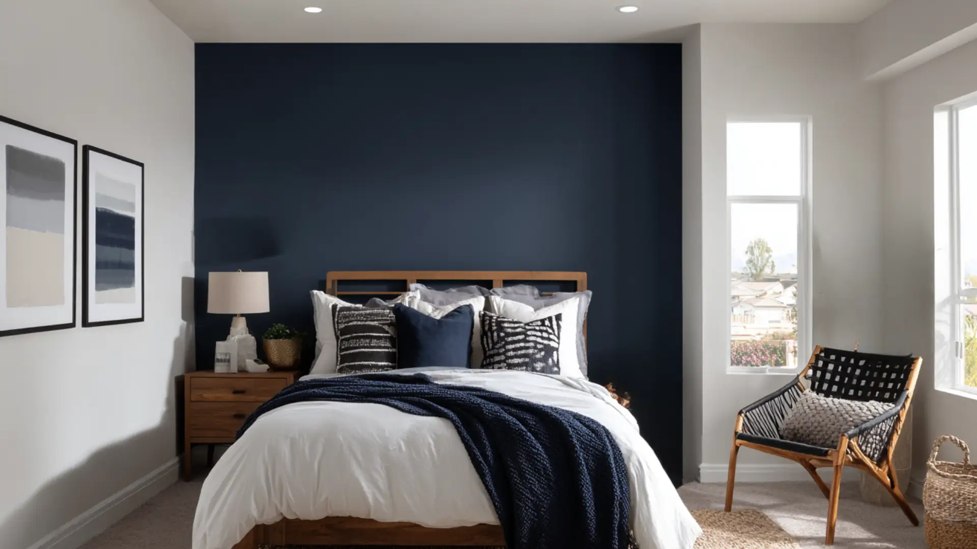
Deep navy on the wall behind the bed with crisp white on the surrounding walls.
The contrast is strong but not harsh.
Navy grounds the room and adds a sense of calm depth, while white keeps everything feeling open and fresh.
This combination works particularly well in rooms with good natural light, where the navy reads rich rather than dark and heavy.
2. Olive Green and Beige
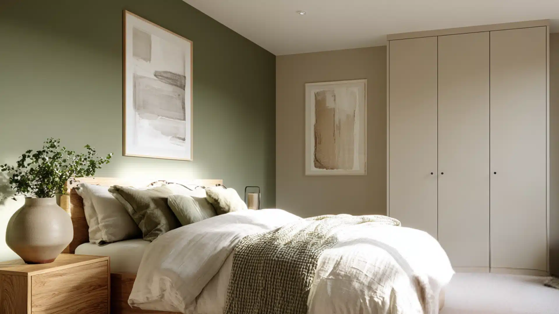
An olive green feature wall adds an earthy, organic quality to the bedroom.
Set against soft beige walls, it creates a warm and grounded atmosphere without leaning too rustic.
This bedroom wall color combination suits spaces with wooden furniture or natural textures like linen and jute, where everything ties together around a nature-inspired palette without trying too hard.
3. Burgundy and Cream
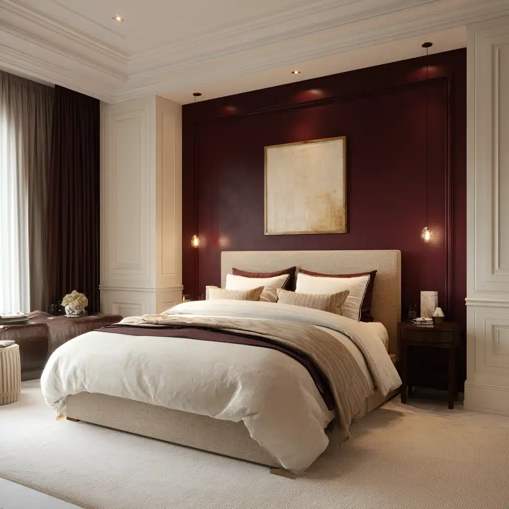
A burgundy accent wall brings a deep, rich warmth to the bedroom that feels comfy without being overpowering.
Cream on the surrounding walls keeps the space balanced and stops the burgundy from feeling too heavy.
This bedroom wall color combination works particularly well in rooms with warm toned flooring or wooden furniture, where the earthy undertones in both shades tie the whole space together naturally.
4. Charcoal Grey and Light Grey
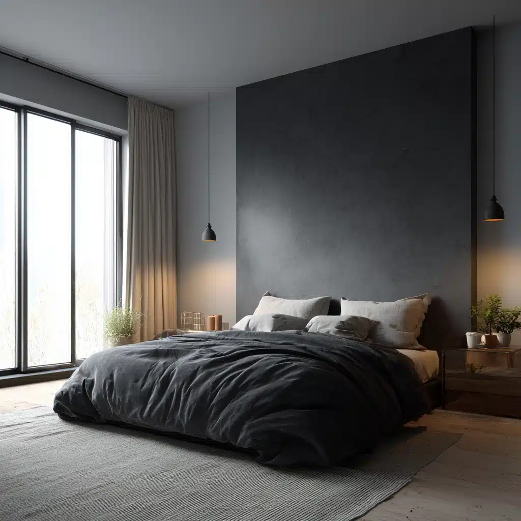
For a more understated look, charcoal and light grey deliver quiet contrast that never feels overdone.
The charcoal accent wall adds weight and definition, while light grey walls keep the space feeling airy.
This works well in minimalist or Scandinavian-style bedrooms where the focus is on clean lines and simple layering rather than bold statements.
Pro Tip: Never skip testing your accent colour under both natural and artificial light. A charcoal wall in a poorly lit room can make the space feel smaller and heavier than intended.
Half-and-Half Wall Painting
This technique splits the wall horizontally at a height of about 90 to 100 centimeters from the floor.
One color on the lower half, another on the upper.
Use a spirit level to mark a clean line, tape firmly before painting each section, and keep the deeper shade below to anchor the room while the lighter tone above maintains a sense of height.
5. Cream and Dusty Pink
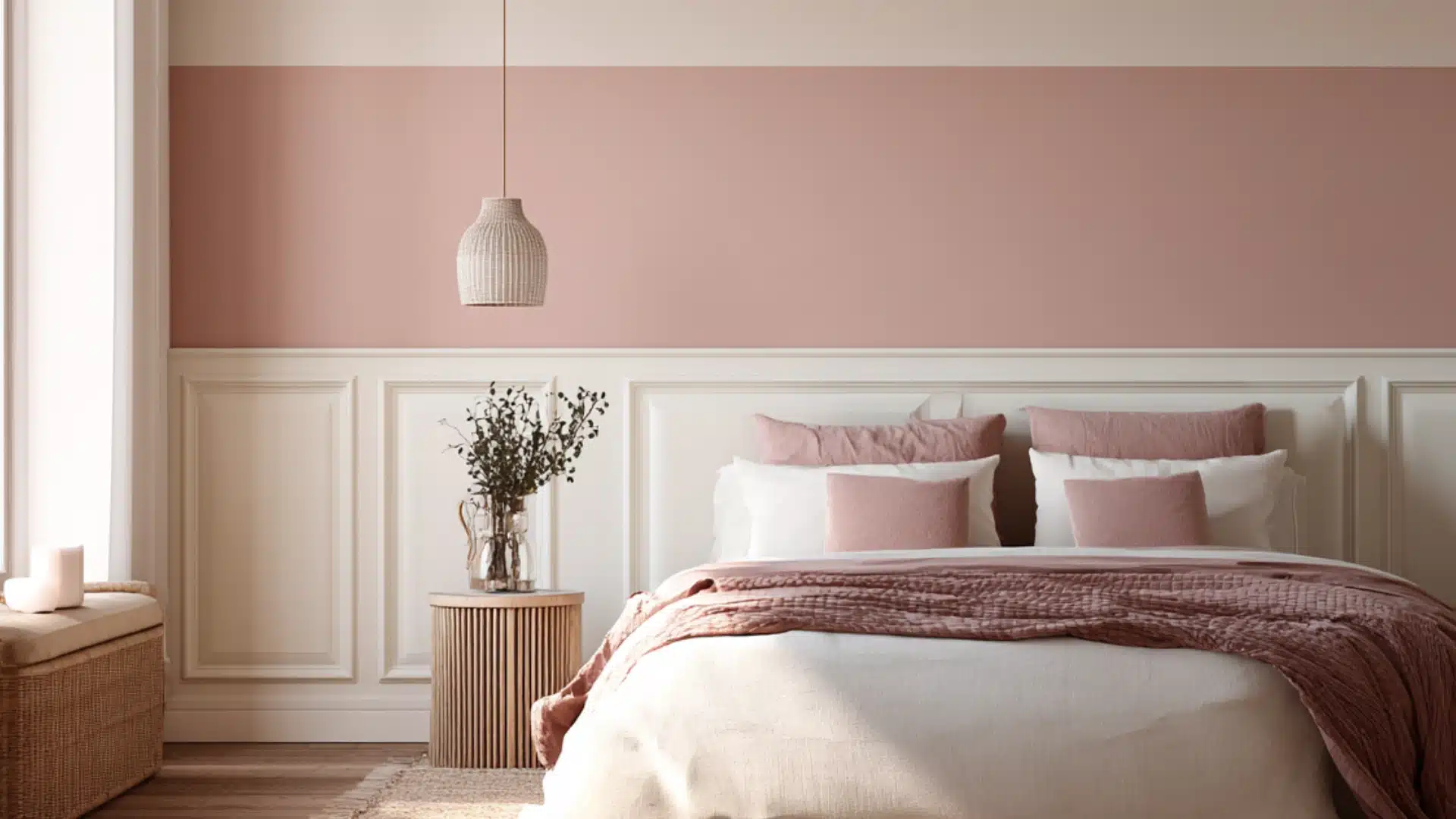
Cream on the lower half and dusty pink above create a soft, comfy atmosphere that feels relaxed rather than overdone.
This bedroom wall color combination suits romantic interiors without going too sweet.
Layer it with warm white bedding and wooden accents to keep the overall look grounded and natural.
6. Sky Blue and White
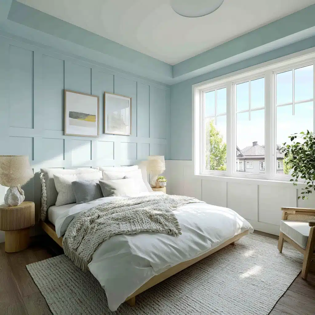
Sky blue on the upper half with white below feels fresh and airy, making it a smart pick for smaller bedrooms that need a sense of openness.
The white lower section reflects light back into the room, while sky blue adds just enough color to prevent the space from feeling sterile.
7. Taupe and Off White
Taupe and off white are one of those combinations that feel quietly put together without much effort.
Taupe on the lower section adds warmth and a soft, earthy quality, while off-white above keeps the room bright and neutral.
Vertical or Horizontal Split Walls
A split wall gives you more flexibility than a standard half-and-half. Run the divide vertically, and the eye travels upward, making ceilings feel taller.
Go horizontal, and the room feels wider and more grounded. The placement of the dividing line changes everything.
8. Mustard Yellow and Grey
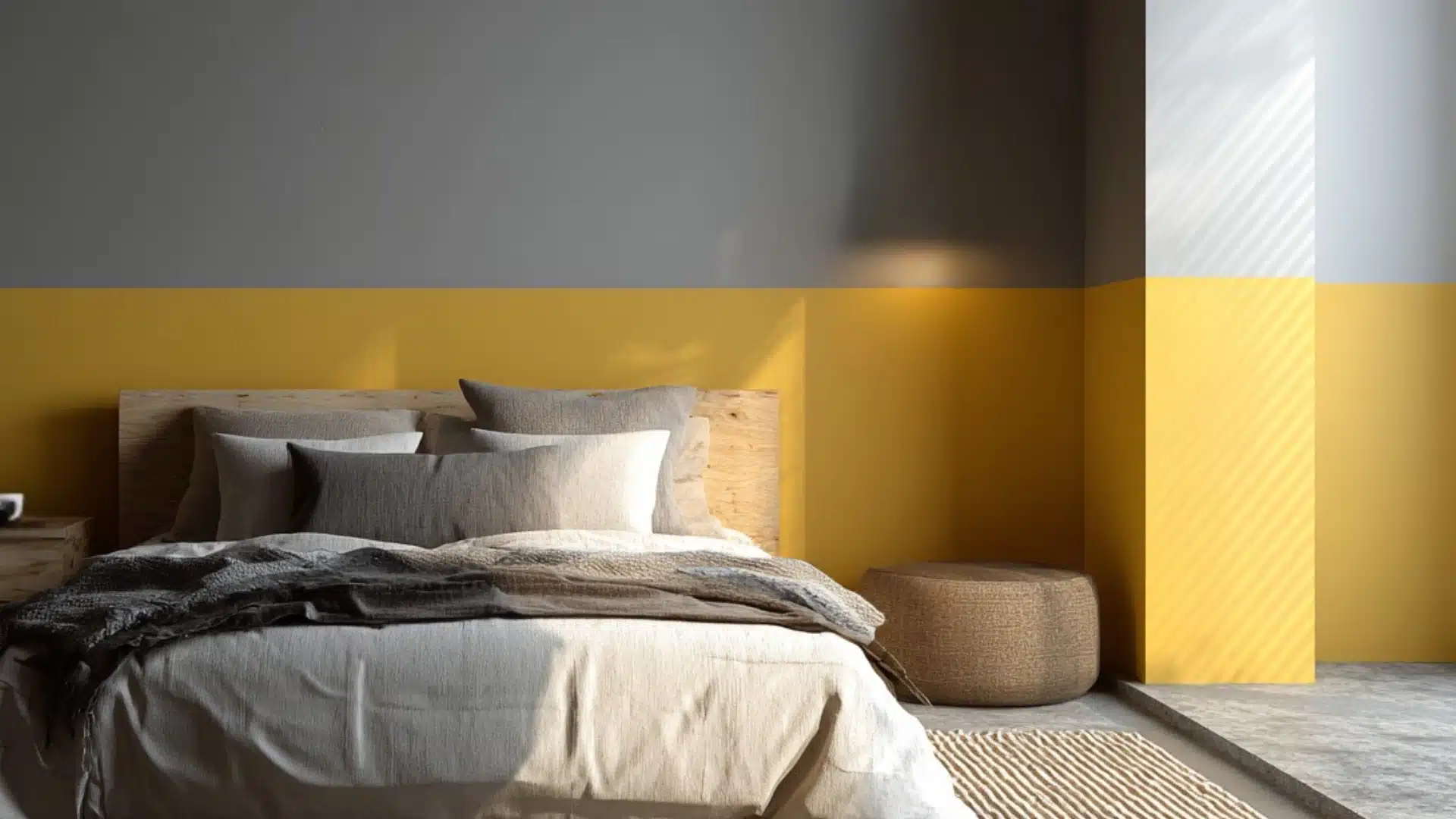
A horizontal split with mustard yellow as a lower band and grey sitting above adds warmth without overwhelming the room.
Mustard is a strong color, and keeping it contained to the lower portion stops it from dominating.
The grey upper section balances it out and brings the whole wall back to a calm, composed finish.
Pro Tip: If one colour is warm and saturated, the second should be cooler and more neutral. Pairing two equally bold shades makes a room feel restless. Always sample test on the wall before committing.
9. Soft Lavender and Grey
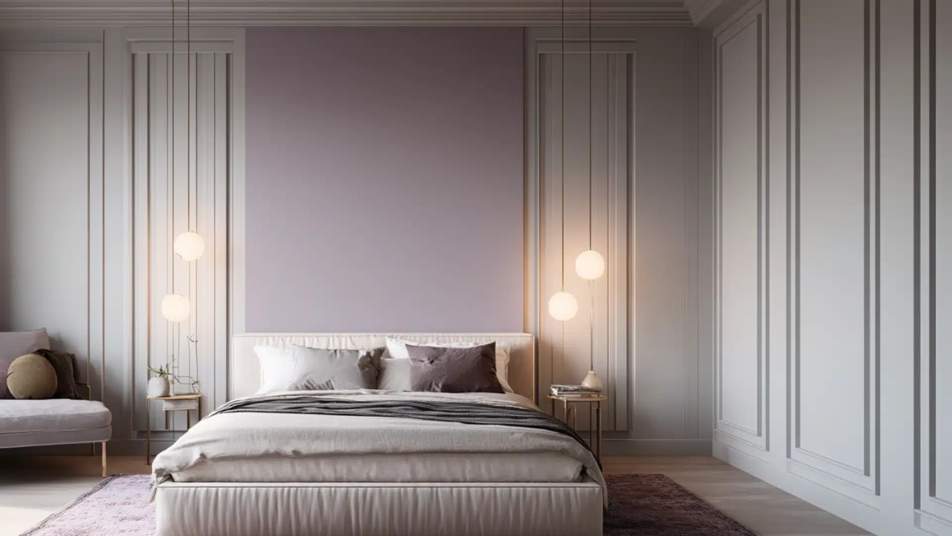
Lavender and grey create a gentle contrast that suits bedrooms designed for rest and quiet.
A vertical or horizontal split between soft lavender and a warm mid-grey works across most furniture styles and sits particularly well with brushed silver or matte white fixtures.
Nothing about this pairing feels forced or overdone, which is exactly why it holds up so well over time.
Geometric and Patterned Designs
Geometric designs apply two colors in shapes rather than sections.
Plan the pattern on paper first, transfer measurements to the wall, and let painter’s tape do the hard work
Press it firmly along every edge and remove it while the paint is still slightly wet for the sharpest lines.
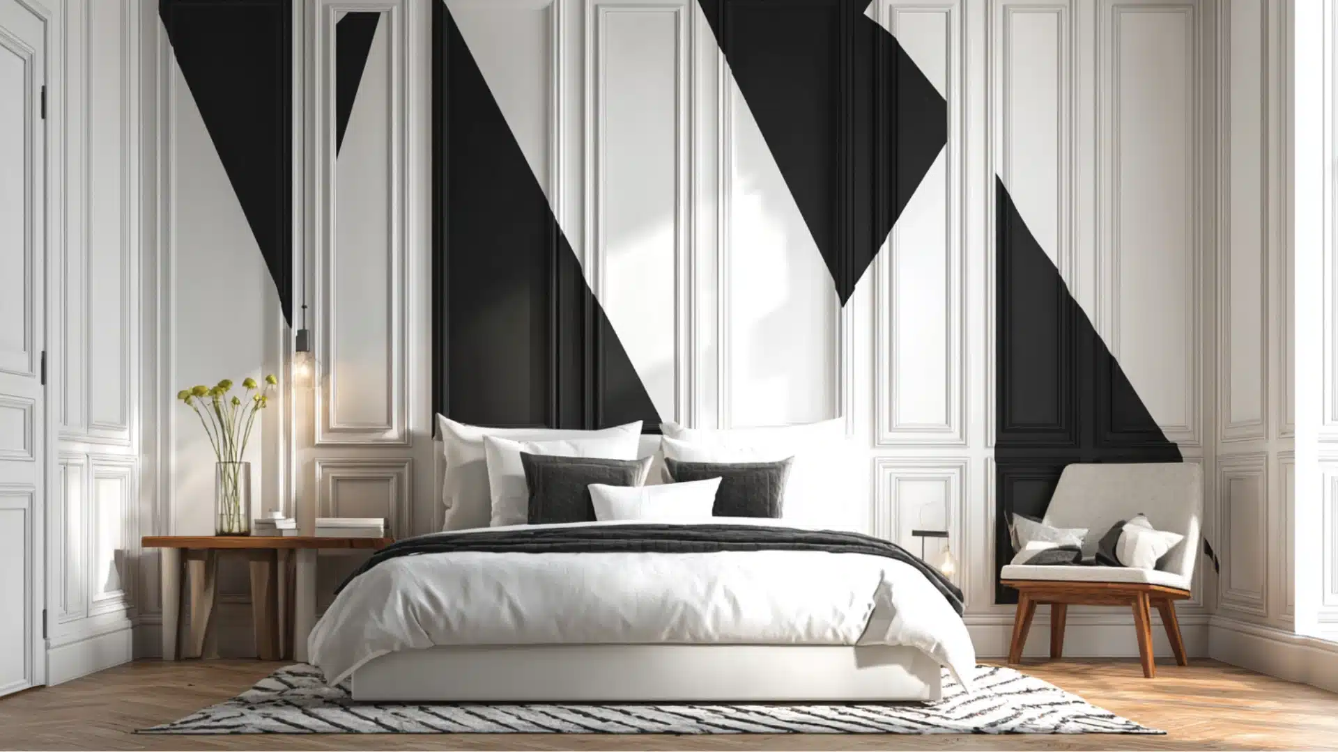
10. Black and White
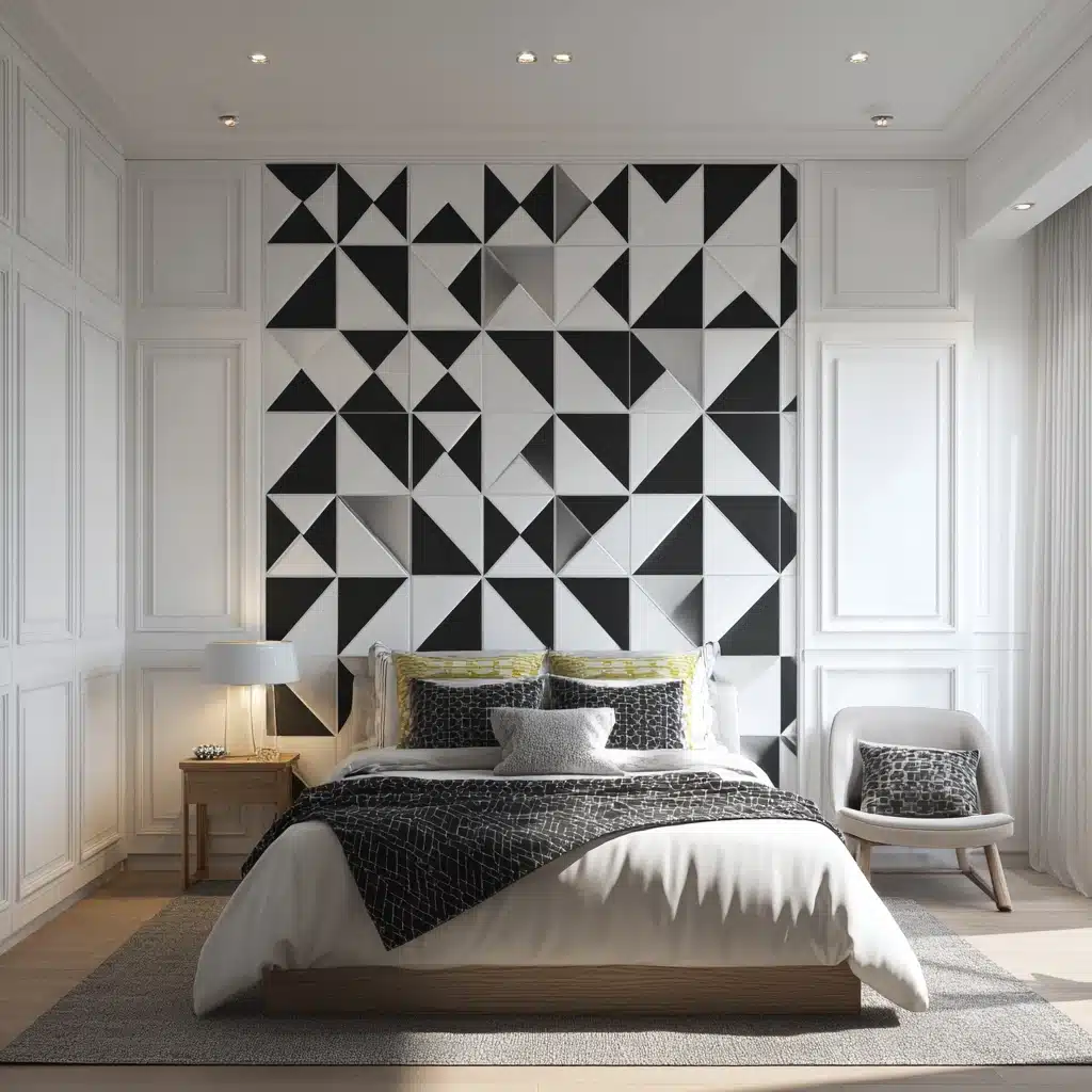
Sharp geometric patterns in black and white create a high-contrast, modern look that feels graphic and intentional.
This is a bold two color combination for bedroom walls that works best when the rest of the room stays simple.
Clean-lined furniture and minimal decor let the wall pattern carry the room without making it feel too busy or visually overwhelming.
11. Blush Pink and Gold
Soft geometric accents in blush pink with gold detailing bring a warm, considered quality to the bedroom without relying on heavy furniture or expensive finishes.
This works particularly well as a headboard wall treatment where the pattern frames the bed as a natural focal point.
Keep the remaining walls in pale blush or warm white to tie everything together without overcomplicating it.
Color Blocking Techniques
Color blocking places two colors in large, deliberate sections to create a strong visual structure.
The shades are placed to frame specific areas, behind the bed, around a window, or along a single panel. It reads best in rooms with clean architectural lines.
12. Terracotta and Cream
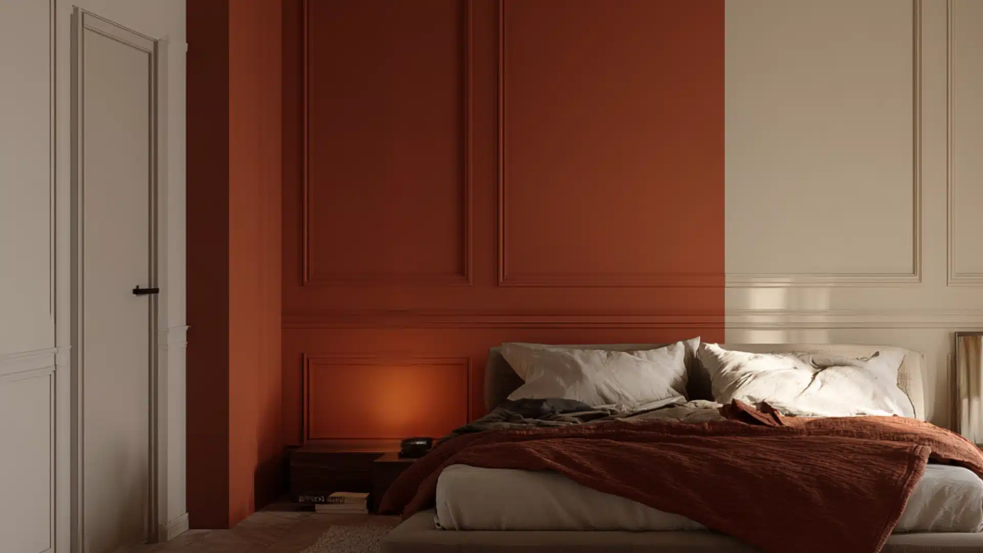
Warm terracotta blocks against cream walls create a grounded, lived in space.
Terracotta pairs naturally with organic textures like cotton, clay, and wood, so the combination feels cohesive rather than forced.
Used as a bold block behind the bed or across the lower section of a wall, it anchors the room without making it feel dark or heavy.
13. Forest Green and Beige
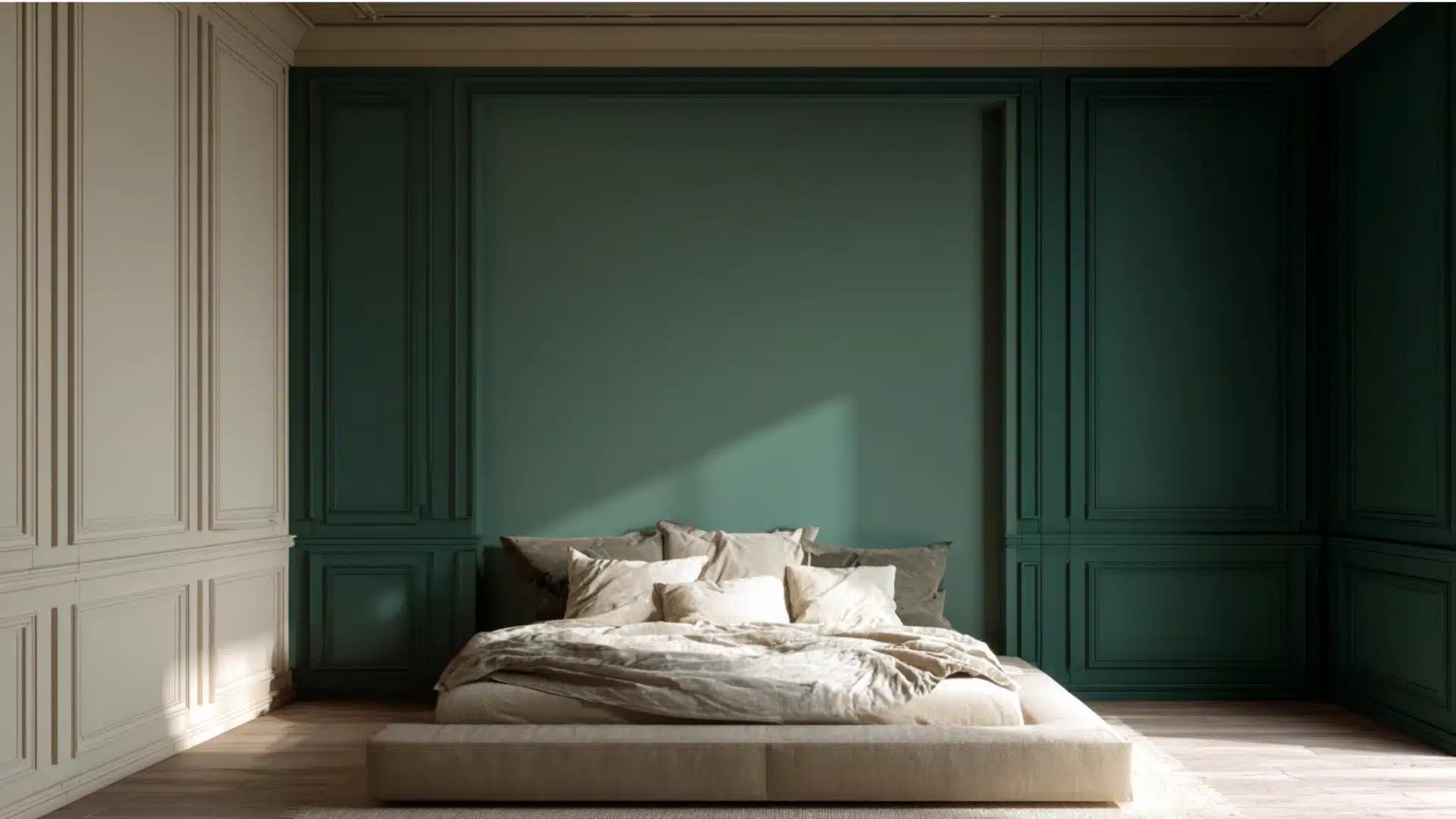
Forest green and beige are bold yet balanced, bringing a natural, relaxing quality to the bedroom.
The green carries enough depth to feel rich and considered, while beige softens the overall effect and prevents the combination from feeling too heavy.
This bedroom wall color combination works best in rooms with plenty of natural light, where the green reads vibrant and alive rather than flat and dull.
New to Bedroom Wall Color Combinations? Follow These Tips First
Starting simple always pays off.
Neutral base colors like warm white, soft grey, or creamy beige work with almost any accent shade, making them the safest foundation when trying a two color combination for bedroom walls for the first time.
Once the base is sorted, picking just one accent color and sticking with it keeps things from getting overwhelming. Adding more than one bold shade too early is where most first attempts go sideways.
A few things worth thinking through before picking up a brush:
- Test colors on the wall first: Large swatches observed across different times of day give a far more accurate read than a small paint chip ever will
- Follow the 60/40 rule: Dominant color on three walls, accent on one
- Check the lighting: Natural and artificial light change how a color reads, sometimes more than expected
- Factor in existing furniture and decor: Wall colors should complement what is already in the room, not clash with it
Starting with a neutral base and a single accent color leaves enough room for contrast without the pressure of getting every decision perfect on the first try.
Paint Finishes and Brands Worth Knowing
The finish you choose affects how a color reads on the wall just as much as the shade itself.
Matte is soft and non-reflective, ideal for calm bedroom spaces. Eggshell adds a slight sheen and holds up well over time. Satin is smooth, durable, and easy to clean.
Semi-gloss and gloss are best saved for trims and doors rather than walls.
When it comes to paint quality, these brands are top picks:
Sherwin Williams
Sherwin-Williams is a reliable coverage with a wide color range across price points
Benjamin Moore
Benjamin Moore is a premium quality brand with rich, consistent finishes that hold their depth over time
Farrow & Ball
Farrow & Ball is a high-end color with a unique depth that is hard to replicate with standard paints
Behr
Behr is a budget-friendly option with solid quality and built-in primer options for easier application
Final Thoughts
The right two color combination for bedroom walls does more than make a room look good.
It changes how the space feels to be in every single day.
There is no perfect formula, but starting with a clear base and testing samples on the actual wall. Pick two colors that feel right for the space, test them properly, and trust the process.
Small decisions like these are what turn a plain bedroom into a space that actually feels like yours.
Frequently Asked Questions
1. Can Two Colors Make a Small Bedroom Look Bigger?
Yes, pairing a light dominant color with a slightly broader accent on one wall adds depth without making the room feel closed in.
2. What is the Best Time to Repaint Bedroom Walls?
Dry seasons with low humidity yield the best results, as paint adheres better and dries more evenly.
3. Should Ceiling Color Match the Bedroom Wall Color Combination?
Not necessarily, keeping the ceiling in plain white or a shade lighter than your dominant wall color helps the space feel taller and more open.