
Finding a neutral that actually feels right is harder than it sounds.
Too white and it feels cold. Too beige and it looks dated. Most neutrals force a choice between the two.
Benjamin Moore Sea Pearl does not!
This soft, greige-leaning shade has shown up time and again on mood boards and in real client spaces, and it keeps delivering. Walls that feel settled, not stark. Calm, not cold.
It sits in that rare middle ground where light can shift it, rooms can change around it, and it still holds its own.
The Sea Pearl vs White Dove debate? That is coming too.
What Color is BM Sea Pearl?
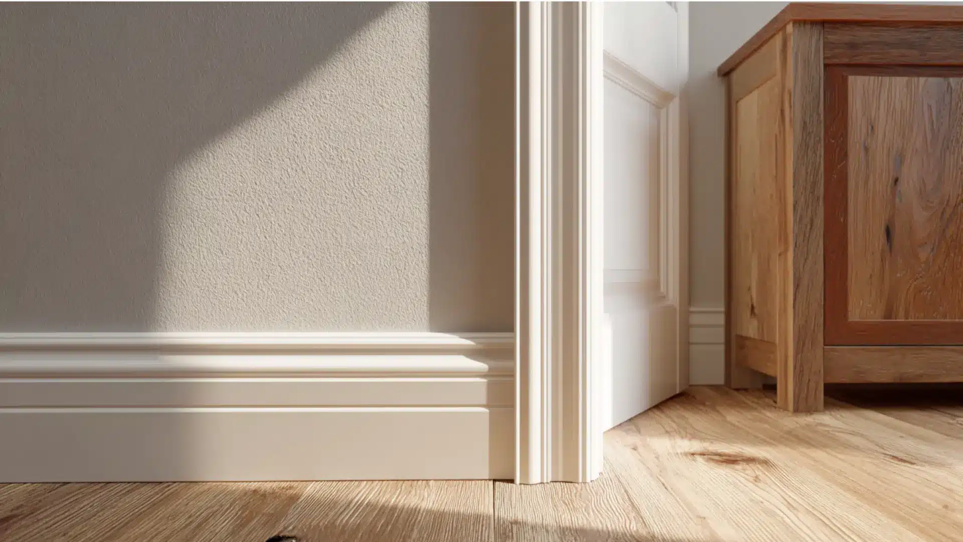
Benjamin Moore Sea Pearl OC-19 is a soft, warm off-white with subtle gray undertones.
It reads as a gentle greige-leaning white, not a bright or crisp white. Benjamin Moore places it in the Off White Collection, and that tells a lot about where it sits on the color spectrum.
Its LRV of 76 means it reflects a good amount of light, keeping rooms feeling open rather than heavy.
The hex value sits around #E7E4D9, a muted off-white that balances soft beige and gray without leaning too hard in either direction.
In most lighting, Sea Pearl feels airy and slightly creamy without going yellow.
It works on walls, trim, cabinets, and exteriors. Warm woods, cool accents, and other neutrals all sit well next to it.
What’s Going On With Sea Pearl’s Undertones?
Sea Pearl carries three undertones working together: soft gray, quiet beige warmth, and a faint green influence.
That combination is what puts it in greige territory rather than plain white or straight beige.
- Soft gray base keeps it from going too creamy or yellow
- Quiet beige warmth stops it from feeling cold or stark
- Faint green influence shows up in cooler or north-facing light
In warm light, the gray and beige balance out, and the color feels settled. In cool light, the faint green surfaces and Sea Pearl read more muted.
This is why pairing matters.
Cool whites on trim will clash with its warm-gray base, and overly yellow tones nearby will fight with its gray.
Hold a Sea Pearl sample next to the trim color before committing. If the trim is a bright or cool white, the clash will show up on the sample before it shows up on the wall.
Benjamin Moore Sea Pearl vs White Dove: Key Differences
Sea Pearl and White Dove are close, but they are not the same.
Sea Pearl is softer, deeper, and more muted with a greige base. White Dove is brighter, creamier, and the stronger pick for trim and ceilings.
| Feature | Sea Pearl OC-19 | White Dove OC-17 |
|---|---|---|
| Undertone | Warm greige, beige-gray | Warm white, soft yellow-gray |
| LRV | 76 to 78 | 83 to 85 |
| Brightness | Muted, slightly deeper | Lighter, more reflective |
| Warmth | Soft, grounded | Cleaner, creamier |
| Trim and Ceilings | Less ideal | Strong choice |
| Soft Muted Walls | Excellent | Good, reads whiter |
| Earthy Interiors | Very strong match | Works, less earthy |
When working on a project where the client wants white walls but not that white look, Sea Pearl is the first shade that goes on the mood board.
White Dove gets saved for the trim.
That combination alone has solved more “it feels too stark” complaints than any other pairing.
Since Sea Pearl carries a warm gray-beige base, the trim needs to stay in the warm family to avoid an undertone clash.
Bright or cool whites will fight it, making both colors look off. Benjamin Moore White Dove OC-17 is the most reliable match.
It is warm enough to complement Sea Pearl without competing with it.
How does Sea Pearl Look in Different Lighting Conditions?
Sea Pearl does not look the same twice, and that is actually what makes it a dependable choice.
The color responds to its environment instead of fighting it, which is exactly what a good neutral should do.
- Natural daylight: Stays soft and balanced, sitting comfortably in its greige zone without pulling too warm or too cool
- Morning light: Cooler light brings those gray undertones forward, and the color reads more neutral
- Evening with warm artificial light: Shifts slightly creamier, and the whole room feels more settled
- North facing rooms: The cooler, muted side of Sea Pearl comes out more
- South-facing rooms: Feel warmer and more grounded throughout the day
No single lighting condition makes it look wrong. It just shifts, and each version of it works.
Designer point of view: Always sample Sea Pearl on two walls, one that gets direct light and one that does not. It reads differently enough that a single swatch on one wall will not tell the full story.
Where Benjamin Moore Sea Pearl Actually Works?
Sea Pearl is one of those colors that moves well from room to room without needing a different justification each time.
It adjusts to the space, the light, and the materials around it.
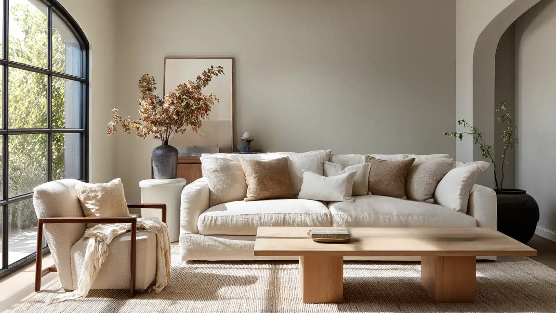
1. Living Rooms
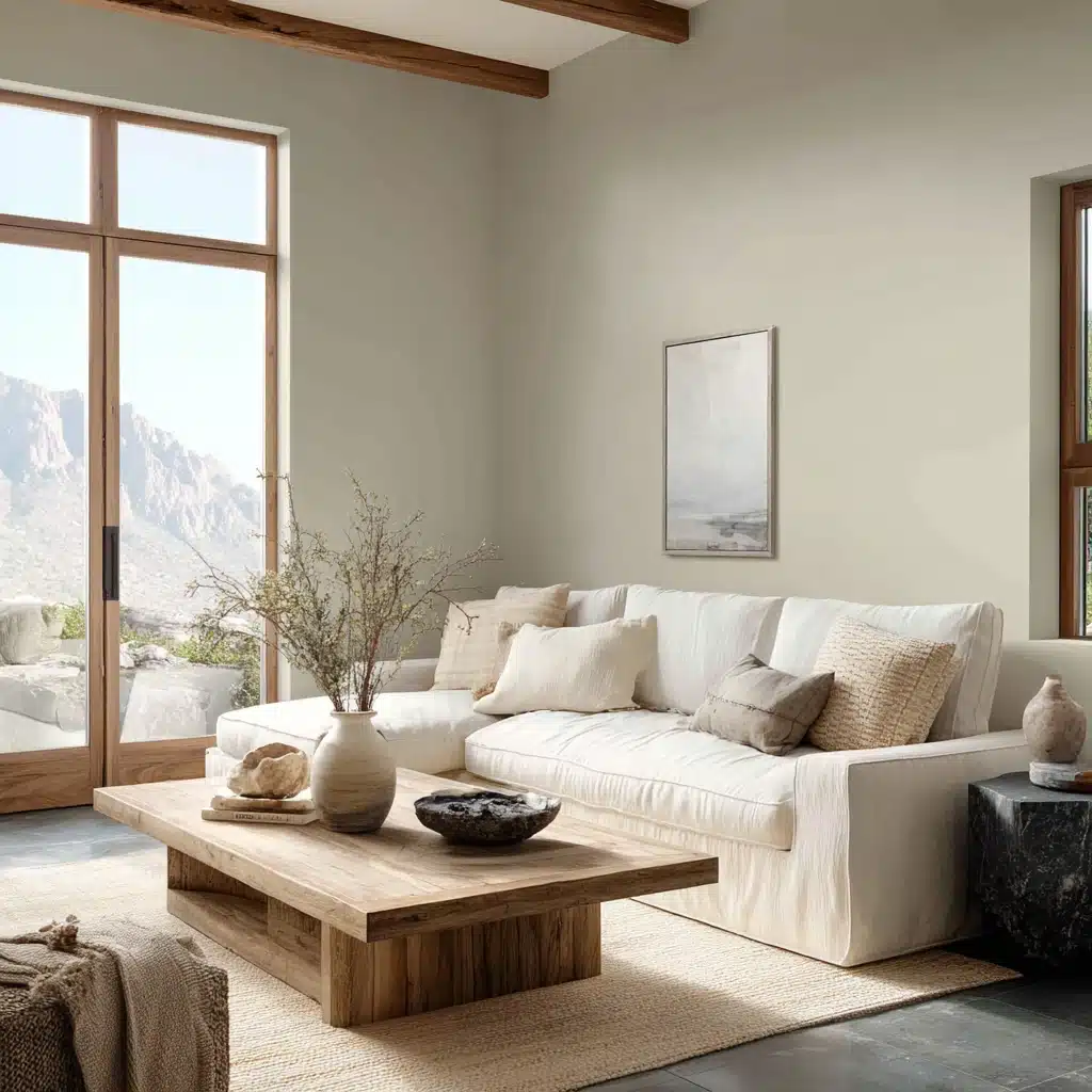
Sea Pearl on the living room walls creates a backdrop that does not compete with furniture or art.
It works with linen sofas, wood coffee tables, and stone accents without needing much help. The greige base keeps the room feeling pulled together even when the decor is mixed.
Pairing Sea Pearl with bright or cool whites on trim creates an undertone clash that makes both colors look off. Stick to warm whites like White Dove for trim work.
2. Bedrooms
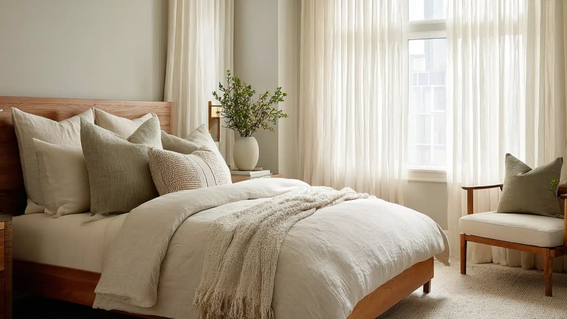
In bedrooms, Sea Pearl keeps things calm without feeling empty.
The slight gray in it prevents the room from going too yellow or too heavy at night. It works well with:
- Warm wood furniture
- Soft linen bedding
- Muted greens and earthy accents
- Aged brass or matte black hardware
The result is a room that feels settled and easy to be in without looking like it tried too hard.
Skipping the test sample in bedrooms with small or north-facing windows. Sea Pearl can read noticeably cooler in low light, and that shift is worth checking before committing to a full room.
3. Kitchens: Works on Cabinets and Walls Both
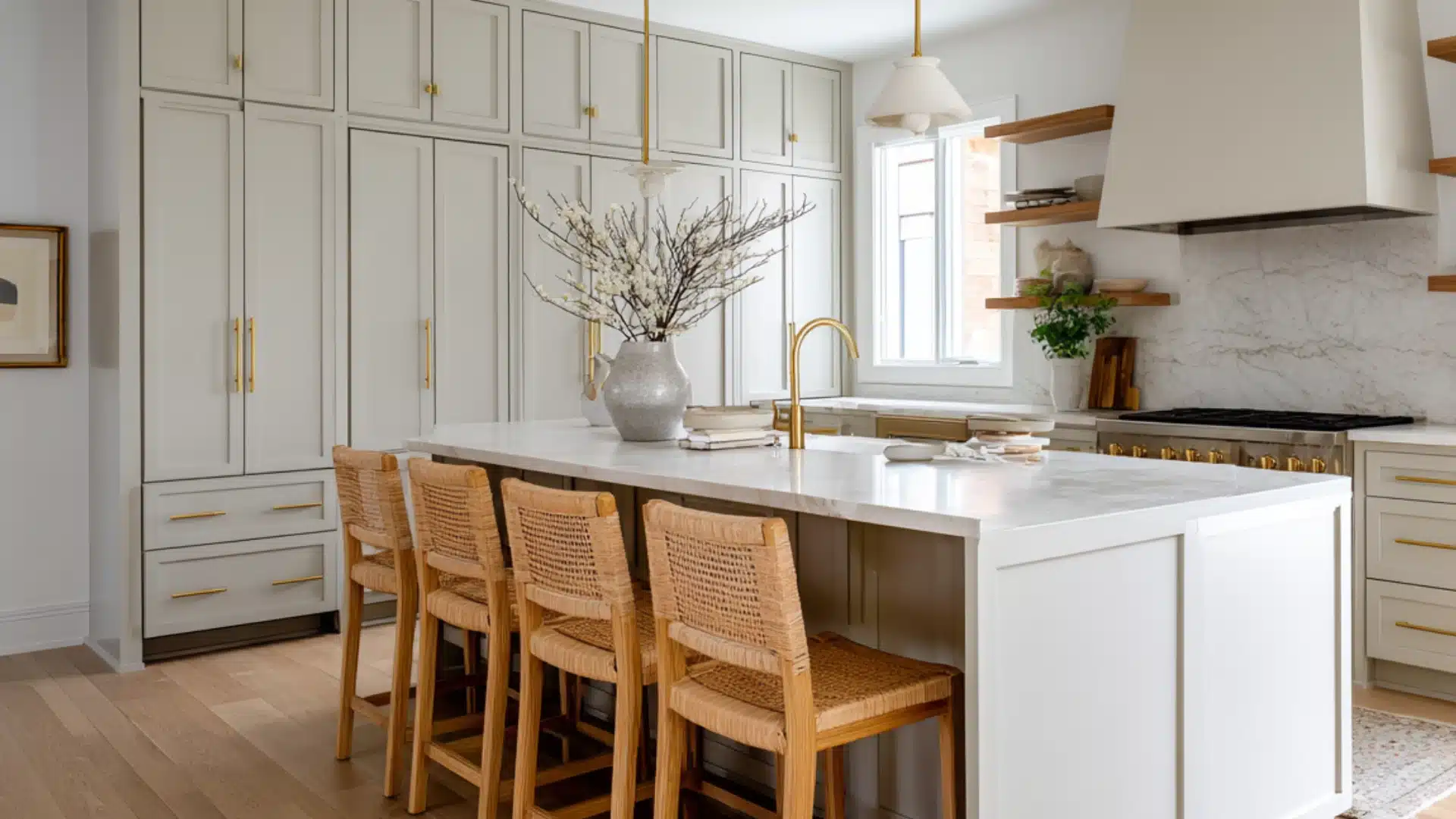
Sea Pearl is not just a wall color. In kitchens, it pulls double duty and does both jobs well.
On cabinets, it gives a softer alternative to stark white without crossing into obvious greige territory.
It reads clean enough for a kitchen but has just enough depth to feel intentional. It sits especially well next to brass or unlacquered hardware, warm wood open shelving, and stone or quartz countertops in cream, gray, or taupe.
On walls, it keeps the kitchen feeling grounded without making the space feel closed in.
Paired with subway tile in warm white or soft gray, the whole kitchen feels cohesive without looking matchy.
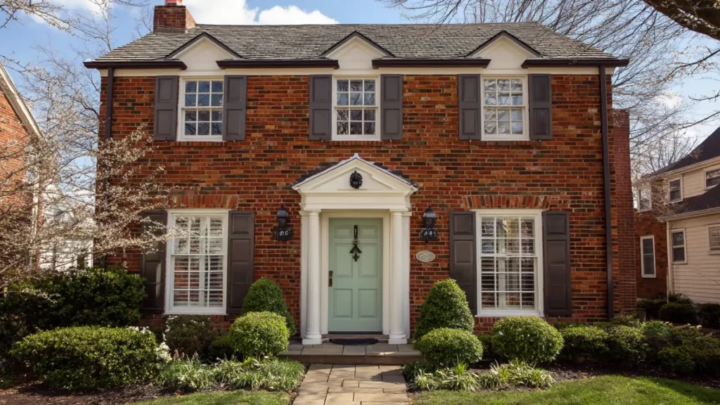
4. Exteriors
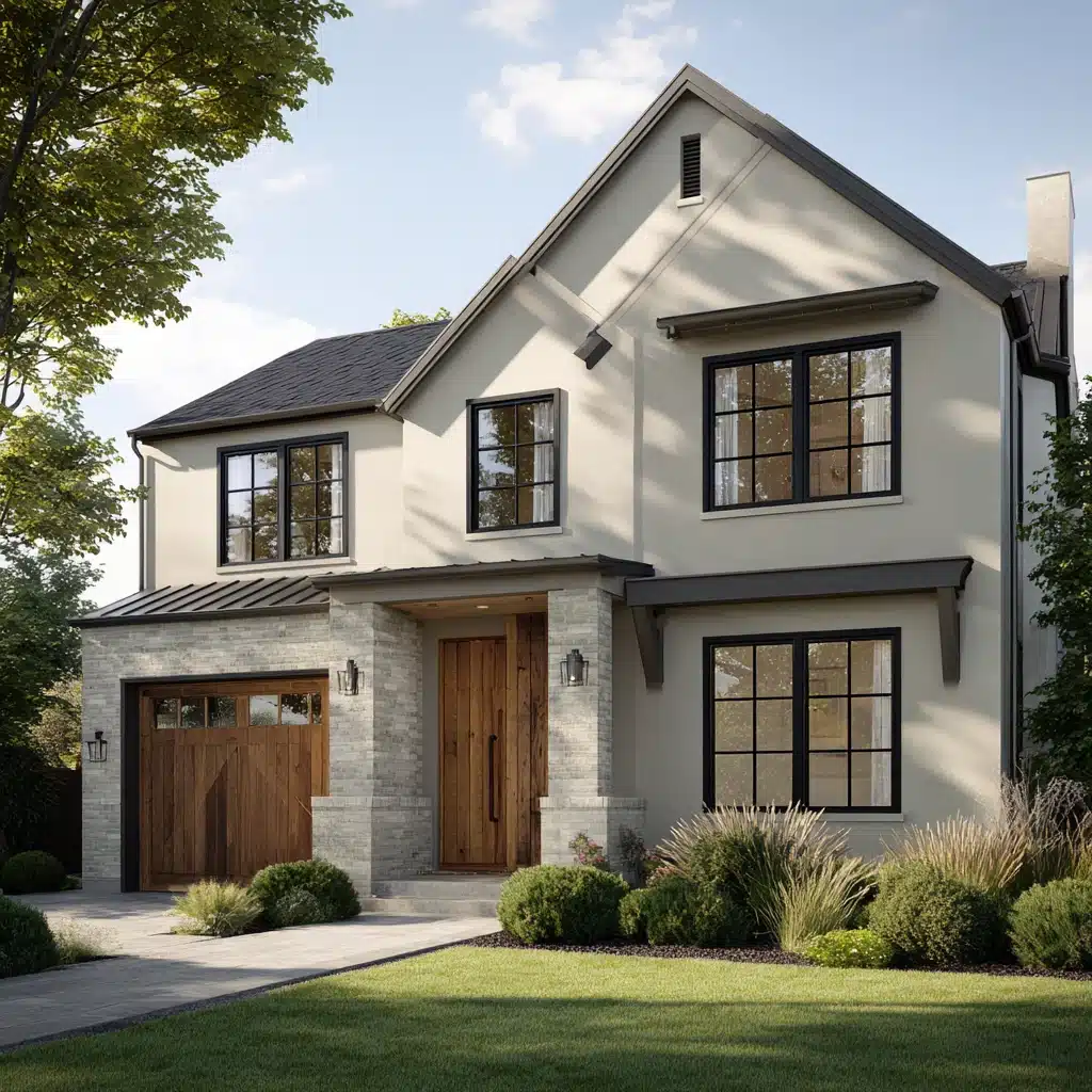
On exteriors, Sea Pearl reads as a soft, warm off-white that feels intentional without being loud.
It holds up in both full sun and shaded areas without shifting into an unflattering tone, which is not something every off white can claim.
It pairs well with:
- Dark trim in charcoal, black, or deep navy
- Natural wood accents on doors or pergolas
- Stone or brick detailing in warm or neutral tones
- Black or aged brass light fixtures and hardware
In full sun, it stays soft and warm. In shaded areas, it holds its greige quality without going muddy. For homes that want a clean exterior that does not feel cold or sterile, Sea Pearl is a solid call.
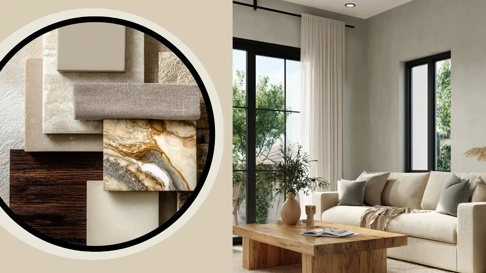
Color Pairings that Work Well with Sea Pearl
Sea Pearl is an easy color to build around. Its gray-beige base does not fight with much. It sits quietly and lets other colors do their thing.
The key is to stay in the same tonal family, warm, muted, and grounded.
1. Warm Neutrals
Taupes, warm tans, and soft browns sit naturally next to Sea Pearl.
They share the same earthy base, so the combination feels cohesive without looking flat.
Good options to look at are Benjamin Moore Pale Oak OC-20 and Sherwin-Williams Accessible Beige SW 7036.
Use these in adjoining rooms or on an accent wall to keep the flow consistent.
2. Muted Greens
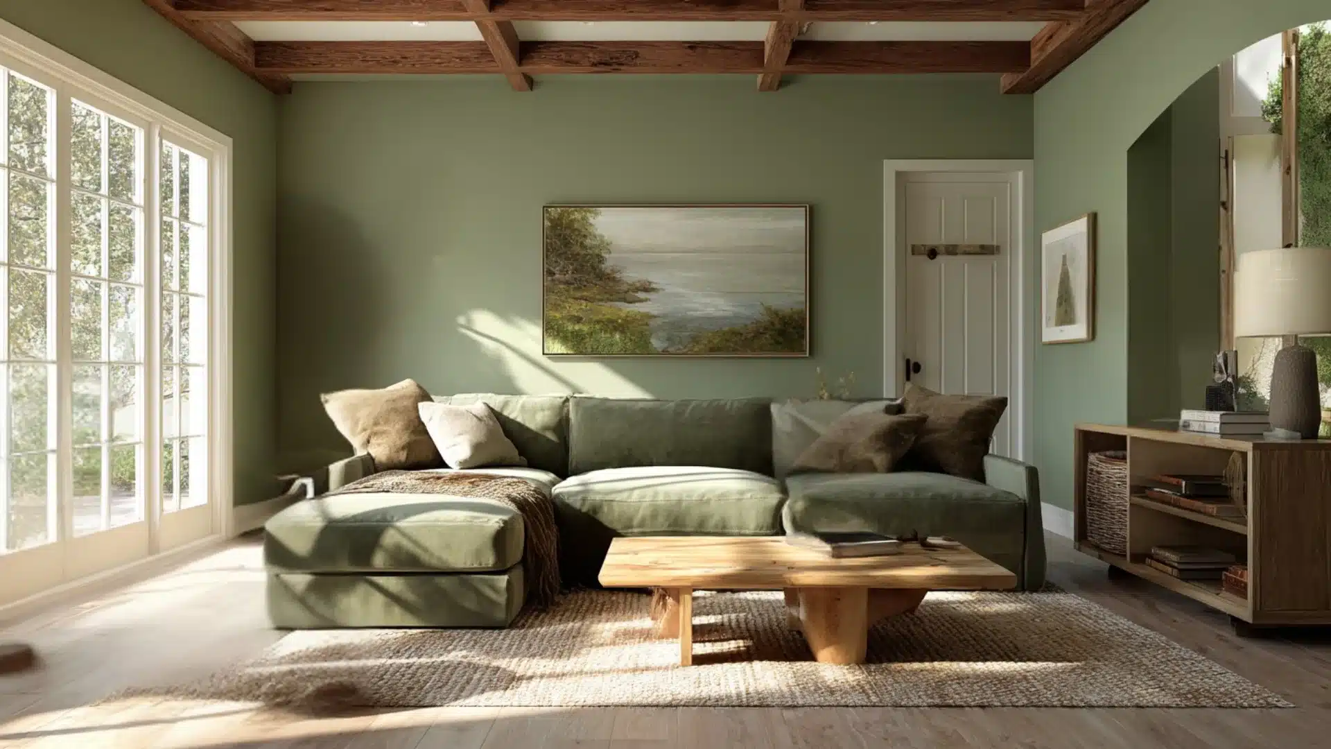
Sage, olive, and soft moss tones work particularly well with Sea Pearl.
The green undertones already sitting in Sea Pearl make this pairing feel intentional rather than accidental.
Benjamin Moore Dried Thyme HC-175 and Sherwin-Williams Sage SW 2860 are both strong picks here. These work especially well as accent wall colors or in soft furnishings like cushions and throws.
3. Deep Moody Accents
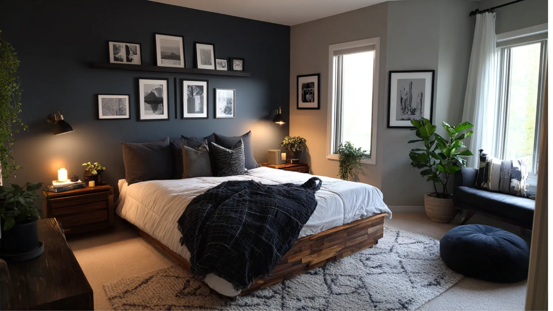
Charcoal, deep navy, and forest green give Sea Pearl something to lean against.
These deeper tones bring out the softness in Sea Pearl without making the room feel heavy.
Used on a single accent wall, in cabinetry, or in furniture, they add contrast without disrupting the calm that Sea Pearl sets up.
4. Warm Woods
Oak, walnut, and other warm wood tones in furniture or flooring sit comfortably next to Sea Pearl.
The warmth in the wood balances the gray in the paint without clashing.
Light oak floors paired with Sea Pearl walls are among the most reliable combinations in neutral interiors right now.
5. Metals and Hardware
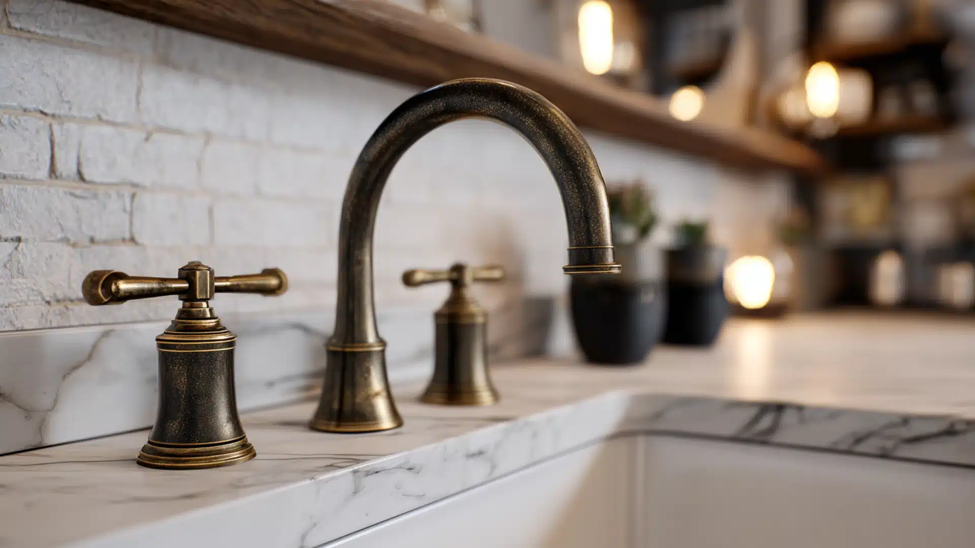
Aged brass, unlacquered bronze, and matte black all work well as accent finishes.
Brushed nickel and chrome can feel too cool against Sea Pearl, so warmer metal finishes are the better call.
In kitchens and bathrooms, especially, the hardware choice can make or break how Sea Pearl reads in the space.
Final Thoughts
Sea Pearl is a reliable, low-drama neutral that works across rooms, lighting conditions, and design styles.
It has enough depth to feel intentional but stays quiet enough to let everything else in the room breathe.
It is the right call for spaces that need soft, grounded walls with warm woods and natural materials. Skip it in rooms with very little natural light or where a crisp, bright white is the goal.
For most spaces, it is one of those colors that just works and rarely needs a second coat of justification.
Frequently Asked Questions
1. Is Benjamin Moore Sea Pearl a Good Choice for Small Rooms?
Yes, with an LRV of 76, it reflects enough light to keep small rooms feeling open rather than closed in.
2. Does Benjamin Moore Sea Pearl Work Well on Ceilings?
It can work on ceilings, but a brighter off-white like White Dove gives a cleaner, lighter result in most spaces.
3. How Many Coats of Paint Does Sea Pearl Typically Need?
Two coats are usually enough for an even finish, especially over a similar neutral base color.
4. Can Sea Pearl be Used in a Bathroom?
Yes, it works well in bathrooms, particularly those with warm lighting and natural wood or stone accents nearby.
5. Does Benjamin Moore Sea Pearl Come in Different Finishes?
Yes, it is available in multiple finishes, including matte, eggshell, satin, and semi-gloss, depending on the surface and room.