
Gray is one of the hardest colors to get right.
Some pull too much blue. Some go flat. Not every gray works in every home.
City Loft by Sherwin-Williams tends to land well, though. It is not too bold. Not too bland. Just steady. It fits modern and traditional spaces equally.
The one thing to know before you choose it?
Lighting changes everything with this color. Here is what you actually need to know.
About SW City Loft: Color Overview
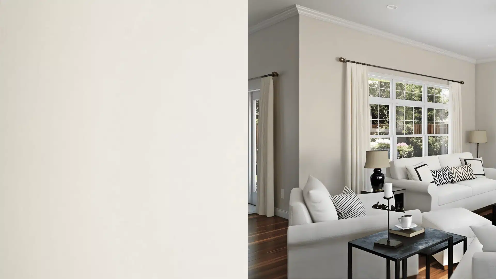
City Loft is a soft, light neutral from Sherwin Williams. The color code is SW 7631 with an LRV of 70. It sits somewhere between gray, beige, and off-white.
That middle ground is exactly what makes it useful in so many homes.
It is not a strong gray. It is not a warm beige either. It reads as a very light, airy neutral that keeps rooms feeling open.
Lighting plays a big role with this one. In bright natural light it can look almost white. In warmer light it pulls slightly toward greige.
Most people tend to use this color in living rooms, bedrooms, and open-plan spaces. It works well when you want a soft backdrop that does not compete with furniture or decor.
It is the kind of color you stop noticing after a while. And that is actually the point.
Undertones
This color leans cool. In certain light, it picks up a faint blue or violet hue. It is subtle, and most people only catch it when comparing swatches directly.
In warm light it settles closer to a soft off-white. In cooler light the gray comes forward a little more.
Before committing, paint a large sample on two or three walls. Check it morning, afternoon, and evening. That step matters more than any swatch card.
SW City Loft Coordinating Colors
City Loft does not fight with other colors. That is one of the reasons it works so well as a base.
Here are six colors that pair well with it without overpowering the softness of the space.
- Pure White works best for trim and ceilings. It keeps things clean and crisp without feeling cold.
- Repose Gray adds a soft contrast if you want a slightly deeper tone nearby. Good for accent walls in an open-plan space.
- Drift of Mist is the quietest pairing on this list. It is slightly cooler and lighter. It works well if you want a gentle contrast while keeping the overall space very calm.
- Accessible Beige brings out the warmer side of City Loft. If your room has warm wood floors or earthy furniture, this pairing feels very natural.
- Iron Ore is the strongest option here. Use it for doors, cabinets, or small accents. It grounds the space and gives City Loft something to work against.
- Natural Linen creates a soft layered look. It is a good choice if you want a tonal, neutral scheme that feels relaxed and lived in.
If you can only pick one, Pure White for trim and Iron Ore for accents is the combination that tends to work in the most rooms.
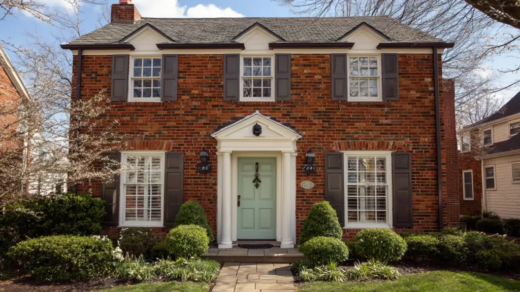
Is City Loft a Good Color for the Exterior of a Home?
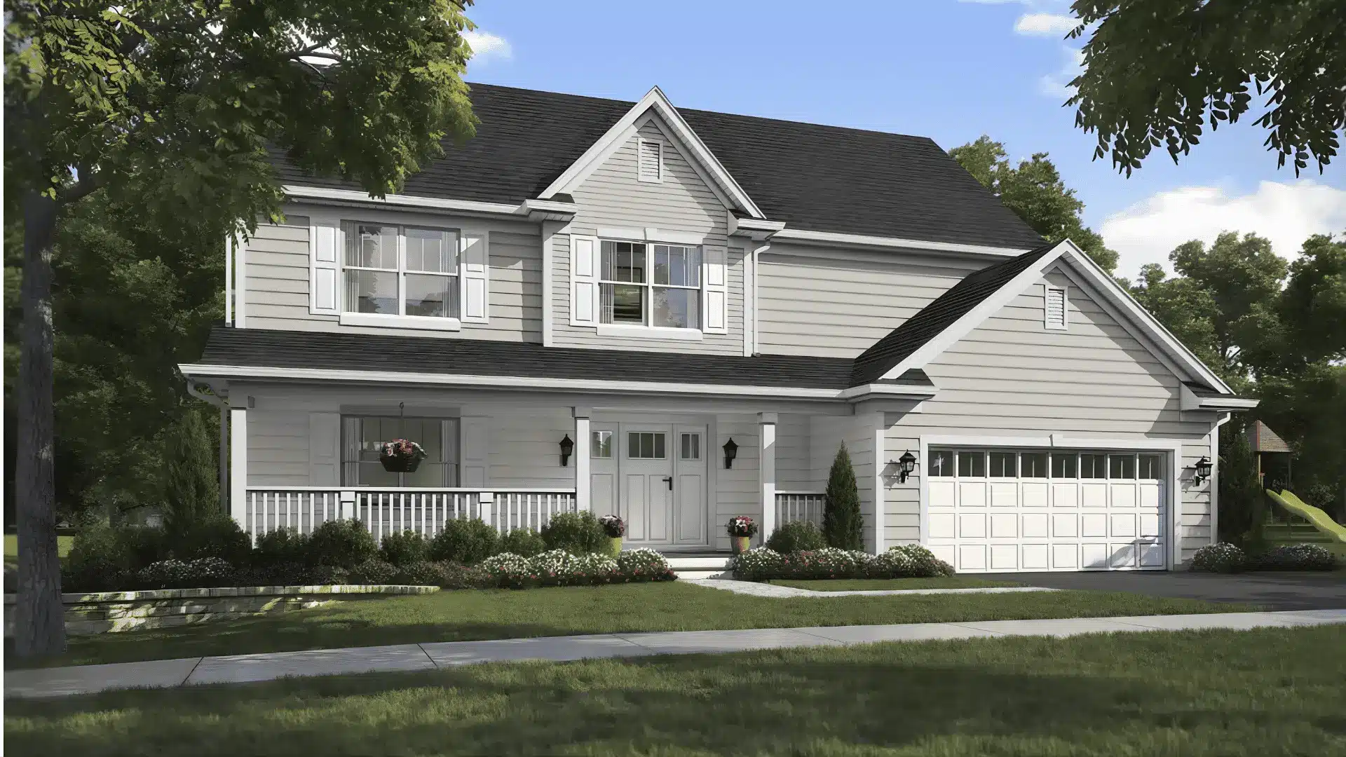
Outside, it looks much lighter than it does indoors. In full sun it can look close to off-white. The gray quality mostly disappears.
So if you fell in love with how it looks on your interior walls, expect a different experience outside.
That said, it is not a bad exterior color. It just works best in the right setup.
Here is when it tends to look good outside:
- Paired with dark trim in charcoal or black
- Against natural stone or brick
- With warm wood accents or shutters
- On cottage-style or modern farmhouse exteriors
- With black door and window hardware for contrast
If you want a clearly gray exterior that holds its color in sunlight, this one will likely feel too light.
But if you want a soft, neutral base that works with a lot of materials, City Loft is worth considering.
City Loft Painted Cabinets
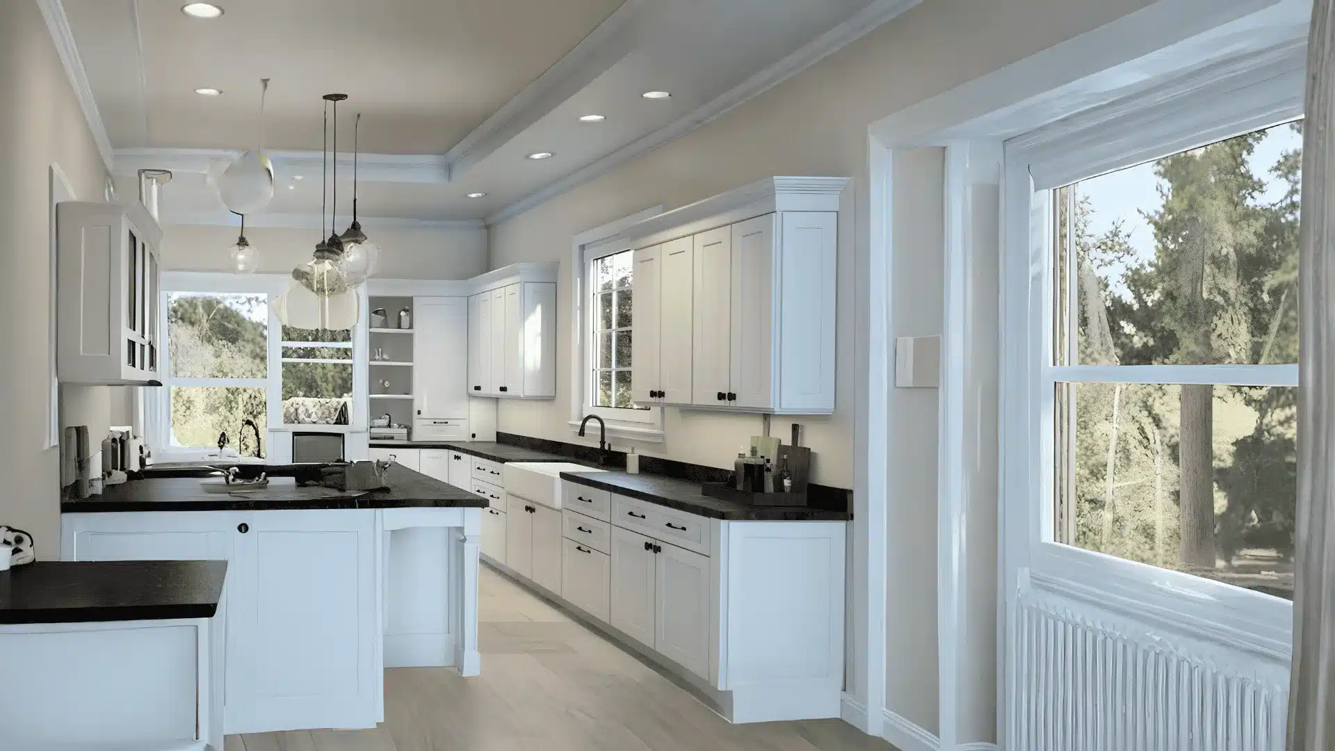
This color on cabinets gives kitchens and utility spaces a soft, understated look.
Not as stark as white. Not as heavy as a true gray. Right in between.
It works well in kitchens, laundry rooms, mudrooms, and built ins. Brass, matte black, and warm wood pulls all pair nicely.
Look at your countertop and flooring together before deciding.
For finish, satin or semi-gloss works best on cabinets. It holds up better over time and is much easier to clean than flat or eggshell.
One thing to know: Cabinets tend to read slightly warmer than walls. City Loft may feel a touch more greige on cabinets than you expect.
City Loft vs Agreeable Gray
Both are popular Sherwin Williams neutrals. But they are not the same color and the difference matters depending on your space.
City Loft is lighter and cooler. Agreeable Gray is slightly deeper and sits warmer. Side by side, Agreeable Gray looks more like a true greige. City Loft looks closer to a pale gray white.
| Feature | SW City Loft | Agreeable Gray |
|---|---|---|
| Color family | Light gray neutral | Warm greige |
| Depth | Very light | Light to medium |
| Undertone feel | Cool to neutral | Warm beige and taupe |
| Best use | Airy, minimal spaces | Traditional or cozy rooms |
| Overall look | Pale, soft, clean | Grounded, warm, familiar |
Want something light and modern? Go with City Loft. Want a room that feels grounded and cozy? Agreeable Gray is the better pick.
Cool finishes suit City Loft. Wood tones and earthy textures sit better with Agreeable Gray. Know your room, and the choice becomes obvious.
Conclusion
City Loft Sherwin-Williams is a reliable, easy-to-live-with neutral.
It works in living rooms, bedrooms, cabinets, and even exteriors when paired well. The key is to test it in your own space before committing. Sample it on a few walls.
Watch how it changes through the day.
If it feels right in your light, it will serve you well. Still unsure? Start with one room and go from there.