
Picking the right white paint is harder than it sounds.
One shade too cool, and the whole room feels cold. One shade too warm and it looks yellow.
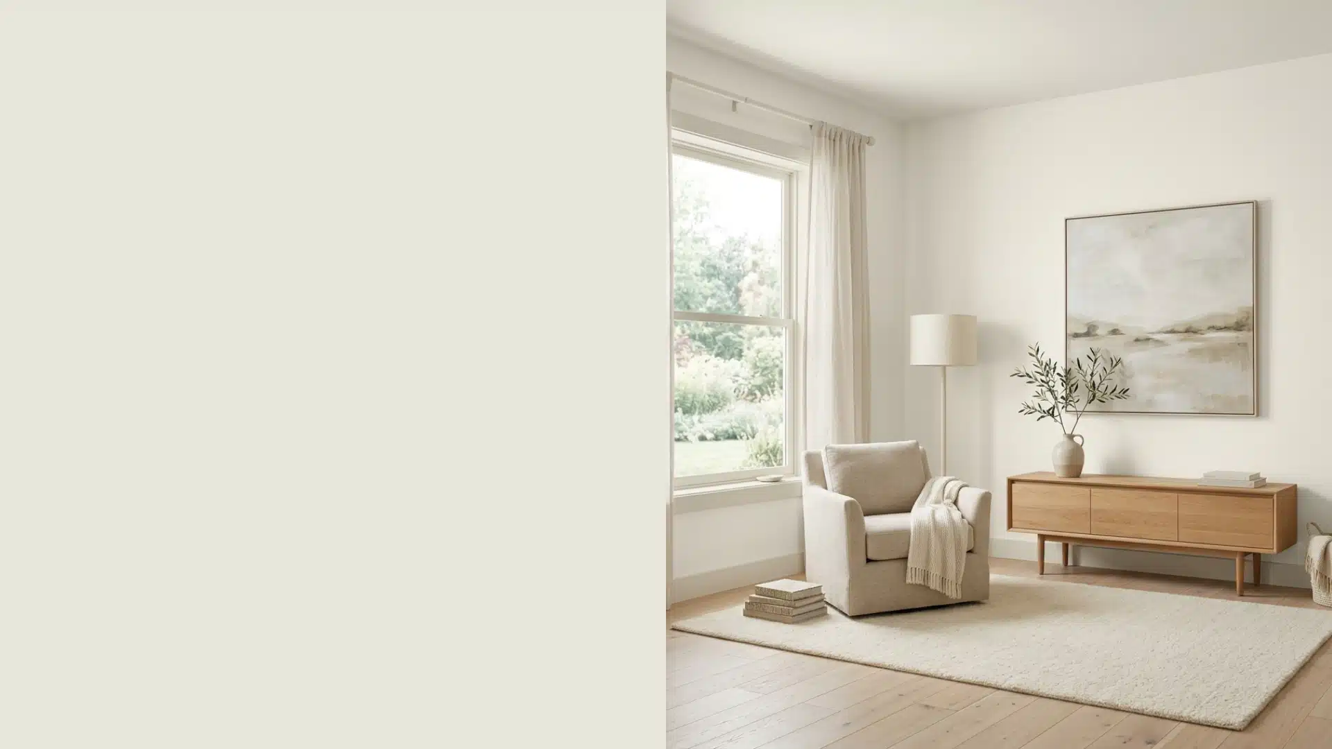
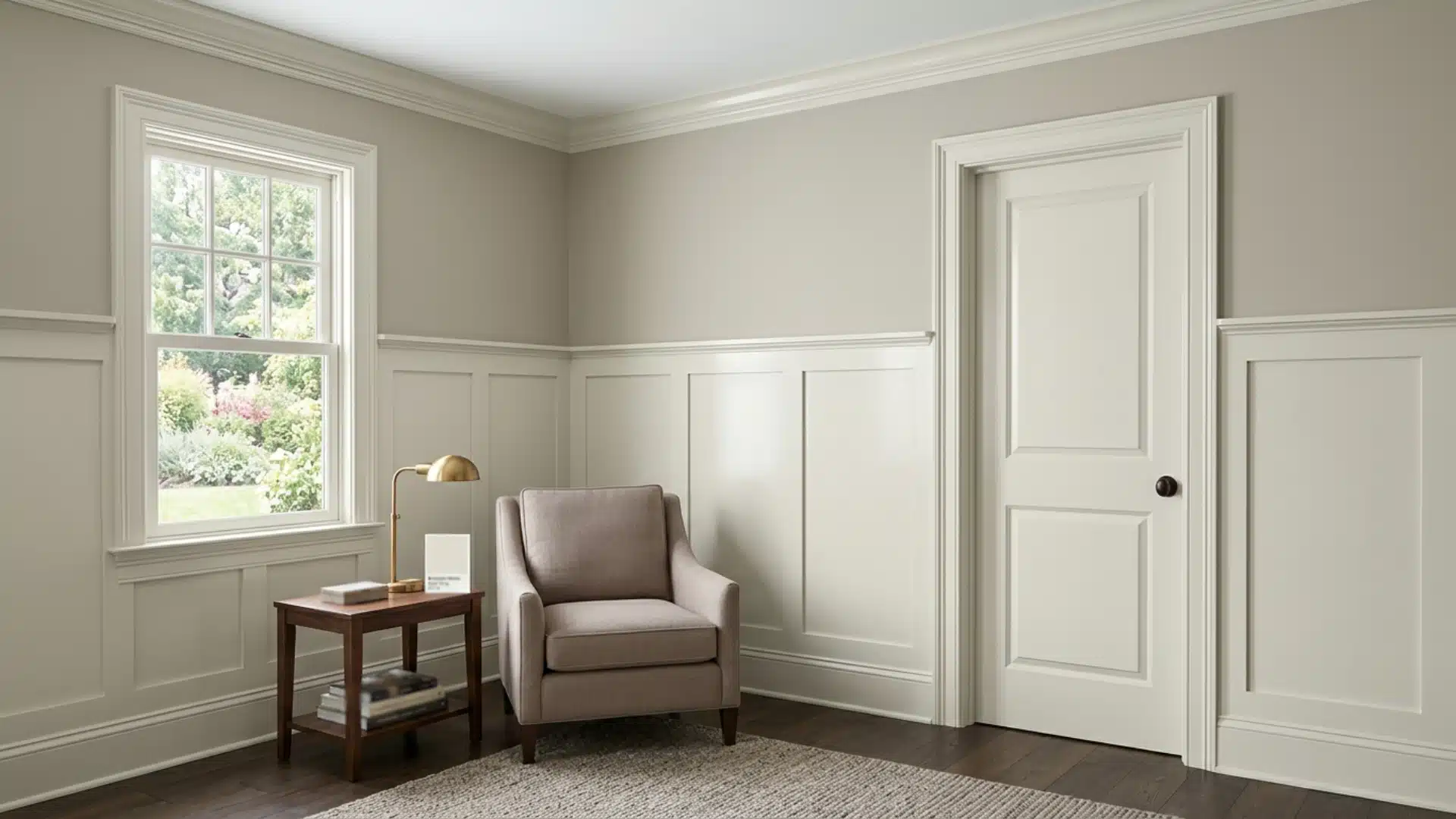
Dove Wing Benjamin Moore sits right in that sweet spot. It’s soft, cordial, and works in almost any room.
Owen and I tried it in my sister’s living room last spring, and I haven’t stopped recommending it since.
Want to know what makes this color so easy to love? Stick around, I’ll cover everything you need to know.
What Color is Dove Wing Benjamin Moore?
Dove Wing (OC-18) sits right between a true white and a soft off-white.
It’s warm without being creamy, and light without feeling stark. The main undertone is a gentle yellow-beige, subtle enough to read as white in most rooms.
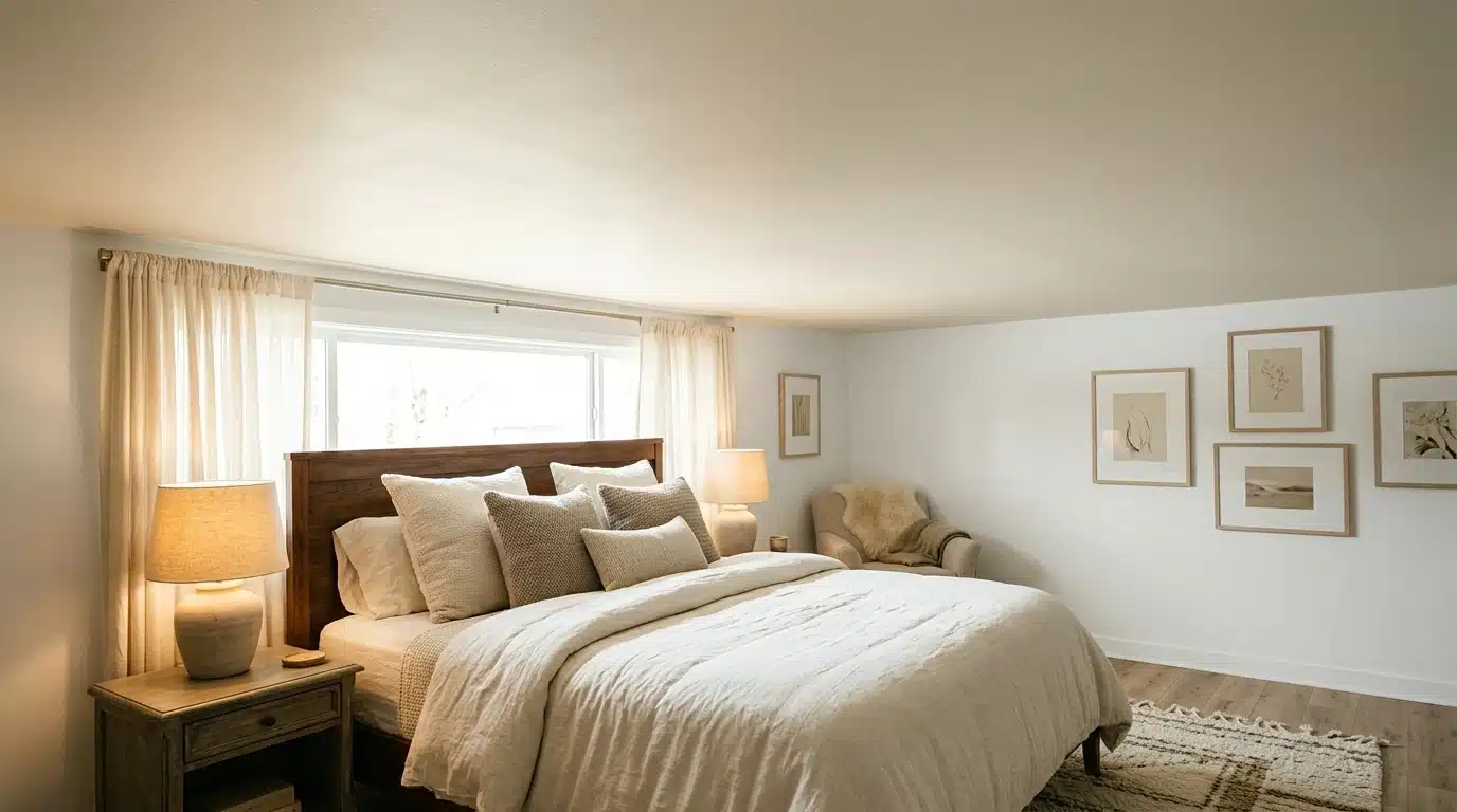
I noticed it first in the north-facing bedroom. The color stayed soft but picked up a slightly cooler tone there.
In the south-facing kitchen, it felt warmer and cozier.
That’s just how Dove Wing works; it responds to light. Same paint, different rooms, slightly different feel.
Something worth keeping in mind before you commit.
Benjamin Moore Dove Wing Undertones Explained
This color has a warm yellow-beige undertone that stays quiet and never takes over.
It doesn’t lean green or pink, which is a big relief when you’re second-guessing swatches.
Here’s what makes it stand out:
- Warm but balanced: It feels cozy without tipping into yellow territory.
- Not creamy: Compared to shades like White Dove or Navajo White, Dove Wing is lighter and less rich.
- LRV of 77.52: That means it reflects a good amount of light, making it a solid pick for smaller or darker rooms.
It’s that middle-ground white that most people spend weeks searching for.
How Dove Wing Shows up in Different Lighting and Directions
Lighting changes everything. Here’s a quick breakdown of what to expect in different conditions.
| Lighting / Direction | How Dove Wing Looks |
|---|---|
| North-facing rooms | Cooler and softer, slightly muted |
| South-facing rooms | Warmer and cozier, more inviting |
| East-facing rooms | Fresh and warm in the morning, cooler by afternoon |
| West-facing rooms | Picks up golden heat in the evening |
| Natural daylight | Reads as a clean, soft, warm white |
| Warm artificial light | Shifts slightly more beige and creamy |
| Cool white light bulbs | Stays closer to a true white |
| Low light conditions | Feels deeper and more off-white |
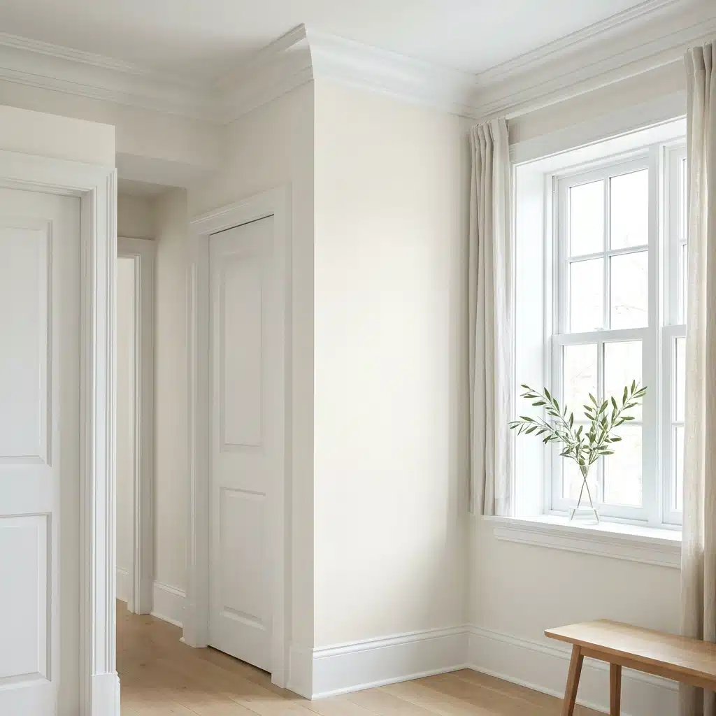
Where to Use Dove Wing Benjamin Moore in Your Home
This is one of those colors that moves well through a home. I’ve seen it work in so many different spots, and it rarely disappoints.
Walls and Living Spaces
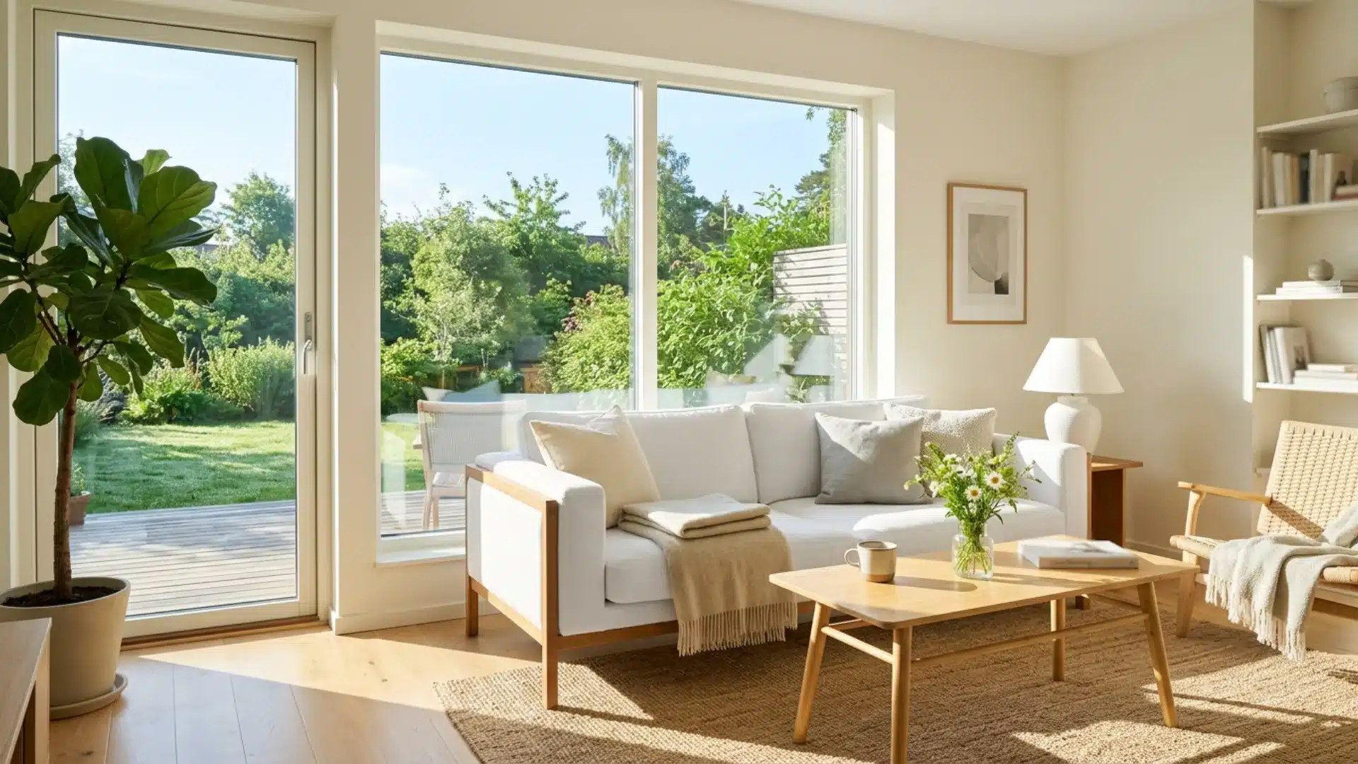
Dove wings on the walls make a room feel open and calm.
It works well in living rooms, bedrooms, and hallways.
The warm undertone keeps it from feeling cold or flat. I have seen it in our neighbors’ living area, and it made the space feel bigger without losing that cozy, lived-in feel as they wanted.
Kitchen Cabinets
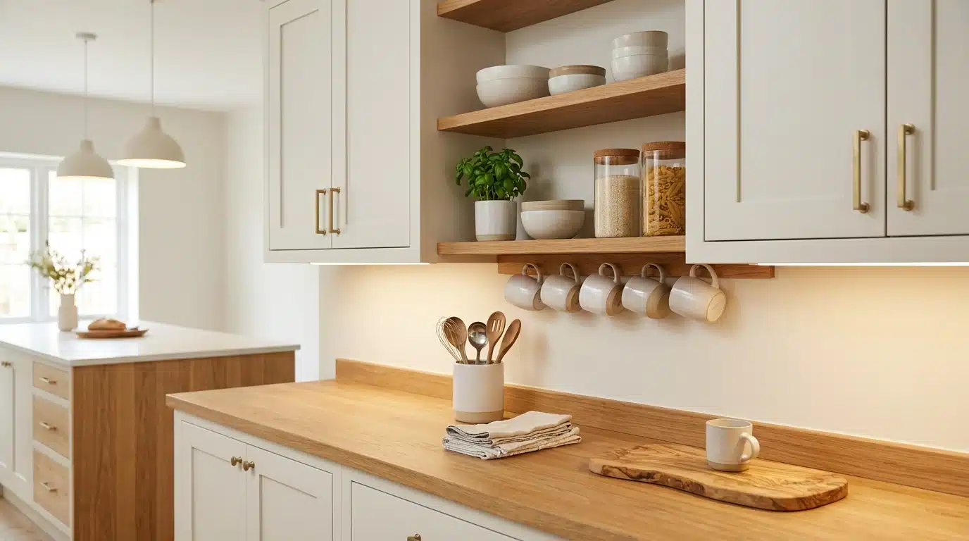
Painted kitchen cabinets in Dove Wing look clean without being too stark.
It pairs well with both wood and stone countertops. The heat in the color keeps white cabinets from looking clinical.
I’d say it’s one of the safest cabinet colors you can choose, especially in a kitchen that gets good natural light.
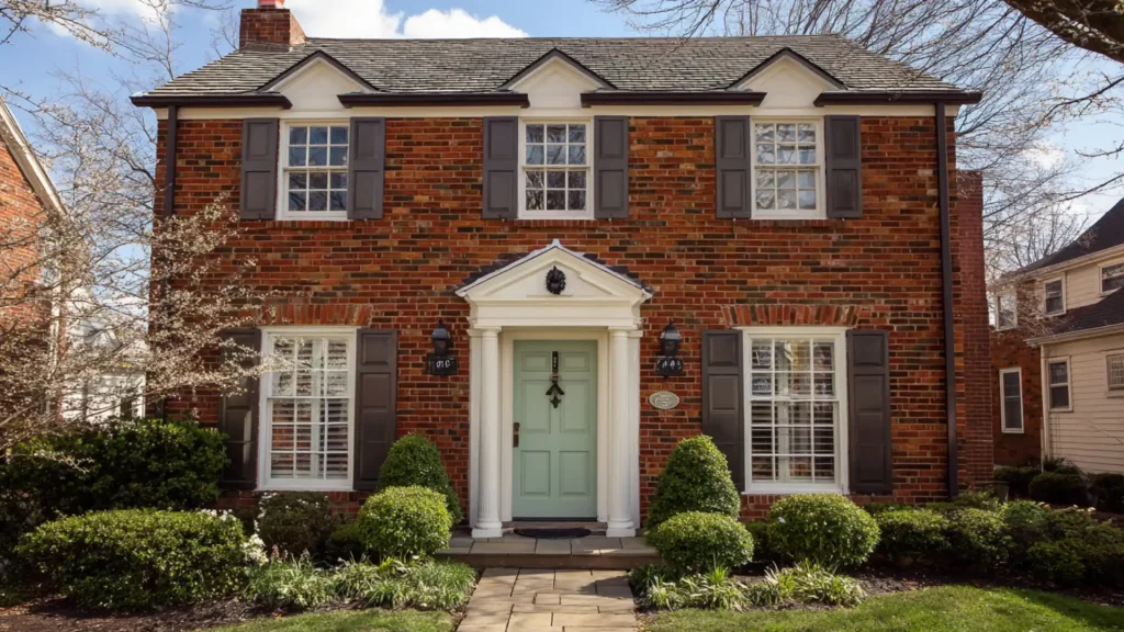
Exterior Use
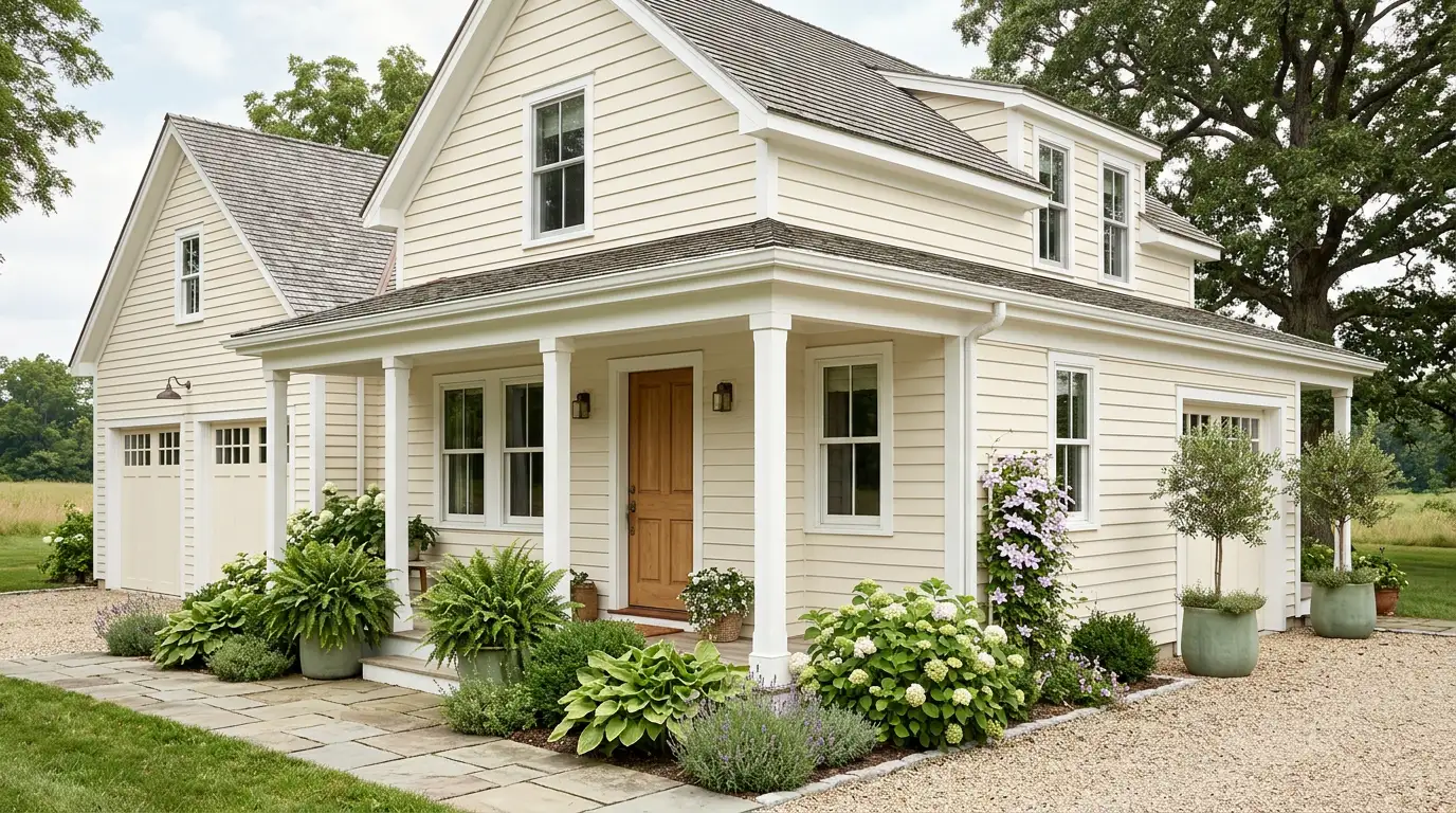
Dove Wing Benjamin Moore holds up nicely as an exterior color, too. It gives a home a soft, classic look that suits both older and newer builds.
It pairs well with white trim and natural wood accents.
Test a large swatch on different walls before choosing an exterior; lighting at different times of day can change how the color appears.
Ceilings
Dove Wing on ceilings is something I didn’t expect to love, but I do. It adds just enough heat to keep the ceiling from looking stark white. It works especially well in rooms with white or off-white walls.
The soft tone ties everything together without making the ceiling feel heavy or low.
Trim and Molding
Using Dove Wing on trim is a great way to get that tonal, layered look.
It works best when the walls are a slightly deeper shade. Owen and I tried this in our friend’s place, and it gave the space a really pulled-together feel.
Just make sure you use a semi-gloss finish; it makes the trim pop just enough.
Dove Wing Benjamin Moore vs Other Similar Shades
Not sure how Dove Wing stacks up against other similar shades? Here’s a quick side-by-side to help you decide.
| Color | Undertone | Warmth | Best For |
|---|---|---|---|
| Chantilly Lace OC-65 | Cool, crisp white | Very cool | Modern, high-contrast spaces |
| Simply White OC-17 | Soft warm white | Slightly warm | Bright, airy rooms |
| Cloud White OC-130 | Warm creamy | Warm | Traditional, cozy spaces |
| Ballet White OC-9 | Soft yellow-beige | Medium warm | Transitional style homes |
| Swiss Coffee OC-45 | Creamy yellow | Very warm | Traditional, cozy interiors |
Swiss Coffee runs noticeably richer and creamier than Dove Wing. If Dove Wing feels too subtle, Swiss Coffee is the next step up.
Benjamin Moore Seapearl vs Dove Wing – Which Bestseller Fits Your Space?
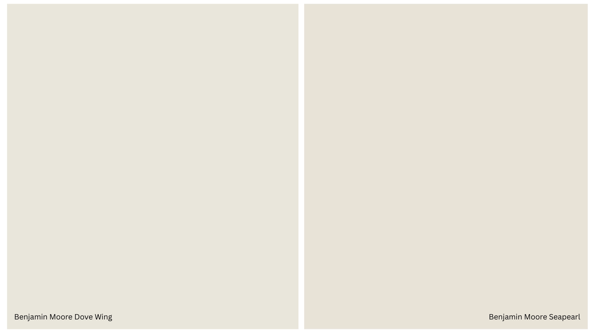
Both are beautiful whites, but they’re not the same.
Knowing the difference saves you from having to repaint twice. Owen and I actually tested both in our hallway, and the difference was clearer than we expected.
Undertones
Dove Wing pulls warm yellow-beige.
It’s subtle, but you’ll notice it against cooler whites. Seapearl leans toward a neutral palette with a slight greige quality, cooler and more balanced overall.
In rooms with lots of natural light, Seapearl can almost look like a true white.
Brightness
Seapearl feels crisper and sharper on the wall. It works well in spaces where you want a clean, fresh finish.
Dove Wing feels softer and more relaxed, especially in natural light.
It doesn’t jump off the wall; it settles in quietly, which is exactly what some rooms need.
Which One Feels Warmer?
Dove Wing wins here. It feels cozier and more inviting, particularly in north-facing or lower-light rooms.
Seapearl stays more neutral across different lighting conditions. So if your room shifts a lot through the day, Seapearl holds steadier while Dove Wing gets warmer as the light changes.
Best Use Cases
They sit close on the swatch card. But on the wall, they tell two very different stories.
- Choose Seapearl for a clean, modern look that remains neutral in most lighting conditions.
- Choose Dove Wing for a warm white that feels lived-in and comfortable.
Always test both before deciding; a small sample can save you a lot of time and money.
Top 4 Color Pairings with Dove Wing Benjamin Moore
The right pairings can make it look sharp, warm, or grounded, depending on what you’re going for.
Trim in White or Off-White
Bright white trim next to Dove Wing creates a clean contrast that defines the room nicely.
For a softer look, off-white trim keeps everything tonal and relaxed.
I’d recommend a satin finish on trim; it holds up better in high-traffic areas and wipes down easily.
Black Accents
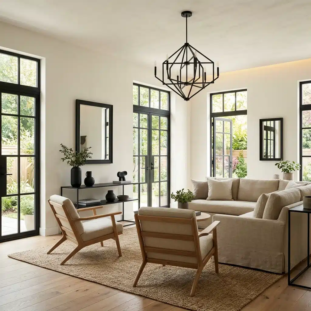
Black pulls out the heat in Dove Wing without crushing it. Consider black window frames, hardware, or light fixtures. It’s a simple way to add some weight to an otherwise soft color scheme.
Matte black works especially well here.
Wood Tones

Warm wood tones sit naturally alongside Dove Wing.
Light oak, walnut, and pine all complement the yellow-beige undertone without clashing. Owen built our shelving in natural pine, and against Dove Wing walls, it looked like they were always meant to be together.
Sage Green
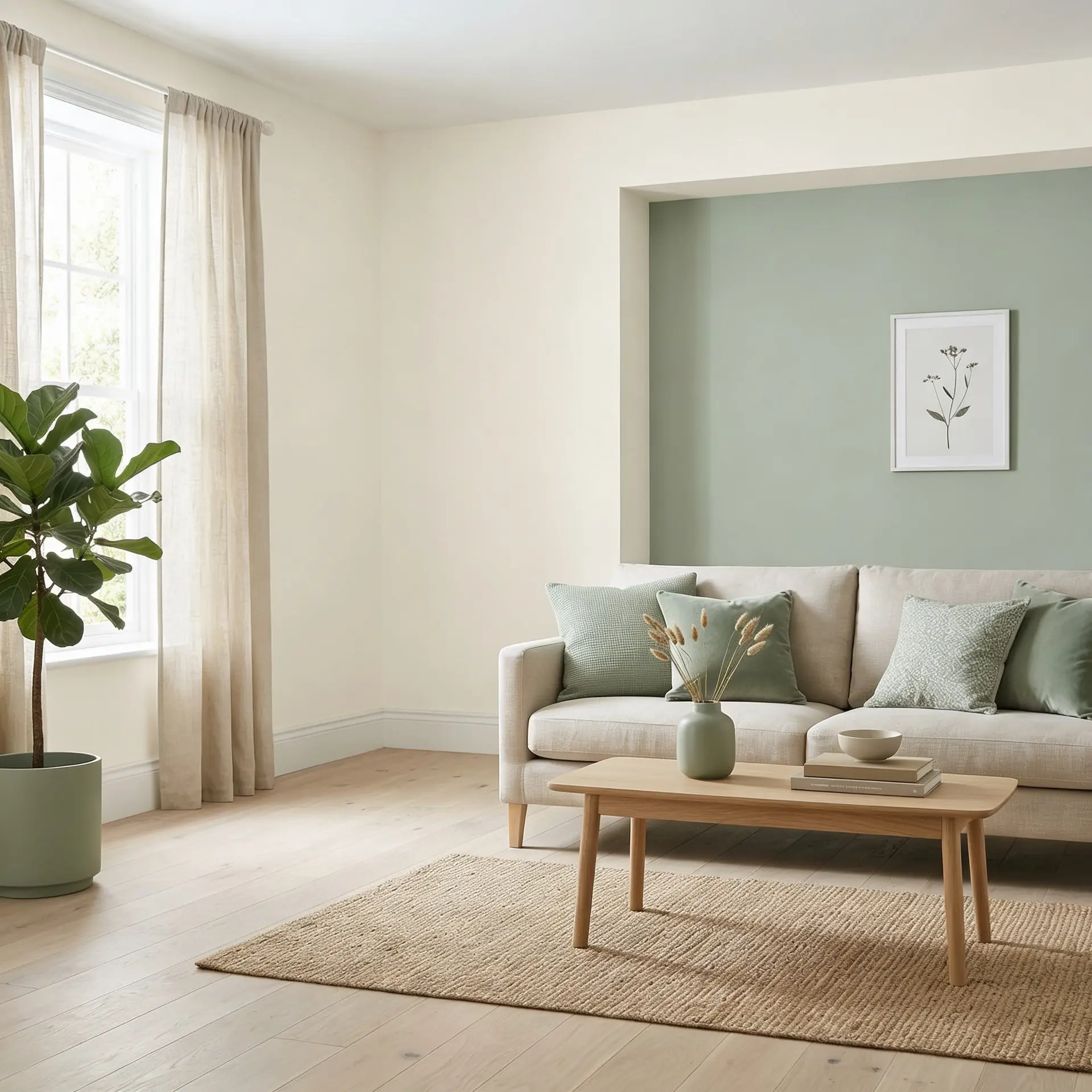
Sage green and Dove Wing make a really easy, natural pairing.
The cool-green tone balances out the warmth in Dove Wing without fighting it.
Use sage on an accent wall or in soft furnishings; either way, it ties the room together without trying too hard.
Pros and Cons of Dove Wing
Every paint color has its strengths and its limits. Here’s an honest look at both sides of Dove Wing.
| Pros | Cons |
|---|---|
| Warm without looking yellow | Can feel warmer under artificial light |
| Works on walls, cabinets, and exteriors | Not ideal for very dark or north-facing rooms |
| LRV reflects good light | May need two coats on darker walls |
| Pairs well with most accent colors | Too warm for very cool or modern spaces |
| Sits between white and off-white, very universal | Undertone can shift with different light bulbs |
| Works with both matte and satin finishes | Hard to match if touch-ups are needed later |
I noticed the heat shift most in the kitchen at night. Under yellow bulbs, it leaned a little more toward beige than expected. Worth testing with your actual lighting before committing.
Tips Before Choosing Dove Wing Benjamin Moore for your Home
Here are a few things worth keeping in mind.
- Skip the small chip, paint a large swatch, or use peel-and-stick samples instead for a truer read.
- Test your swatch in morning, afternoon, and evening light before deciding.
- Check how Dove Wing looks under your actual light bulbs. Warm bulbs shift it more than you’d expect.
- Look at it next to your flooring, countertops, and furniture before committing.
- If your floors run warm, Dove Wing will lean even warmer; factor that in early.
- Cool stone countertops can nicely balance out the heat, a good pairing to consider.
- Always buy a sample pot first; it’s a small cost that saves a full repaint.
Final Thoughts
Dove Wing Benjamin Moore is one of those colors that just makes sense.
It’s warm, it’s universal, and it works across so many spaces: walls, cabinets, trim, and even exteriors.
The key is to test it in your own home, under your own lighting, next to your own floors and furniture. No swatch card can do that for you. Owen and I learned that the hard way.
But once you see it on your walls in the right light? You’ll know.
Give it a proper test run, I think you’ll be glad you did.
Frequently Asked Questions (FAQ’s)
1. Does Dove Wing Look Gray?
No. It reads as a soft, warm white, never gray, in most lighting.
2. What is the Best Warm White that Doesn’t Look Yellow?
Dove Wing is a top pick, warm, but never tips into yellow.
3. What is the Best Creamy White Paint Color?
Swiss Coffee and Cloud White are both strong, well-loved, creamy white options.
4. Does Dove Wing Look Dingy?
Not typically. In low light, it can feel deeper, but never dingy.
5. What’s the Hardest Color to Paint Over?
Deep reds and dark blues are notoriously tough, always prime first.