
Some paint colors look great on a chip and fall apart on the wall.
Oyster White (SW 7637) is not that color.
This soft, warm off-white from Sherwin-Williams keeps showing up on interior walls, kitchen cabinets, and exterior siding because it actually delivers.
It sits between that true white and light beige, which means it works in more spaces than most neutrals do.
If you are repainting a room, updating your cabinets, or refreshing your exterior, and want a color that does not require a backup plan, Oyster white totally deserves a spot on your shortlist!
What Color is Oyster White Exactly?
Oyster White (SW 7637) is not your typical white.
It carries greige undertones, with soft green and gray hints that shift with the light in the room.
Its LRV sits at 72, which means it reflects a decent amount of light but stays far from bright or crisp.
In most interiors, it reads more like a soft greige than a white.
If someone wants a sharp, high-contrast backdrop, this color will likely feel too “colored” for that job. But that quiet depth is exactly what makes it work everywhere else.
Is it Warm or Cool?
SW Oyster White sits in the warm-neutral range, but it is not straightforwardly warm.
The greige base gives it warmth, while the soft gray and faint green undertones pull it slightly cool, depending on the light.
In a south-facing room with plenty of natural light, it reads warm and creamy.
In a north-facing room or under cool artificial lighting, those gray undertones come forward, and the color shifts closer to a muted greige.
Before settling on this shade for an interior space, check it under the bulbs you actually use. Warm soft white LEDs will pull it creamier.
Cool or daylight bulbs will bring out the gray, and it will read noticeably different from what you saw in the store.
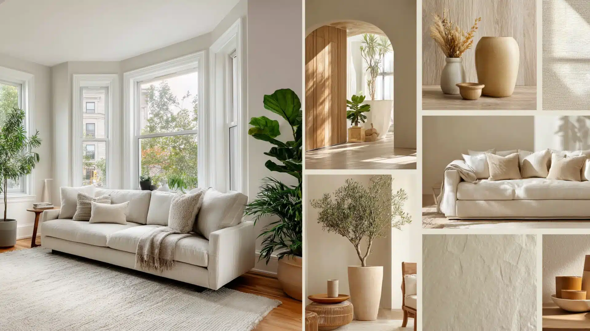
How Oyster White Sherwin Williams Looks in Different Rooms
Not every neutral behaves the same way across different spaces.
A good rule of thumb: always test your color combinations in direct sunlight and in shade before finalizing. What reads well on a paint chip can look completely different on a south-facing wall at noon.
1. Living Room
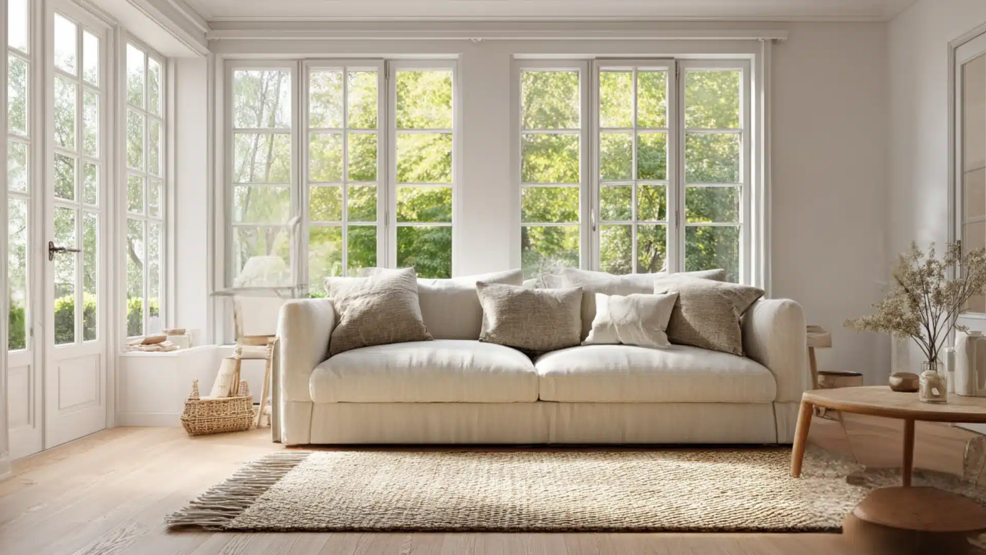
Oyster White in a living room keeps things calm without feeling cold.
The greige undertones stop it from looking washed out under natural light, and it pairs well with warm wood floors, linen softas, and natural textures.
For trim, go either crisp white or slightly darker for contrast.
- Works with both light and dark furniture
- Holds well under warm and cool lighting
- Does not compete with bold decor pieces
2. Kitchen
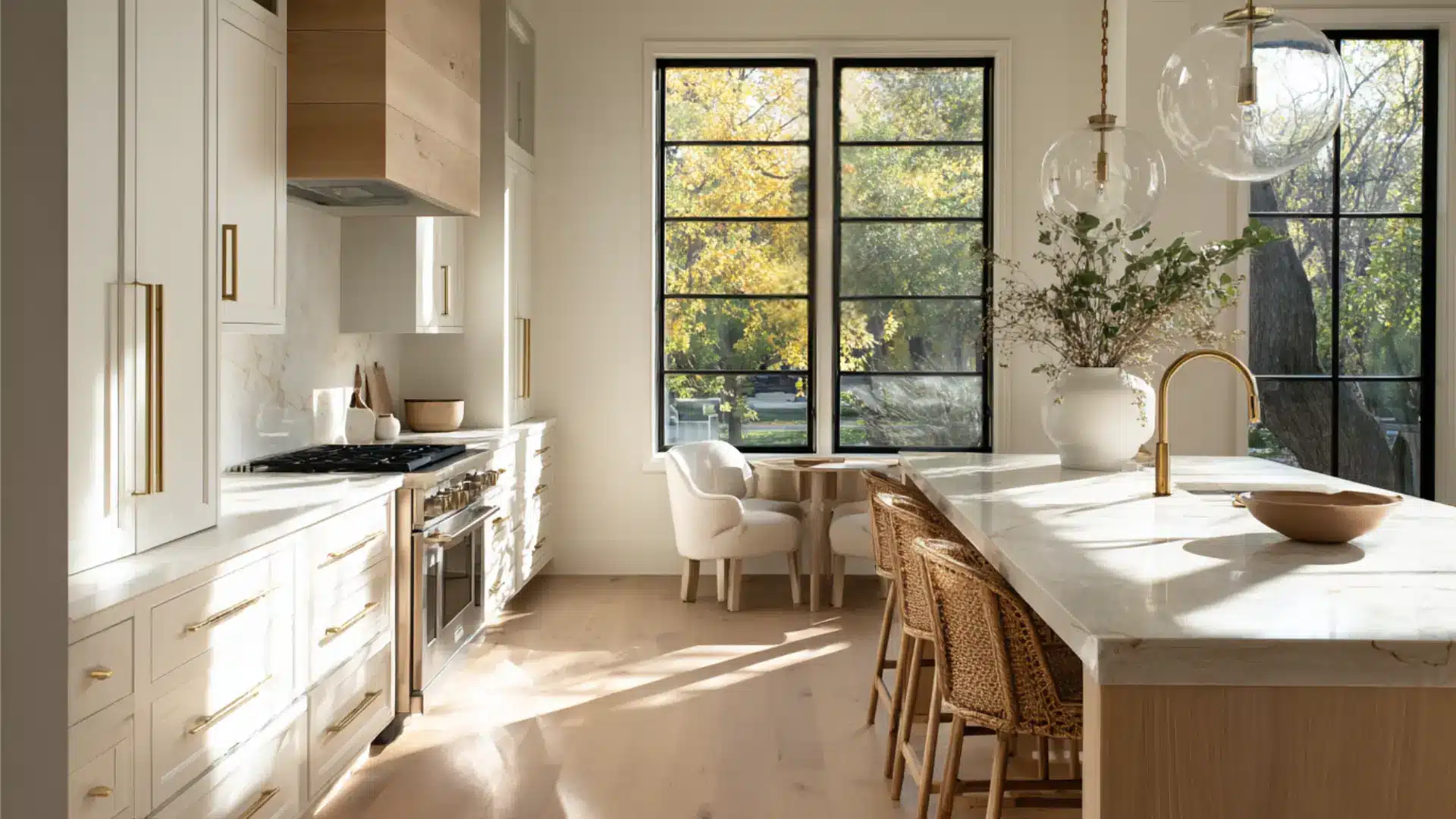
On kitchen cabinets, this color adds depth without going too dark or too cream.
Sherwin-Williams Oyster white on kitchen cabinets works especially well with brass hardware, stone countertops, or dark lower cabinets.
It makes the space feel put together without trying too hard.
3. Bathroom
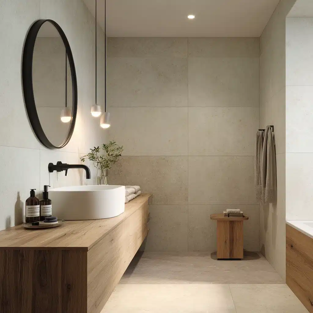
In a bathroom, this color keeps things clean but not clinical. The soft undertones warm up tile-heavy spaces that tend to feel sterile.
It works on both walls and vanity cabinets.
Pair it with matte-black fixtures or warm wood accents to bring out its best.
4. Hallways and Open Floor Plans

Hallways and open floor plans are where most neutrals fall apart, either going muddy in low light or feeling disconnected as the space opens up.
Oyster White handles both better than most.
It keeps narrow hallways feeling open and flows naturally across larger spaces without creating visual breaks.
- Stays consistent under both natural and artificial light
- Does not turn yellow or gray in low-light corridors
- Connects rooms without needing a color transition
If you are planning a full-home repaint, running Oyster White through hallways and into adjoining rooms is one of the easier ways to pull everything together without losing sleep over color transitions.
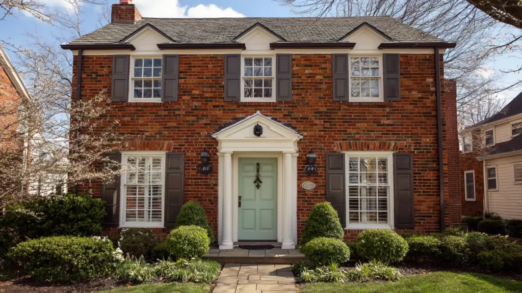
Oyster White Sherwin-Williams Exterior Color Pairs, Before and After Looks
Oyster White does not fight with exterior or fixed elements around it, which is exactly why it works so well on exteriors.
Before committing to an exterior palette, consider what you cannot change.
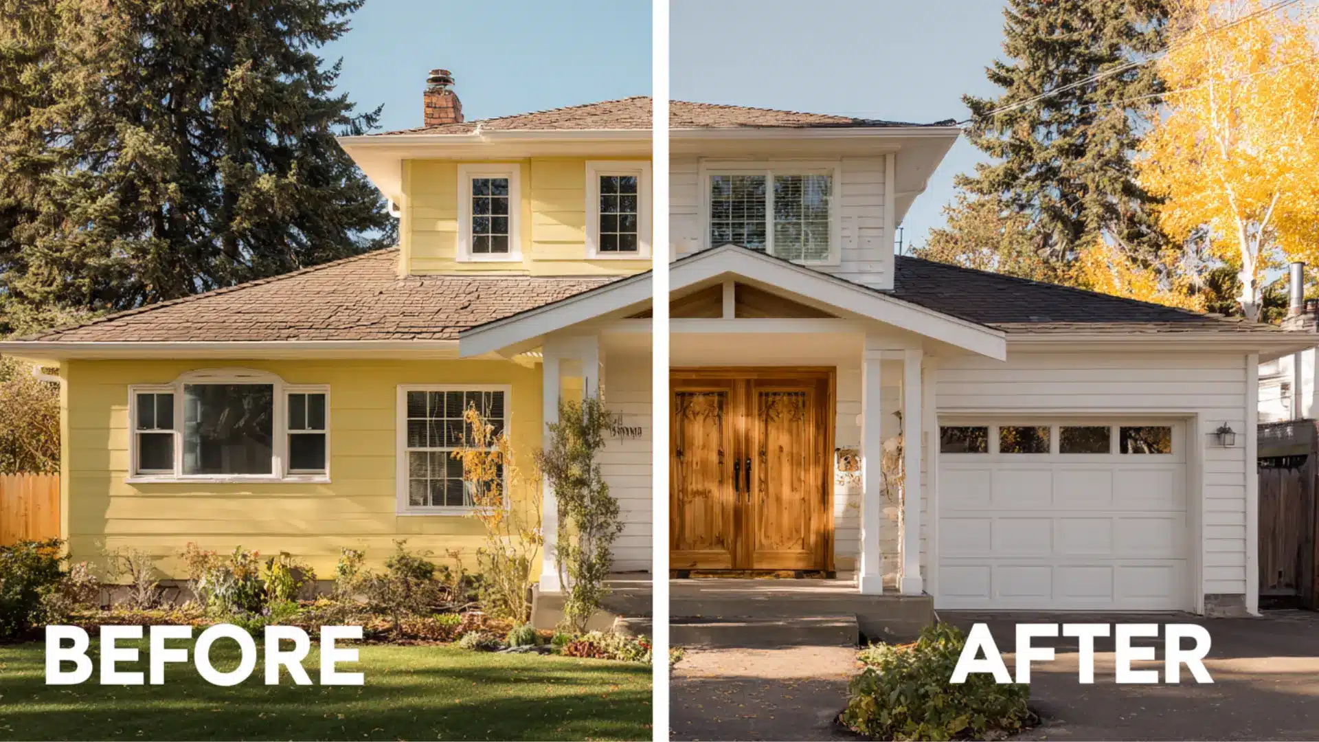
1. Flat White to Bold Modern Contrast
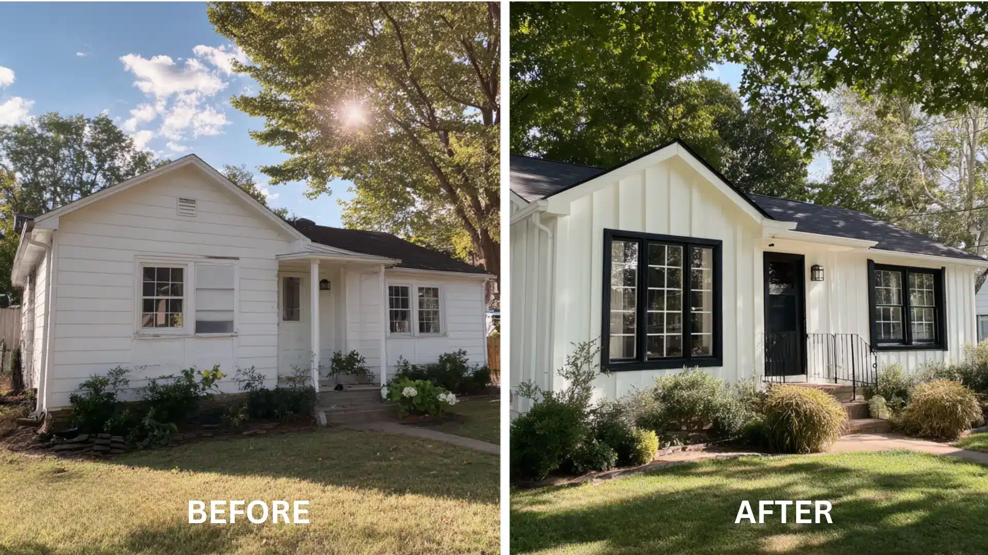
Before: Plain white exterior with no visual contrast or definition.
After:
- Oyster White (siding)
- Tricorn Black (trim and windows)
Tricorn Black (SW 6258) does the heavy lifting here. It gives the exterior sharp definition and makes the Oyster White siding look intentional. This works especially well on homes with clean architectural lines.
Keeping white trim with Oyster White siding is a common slip. The two sit too close in tone, and the exterior ends up looking unfinished rather than cohesive.
2. Yellow Beige to Warm Modern Exterior
Before: Yellow-toned beige exterior that reads as dated and heavy.
After:
- Oyster White (main siding)
- Accessible Beige (garage and secondary siding)
- Natural Wood (door accents)
Natural wood door accents tie this combination together by bringing in organic warmth that complements the greige undertones in Oyster White.
Accessible Beige on the garage keeps the tones connected without making everything look identical.
Always consider your roof color and fixed elements, such as stone or brick, before finalizing. Oyster White is forgiving, but a cool gray roof against a warm exterior palette can create a disconnect that no trim color will fix.
3. Basic Neutral to Layered Designer Look
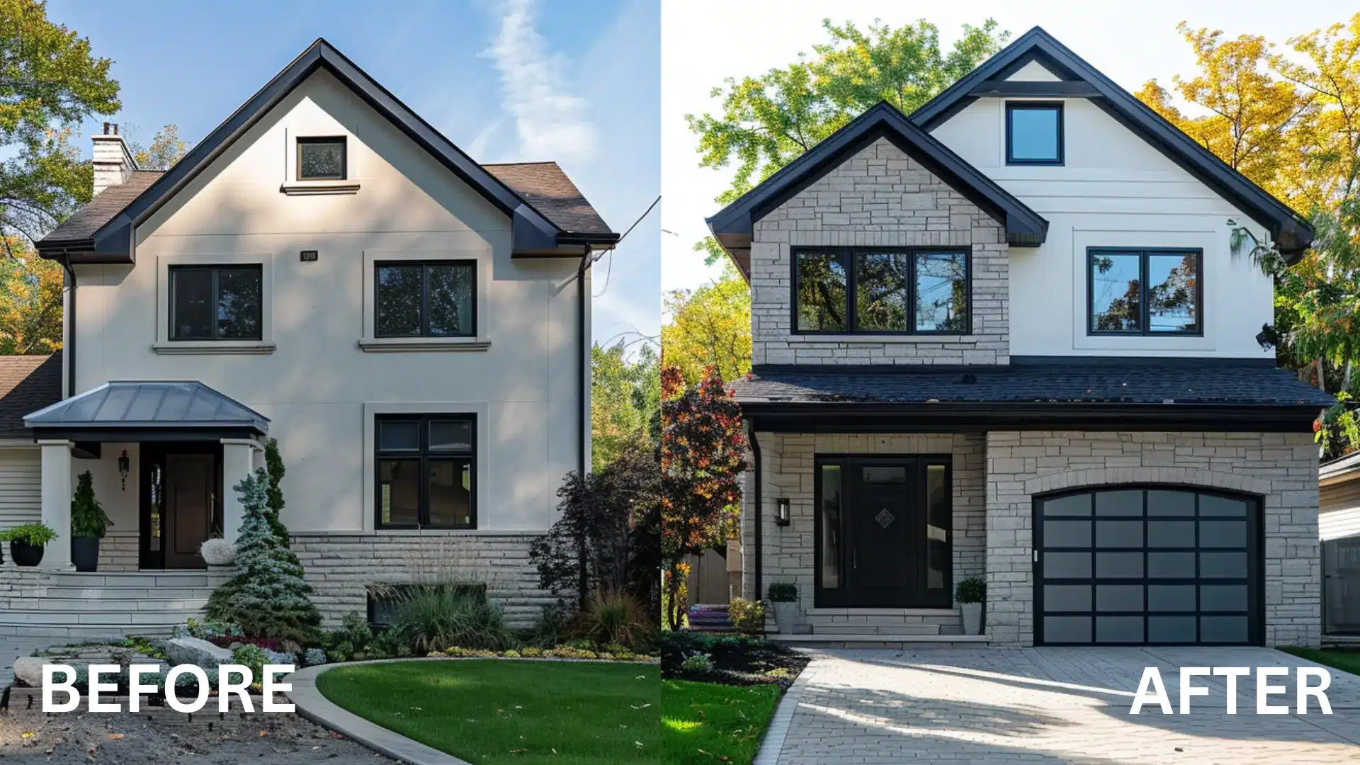
Before: Flat neutral exterior with no depth or visual interest.
After: Oyster White as the base, Repose Gray on the trim, and Light Gray Stone for accents.
Repose Gray trim defines the edges without disrupting the palette. The stone accents add texture without introducing a new color family.
For brand alternatives, Benjamin Moore Gray Owl sits in a similar soft gray range and works just as well in this combination.
4. Dull Off-White to Organic Modern Exterior
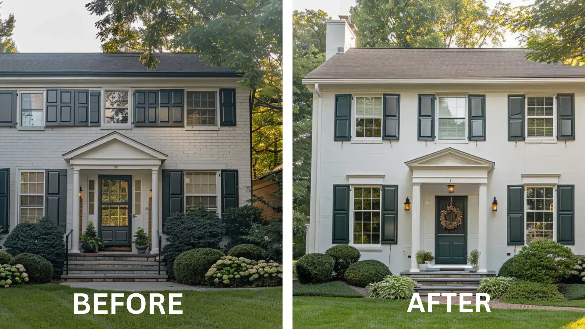
Before: Faded off-white exterior that looks tired and flat.
After:
- Oyster White (siding)
- Evergreen Fog (shutters and door)
Evergreen Fog (SW 9130) is a muted, earthy green that sits beautifully against Oyster White’s warm, beige base.
It adds just enough contrast to make the exterior feel current without screaming color. Works especially well on homes surrounded by trees or natural landscaping.
Using a bright or saturated green against Oyster White will clash. The undertones in Oyster White lean warm and muted, so keep accent colors in the same tonal range.
Oyster White vs Shoji White: Which One Actually Fits Your Space?
If you want a neutral that works across both interiors and exteriors without leaning too warm or too cool, go with Oyster White.
But if your space gets lower natural light and you want something that feels bright and cozy without going stark white, Shoji White is the safer pick.
| Feature | Oyster White SW 7637 | Shoji White SW 7042 |
|---|---|---|
| LRV | 72 | 74 |
| Hex Code | #D4C9B0 | #E8DFC8 |
| Undertones | Gray, beige, faint green | Taupe, cream, warm gray |
| Color Temperature | Warm-neutral | Warm |
| Visual Vibe | Earthy, muted, grounded | Cozy, creamy, inviting |
| Best Lighting | Well-lit rooms to balance depth | Works in both bright and lower-light spaces |
| Best For | Interiors and exteriors | Soft, traditional cream feel indoors |
When in doubt, sample both on the actual wall and check them at different times of the day before deciding.
What Trim Color Actually Works With Oyster White?
Trim color can make or break an Oyster White exterior.
Since it sits in the warm-neutral range, the trim either sharpens or softens the look, depending on what you pick.
For a modern farmhouse feel, Pure White (SW 7005) creates clean contrast without going stark. For more definition, Tricorn Black (SW 6258) frames the home sharply and makes the siding look intentional.
For a softer, layered approach:
- Repose Gray (SW 7015) for subtle cool contrast
- Accessible Beige (SW 7036) for a warmer, tonal blend
- Agreeable Gray (SW 7029) for a transitional middle ground
Final Thoughts
Oyster White is a solid choice if you want a neutral that works without constant second-guessing.
It performs well on exterior siding, interior walls, and almost everywhere without needing much help from surrounding colors.
Choose it if you want a warm, grounded off-white that pairs well with both light and dark accents and holds up across multiple rooms and outdoor spaces.
Skip it if you are after a crisp, bright white for high-contrast modern interiors or a clean trim color.
In that case, it will likely feel too colored for what you have in mind.
Frequently Asked Questions
1. Does Oyster White Work Well With Wood Tones?
Yes, it pairs naturally with warm and medium wood tones without competing or clashing.
2. Is Oyster White a Good Choice for Dark Rooms?
It can work, but in rooms with very little natural light, it may read darker and muddier than expected.
3. How Many Coats of Oyster White do You Typically Need?
Most surfaces need two coats for full, even coverage, especially when painting over darker colors.
4. Does Oyster White Work on Ceilings?
It can, but it will make the ceiling feel slightly heavy, so it works best in rooms with good natural light and decent ceiling height.
5. Is Oyster White Available in Different Finishes?
Yes, Sherwin-Williams offers it in multiple finishes, including flat, eggshell, satin, and semi-gloss, depending on the surface and application.