
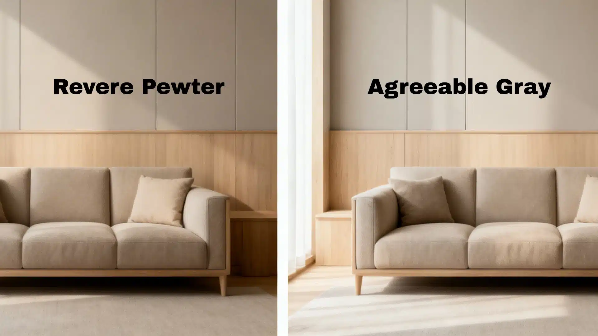
Revere Pewter vs Agreeable Gray, hmm, it’s confusing, both look like the same shade of neutral gray.
But these two colors are not the same, for sure.
Revere Pewter leans soft and natural, whereas Agreeable Gray pulls slightly cooler and softer. The difference is confusing, though it is important that you know them before you get one.
Agreeable Gray Color Description
Agreeable Gray has earned that popularity.
It sits at an LRV of 60, light enough to keep rooms feeling open but present enough to read as a color rather than a glorified white.
Its beige and taupe undertones are subtle, which means it rarely clashes with what’s already in the room.
That’s rare for a neutral. But is Agreeable Gray a grey, beige, or griege?
It is actually neither pure gray nor pure beige. It is in between, which is why many people call it a greige (gray + beige).
Navy, forest green, dusty rose, and soft terracotta are some colors that complement agreeable gray.
Revere Pewter Color Description
Benjamin Moore’s Revere Pewter has been among the top 10 for 14 years.
At LRV 55, it carries more depth than most neutrals have, and that depth is what gives it character.
Its green, yellow, and soft brown undertones give it an earthy, organic quality that beautifully complements natural materials, wood floors, stone countertops, and exposed brick.
It feels at home in traditional and transitional spaces in a way that cleaner, lighter neutrals don’t.
Deep navy, burgundy, soft ochre, and earthy greens complements Revere Pewter.
Revere Pewter vs Agreeable Gray: Under Different Lighting
LRV stands for Light Reflectance Value. It’s just a number that tells you how much light a color bounces back.
Higher equals lighter feel in the room.
| Feature | Agreeable Gray | Revere Pewter |
|---|---|---|
| Brand | Sherwin Williams | Benjamin Moore |
| Code | SW 7029 | HC,172 |
| LRV | ~60 | ~55 |
| HEX | #D1CBC1 | #CCC4B8 |
| Undertones | Beige, taupe, soft violet | Green, yellow, soft brown |
| Feel | Light, airy, neutral | Deeper, earthy, grounded |
That five-point LRV gap creates a big, big difference.
Agreeable Gray feels lighter and more open, especially in smaller rooms. But Revere Pewter carries more weight and presence.
And in a dim room or a tight hallway, that difference is very prominent.
Revere Pewter vs Agreeable Gray Paint: Undertone Differences
Undertones are the reason two colors that look identical feel completely different on your wall.
It is basically the hidden color beneath the main color.
Agreeable Gray
It carries soft beige and taupe undertones.
In most homes, it is soft, neutral, and balanced, and in certain lighting, it can flash a subtle amount of violet or green.
Sometimes it even doesn’t get noticed, but that is why it works in so many spaces.
Revere Pewter
Its undertones are a layering of soft green, yellow, and earthy brown.
In soft natural light, it reads as a rich, grounded greige. But in cooler or northern-facing lights? That green can surface, making it look almost olive or khaki.
Where Agreeable Gray Excels?
Agreeable Gray paint is one of those colors that just feels different, and it holds up in rooms that are a little complicated. That being said, it’s very adaptable.
- Open-concept floor plans: They arewhere one color needs to flow through multiple connected spaces.
- Rooms with mixed light sources: A combination of natural and artificial light won’t throw it off.
- Modern interiors: A cleaner, more neutral base is preferred.
- Spaces with crisp white trim: Theypair naturally and effortlessly with Agreeable Gray.
- Dark or north-facing rooms: It is where its higher LRV gives it a better shot at keeping things bright.
Where Revere Pewter Excels?
Revere Pewter is special and doesn’t suit every room, unless you use it strategically.
- Traditional and transitional spaces: Places with soft wood tones, stone, or earthy textures.
- Farmhouse and cottage-style homes: Places that are grounded, organic, and with a soft aesthetic.
- Well-lit rooms with good natural light: Places where the color can develop its full softness without going muddy.
- Smaller rooms with character: A study, a reading nook, or a formal dining room are go-to for this color.
- Spaces with softer trim cordial or off-white trim: These complement Revere Pewter better than stark, cool whites, which can make it look muddy in contrast.
So, Which One Should You Choose?
Choosing between Revere Pewter vs Agreeable Gray isn’t about which color is better, but it’s about which suits you.
Refrain from deciding based on a swatch.
Paint both on a large poster board, move it around your room, and see how each color behaves throughout the day, like in the morning light, afternoon sun, and evening lamp.
They’ll each tell you something different. Trust your feelings and choose based on the aesthetic of your room.
Now let me know in the comments which color you are going for.
Frequently Asked Questions (FAQs)
1. When Should You Not Use Agreeable Gray?
Avoid if you want a bold, high contrast look. It’s too subtle for dramatic spaces.
2. When Should You Not Use Revere Pewter?
Avoid in dark, north-facing rooms, as it tends to turn muddy. Skip with cool white trim.
3. What is Agreeable Gray vs Repose Gray?
Agreeable Gray warms a room up, whereas Repose Gray keeps it feeling cool and clean.