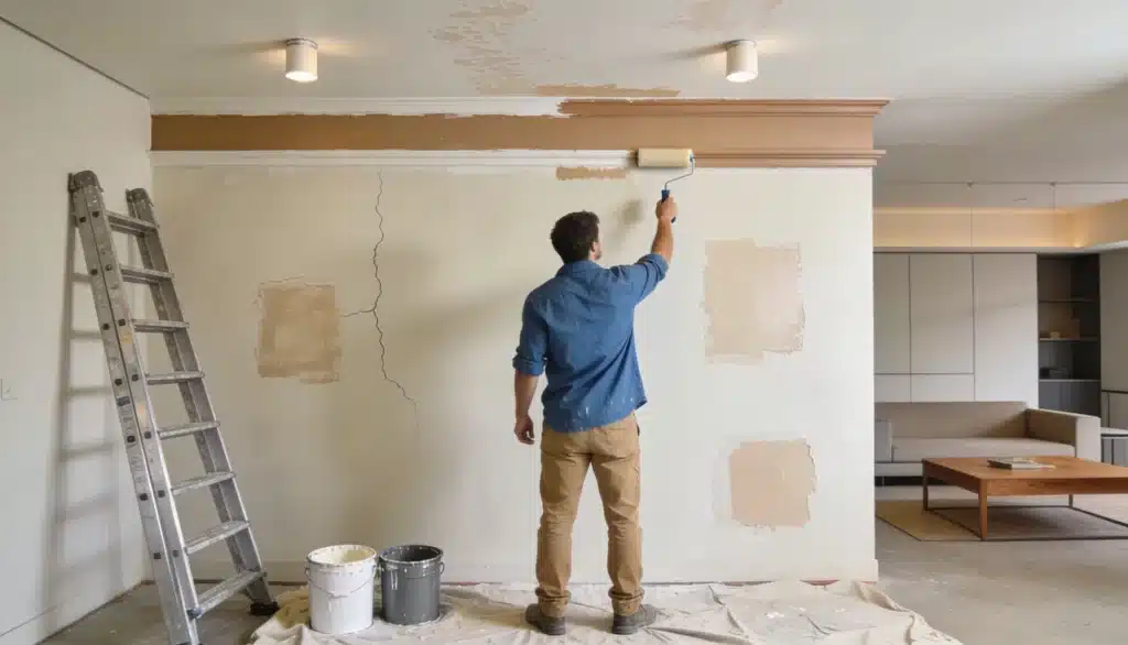

White paint seems like the easiest choice.
Walk into a store, face fifty shades of white, and that confidence fades quickly.
Owen and I have been there more times than I can count.
Origami White Sherwin Williams kept coming up whenever we looked for a white that felt calm, clean, and livable, not cold or stark. Once we tried it, we understood why so many people keep coming back.
It works in small rooms, big spaces, and everywhere in between.
Want to know what makes this shade special and how to use it well? This blog covers it all.
Is Origami White Sherwin Williams a Popular Choice?
Soft whites have taken over modern interiors and for good reason.
They add light without feeling clinical, and heat without going yellow.
This color sits right in that sweet spot within Sherwin-Williams’ neutral lineup of colors.
It’s not the brightest white on the shelf, nor the warmest.
It lands somewhere steady and reliable in between.
People after a fresh update, renovators working with older spaces, and designers who need a dependable neutral all tend to reach for it. It rarely lets anyone down.
Origami White SW 7636: Color Profile and Technical Breakdown

Light changes everything with this color. In natural daylight, it looks crisp and fresh.
Under warm artificial light, it shifts slightly to a softer, creamier tone. North-facing rooms bring out a cooler, quieter side. South-facing spaces make it glow.
For finishes, eggshell works well on walls, satin holds up in kitchens and bathrooms, and semi-gloss is a solid pick for trim and doors.
What is the Undertone and LRV
Origami White (#E5E2DA) has a subtle gray undertone with a touch of beige beneath. That mix keeps it from reading too stark or too warm.
- LRV: 76 reflects good light without feeling washed out
- Undertone shifts slightly depending on surrounding colors
- Pairs cleanly with both cool and warm accents
That gray-beige base is what makes it so easy to work with across different rooms and styles.
Is it Warm or Cool?
The color sits right in the middle. It leans slightly cool but never feels cold, making it one of the more balanced whites in the Sherwin-Williams lineup.
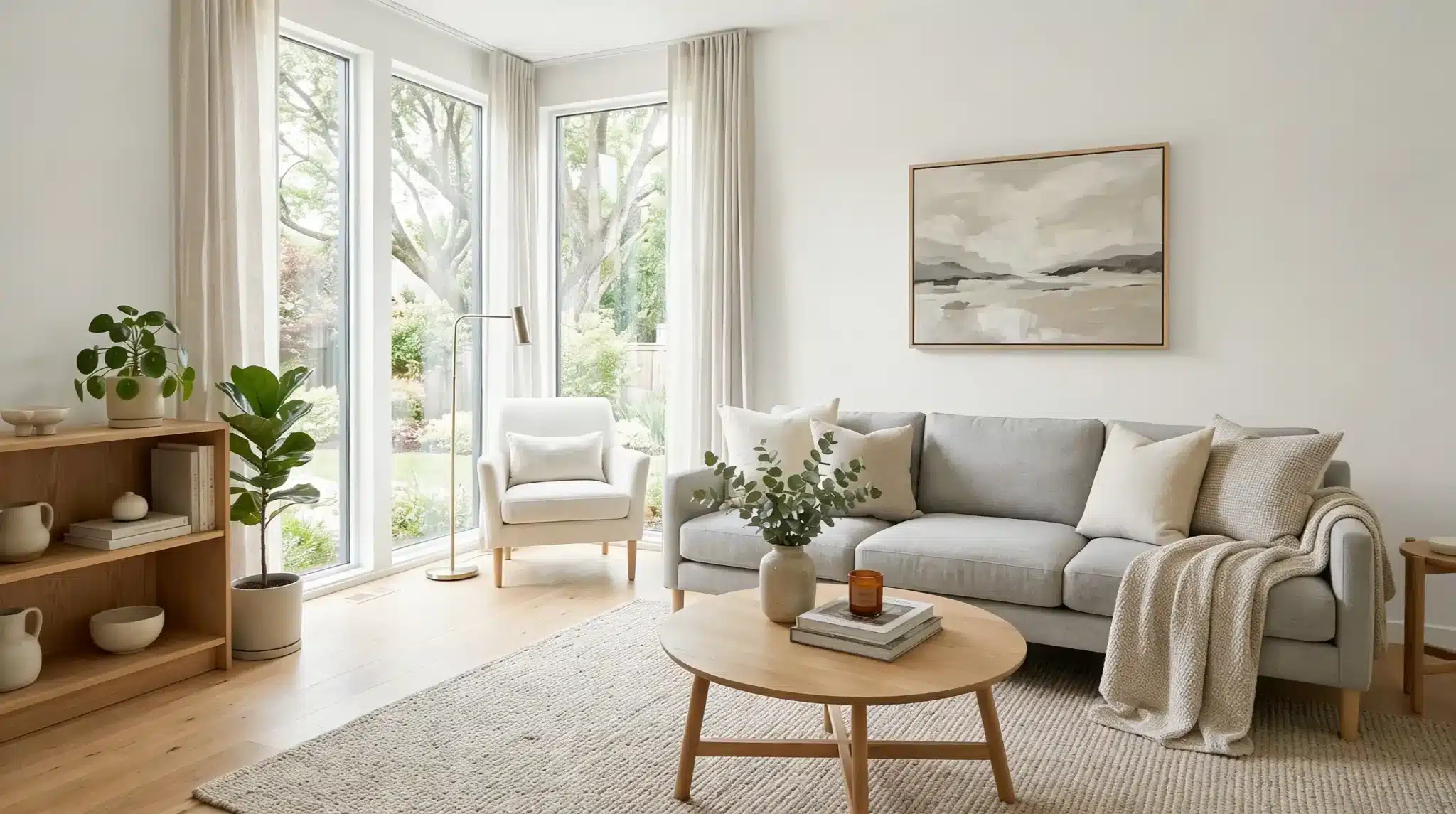
How Origami White Looks
No two rooms show this color the same way. Lighting, size, and surface all affect how it reads.
Here’s what I noticed and what others consistently report, too.
North-Facing vs South-Facing Rooms

North-facing rooms pull out the gray undertone, giving Origami White a cooler, quieter feel.
It stays clean but softer.
South-facing rooms are a different story; natural light warms them, and it almost glows throughout the day.
Both work well, just differently.
Small vs Large Spaces

In smaller rooms, it keeps things feeling open and airy without stark contrast.
Large spaces? It holds its own without feeling flat or washed out. The LRV of 74 does a lot of heavy lifting here, evenly bouncing light around.
Appearance on Walls vs Trim vs Cabinetry

On the walls, it reads softly and clearly.
On trim, it adds a slight contrast when paired with a warmer white, crisp but not harsh. Cabinet fronts show off its smoothness best, especially in satin or semi-gloss.
Each surface brings out a slightly different side of it.
Common Observations and Professional Insights

People often say it photographs beautifully and looks even better in person. Designers point to its flexibility, which works equally well with wood tones, metals, and bold accents.
Owen called it the white that doesn’t argue with anything else in the room. That about sums it up.
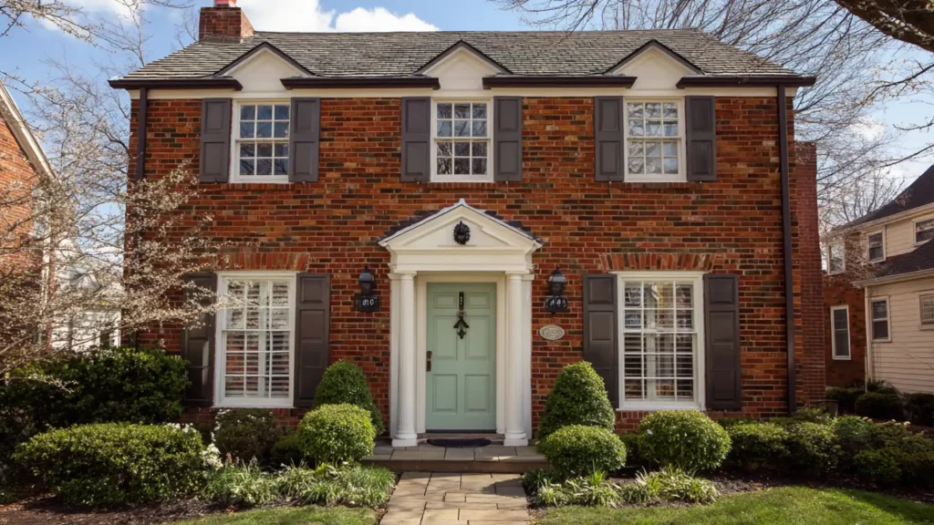
Interior vs Exterior

Indoors, it feels soft, layered, and calm.
Outside, it reads brighter and crisper against natural surroundings. On exteriors, it pairs well with dark trim for contrast or soft stone tones for a more relaxed look.
Either way, it holds up well in both settings.
Where to Use Origami White and Where to Avoid
Origami White Sherwin Williams is universal, but it’s not the right fit for every situation. Here’s a quick breakdown of where it shines and where it falls short.
| Space or Surface | Use it | Avoid it |
|---|---|---|
| Living room walls | Works in natural & artificial light | Skip if the room has very warm, yellow-heavy tones |
| Kitchen cabinetry | Works well in satin or semi-gloss. | Avoid heavy orange or red-toned wood |
| Bathroom walls | fresh and bright without going stark | Not ideal in windowless bathrooms |
| Bedroom walls | Calm and easy to live with daily | May feel too cool in rooms with no warm accents |
| Ceiling | Pairs well with walls in a similar neutral | Can flatten a room if the walls are also very light |
| Exterior walls | Holds up well in natural light | Avoid heavily shaded areas reads dull and gray |
| Trim and doors | Clean finish alongside deeper wall colors | Too similar to use alongside other soft whites |
| Home office | Keeps the space focused | Avoid if you rely heavily on warm task lighting |
| Kids’ rooms | Neutral tone may feel flat without color | Works as a base if paired with bold accents |
Origami White vs Benjamin Moore & Other Brand Matches

Sherwin-Williams isn’t the only option on the shelf.
Here’s how Origami White Sherwin Williams compares to close matches from other popular brands.
Origami White vs Benjamin Moore Chantilly Lace
Chantilly Lace is one of Benjamin Moore’s most talked-about whites, and it’s noticeably brighter and crisper than Origami White.
- Chantilly Lace has virtually no undertone; Origami White carries that soft gray-beige base.
- Chantilly Lace works best for high-contrast, bold spaces.
- Origami White suits rooms where you want softness over sharpness.
Chantilly Lace makes a statement. Origami White stays quiet and lets everything else in the room do the talking.
Origami White vs Behr Ultra Pure White
Behr’s Ultra Pure White is about as clean and bright as white gets, a true, flat white with almost no depth.
- Ultra Pure White reads stark in most lighting conditions.
- Origami White adds subtle complexity without feeling busy.
- Ultra Pure White works well on ceilings; Origami White works better on walls and cabinetry.
Where Ultra Pure White feels clinical in warmer spaces, Origami White adjusts and settles in more naturally.
Origami White vs PPG Antique White
PPG Antique White pulls noticeably warmer, with a creamy yellow undertone that reads traditional and cozy.
- Antique White leans toward vintage and farmhouse styles.
- Origami White stays more modern and versatile across different design directions.
- In cooler or north-facing rooms, Antique White can feel heavy; Origami White stays balanced.
My husband Owen and I actually sampled both side by side on our kitchen wall. Antique White looked lovely but felt too warm for the space. Origami White just worked.
Origami White vs Popular Sherwin-Williams Whites
Not all whites are interchangeable; each has a unique personality, and choosing the wrong one can impact a room.
Here’s how Origami White compares to four Sherwin-Williams whites.
Origami White vs Alabaster
Alabaster runs warmer with a noticeable creamy, yellow-beige undertone.
Origami White is cooler and more neutral by comparison. Alabaster feels cozy and traditional, making it a great choice for warm-toned rooms with wood and earthy accents.
Origami White suits spaces where you want brightness without the heat.
For modern or transitional rooms, Origami White tends to feel cleaner and more balanced overall.
Origami White vs Pure White
Pure White is brighter and sharper, with very little undertone.
Origami White is softer and slightly more complex than it. Pure White works well for trim, ceilings, and spaces that need a strong contrast. Origami White brings a quieter, more layered look to walls.
Side by side, Pure White pops while Origami White settles, both useful, just for different purposes.
Origami White vs Snowbound
Snowbound carries a soft gray-violet undertone that can read almost lavender in certain lights. Origami White stays more neutral and grounded.
In cooler rooms, Snowbound can feel slightly moody.
Origami White keeps things steady and clean across most lighting conditions.
For anyone who wants an easy-to-pair white, Origami White is the more reliable pick between the two.
Best Color Pairings with Origami White Sherwin Williams
This color plays well with a lot, but some combinations really bring out the best in it. Here are pairings that work consistently well across different rooms and styles.
Soft Neutrals and Warm Greiges

Origami White Sherwin Williams sits beautifully alongside warm greiges like Accessible Beige or Agreeable Gray.
The tones complement without competing.
- Use the color on upper walls and greige on lower wainscoting.
- Keep flooring in warm oak or walnut tones to tie everything together.
- Add linen or oatmeal textiles to carry the softness through the space.
Cool Grays and Blue-Grays

Pairing this color with cool grays like Repose Gray or Passive creates a calm, collected feel throughout a home.
- Use gray as the dominant wall color with Origami White on trim and ceilings
- Stick to brushed nickel or chrome fixtures to keep the cool tone consistent
- Layer in soft blue or slate accents through cushions, rugs, or artwork
Deep and Moody Accents

Origami paired with deep navy, charcoal, or forest green creates a strong contrast that feels polished and grounded.
- Use this color on cabinetry against a dark feature wall for balance.
- Black hardware and matte fixtures reinforce the contrast cleanly.
- Keep larger surfaces light so the room doesn’t feel closed in.
Warm Wood Tones and Natural Materials

Wood tones are some of the friendliest companions for this color.
Medium to dark woods bring warmth that balances its cooler undertone beautifully.
- Pair with medium oak flooring for a grounded, natural feel.
- Rattan, cane, and linen textures add depth without adding color.
- Owen added open wood shelving in our kitchen against Origami White walls; it pulled the whole room together.
Soft Pastels and Muted Tones

Muted sage, dusty rose, or soft terracotta sit well alongside this color without overpowering it.
- Use pastel colors as accent wall colors, with Origami White on all remaining surfaces.
- Keep bedding, curtains, and rugs in the same muted family for a pulled-together look.
- Avoid bright or saturated versions of these colors; the softer the tone, the better it works.
Designer Tips for Using Origami White Like a Pro
Getting the most out of the color comes down to a few smart choices.
These are the tips Owen and I picked up from experience, some straight from designers we trust.
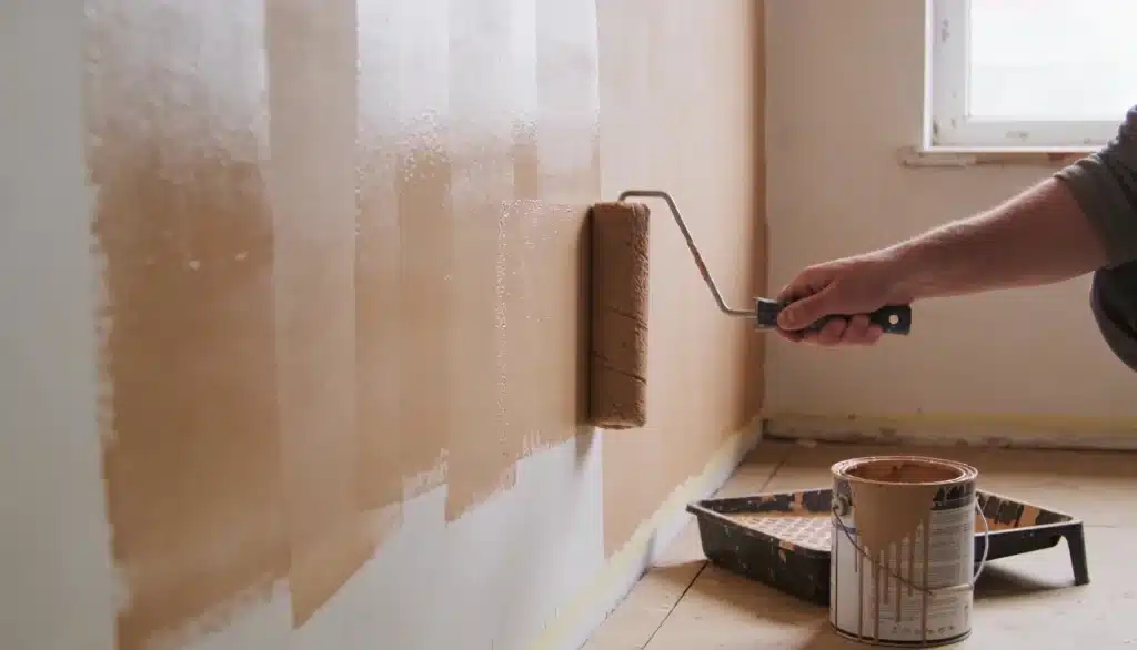
1. Sample Before You Commit: Always test a large swatch at least 12×12 inches directly on your wall. Live with it for two to three days across different lighting conditions before making a final call.
2. Watch Your Light Bulb Temperature: Bulb temperature changes everything.
Stick to bulbs between 2700K and 3000K for a balanced result. Anything warmer pushes the gray undertone toward beige. Cooler bulbs sharpen it up considerably.
3. Use It Consistently Across Open Spaces: In open-plan homes, running Origami White across connected spaces creates a clean, uninterrupted flow.
Switching whites between rooms even slightly creates an unsettling visual break that’s hard to ignore.
4. Let the Accents Do the Work: Origami White works best as a backdrop. Keep walls neutral and let furniture, textiles, and hardware carry the personality of the room.
Overcrowding it with too many competing tones dulls its quiet strength.
5. Don’t Skip Primer: A quality gray-tinted primer underneath makes a real difference.
It helps Origami White show its true color rather than being influenced by whatever was on the wall before.
Is Origami White the Right Choice for Your Space?
Not every white suits every home, and Origami White is no different.
It works best in spaces that already have some natural light and a mix of cool and neutral tones. If your room leans heavily warm with deep wood tones and amber lighting, it may need extra support to feel right.
But for spaces that need a clean, dependable base without going too bright or too stark, it consistently delivers.
Owen always says, when in doubt, sample it first. That one step saves a lot of second-guessing.
Final Thoughts
The color is steady, flexible, and works across more spaces than most whites on the market. From cabinetry to exteriors, it holds its own without demanding too much attention.
The key is knowing your room its light, its existing tones, and what you want it to feel like day to day.
Get those details right, and this color rarely disappoints.
Sample it, live with it for a few days, and let the room tell you the answer. More often than not, it’ll be a yes.
Frequently Asked Questions (FAQ’s)
1. Does Origami White Look Dingy?
No, its LRV reflects enough light to keep it looking clean and fresh in most spaces.
2. What is the Best Warm White that Doesn’t Look Yellow?
Origami White is a strong pick; it reads warm enough to feel livable but never tips into yellow territory.
3. What Undertone is Origami White?
It has a soft gray-beige undertone that remains subtle and varies with light and colors.
4. Is Origami White a Greige Color?
Not quite, it leans more white than greige, but that quiet beige-gray base gives it a similar grounded, neutral quality.
5. What is the Most Popular White Color in Sherwin Williams?
Alabaster is one of Sherwin-Williams’ top whites, followed by Pure White and Origami White.