
Most paint colors promise heat but deliver mud.
Stone Hearth Benjamin Moore is different; it’s a muted, gray-green with just enough brown to feel grounded without looking dull. Owen spotted it on a design forum, and I was skeptical.
One sample pot later, it was going on every wall in our main bedroom.
It reads differently in morning light versus evening light, and that’s what makes it so good.
This blog breaks down exactly how Stone Hearth performs, where it works best, and which colors pair well with it.
Overview of Benjamin Moore Stone Hearth
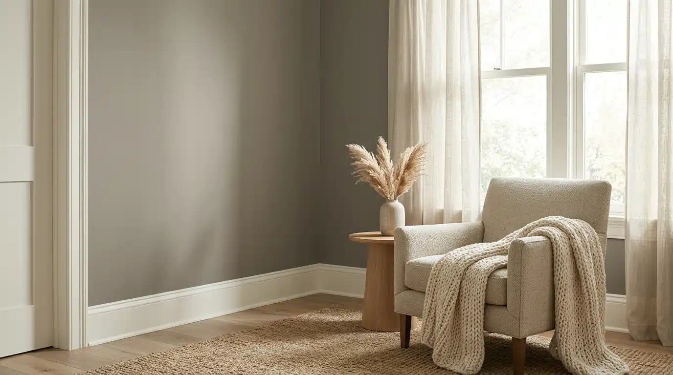
Stone Hearth sits somewhere between warm gray and soft sage.
At first glance, it reads almost neutral, nothing too bold, nothing too flat.
But after living with it for a few days, something shifts. After a full day of light changes, it settled into this quiet, mossy heat that felt more like a natural material than a paint color.
That’s what separates it from most greiges. Those tend to pull cool or purple in low light.
Stone Hearth stays warm throughout morning, afternoon, and lamp-lit evenings.
Breaking Down Stone Hearth’s Undertone
Stone Hearth (HC-81) has an LRV of 48.45 and a hex code of #C4BAAA.
That puts it right in the middle, not too light, not too dark.
It’s technically a greige, but the green-brown base keeps it from feeling flat or cold.
Next to bright white trim, the warm undertone shows up clearly. Next to flooring, especially wood or stone, it softens and blends naturally.
I’ve noticed that swatching it in isolation tells you very little.
Stone Hearth Benjamin Moore Color Palette
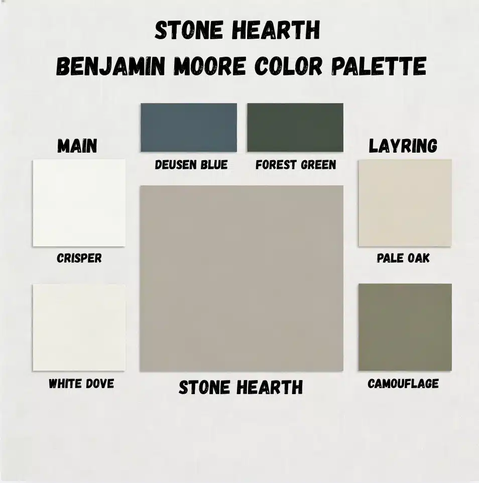
Building a palette around Stone Hearth doesn’t take much effort. The color sits quietly and lets everything else do the talking.
Trim colors that work:
- Benjamin Moore White Dove is clean and warm
- Chantilly Lace crisper, but still friendly with the undertone
Accent colors worth trying:
- Van Deusen Blue adds depth without overwhelming
- Black Forest Green earthy and grounded, feels intentional
For a tonal, layered look:
- Pale Oak on adjacent walls softens the transition
- Camouflage brings in a similar warmth with slightly more green
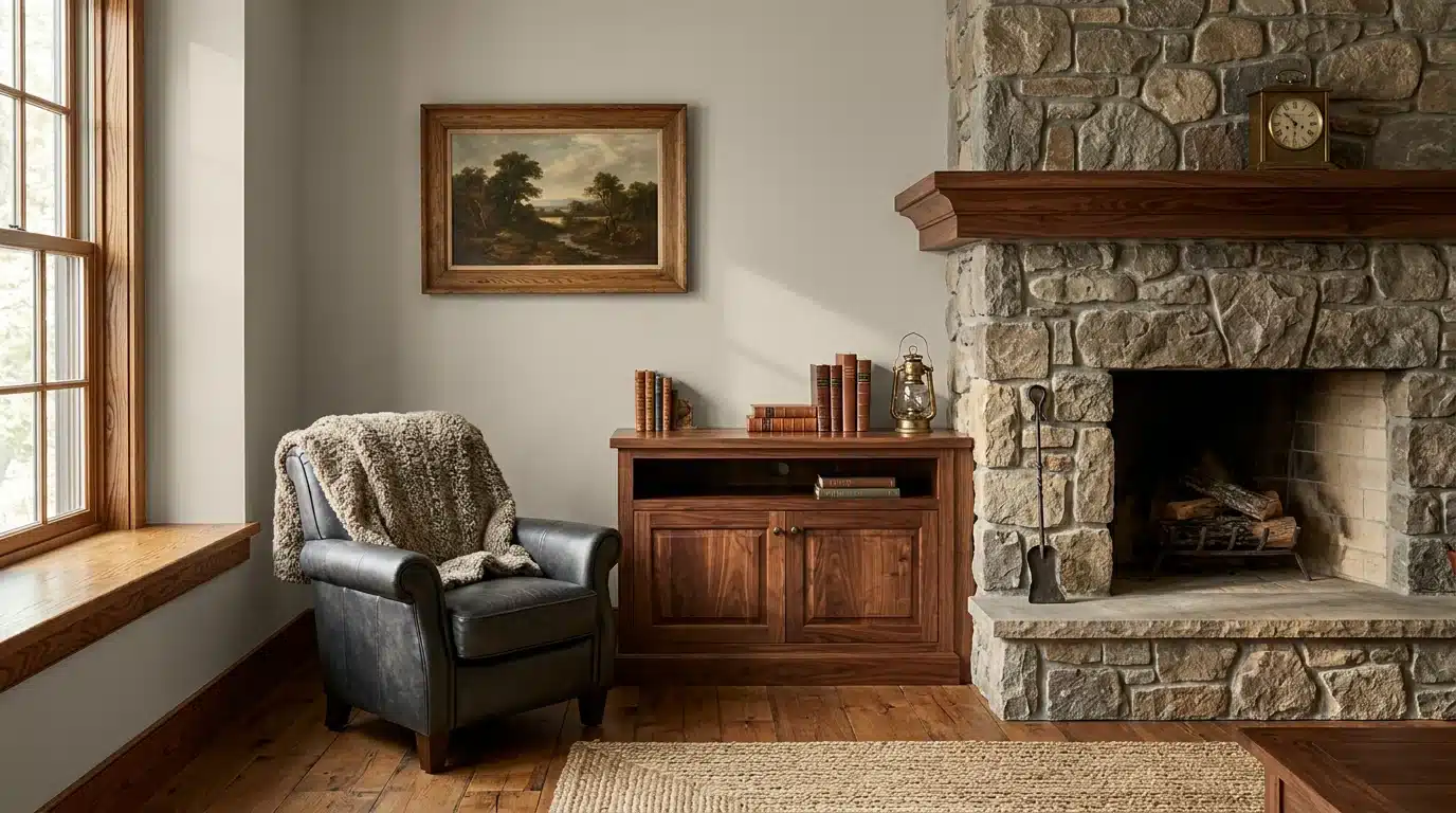
Wood tones like walnut and oak sit naturally beside it. Brass and bronze hardware finish the look better than chrome ever could.
How Stone Hearth Benjamin Moore Reacts to Light
Light changes everything with this color, and Stone Hearth is particularly sensitive to it.
Morning light: Pulls slightly cooler and fresher, almost like a soft sage.
Evening light: Warm bulbs bring out the brown base, making it feel cozy and settled.
North-facing rooms: The green undertone gets stronger. It can read moodier here, which some people love.
South-facing rooms: Stays consistently warm throughout the day; this is where it performs best.
Owen always says test it under both warm bulbs and cool LEDs before committing. The difference is bigger than you’d expect, and it saves a lot of second-guessing later.
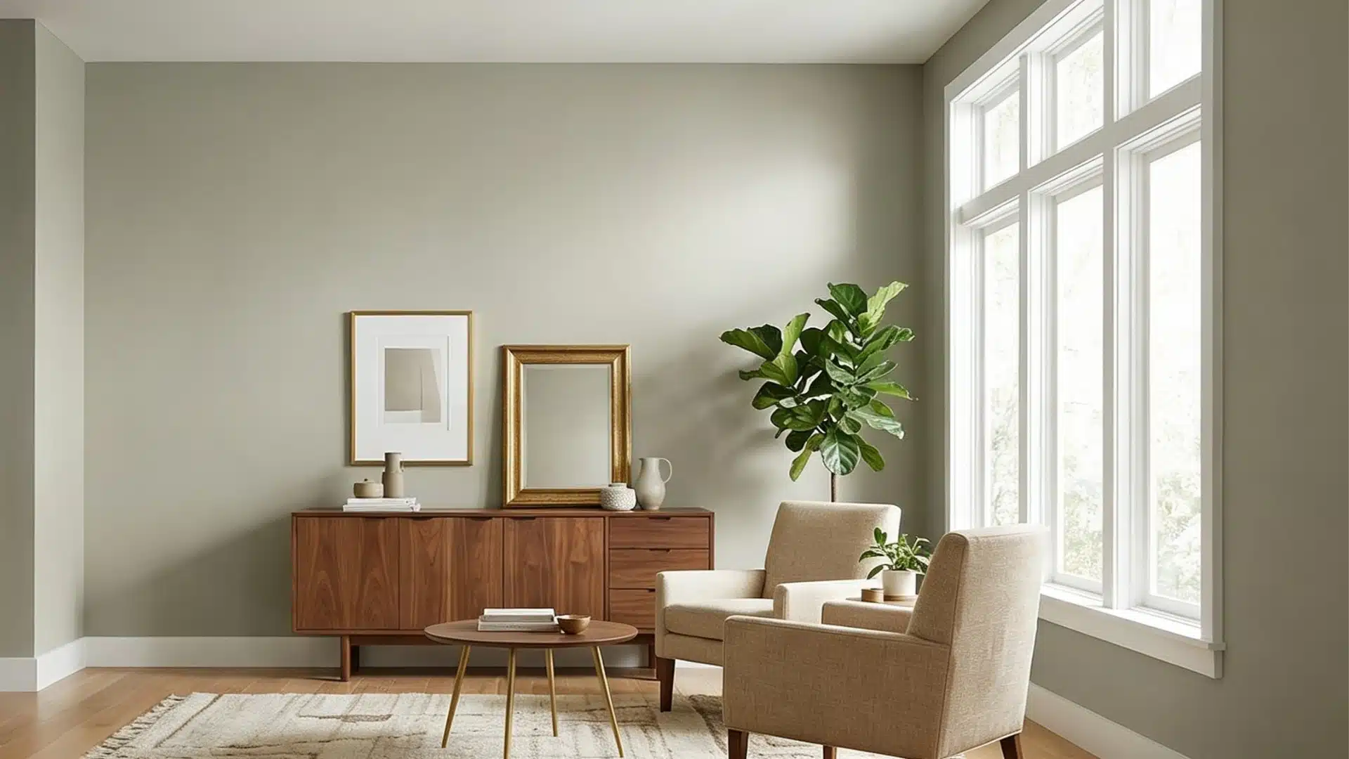
Where Stone Hearth Feels Most Natural in a Home
Stone Hearth Benjamin Moore doesn’t demand attention; it earns it. Here’s where it tends to shine the most.
Open Living Areas that Need Soft Depth
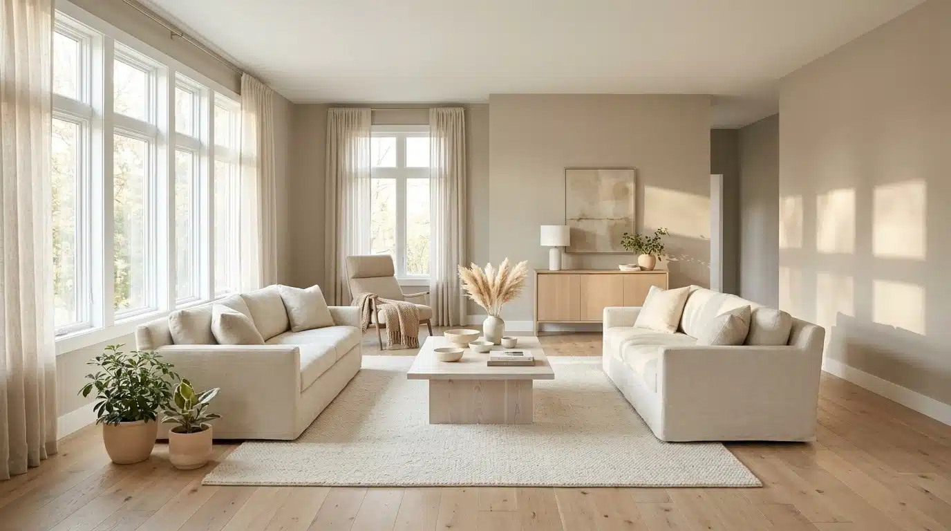
Large open spaces can feel cold or directionless with the wrong neutral.
It adds just enough heat to make the room feel pulled together. It works especially well when natural light moves across the walls through the day, shifting the mood without changing the color.
Bedrooms that Should Feel Settled, Not Flat
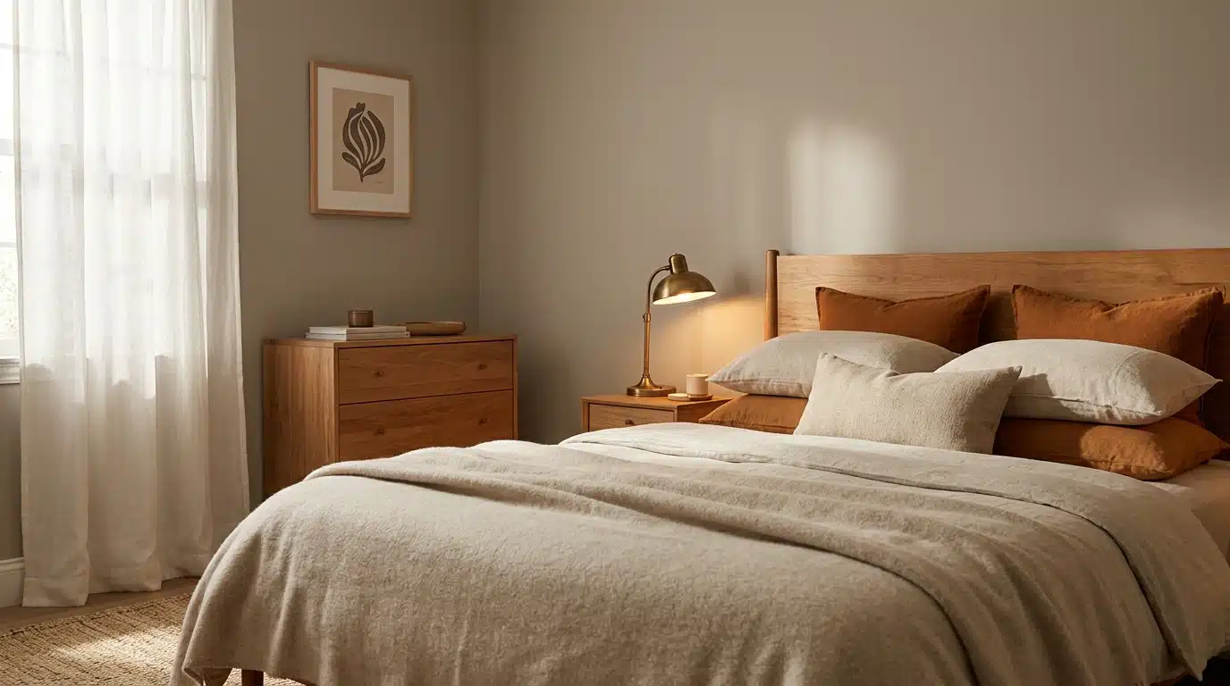
Bedrooms need a color that relaxes rather than stimulates. Stone Hearth does that well. It wraps the room in a quiet, earthy tone that feels restful.
Paired with warm bedding and wood furniture, it creates a space that genuinely feels good to wake up in.
Connecting Spaces Like Hallways and Entryways
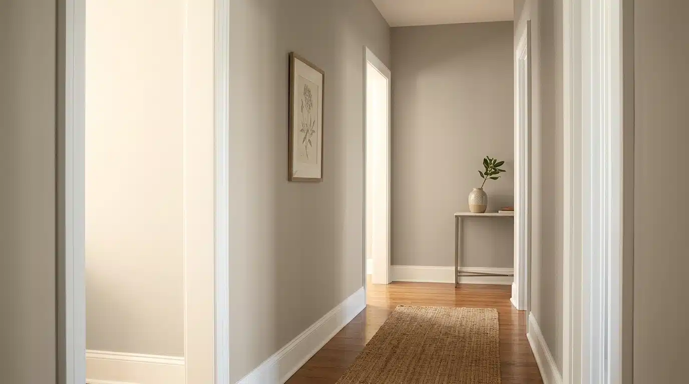
Hallways are tricky; they see every light condition and connect every room.
This color handles that well because it stays consistent without looking washed out.
A good tip, Owen swears by painting the adjacent walls first and checking the flow before finishing the connecting space.
Kitchens Looking for a Grounded Backdrop
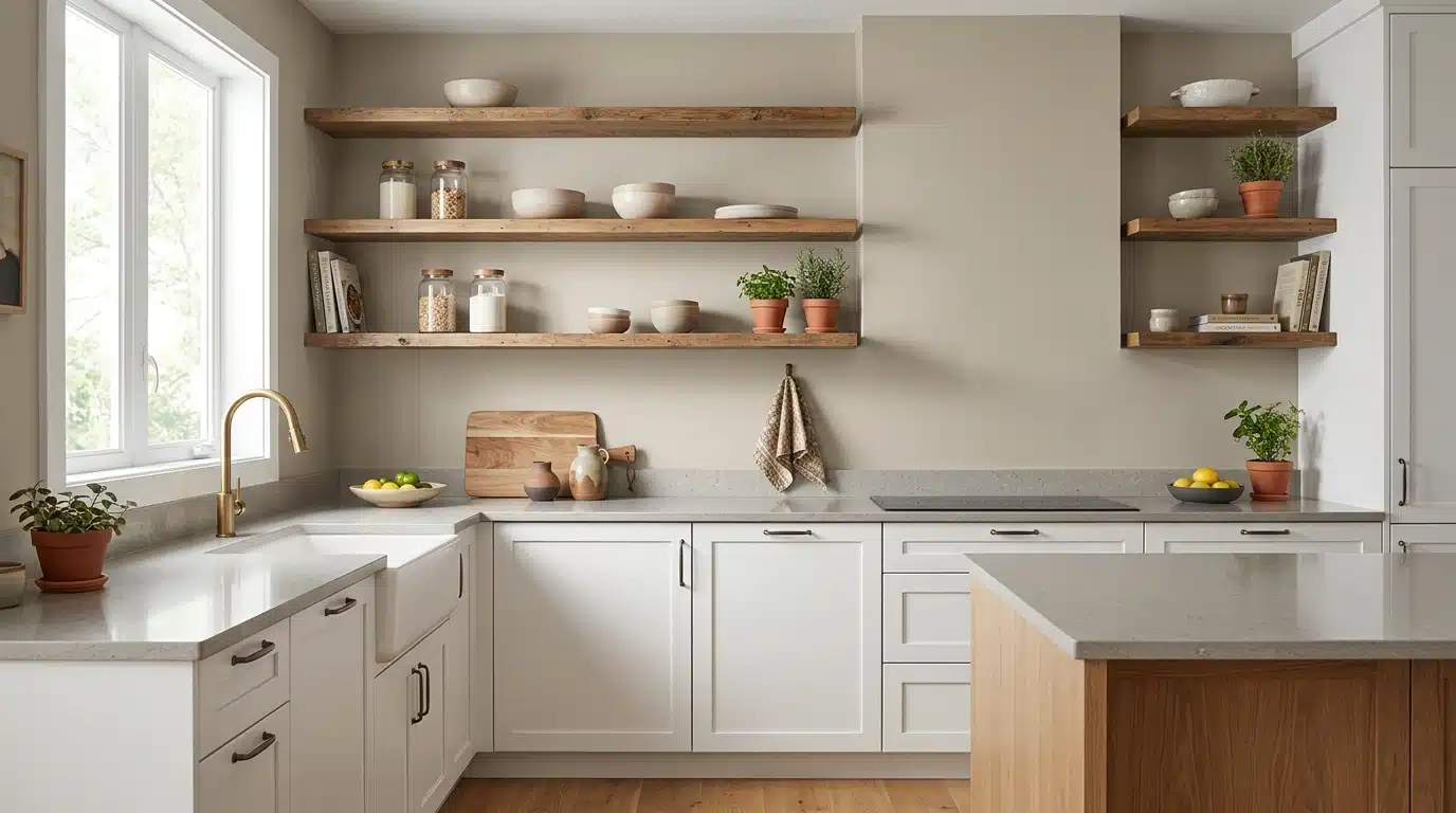
Stone Hearth works surprisingly well in kitchens, especially behind open shelving or alongside natural wood cabinets.
It doesn’t compete with food, cookware, or countertop materials. Instead, it sits back and lets the textures in the room do the work. White or cream cabinets look particularly sharp against it.
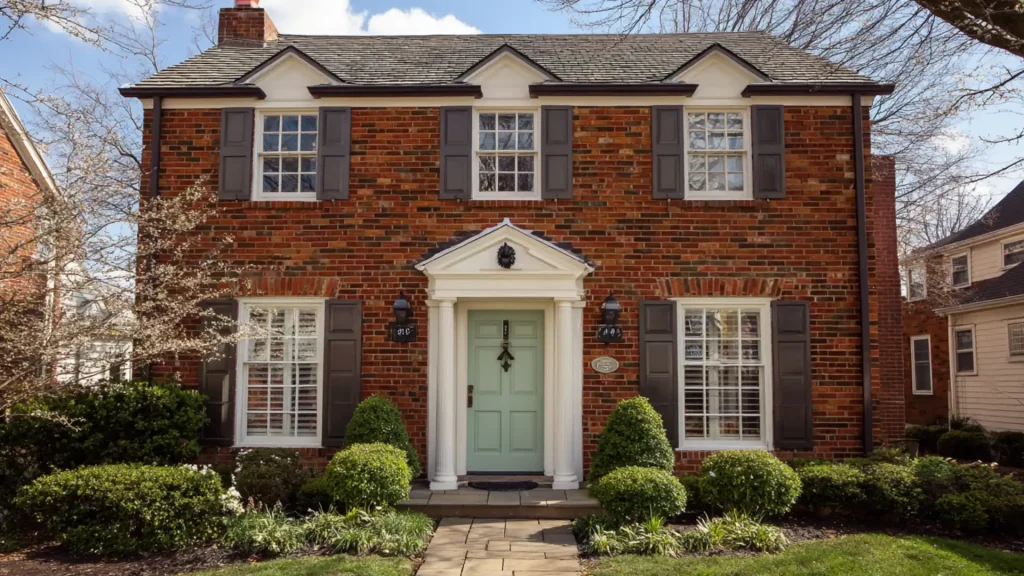
Exteriors that Want Character without Going Bold
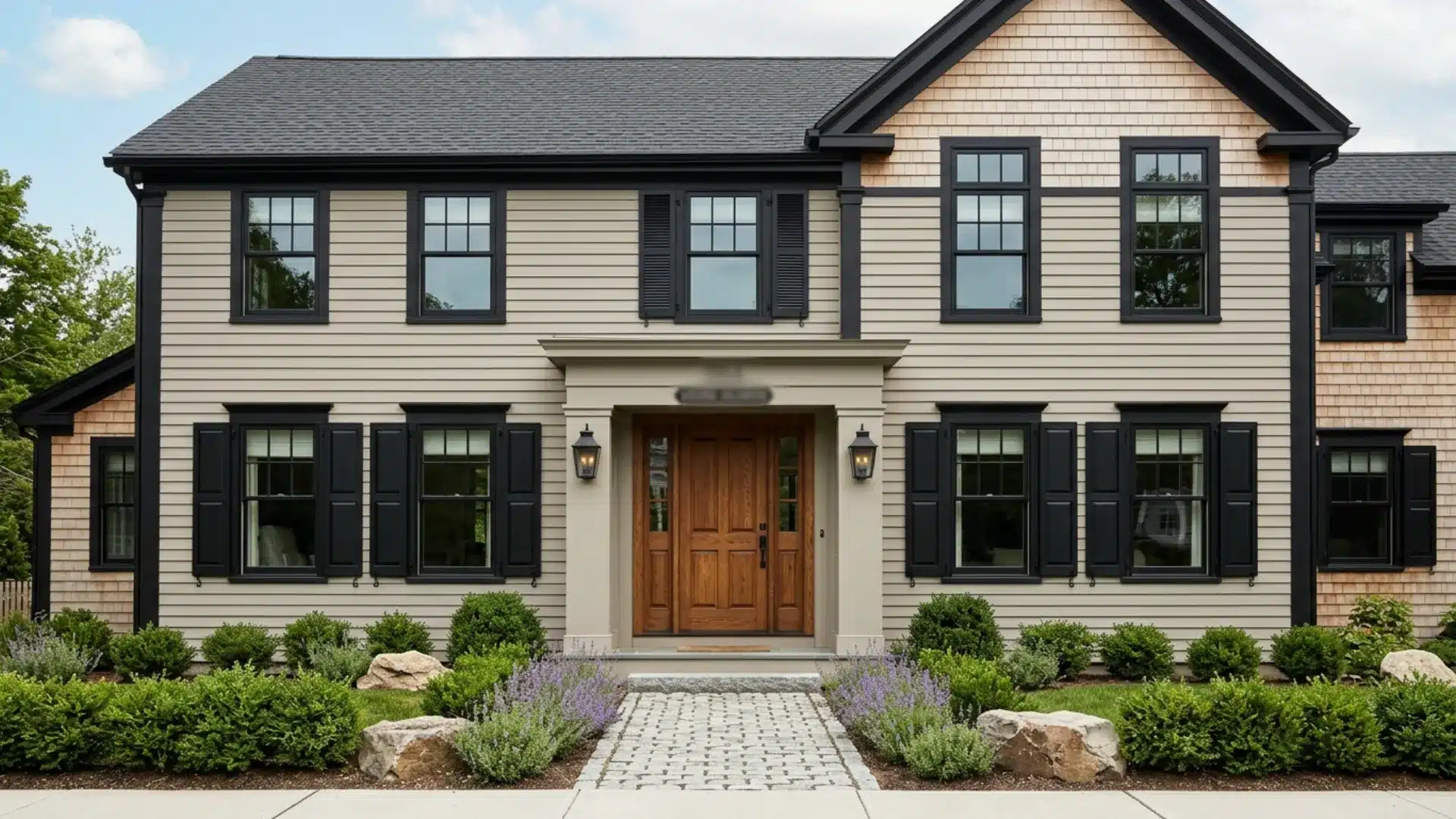
Stone Hearth on an exterior reads as a warm, natural stone-like finish.
It works well on rendered or brick homes where you want character without a strong color statement.
Pair it with deep charcoal or black trim for contrast, or go softer with white fascia for a cleaner finish.
I have seen it hold up well across different outdoor lighting conditions; it never looks washed out or muddy in direct sunlight.
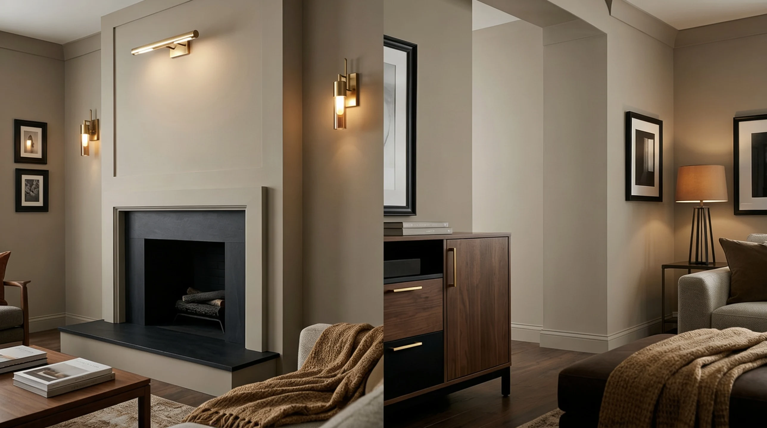
Stone Hearth Benjamin Moore Cabinets
This cabinet color is an understated choice that pays off. It brings heat without the heaviness of darker colors.
How does it look on the cabinets?
Soft, grounded, and natural, it makes kitchen cabinets look intentional rather than overdone.
Pairing with countertops and backsplashes:
- White quartz or marble keeps things light and balanced.
- Butcher block adds a warmer, more organic feel.
- Subway tile in cream or off-white ties everything together naturally,
Best lighting for cabinets:
Under-cabinet warm lighting brings out the brown base beautifully. Cool overhead lighting flattens it slightly.
For finish, Owen and I always recommend satin or semi-gloss on cabinets. Both hold up better to daily cleaning and moisture than matte, and they make the color look more polished on a flat cabinet surface.
What Pairs Well with Stone Hearth Benjamin Moore
Stone Hearth is a team player. The right pairings bring out its best qualities; the wrong ones muddy it.
Here’s what actually works.
Whites that Don’t Clash
Warm whites work best here. Benjamin Moore White Dove and Simply White sit comfortably without creating an odd contrast. Cooler whites like Decorator’s White can make the green undertone look stronger than intended.
Always test white trim samples directly on the wall beside it; screens never show the full story.
Woods that Improve vs Dull it
Always bring actual wood samples into the room before making a decision.
- Walnut and oak: Warm, natural tones that complement the brown base beautifully.
- Pine and light maple: Can make the color look washed out and flat.
- Darker-stained wood: Adds contrast and grounds the space well.
A photo never captures how a material reads in real light.
Metals that Either Lift or Flatten the Tone
Warm metals are always the safer call here.
- Brass and unlacquered bronze: Warm and grounding, they naturally lift Stone Hearth.
- Matte black: Strong contrast that works well in modern spaces.
- Polished chrome and nickel: Too cool pulls the green undertone in the wrong direction.
Owen and I learned this the hard way with a chrome faucet that made our whole color scheme feel off.
Stone Hearth vs Other Popular Neutrals: What Sets it Apart
Not all neutrals behave the same way on a wall.
In side-by-side testing, Stone Hearth holds its own, but it’s not always the right pick.
| Color | Undertone | Feels Like | Where it Wins | Where Stone Hearth Beats it |
|---|---|---|---|---|
| Revere Pewter | Gray-green | Cool, industrial | Modern, minimal spaces | Warmer, homier rooms |
| Accessible Beige | Beige-pink | Safe, traditional | Classic interiors | Rooms needing more depth |
| Agreeable Gray | Cool gray | Light, airy | Small, bright rooms | Cozy, grounded spaces |
| Edgecomb Gray | Warm gray | Soft, quiet | Formal living areas | Casual, earthy interiors |
| Stone Hearth | Gray-green-brown | Warm, natural | Most light conditions | — |
Next to similar shades, Stone Hearth consistently feels softer and more grounded.
Cooler greiges tend to pull stark or flat in low light. Stone Hearth stays warm. That said, in very bright south-facing rooms, lighter neutrals like Agreeable Gray can feel fresher and more open.
Before You Commit: A Simple Testing Routine that Works
Skipping this step is the most common reason people repaint. Take the time, it’s worth it.
Large swatch placement: Skip small wall patches. Use poster boards or peel-and-stick samples instead. Move them around the room to test different walls and corners.
Viewing at different times:
- Morning, midday, and evening all show different sides of Stone Hearth.
- Check it under both natural light and your actual room lighting,
Checking against fixed elements: Hold the sample directly next to your flooring, countertops, and existing furniture. These are the things that won’t change, so they matter most.
Owen and I made the mistake of judging colors from small wall patches early on. Poster boards changed everything. You see the real color, in your real space, before spending a cent on full tins.
Final Verdict
Stone Hearth Benjamin Moore is a genuinely good color, but it’s not for every space or every person.
It needs warm lighting, the right trim, and complementary materials to perform at its best.
In the wrong conditions, the green undertone can take over, and the heat disappears.
That’s worth knowing before you commit.
When everything lines up, the light, the pairings, the finish delivers a quiet, grounded look that’s hard to replicate with other neutrals. Test it properly, take your time.
It’ll give you exactly what you’re looking for.
Frequently Asked Questions (FAQ’s)
1. How Does Stone Hearth Compare to Revere Pewter?
Stone Hearth runs warmer and softer. Revere Pewter pulls cooler and more industrial overall.
2. What Color Family Does Stone Hearth Belong to?
It sits in the greige family, with noticeable green-brown undertones throughout.
3. How to Update Stone Hearth?
Swap hardware to brass, add warm textiles, and refresh trim with White Dove.
4. What is the Best Warm White that Doesn’t Look Yellow?
Benjamin Moore White Dove stays warm without tipping into yellow, a reliable choice.
5. What is the Most Popular Color of Siding Right Now?
Warm grays and soft sage greens are leading siding color choices right now.