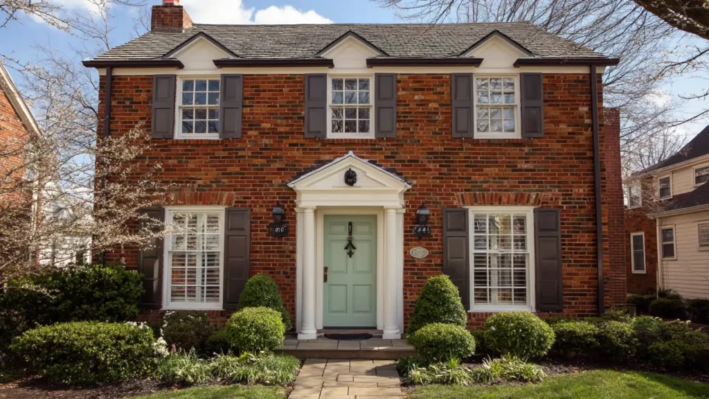

You spend hours picking two different colors for walls and trim. And then the room still feels off.
Picking the same color for both can actually fix that. It makes any space look cleaner, bigger, and more put-together.
This blog covers why that one simple choice works so well. It also shares real color ideas you can try at home today.
The Pros and Cons of Painting Trim Same Color as Walls
Painting walls and trim the same color is a simple choice. But like anything in home design, it comes with its own set of good and not-so-good sides.
| Pros | Cons |
|---|---|
| Makes a room look bigger and more open | Can make a room feel flat if the wrong color is picked |
| Gives a clean, finished look | Trim details may get lost visually |
| Easier to touch up, only one color to match | May not suit every room style |
| Works well in small or low-light spaces | Requires good prep for a neat finish |
| Reduces decision fatigue when choosing colors | Bold or dark colors can feel heavy on all surfaces |
Is this Color Drenching?
Not quite, though they’re closely related. Painting walls and trim the same color is one part of color drenching, but it doesn’t capture the full technique.
Color drenching goes further. It means coating an entire room, trims, doors, walls, and ceiling, and even built-ins, in one continuous color.
The goal is total immersion, creating a cocoon-like effect in which the eye finds no breaks or contrast.
Simply matching walls and trim while leaving the ceiling white is a more restrained move. It softens the room without fully committing to the drench.
So yes, same-color walls and trim overlap with color drenching, but the real drench also pulls the ceiling in.
Color Suggestions for Painting Walls and Trim in the Same Color
The right color is the most important part of this whole approach.
The wrong shade can make a room feel off, while the right one pulls everything together.
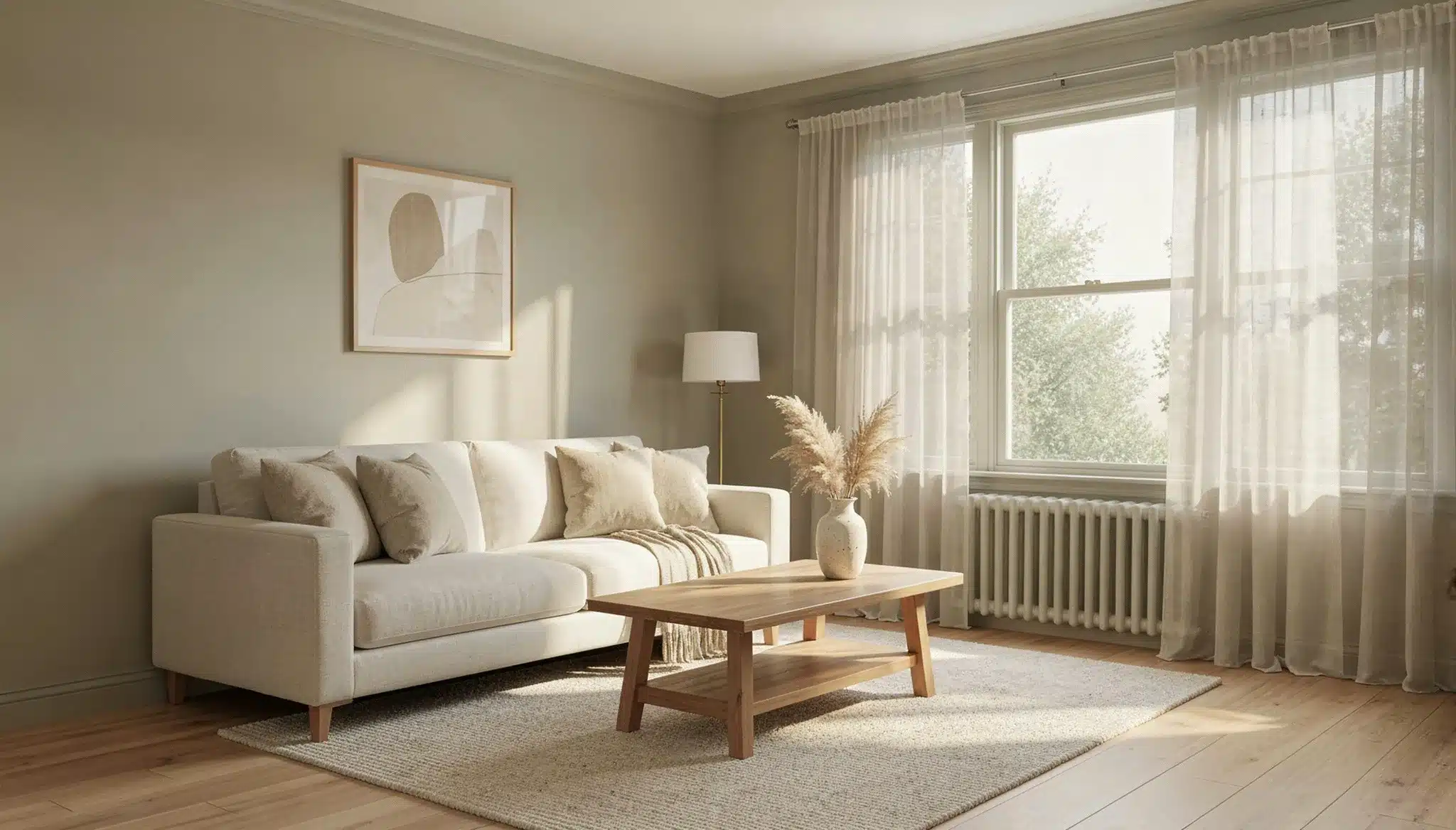
Warm White
Warm white is one of the safest and most reliable choices for this look.
It keeps the room feeling clean and open without coming across as cold or stark. Unlike a bright, cool white, warm white has a slight creamy undertone that softens the space.
It works in almost every room, living rooms, bedrooms, hallways, and bathrooms alike.
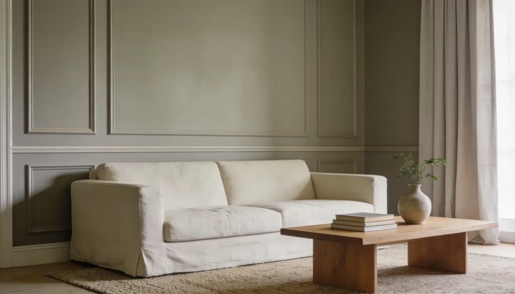
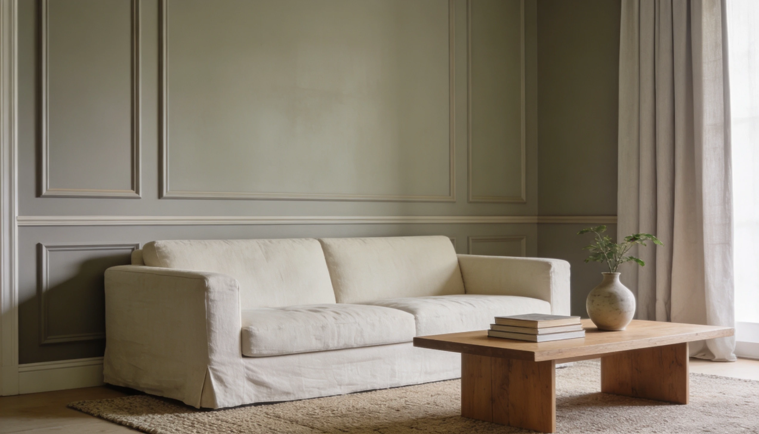
Greige
Greige sits right between grey and beige, and that balance is exactly what makes it so useful.
When you paint walls and trim the same greige shade, the room feels grounded and easy to live in.
If greige feels too safe, try a slightly warmer version with more beige in it. Use it on the ceiling too and the whole room feels like it was designed with real intention.
Sage Green
Sage green brings a soft, natural quality to any room. It’s not loud or overpowering; it sits quietly, making the space feel connected to the outdoors.
When used across both walls and trim, it creates a gentle, organic look that feels fresh without trying too hard.
It works especially well in kitchens, bedrooms, and bathrooms.
You can pair it with natural wood tones, linen, or terracotta accents for a relaxed and comfortable look.
Navy Blue
Navy blue is for those who want a room that makes a real statement.
It’s bold and rich, adding a sense of depth that lighter colors simply can’t match. The room takes on a moody, dramatic quality that feels intentional and confident.
It works best in rooms with good lighting, natural or artificial. Powder rooms, home offices, and reading nooks are all strong candidates for this kind of look.
Taupe and Earthy Browns
Taupe and earthy browns bring a warmth to a room that’s hard to replicate with cooler shades.
These tones feel grounded, familiar, and genuinely cozy. When used across both walls and trim, they wrap the room in a comfort that makes you want to stay a while.
They pair beautifully with metals like brass and copper, and natural textures like wool and wood.
Room-by-Room Ideas for Painting Trim Color Same as Walls
Every room in your home has its own feel, and the right color palette can really change things for the better.
Some rooms are natural fits for this look, while others just need the right shade to pull it off.
Living Room
The living room is one of the best places to try this look. A single warm color across walls and trim creates a cozy, modern feel that’s hard to get any other way.
Warm neutrals like greige, beige, sage, and warm white work especially well here.
When the walls and trim blend together, your furniture, rugs, and artwork naturally become the focal point.
For living room, go with a warm greige on both the walls and trim. It’ll make the sofa and artwork shine out like never before.
Bedroom
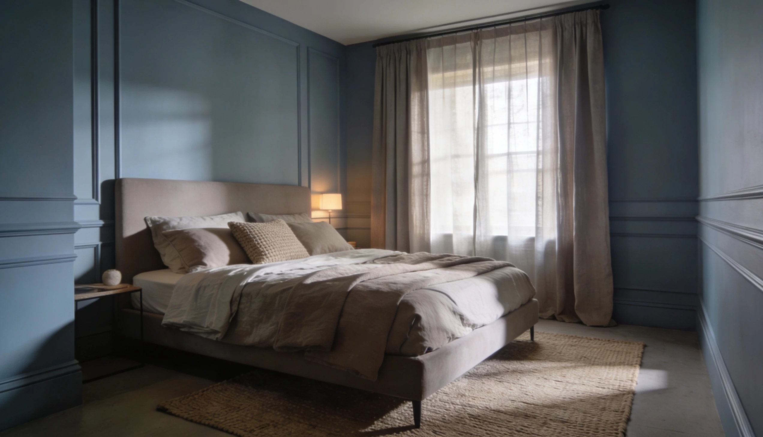
The bedroom is where this approach really delivers. Painting walls and trim the same color wraps the room in one shade, creating what designers call a “cocoon effect.”
Muted blues, dusty greens, taupe, and earthy tones are all strong choices here.
They bring a sense of quiet to the room without making it feel dark or heavy.
Bathroom
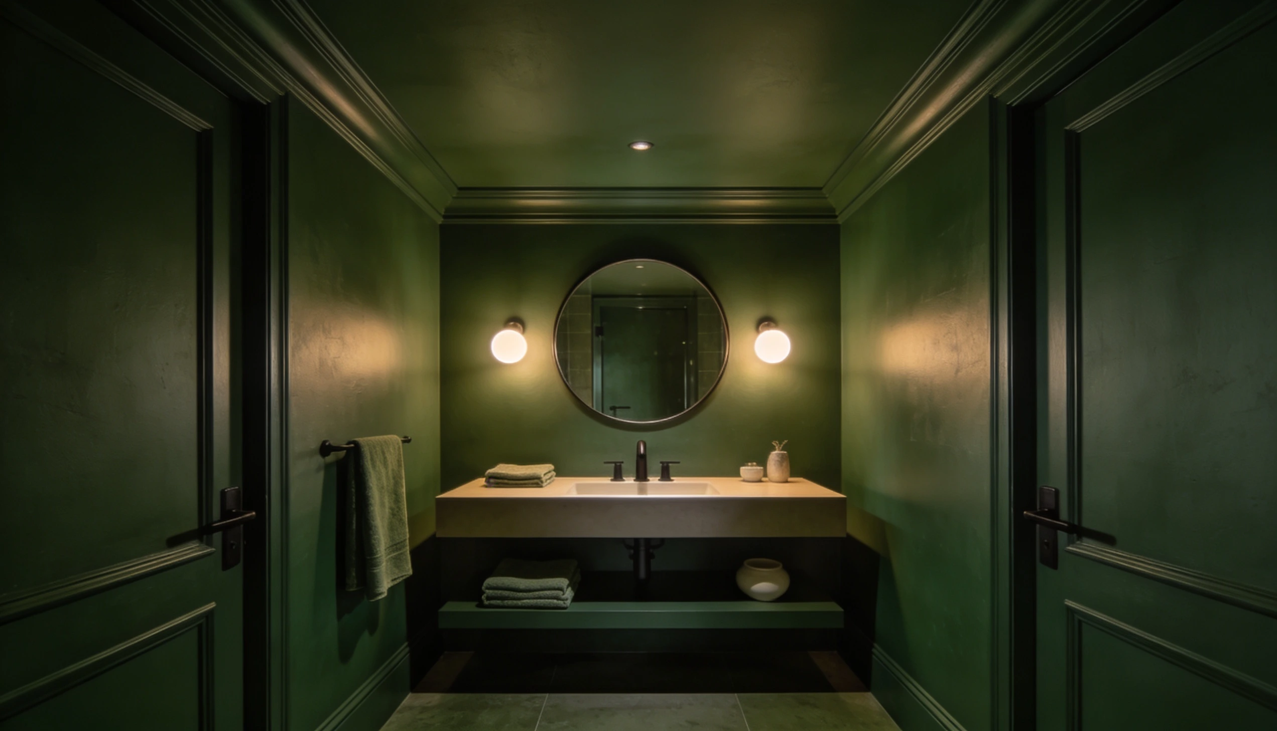
Bathrooms are a great place to go bold with this look. A single color across walls and trim gives even a small bathroom a clean, spa-like feel.
Soft whites and warm neutrals keep things light and fresh.
But darker shades can bring something fresh as well. It depends on what you like. Deep navy, forest green, or charcoal can add a dramatic feel to a bathroom.
So, is Painting Trim the Same Color as Walls Worth It?
For most homes, yes, it really is. When you paint walls and trim in the same color, the space feels calmer, cleaner, and more put-together.
It’s not a complicated change, but the difference it makes is hard to ignore.
Start with one room, pick a shade you’re comfortable with, and see how it feels.
You might be surprised by how much you like it. Sometimes the simplest changes make the biggest impact.
Frequently Asked Questions (FAQs)
1. What is it Called When You Paint the Trim and Walls the Same Color?
It’s called “color drenching.” You use one color across walls, trim, and sometimes the ceiling too, for a complete, uniform look.
2. Should Your Trim be Lighter or Darker than Walls?
It’s a personal choice. Lighter trim makes walls stand out. Darker trim adds depth. Matching both creates a clean, modern look with no contrast.
3. What’s the Most Popular Wall Color Right Now?
Warm whites, greige, and soft sage green are very popular right now. They work in most rooms and pair well with a wide range of furniture.