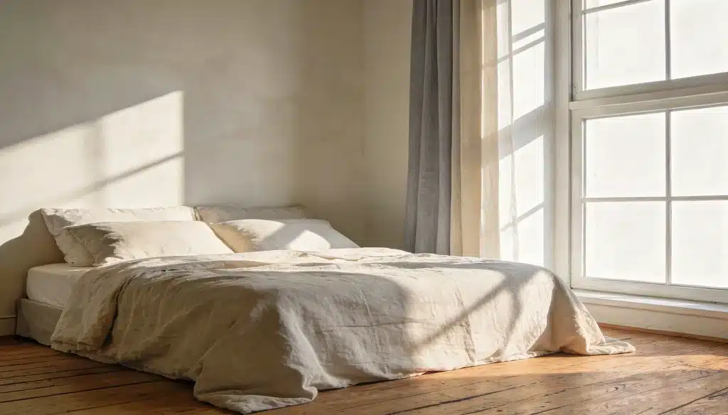

A bedroom should feel like a calm place. But for many, it just doesn’t. The walls are the wrong color, the room feels tense, and sleep never comes easily.
That subtle mismatch makes it harder to fully relax, and the wrong paint color makes it worse.
It keeps the mind busy when it should be winding down. The right calm bedroom paint colors can change all of that.
These relaxing master bedroom paint ideas are here to help find the perfect shade for a peaceful night’s sleep.
How to Choose a Palette for Your Bedroom?
The color on a bedroom wall does more than fill space. It sets the mood. In a master bedroom, that mood needs to be calm and quiet.
Calm bedroom paint colors fall into a few key families:
- Soft neutrals: warm whites, greiges, and tans
- Muted blues and greens: cool and easy to rest in
- Pale lavenders and blush tones: soft and gentle on the eyes
Picking the right shade isn’t just about looks. It’s about how the room feels once the walls dry. A few things can help you get that right:
- Natural light: Bright rooms suit cooler tones. Low-light rooms do better with warm shades.
- Room size: Light colors make a small room feel bigger. Deep tones make a large room feel snug.
- Existing furniture: The wall color should work with what’s already in the room.
For finish, matte finish and eggshell finish work best. They soften light and cut glare. That keeps the room feeling calm throughout the day.
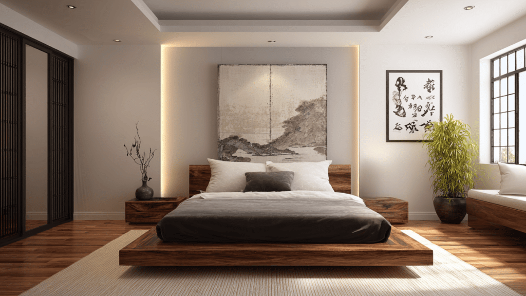
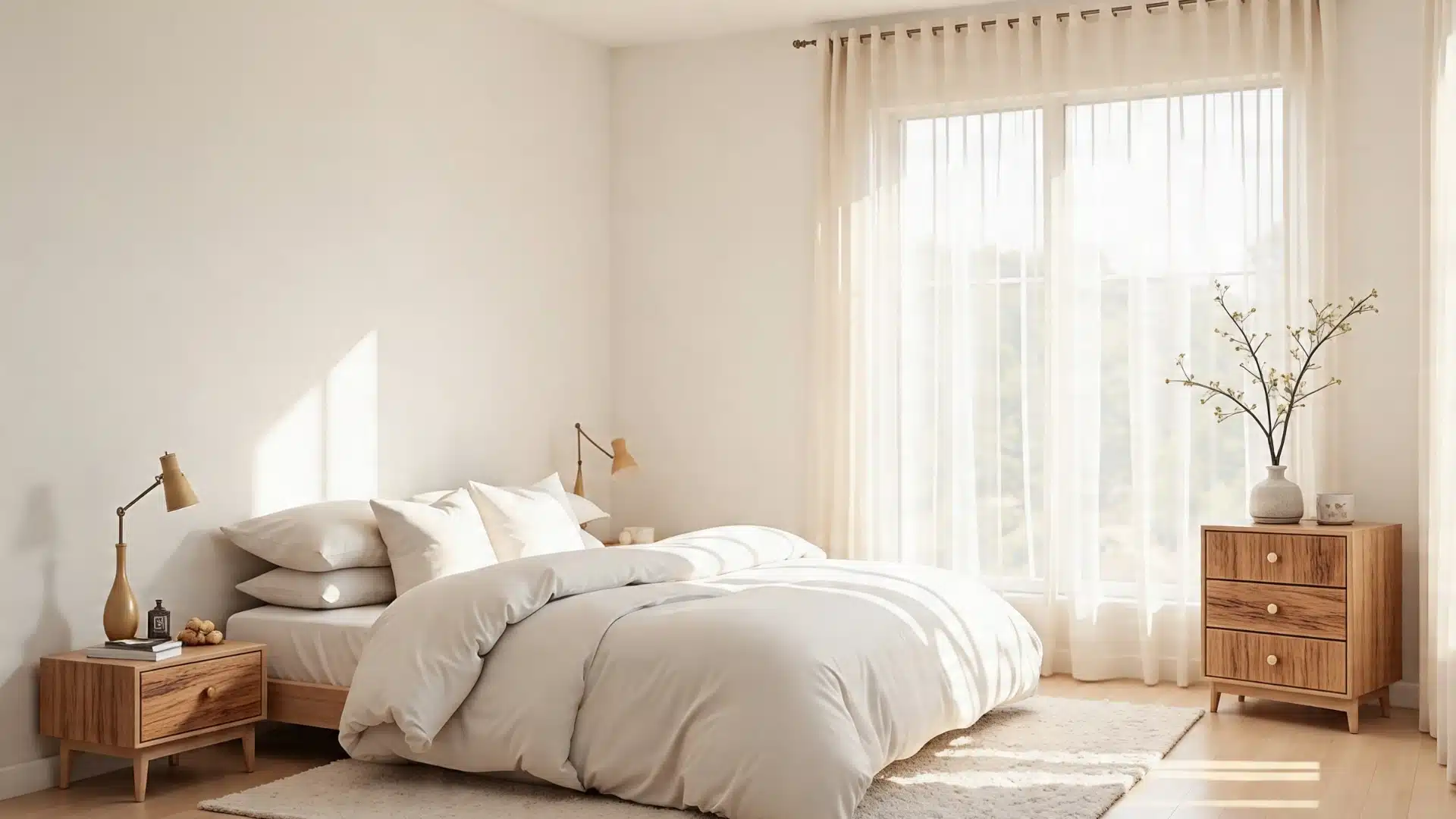
Relaxing Master Bedroom Paint Ideas for a Serene Space
A calm bedroom decor starts with the right color on the walls. These paint ideas cover a range of tones that consistently create a quiet, restful space.
1. Coventry Gray
Coventry Gray HC-169 is a soft, blue-toned gray that feels calm without feeling cold. It’s one of the most popular relaxing master bedroom paint ideas for good reason.
The shade works well in both natural and artificial light. Style it nicely with white trim, wood furniture, and soft bedding.
The result is a room that feels put-together and peaceful without trying too hard
2. Quiet Moments
The name says it all. Quiet Moments 1563 is a pale, muted blue-green that brings a relaxed, restful feel to any master bedroom.
It’s soft enough not to overpower the room but has just enough color to add character.
The color appears to work especially well in rooms with good natural light. Pair it with light wood tones and simple white linens for a clean, restful finish.
3. Pale Oak
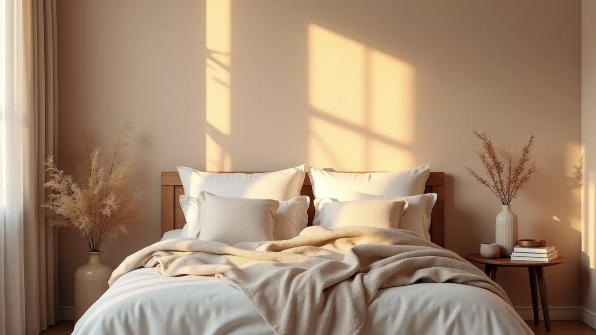
Pale Oak OC-20 is a warm, creamy neutral sitting between beige and blush. It’s one of those calm bedroom paint colors that feels instantly comfortable.
The shade adds warmth without making the room feel heavy. Feels balanced with soft whites, warm wood tones, and natural textiles.
Rooms painted in pale oak feel cozy and inviting, making it easy to unwind at the end of a long day.
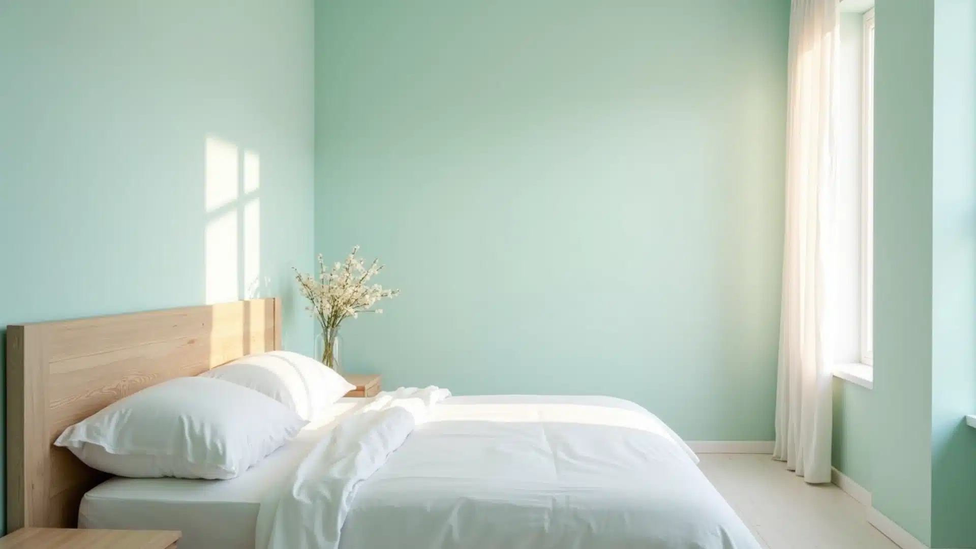
4. Morning Dew
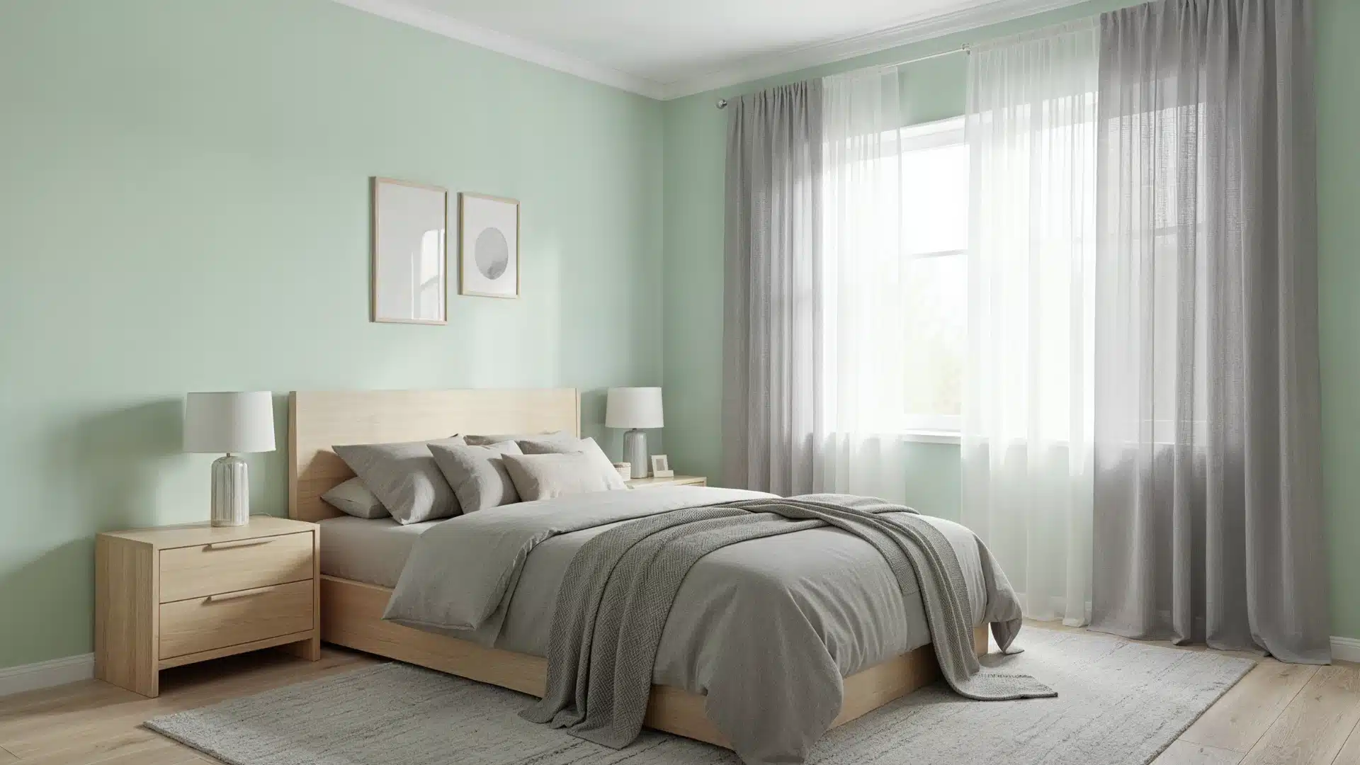
Morning Dew is a soft, light green with gentle gray undertones, giving it a fresh yet muted look.
It leans slightly cool but stays balanced, avoiding brightness. In natural light, it appears airy and subtle, while in lower light, it softens further.
This shade creates a calm, easygoing backdrop that feels clean, relaxed, and quietly refreshing.
5. Pashmina
Pashmina AF-100 is a warm, soft, greige that sits right between gray and beige. It’s one of those relaxing master bedroom paint ideas that works in almost any space.
The shade feels grounded and comfortable without being too plain. Use it well alongside deeper wood tones, warm lighting, and layered textiles.
Rooms painted in Pashmina have a quiet, settled feel, the kind that makes it easy to switch off and rest.
6. Snow Bound
Snow Bound SW 7004 is a soft, warm white that avoids feeling stark or clinical. It’s cleaner than cream but warmer than pure white, sitting in a sweet spot that works well in most bedrooms.
This shade makes a room feel open and light without feeling empty. Looks clean with almost anything: warm neutrals, soft blues, or natural wood.
A simple but smart choice for a calm, well-balanced bedroom.
7. Natural Tan
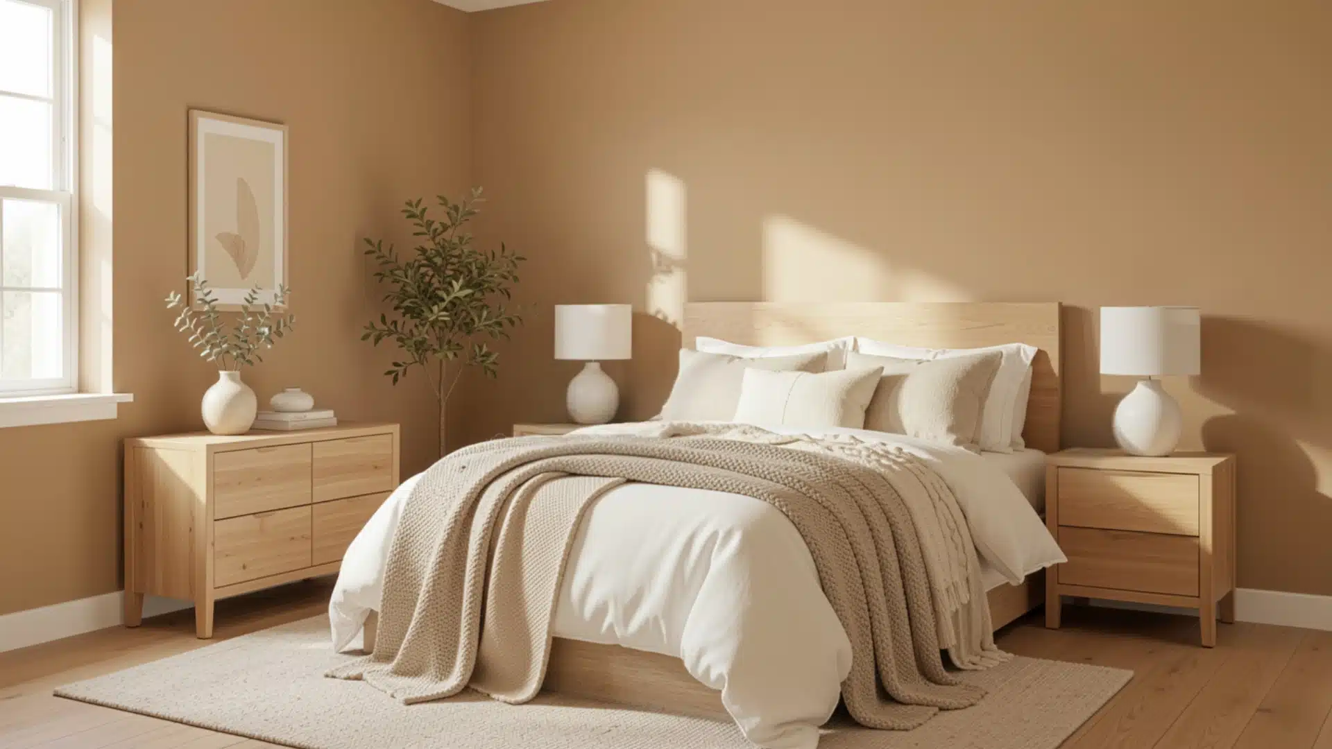
Natural Tan SW 7567 is a warm, medium-depth neutral that sits between beige and taupe.
It has soft brown undertones with a slight gray influence, which keeps it from looking too yellow or overly warm.
In bright light, it reads lighter and more beige, while in lower light, it deepens into a richer, cozy tone. It creates a steady, grounded backdrop that feels comfortable and easy to live with.
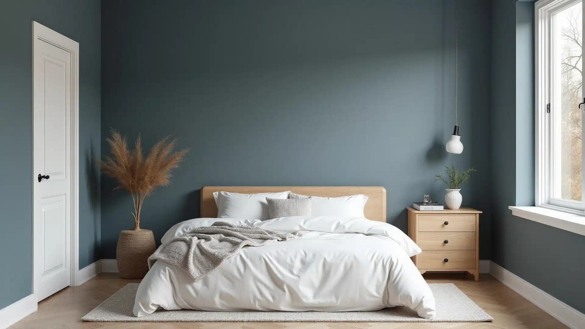
8. Soft Blue
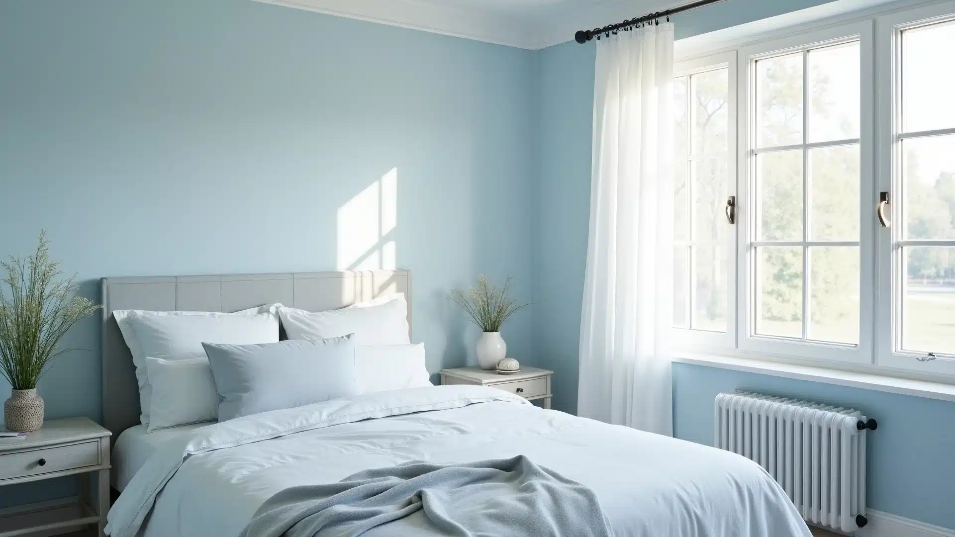
Soft Blue V107-1 is one of the most well-known calm bedroom paint colors, and for good reason. Blue has a natural calming effect on the mind.
This particular shade is light and easy, without feeling too cool or washed out. Works well in both small and large bedrooms.
Pair it with white trim, light gray accents, and simple bedding for a bedroom that feels clean, calm, and genuinely restful.
9. Blush Pink
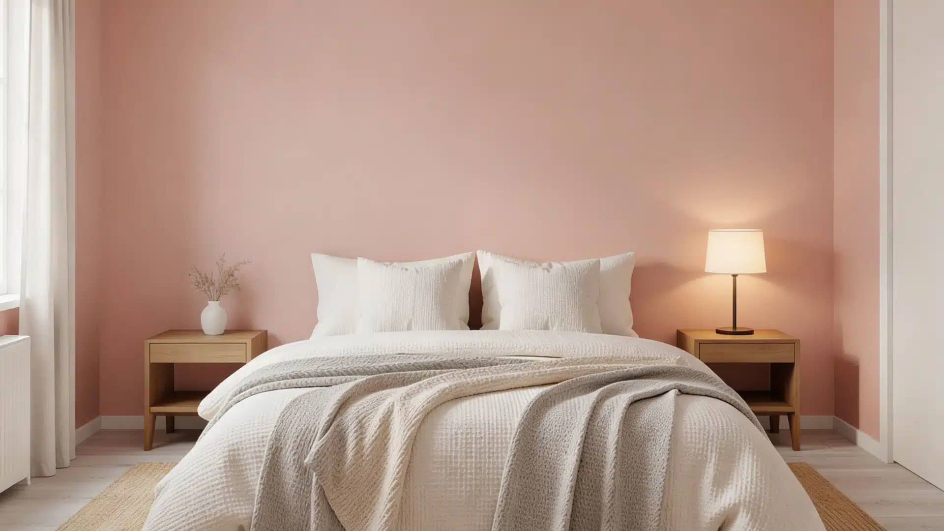
Blush Pink is a soft, warm shade that adds a gentle, cozy feel to the bedroom. It’s nothing loud or overpowering, just a quiet hint of color that makes the space feel warm and welcoming.
It pairs well with warm whites, light grays, and natural wood tones. A great option for a bedroom that feels soft, calm, and restful.
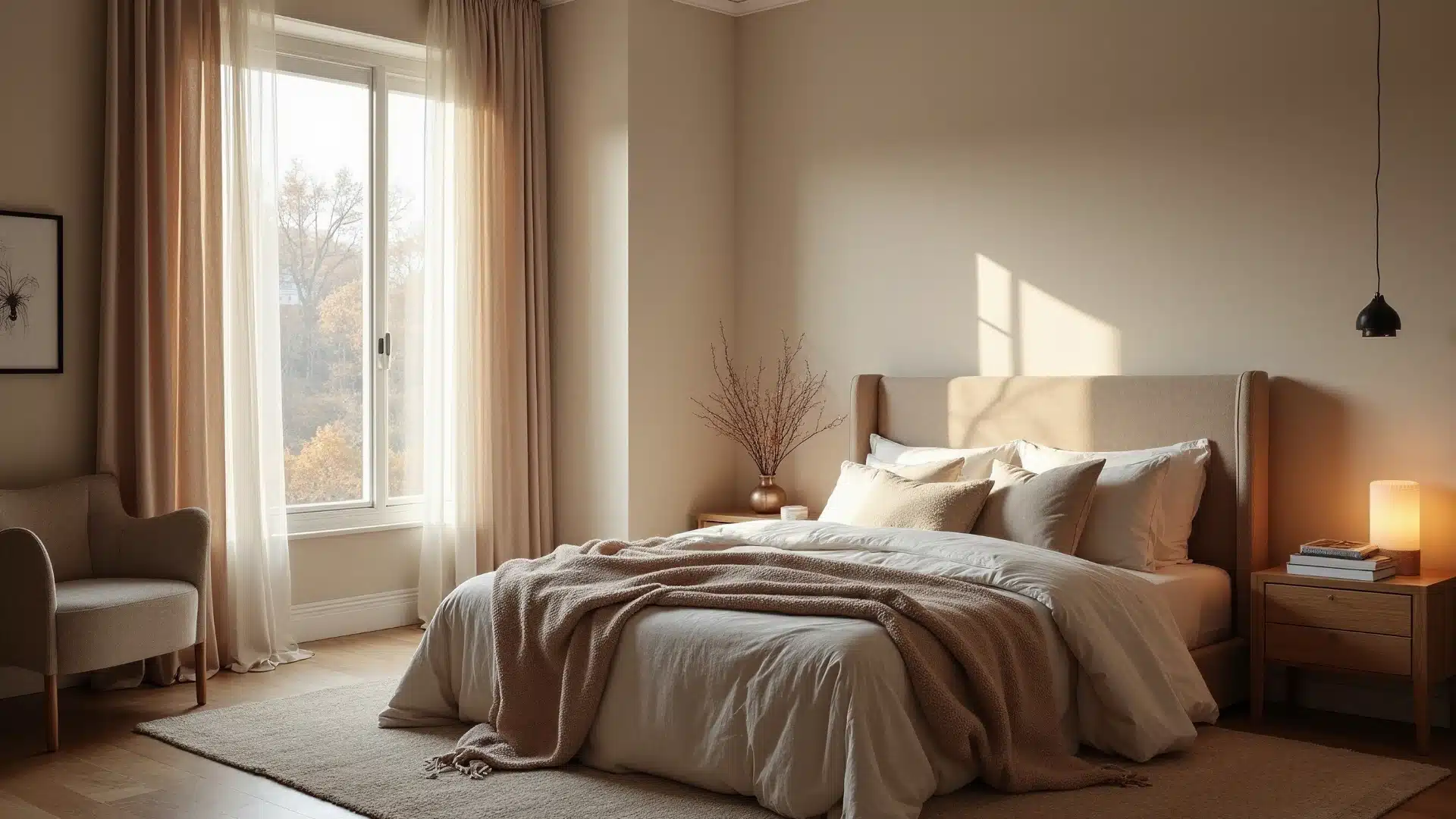
10. Warm Greige
Warm greige is the perfect middle ground between gray and beige. It’s one of those relaxing master bedroom paint ideas that feels both modern and comfortable at the same time.
The shade adds depth without feeling heavy. It works well with warm lighting, soft textiles, and natural wood furniture.
Rooms painted in warm greige feel settled and easy, not too cool, not too warm. Just the right balance for a restful bedroom.
11. Sun-Kissed Yellows
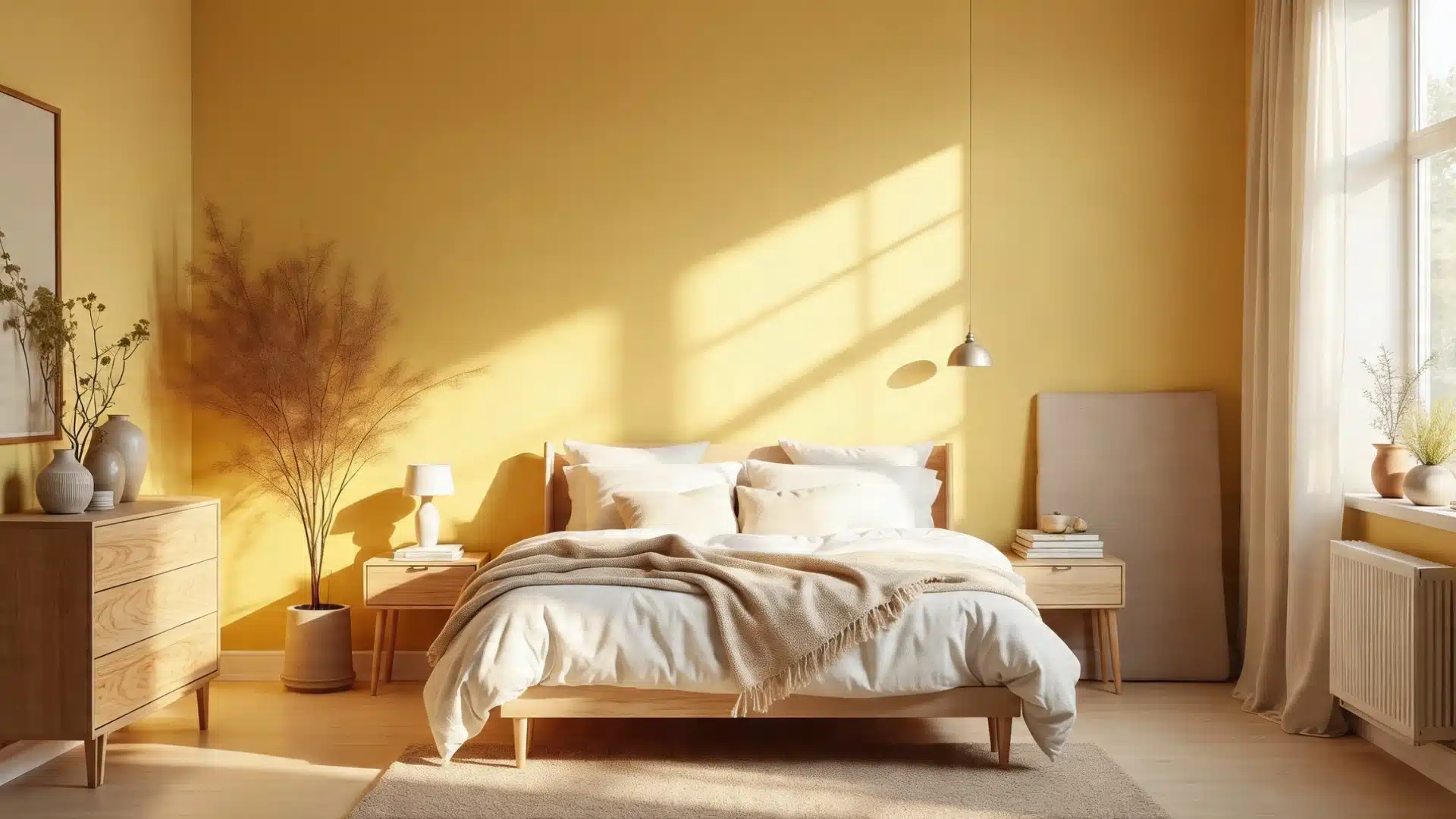
Yellow might not be the first color that comes to mind for a bedroom, but Sun Kissed Yellow 2022-20 is a soft yellow that feels warm and calming.
The key is keeping it light, nothing too bright or too saturated. A gentle, sun-warmed yellow adds a quiet cheerfulness to the room without feeling loud.
Works nicely with white trim, natural wood, and soft neutral bedding. A good pick for rooms that need a little warmth.
12. Sage Green
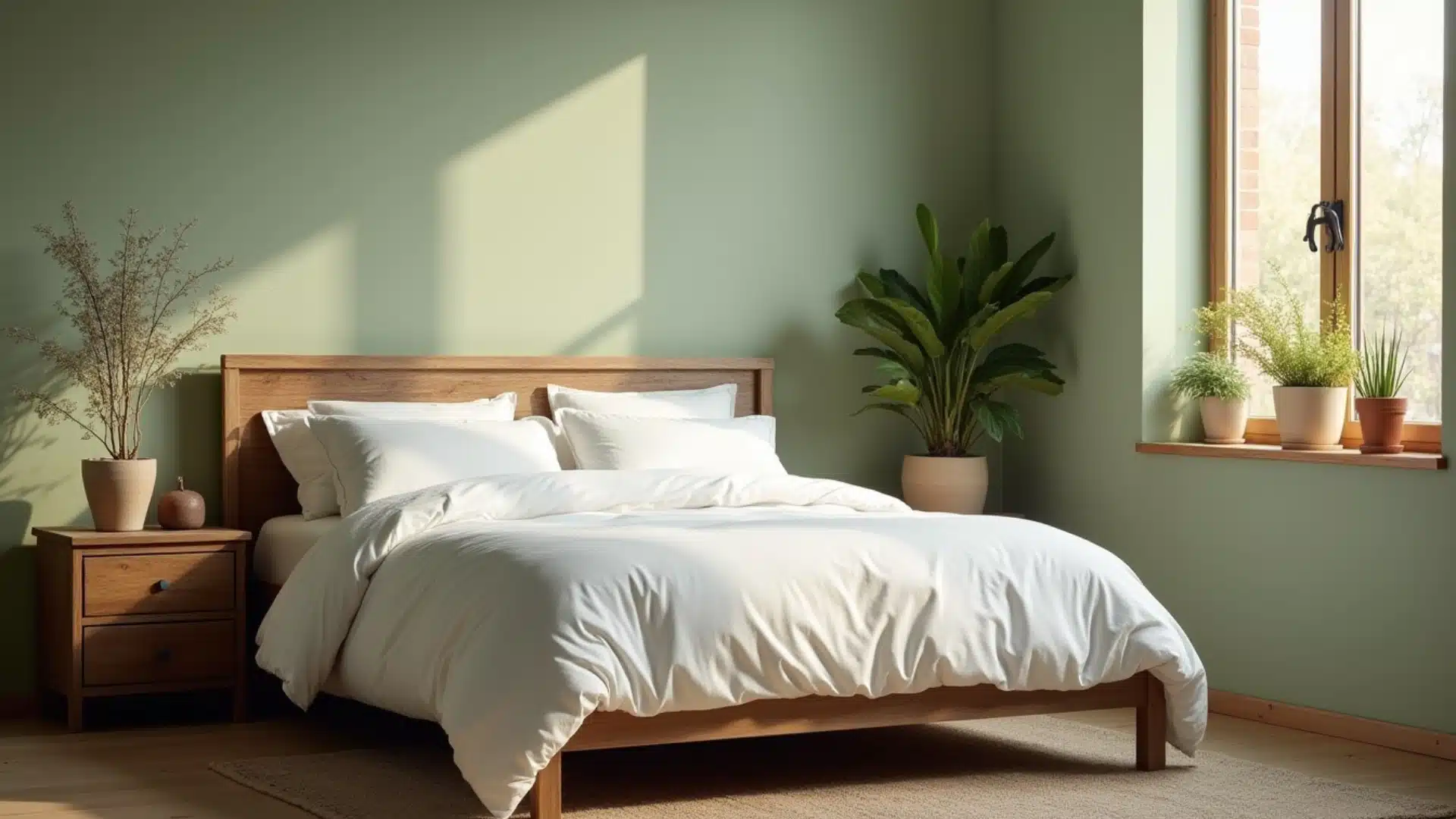
Sage green is a muted, earthy green that feels calm and grounding. It brings a quiet, natural feel to the room without being too bold.
Combine it with warm whites, natural wood tones, and linen textures.
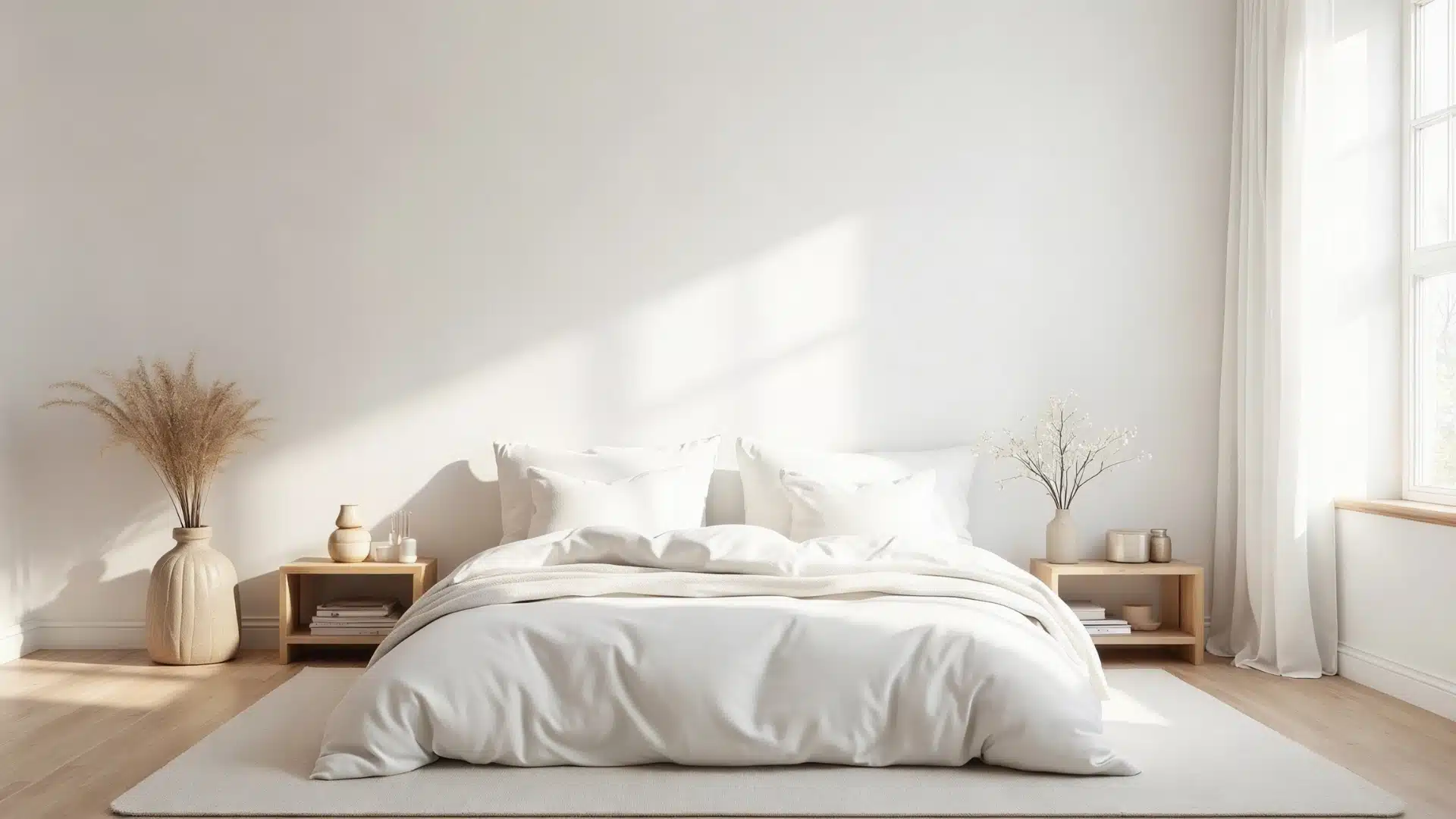
13. Ivory
Ivory color is a warm, creamy white that feels soft and welcoming. It’s a step warmer than standard white but still keeps the room feeling light and open.
It works well in bedrooms of all sizes and styles. It pairs naturally with warm neutrals, soft greens, and earthy tones.
Ivory walls create a quiet, comfortable backdrop that lets the rest of the room breathe.
How to Layer These Colors for A More Relaxing Bedroom?
A wall color is just the start; how those colors are layered with the rest of the room makes the real difference.
- Start with the walls: Choose a soft, simple base from the relaxing master bedroom paint ideas listed above.
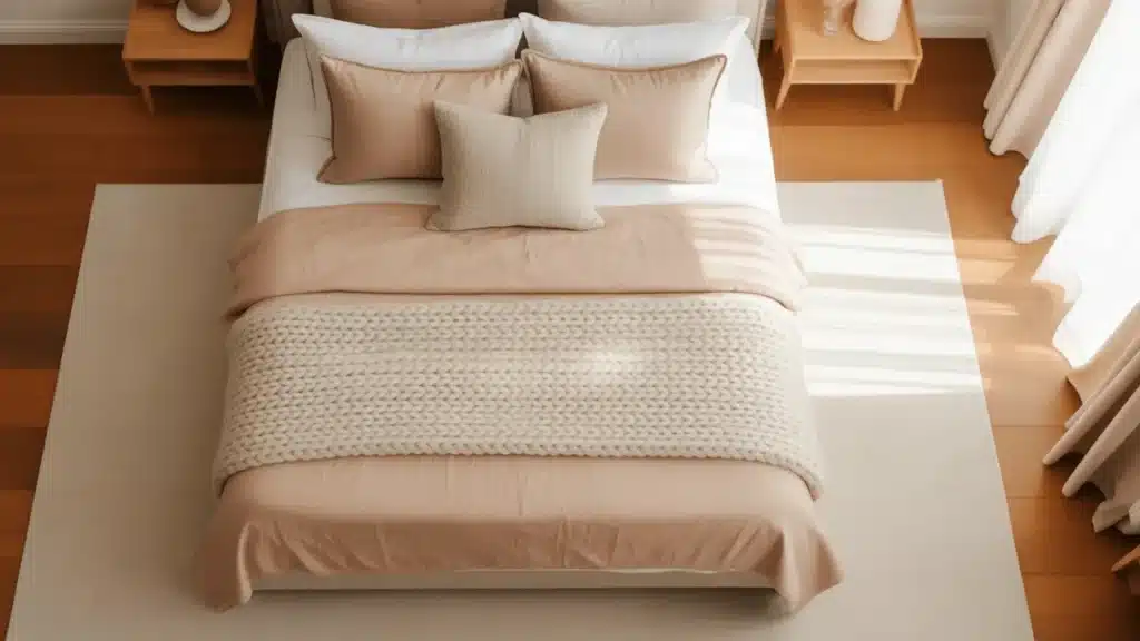
- Add textiles next: Bedding, curtains, and rugs should complement the wall color, not compete with it.
- Bring in natural materials: Wood, linen, and rattan add warmth without adding visual noise.
- Use lighting carefully: Warm bulbs suit warm shades. Cool whites work better with softer, cooler tones.
- Keep accessories minimal: A few well-chosen pieces work better than a room full of competing colors.
How Lighting Affects Bedroom Paint Colors?
The same paint color can look completely different depending on the light in the room. It’s one of the most overlooked parts of picking a shade.
Here’s what to keep in mind:
Natural Light
Brings out the truest version of any color. North-facing rooms get cooler light, which can make warm shades look more neutral.
Warm Bulbs
Works well with earthy tones like natural tan, pashmina, and ivory. They add a soft, settled glow.
Cool White Bulbs
Suit shades like soft blue, Coventry gray, and light dove grey. They keep the room feeling fresh and clean.
Dimmer Switches
It helps adjust the mood without changing the paint.
Always test a color in the room’s actual lighting before making a final call.
Things that can Make Bedrooms Feel Less Relaxing
Even the best paint color won’t save a bedroom if these mistakes are in play.
- Going too dark too fast. Deep shades can feel heavy and closed-in. Always test before committing.
- Ignoring undertones. A shade that looks gray in the store can turn purple on the wall. Check in natural light.
- Too many colors at once. More than three colors create visual clutter. Keep it simple.
- Skipping a finish check. High-gloss paint reflects light harshly. Matte or eggshell finishes work better in bedrooms.
- Forgetting the ceiling. A bright white ceiling against calm bedroom paint colors can feel jarring. Soft whites work better.
Small oversights make a big difference. Getting these right matters just as much as picking the right Shade.
Conclusion
A bedroom should feel like the easiest place to breathe. And the right paint color goes a long way in making that happen.
From soft grays and warm whites to sage green and pale lavender: there’s a shade on this list for every kind of sleeper.
So pick a color, test it on the wall, and see how it feels after a day or two.
Frequently Asked Questions (FAQ’s)
1. What Is the Most Calming Color for Bedroom Paint?
Soft blue, sage green, and warm white are top choices. They’re quiet on the eyes and help the mind slow down at night.
2. What Color Bedroom Paint Is Best for Anxiety?
Muted greens, soft blues, and warm neutrals work best. These shades feel steady and grounded, nothing too bright or too bold.
3. What Are Calming Color Combinations?
Sage green with warm white. Soft blue with light gray. Pale lavender with ivory. Soft blush with sage green. Simple pairings within the same tone family always work well.
4. What Is the Best Color to Paint Bedroom Walls?
Warm white, soft gray, or pale greige are safe, solid picks. They work in most spaces and suit almost any style.